

 100% Security Verified | No Subscription Required | No Malware

A moody color palette uses deep shadows, softened highlights, and restrained saturation to create a sense of atmosphere. These colors can feel cinematic, intimate, mysterious, or reflective, making them useful when a visual project needs more emotional depth than a bright palette can provide.
Creators use moody color combinations in video intros, thumbnails, title cards, branding, social posts, and cinematic edits. Below, you will find 15 Moody Color Palette color palettes with HEX codes for creative projects, including options for Filmora users who want to shape the mood of an entire video with consistent color choices.
In this article
Dark & Cinematic Moody Color Palette Color Palettes
Midnight Ember

- HEX Codes: #17151f, #352331, #703c35, #b56b4a, #d6a56f
- Mood: Cinematic, mysterious, and quietly warm.
- Use for: This palette works well for film trailers, dramatic thumbnails, music videos, and atmospheric brand intros.
Midnight Ember pairs deep plum shadows with glowing copper highlights for a scene that feels intense and refined. The darker tones create visual weight, while the terracotta and tan accents keep the composition from feeling flat or cold.
Use the palette for dramatic video intros, music thumbnails, film-inspired title cards, or branding that needs warmth without losing its dark edge. A copper highlight can also draw attention to important text, logos, or visual details.
Pro Tip: Build A Cinematic Midnight Ember Look In Filmora
Filmora can help you carry the Midnight Ember mood across an entire edit. Start with deep plum or charcoal tones in the intro, then repeat copper accents in lower thirds, transitions, thumbnail text, and selected b-roll details.
Keep the brightest tan shade for focal points rather than using it everywhere. This creates a controlled visual rhythm across trailers, social edits, and longer videos while preserving the palette's mysterious character.
AI Color Palette
Creators can use a reference image, color card, or still frame that contains the Midnight Ember palette and apply its visual character across a complete project. Filmora's AI Color Palette feature helps match colors between clips so footage from different cameras or locations feels more unified.
This is especially useful when a video includes dark interiors, warm practical lights, and outdoor b-roll. A consistent color treatment can make the sequence feel like one intentional story instead of a collection of unrelated shots.
 secure download

HSL, Color Wheels & Curves
Fine-tune Midnight Ember by lowering saturation in the shadows and adding a subtle red or orange lift to the midtones. Use the color wheels to keep the shadows plum-toned, then warm the highlights so skin, lamps, and reflective surfaces carry the palette's copper character.
Curves can add contrast without crushing important detail. Raise the deepest blacks slightly for a faded film look, or deepen them for a sharper trailer aesthetic. These adjustments help keep the palette cinematic across both bright and low-light footage.
secure download1000+ Video Filters & 3D LUTs
Filmora's library can quickly push Midnight Ember toward different creative directions. A cinematic LUT can deepen the plum shadows, while a warm filter can emphasize the copper and honey tones for lifestyle footage, food scenes, or intimate interviews.
Filmora's video filters and 3D LUTs make it easy to test several treatments before choosing the version that best fits your story. Apply a subtle option first, then adjust intensity so the filter supports the footage instead of hiding its natural detail.
secure downloadNoir Rain
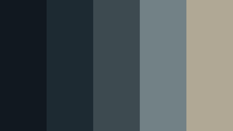
- HEX Codes: #111820, #1d2a32, #3d4b4e, #718184, #b1a795
- Mood: Rainy, introspective, and urban.
- Use for: This palette is ideal for documentary title cards, city vlogs, editorial graphics, and minimalist user interfaces.
Noir Rain blends blue-black tones with weathered gray neutrals for a thoughtful metropolitan mood. The restrained contrast feels like a wet street at night, with enough muted light to guide the viewer through the composition.
Use the darkest colors for backgrounds and title cards, then reserve the pale neutral for captions, interface elements, or key details. It works especially well for quiet storytelling, urban footage, and polished layouts with generous negative space.
Velvet Dusk
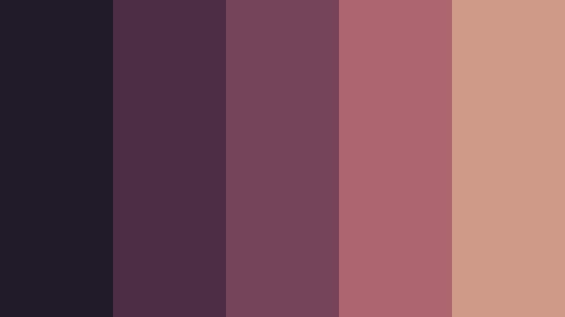
- HEX Codes: #211b29, #4b2e46, #75445a, #ad6670, #d09a88
- Mood: Lush, romantic, and softly dramatic.
- Use for: Use this palette for beauty videos, fashion thumbnails, romantic title sequences, and elegant social media templates.
Velvet Dusk combines plush berry shades with faded rose accents for a sophisticated evening feel. The palette has rich layering, so visuals can look luxurious while still remaining soft and approachable.
Use berry tones in fashion edits, beauty branding, and romantic intros, then bring in the dusty rose shade for readable text or gentle highlights. It can also give social templates a polished look without relying on bright pink.
Obsidian Bloom
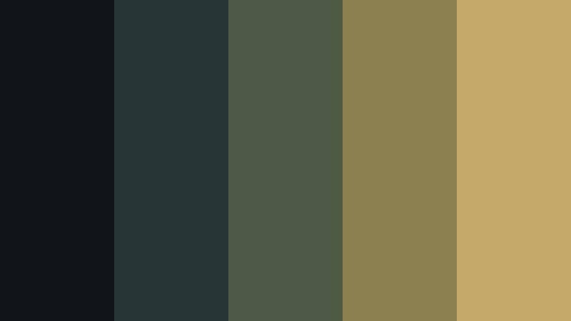
- HEX Codes: #101617, #263536, #4e5a45, #8c8051, #c5a96b
- Mood: Botanical, mysterious, and grounded.
- Use for: This palette works well for wellness branding, nature documentaries, botanical packaging, and slow-living video content.
Obsidian Bloom places muted olive and antique gold against nearly black teal for a shadowy organic look. The combination feels premium and earthy, with gold adding a refined accent to the natural foundation.
Use the dark teal for video backgrounds, botanical footage, and packaging surfaces. Olive can support section headings or graphic overlays, while antique gold works well for logos, thin borders, and elegant intro animations.
Earthy & Atmospheric Moody Color Palette Color Palettes
Mossy Hearth
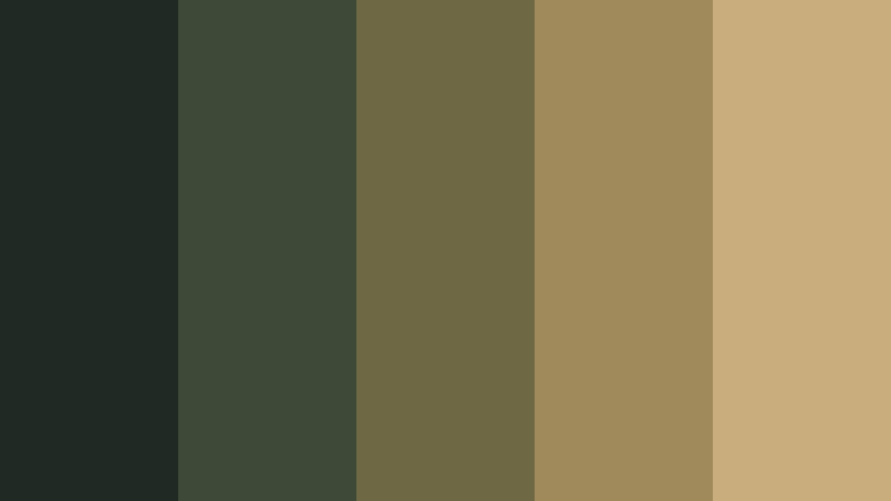
- HEX Codes: #202a24, #3e4a38, #6e6845, #a08a5c, #c9ad7c
- Mood: Cozy, natural, and quietly nostalgic.
- Use for: Use this palette in cabin vlogs, lifestyle thumbnails, home decor content, and rustic brand identities.
Mossy Hearth mixes forest greens with toasted beige and warm ochre for a welcoming outdoor mood. It suggests wood, leaves, handmade materials, and soft firelight without becoming overly rustic.
Use the green shades for backgrounds and footage overlays, then add ochre or beige to emphasize text and product details. This palette is effective for content centered on comfort, craft, home decor, food, and slow travel.
Autumn Smoke

- HEX Codes: #29201e, #57352d, #884d35, #b4774d, #d3aa77
- Mood: Rustic, nostalgic, and softly radiant.
- Use for: This palette suits travel reels, autumn campaigns, food photography, editorial covers, and warm cinematic overlays.
Autumn Smoke captures the feeling of fading daylight through smoky brown, terracotta, and honeyed tan. Its warmth gives everyday scenes a nostalgic seasonal glow without making the image look too saturated.
Use terracotta for thumbnail accents and transitions, while the honeyed tan can highlight captions or calls to action. The palette is a natural fit for fall campaigns, travel stories, cooking videos, and editorial compositions.
Cedar Twilight

- HEX Codes: #192326, #35443e, #5e6250, #96765a, #c2a27a
- Mood: Calm, woody, and contemplative.
- Use for: Use Cedar Twilight for outdoor adventure videos, sustainable packaging, portfolio websites, and editorial design.
Cedar Twilight balances cool evergreen shadows with cedar brown and muted sand. The result feels steady, tactile, and connected to the natural world, making it a strong choice for calm visual narratives.
Apply the darker colors to title cards and website sections, then use cedar brown to warm footage of wood, mountains, tools, or travel gear. The sand tone can improve readability in captions while keeping the design understated.
Clay After Rain
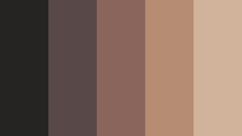
- HEX Codes: #262323, #584847, #89655c, #b68c73, #d1b29a
- Mood: Grounded, reflective, and gently intimate.
- Use for: This palette is a strong choice for ceramics brands, wellness content, personal essays, and understated social graphics.
Clay After Rain pairs softened clay tones with dusky neutrals for a tactile and reflective atmosphere. It feels connected to handmade materials, quiet interiors, and personal storytelling.
Use the deep brown-gray for backgrounds, then layer clay and warm beige across cards, subtitles, product shots, and intro graphics. The palette creates a personal look without becoming overly bright or sweet.
Jewel-Toned & Dramatic Moody Color Palette Color Palettes
Deep Amethyst
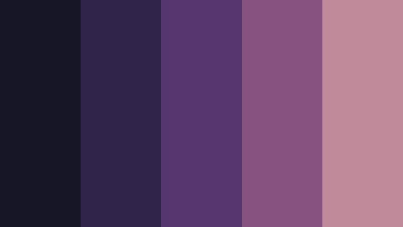
- HEX Codes: #171626, #30244a, #56366d, #86527e, #c08a9b
- Mood: Mystical, luxurious, and expressive.
- Use for: This palette works beautifully for music visuals, beauty campaigns, creative portfolios, and bold intro animations.
Deep Amethyst layers violet-black shadows with jewel-like purple and dusty mauve. It adds artistic depth to designs that need a dramatic yet polished identity.
Use the darkest shade as a cinematic base, then introduce purple in motion graphics, transitions, and thumbnail details. Dusty mauve can soften the design and provide a refined accent for beauty, music, and personal branding projects.
Sapphire Night
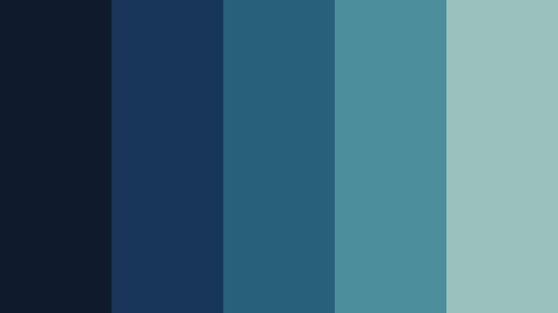
- HEX Codes: #0f1b2c, #183657, #28607a, #4c8e9b, #9bc1bd
- Mood: Cool, focused, and quietly luxurious.
- Use for: Use this palette for tech videos, travel content, app interfaces, professional presentations, and cinematic title cards.
Sapphire Night creates a deep oceanic mood with layered blue tones and a pale mineral accent. It feels modern, trustworthy, and visually immersive without losing its moody character.
Use the darkest blues for title cards and interface panels, then add brighter teal to guide attention through diagrams or motion graphics. The pale green-gray accent is useful for readable captions, charts, and clean presentation layouts.
Garnet Lounge
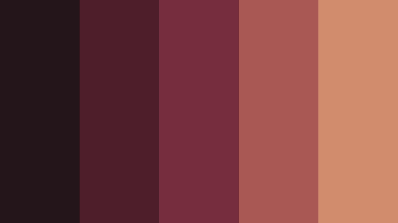
- HEX Codes: #24151b, #4d1f2b, #762e3d, #a95854, #d18b6d
- Mood: Sensual, confident, and richly intimate.
- Use for: This palette is suited to nightlife promotions, fashion edits, cocktail branding, event posters, and dramatic social content.
Garnet Lounge combines deep wine shades with softened coral for a confident evening aesthetic. It brings energy and sophistication to bold visual compositions while keeping the overall mood intimate.
Use garnet and wine tones in nightlife videos, fashion transitions, and event graphics. Coral and muted peach can highlight faces, product details, or important text without weakening the palette's dramatic foundation.
Teal Eclipse

- HEX Codes: #101d21, #173e43, #286a68, #57948b, #a4b9a0
- Mood: Futuristic, balanced, and enigmatic.
- Use for: Use Teal Eclipse for technology branding, science content, modern UI systems, and sleek explainer video graphics.
Teal Eclipse uses dark teal foundations with mineral green highlights to create a crisp, otherworldly mood. Its controlled contrast keeps digital designs readable and distinctive.
Use the deepest tones as a background for explainer videos and interfaces, then reserve brighter teal for diagrams, transitions, and animated lines. The pale green accent can soften the high-tech look in presentation slides and brand systems.
Soft & Shadowy Moody Color Palette Color Palettes
Foggy Lavender
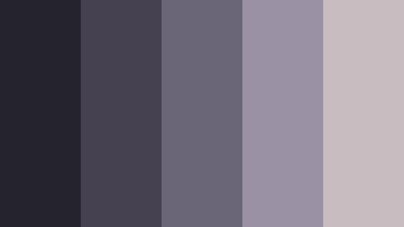
- HEX Codes: #25232d, #454151, #6b6578, #9b91a5, #c9bcc1
- Mood: Dreamy, quiet, and introspective.
- Use for: This palette works well for journaling videos, soft editorial layouts, wellness apps, and gentle lifestyle thumbnails.
Foggy Lavender blends cool charcoal violet with hazy lilac and pale mauve. It creates a calm visual rhythm for thoughtful, slow-paced content and gives ordinary layouts a soft atmospheric quality.
Use the darker violet shades for titles and backgrounds, then add lilac to cards, borders, and motion graphics. The pale mauve works well for captions, wellness branding, and lifestyle thumbnails that need a quiet, modern finish.
Blue Hour Mist

- HEX Codes: #182331, #2d3c52, #52647a, #8994a1, #c0c1bb
- Mood: Peaceful, airy, and contemplative.
- Use for: Use Blue Hour Mist for sunset reels, photography portfolios, meditation content, and clean presentation templates.
Blue Hour Mist reflects the subdued light just after sunset with layered navy and silvered gray. It feels spacious, composed, and easy on the eyes, making it useful for visual stories that need a gentle pace.
Use navy for opening frames and text panels, then transition into slate blue and gray as the scene becomes lighter. The soft neutral can support subtitles and presentation elements while maintaining a calm, cohesive look.
Rosewood Haze
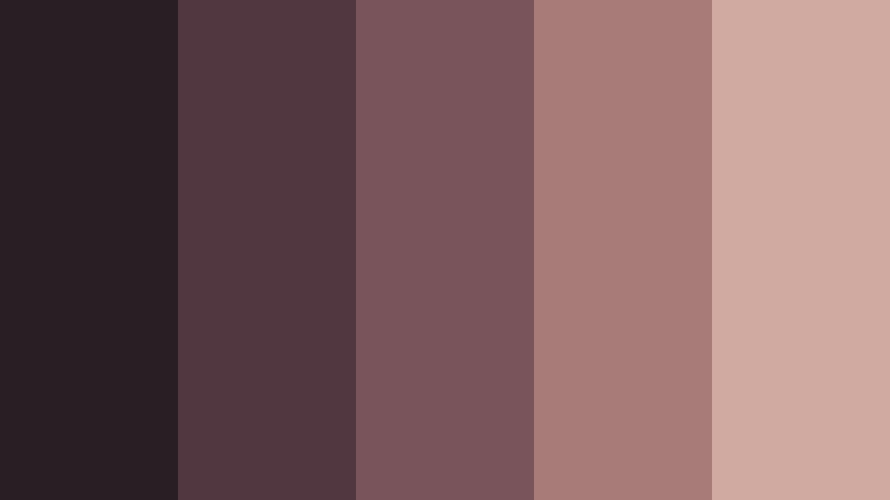
- HEX Codes: #281e23, #513840, #79545a, #a77b78, #d0aaa0
- Mood: Tender, vintage, and quietly sophisticated.
- Use for: This palette is ideal for personal branding, wedding films, beauty content, stationery, and nostalgic social campaigns.
Rosewood Haze softens deep brown-red tones with faded blush and warm beige. It offers a mature romantic look that feels personal rather than overly delicate.
Use rosewood shades in wedding films, personal intros, and vintage-inspired thumbnails. The blush and beige tones can highlight names, dates, product details, and captions while preserving the palette's sophisticated mood.
Tips for Creating Moody Color Palette Color Palettes
Moody color palettes work best when dark tones are balanced with intentional highlights and readable contrast. Whether you are editing video, designing a thumbnail, or building a brand identity, use the palette as a flexible system rather than applying every color at the same intensity.
- Use one or two dark anchor colors for backgrounds, title cards, and large visual areas.
- Reserve the lightest color for readable text, focal points, logos, and important calls to action.
- Match the palette to the footage. Cool blues suit night scenes and urban footage, while brown, copper, and olive tones complement natural or interior scenes.
- Keep skin tones natural when applying a moody treatment. Adjust the background and shadows first instead of heavily tinting faces.
- Repeat the same accent color across intros, lower thirds, thumbnails, transitions, and end screens to strengthen brand consistency.
- Test contrast on mobile screens because dark palettes can lose detail or make small text difficult to read.
- Use saturation carefully. Muted colors often create a more premium and cinematic result than fully saturated jewel tones.
- Save color presets or LUTs for recurring projects so your videos and social graphics maintain a recognizable visual identity.
A moody color palette can shape how viewers interpret a scene before they hear the dialogue or read the message. Deep colors can suggest mystery, luxury, nostalgia, calm, or drama, while carefully chosen accent colors guide attention and create a stronger visual identity.
Try these HEX coded palettes in thumbnails, intros, b-roll, title cards, and brand graphics. Filmora can help you match footage, refine individual tones, and apply filters that keep the visual direction consistent from the first frame to the last.
Start with one palette that fits your subject, then adjust its contrast and saturation to match your footage. With a consistent color system, even simple edits can feel more intentional, atmospheric, and memorable.
secure download