

 100% Security Verified | No Subscription Required | No Malware

Navy and teal create a balanced visual language that combines the trust and stability of deep blue with the freshness and energy of green-blue tones. Navy adds structure and authority, while teal brings clarity, creativity, and a modern digital feel. Together, they can make a design feel calm, intelligent, polished, and approachable.
These colors work especially well in video intros, thumbnails, brand identities, app interfaces, social graphics, and cloud technology visuals. This collection provides Navy And Teal Cloud Platform Color color palettes with HEX codes for creators, designers, marketers, and Filmora users who want a consistent look across their projects.
In this article
Calm And Refined Navy And Teal Cloud Platform Color Palettes
Harbor Mist
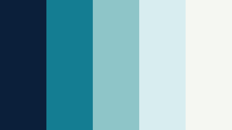
- HEX Codes: #0b1f3a, #147d92, #8ec5c8, #d8edf0, #f5f7f2
- Mood: Calm, polished, airy, and trustworthy.
- Use for: This palette works well for cloud software thumbnails, wellness videos, brand intros, and clean website interfaces.
Harbor Mist pairs deep navy with softened teal and pale aqua for a peaceful, professional look. The dark base gives layouts a strong visual anchor, while the lighter shades add space and softness.
Use it for minimal video title cards, technology explainers, wellness content, and polished brand intros. The pale neutral is also useful for backgrounds, captions, and interface areas that need comfortable readability.
Pro Tip: Enhance Your Navy And Teal Cloud Platform Color Visuals with Filmora
Filmora can help you carry the Harbor Mist palette through an entire edit by using deep navy for title cards, softened teal for transitions, and pale aqua for captions or graphic accents. Repeating these colors across intros, b-roll overlays, and end screens creates a more unified visual identity.
For a polished result, keep the darkest navy in structural elements and reserve brighter teal for focal points. This approach gives cloud software videos, wellness edits, and social content a calm appearance without making the visuals feel flat.
AI Color Palette
Creators can use a Harbor Mist reference image or color card to guide the look of a complete video. Filmora's AI Color Palette feature can identify the main colors in a reference and apply a coordinated appearance across clips, helping footage from different cameras feel more consistent.
This is useful when combining screen recordings, talking-head footage, product shots, and b-roll. A shared navy and teal balance can make every part of the edit feel connected.
 secure download

HSL, Color Wheels & Curves
Use HSL controls to refine the relationship between navy, teal, and aqua. You can lower teal saturation for a softer Harbor Mist appearance, shift cyan slightly toward green for a natural feel, or deepen blue shadows to give an intro more cinematic weight. Color wheels can add cool tones to shadows while keeping highlights clean and neutral.
Curves are helpful for creating gentle contrast without losing the airy character of the palette. For more guidance on balancing color and contrast, use this Filmora color grading tutorial as a practical reference.
secure download1000+ Video Filters & 3D LUTs
Filmora's library of video filters and 3D LUTs makes it easy to stylize Harbor Mist footage quickly. Start with a cool cinematic preset, then reduce its strength so the navy shadows and aqua highlights remain controlled.
Filters can also help match clips recorded in different lighting conditions. Apply the same general treatment to interviews, screen captures, and b-roll before making small manual adjustments for skin tones and important details.
secure downloadCoastal Cloud
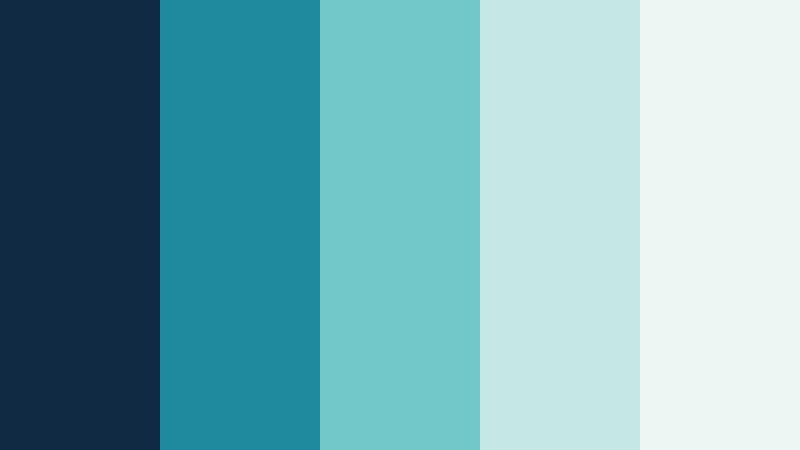
- HEX Codes: #102a43, #1f8a9e, #72c7c8, #c5e8e5, #eef6f3
- Mood: Fresh, open, balanced, and optimistic.
- Use for: Use this palette for travel reels, educational content, SaaS landing pages, and social graphics with a bright coastal feel.
Coastal Cloud blends oceanic teal with a dependable navy foundation and soft mint highlights. The combination feels clear, approachable, and easy to use across digital media.
Its bright coastal character makes it a strong choice for travel reels, educational videos, SaaS explainers, and welcoming social thumbnails. Use the palest tones for backgrounds and the darker colors for titles or navigation.
Quiet Tide
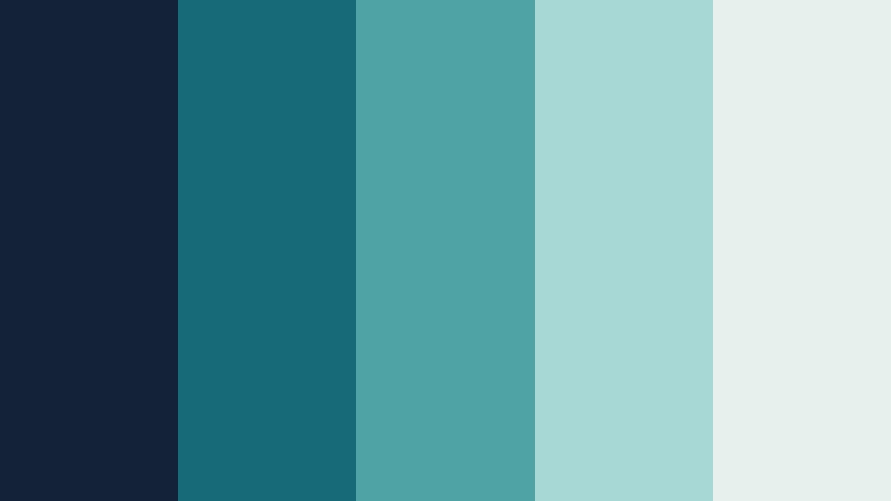
- HEX Codes: #132238, #176b78, #4fa3a5, #a8d8d5, #e6f0ed
- Mood: Serene, grounded, thoughtful, and contemporary.
- Use for: This palette is effective for meditation videos, documentary titles, editorial layouts, and understated app interfaces.
Quiet Tide uses muted teal shades to soften a dark navy base. Its restrained contrast creates a reflective visual style for calm storytelling and premium digital design.
Use the darker shades in documentary title cards or meditation intros, then bring in pale aqua for subtitles, section dividers, and gentle motion graphics. The palette supports a focused experience without excessive visual noise.
Sea Glass Horizon
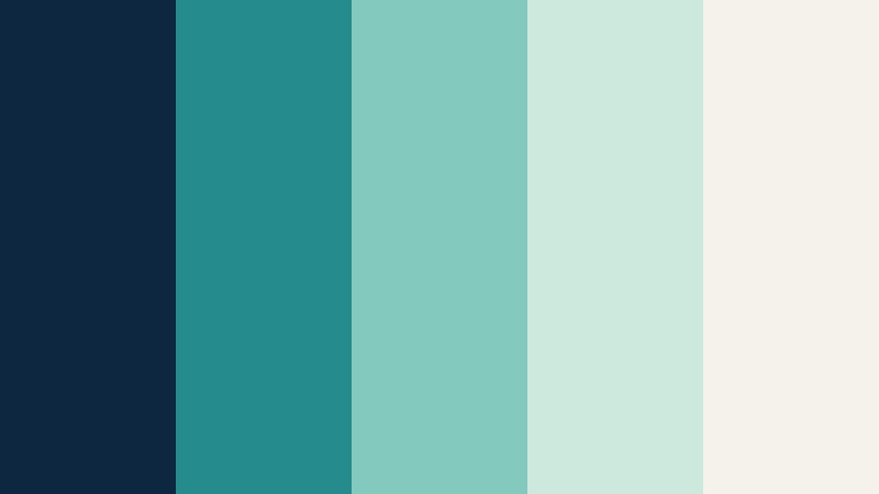
- HEX Codes: #0d2740, #268b8c, #83c9bd, #cde8dc, #f4f2e9
- Mood: Natural, restorative, elegant, and light.
- Use for: Use it for lifestyle thumbnails, sustainable brand campaigns, product explainers, and airy presentation templates.
Sea Glass Horizon combines marine teal, soft green, and warm ivory around a strong navy anchor. It brings a refined coastal atmosphere to both video and print design.
The warm ivory helps lifestyle and sustainability content feel inviting, while the navy provides enough contrast for headlines and logos. It also works well for product explainers that need a clean but human visual style.
Bold And Energetic Navy And Teal Cloud Platform Color Palettes
Neon Network

- HEX Codes: #071a33, #00a6a6, #35e0c0, #d8ff62, #f2f7f5
- Mood: Energetic, futuristic, playful, and high-impact.
- Use for: This palette is suited to tech launch videos, gaming thumbnails, motion graphics, livestream overlays, and bold social content.
Neon Network energizes navy with vivid teal, electric mint, and a sharp lime accent. It delivers instant contrast for fast-paced digital projects and cyber-inspired visuals.
Use lime sparingly for calls to action, interface signals, or thumbnail highlights. The bright accents stand out most effectively when surrounded by the deep navy base and controlled areas of teal.
Electric Current

- HEX Codes: #081c36, #007f86, #00c9b7, #7cf5df, #fff1b8
- Mood: Dynamic, bright, inventive, and confident.
- Use for: Use this combination for app promos, product demos, music visuals, creator branding, and animated social posts.
Electric Current creates a lively digital pulse with bright teal and aqua against deep navy. A warm cream accent keeps the palette expressive without overwhelming the composition.
It is especially effective for animated product demonstrations and creator branding. Let aqua define motion trails or transitions, while cream adds warmth to captions, icons, and selected highlights.
Aqua Signal

- HEX Codes: #0a2142, #008c95, #26d0ce, #b7ffea, #ffcc66
- Mood: Alert, optimistic, youthful, and vibrant.
- Use for: This palette works well for notification graphics, startup branding, tutorial thumbnails, event promos, and UI highlights.
Aqua Signal pairs saturated teal with a warm golden accent for an energetic communication style. The navy backdrop gives every bright color strong visibility and structure.
Use golden yellow for buttons, timestamps, or important thumbnail text, but keep it limited so the aqua remains the main visual signature. This balance works well for tutorials and startup content that needs to feel active and friendly.
Midnight Circuit

- HEX Codes: #050f24, #123e63, #00a9a5, #68f2d2, #e9f7f2
- Mood: Technical, dramatic, sleek, and powerful.
- Use for: Use it for cybersecurity explainers, futuristic title cards, gaming interfaces, and cinematic technology presentations.
Midnight Circuit builds a dramatic foundation with almost-black navy and glowing teal accents. It is designed for high-contrast layouts that need a sophisticated digital edge.
The near-black navy is ideal for cinematic backgrounds, while glowing teal can highlight data paths, interface elements, and key terms. Add pale mint to keep longer text readable in dark video scenes.
Nature Inspired Navy And Teal Cloud Platform Color Palettes
Rainforest Server

- HEX Codes: #0b2533, #126b5b, #39a96b, #a8d672, #eef1d0
- Mood: Organic, stable, fresh, and restorative.
- Use for: This palette fits eco-tech campaigns, sustainability videos, outdoor content, packaging, and nature-inspired web design.
Rainforest Server connects cloud technology with lush natural tones. Deep navy and forest teal feel dependable, while green accents suggest growth and renewal.
It can give sustainability videos and eco-tech brands a credible visual foundation. Use the light yellow-green shade for charts, badges, or transition graphics that need a natural sense of energy.
Lagoon Garden

- HEX Codes: #102b3f, #087f8c, #3bb273, #b7d968, #f4f1de
- Mood: Friendly, vibrant, natural, and encouraging.
- Use for: Use this palette for food content, environmental branding, creator channels, educational graphics, and community-focused campaigns.
Lagoon Garden mixes blue-green water tones with leafy greens and a soft natural neutral. It gives digital projects a friendly, sustainable, and inviting personality.
The palette is flexible enough for educational thumbnails, food videos, and community campaigns. Pair the navy with cream for readable text, then use green accents to identify positive actions or key information.
Mossy Upload
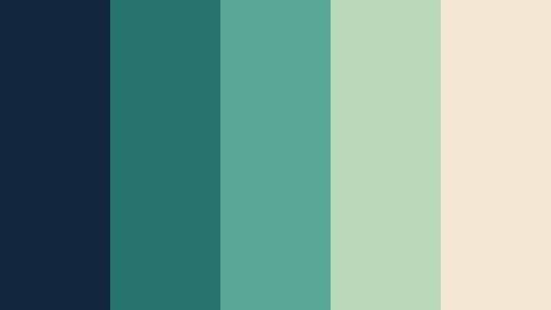
- HEX Codes: #12263a, #27736e, #5aa897, #b8d8ba, #f2e8cf
- Mood: Grounded, warm, reliable, and creative.
- Use for: This palette works well for handmade brands, productivity videos, editorial graphics, and calm software onboarding screens.
Mossy Upload softens cloud-inspired navy and teal with sage green and warm beige. The result feels approachable and crafted rather than overly technical.
Warm beige is useful for paper-like backgrounds, product cards, or editorial layouts, while the darker tones provide dependable structure. This combination can make productivity and software onboarding content feel more personal.
Ocean Canopy
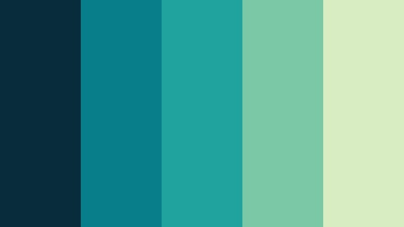
- HEX Codes: #082c3c, #087e8b, #20a39e, #7bc8a4, #d9edc2
- Mood: Refreshing, balanced, expansive, and optimistic.
- Use for: Use this palette for travel content, outdoor apps, conservation campaigns, and vibrant yet professional brand systems.
Ocean Canopy combines clear aquatic teal with leafy green and a pale botanical tint. It creates a sense of open space, motion, and responsible innovation.
Use the deeper colors for logos and title bars, then let the lighter green shades support maps, lower thirds, and environmental visuals. The palette is bright enough for social video while remaining professional for branded content.
Elegant And Modern Navy And Teal Cloud Platform Color Palettes
Executive Cloud

- HEX Codes: #0a1b33, #164e63, #2a9d8f, #9fd8cb, #f6f1e9
- Mood: Professional, composed, intelligent, and premium.
- Use for: This palette is ideal for B2B presentations, corporate videos, consulting websites, and polished software branding.
Executive Cloud presents navy and teal in a structured, executive-friendly arrangement. Warm ivory adds sophistication and keeps the palette from feeling too cold.
It works well in corporate video intros, investor presentations, and consulting content. Use navy for authority, teal for active information, and ivory for spacious layouts that keep the message easy to follow.
Glass Interface

- HEX Codes: #111827, #155e75, #2dd4bf, #99f6e4, #f8fafc
- Mood: Minimal, crisp, modern, and precise.
- Use for: Use it for app dashboards, UI mockups, product tutorials, tech thumbnails, and clean motion design systems.
Glass Interface uses cool navy, blue-teal, and translucent aqua tones for a sharp digital finish. Its pale neutral background supports clear hierarchy and readable interfaces.
For video, the palette is effective in screen-recording overlays, app tutorials, and minimal motion graphics. Use the bright aqua for active states or animated lines, keeping the dark navy behind key information.
Blue Hour Data

- HEX Codes: #0b1930, #1e3a5f, #168aad, #76c893, #f1faee
- Mood: Reflective, intelligent, balanced, and quietly innovative.
- Use for: This palette works well for data stories, analytics dashboards, educational videos, and sophisticated editorial layouts.
Blue Hour Data pairs layered blues with teal and a restrained green accent. It feels analytical yet human, making it useful for brands that communicate insight and progress.
Use the blue layers to organize charts or chapter sections, then introduce green to signal growth, success, or a positive result. The pale neutral can support subtitles and data labels without competing with the main story.
Teal Blueprint
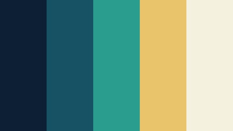
- HEX Codes: #0c1f35, #155263, #2a9d8f, #e9c46a, #f4f1de
- Mood: Strategic, refined, creative, and assured.
- Use for: Use this palette for architecture-style layouts, brand guidelines, video title cards, product packaging, and design portfolios.
Teal Blueprint gives a classic navy and teal system a confident golden accent. The palette feels carefully engineered while retaining warmth and visual personality.
Golden yellow can draw attention to important details in title cards, portfolios, and product packaging. Keep it as a focused accent against navy and ivory to preserve the palette's refined character.
Tips for Creating Navy And Teal Cloud Platform Color Color Palettes
Successful Navy And Teal Cloud Platform Color combinations depend on contrast, proportion, and consistency. Start with a dependable navy foundation, select one main teal, and use lighter or warmer accents to guide attention through the design.
- Use deep navy for backgrounds, title bars, logos, or interface structure when you need authority and strong contrast.
- Reserve vivid teal for focal points such as buttons, transitions, icons, key words, and thumbnail accents.
- Pair dark colors with pale aqua, mint, ivory, or soft gray to keep captions and longer text readable.
- Use lime, yellow, or gold accents sparingly so they create emphasis instead of making the composition feel crowded.
- Check the palette against your footage. Natural daylight, skin tones, and product colors should remain believable after grading.
- Keep the same navy and teal values across intros, lower thirds, thumbnails, end screens, and social templates to strengthen branding consistency.
- Test color contrast on mobile screens, especially when creating vertical videos or small social thumbnails.
- Save your preferred HEX values and matching Filmora adjustments as a repeatable visual style for future projects.
Navy and teal palettes can shape a project in very different ways, from calm and trustworthy to futuristic and high-impact. The balance between dark structure, vivid teal, pale neutrals, and supporting accents helps define how viewers understand a brand or story.
Choose a palette that matches your footage, audience, and message, then apply it consistently across titles, transitions, overlays, thumbnails, and social exports. Even small color decisions can make a video feel more professional and recognizable.
Filmora makes it easier to test these combinations, match footage, refine individual tones, and build a repeatable visual system. Try one of the palettes above and adjust its saturation, contrast, and accent colors until it fits your creative direction.
secure downloadNext: Indigo And Lime Cybersecurity Firm Color Color Palette
