

 100% Security Verified | No Subscription Required | No Malware

Orange and slate create a strong visual balance between energy and structure. Orange brings warmth, action, and optimism, while slate adds stability, focus, and a modern professional tone. Together, they work well for project management dashboards, productivity apps, creative workflows, thumbnails, and branded video content.
This collection provides Orange And Slate Project Management App Color palettes with HEX codes for creators and Filmora users. Use these combinations for video intros, social media graphics, app demos, presentations, branding systems, and design projects that need a confident yet organized appearance.
In this article
Bold & Productive Orange And Slate Color Palettes
Citrus Command

- HEX Codes: #f47c20, #ffad33, #5b6670, #263238, #f5f1e8
- Mood: Energetic, focused, and confident
- Use for: Use this palette for project management dashboards, productivity app thumbnails, startup intros, and bold interface highlights.
Citrus orange adds momentum while deep slate creates a reliable foundation. The combination feels active and organized, making it a practical choice for productivity brands, creative teams, and digital tools that want to communicate progress.
Use the bright orange for titles, buttons, motion graphics, or intro accents, then reserve slate for backgrounds, panels, and supporting text. The pale cream shade can soften thumbnails and keep presentations from feeling too heavy.
Pro Tip: Enhance Your Orange And Slate Project Management App Color Visuals with Filmora
Filmora can help you carry the Citrus Command palette across an entire edit. Use orange for animated titles, progress bars, transitions, and callouts, while slate tones can shape lower thirds, background cards, and interface-inspired overlays.
For a consistent project management or productivity video, repeat the same orange and slate values in the intro, b-roll labels, chapter markers, and closing screen. This creates a clear visual system even when your footage comes from different sources.
AI Color Palette
Creators can use a reference image, screenshot, or color card based on Citrus Command and apply its look across their footage. Filmora's AI Color Palette feature helps match clips so orange highlights, neutral surfaces, and slate shadows feel more connected.
This is especially useful when combining screen recordings, desk shots, product footage, and social clips. Apply the palette as a starting point, then make small adjustments for skin tones and lighting conditions.
 secure download

HSL, Color Wheels & Curves
Use HSL controls to make the Citrus Command orange more golden, more saturated, or slightly muted depending on the tone of your footage. Color wheels can warm the highlights while keeping slate shadows cool, creating a cinematic separation between active elements and the background.
Curves are useful for adding contrast without losing the soft cream tones. Lift the shadows slightly for a friendly tutorial, or deepen them for a sharper startup intro. These adjustments help the same palette work across bright desk scenes and darker screen recordings.
secure download1000+ Video Filters & 3D LUTs
Filmora's video filters and 3D LUTs make it easy to stylize Citrus Command footage quickly. Choose a clean modern filter for app demos or a warmer LUT for creative workflow stories.
After applying a filter, reduce its intensity if the orange begins to overpower important details. A lighter treatment keeps slate backgrounds readable and allows your branded orange accents to remain the visual focus.
secure downloadDeadline Ember

- HEX Codes: #e85d04, #f48c06, #6c757d, #343a40, #fff3e0
- Mood: Urgent, driven, and high energy
- Use for: Use this palette for task tracking videos, deadline reminders, social media graphics, and attention grabbing callouts.
Fiery orange tones communicate urgency without losing clarity. Slate neutrals balance the intensity for polished project planning visuals, making this palette suitable for content about deadlines, launches, and fast-moving campaigns.
Use Ember orange for countdowns, warning labels, and key statistics in thumbnails. Dark slate can anchor the layout, while the pale cream shade gives text and cards enough breathing room.
Sprint Signal

- HEX Codes: #ff7900, #ffb703, #475569, #1e293b, #e2e8f0
- Mood: Fast, optimistic, and decisive
- Use for: Use this palette for agile workflow content, app onboarding screens, explainer videos, and animated status indicators.
Bright orange and golden yellow create a clear sense of movement and progress. Cool slate shades keep the design structured and easy to scan, which is useful for agile boards and workflow explainers.
Animate the orange and yellow tones as progress indicators, completed tasks, or section transitions. Use the deep slate shade behind text and interface mockups to maintain strong contrast.
Workspace Voltage

- HEX Codes: #fb8500, #ffb703, #334155, #0f172a, #f8fafc
- Mood: Vibrant, modern, and ambitious
- Use for: Use this palette for SaaS branding, productivity tutorials, presentation covers, and modern workspace content.
Electric orange gives this palette a lively digital presence, while dark slate delivers contrast and authority. It is ideal for clean, high-impact layouts that need to feel current and capable.
Use orange for icons, cursor animations, and presentation highlights. The near-black slate works well for full-screen title cards, while off-white backgrounds keep the overall design crisp.
Milestone Spark

- HEX Codes: #f97316, #fdba74, #64748b, #1e293b, #fffbeb
- Mood: Celebratory, practical, and motivating
- Use for: Use this palette for milestone announcements, achievement badges, team videos, and project success stories.
Warm orange highlights make accomplishments feel rewarding and visible. Soft peach and slate tones add approachability to a professional system without reducing its sense of progress.
Use this palette in team recap videos, project completion graphics, and celebratory intros. Peach can support background shapes and cards, while dark slate keeps achievement text easy to read.
Elegant & Modern Orange And Slate Color Palettes
Slate Studio

- HEX Codes: #e76f51, #f4a261, #59636e, #293241, #f1faee
- Mood: Refined, calm, and creative
- Use for: Use this palette for polished app demos, creative agency branding, portfolio videos, and editorial style thumbnails.
Muted orange brings warmth to a sophisticated slate framework. The combination feels creative without becoming distracting or overly playful, making it useful for refined brand stories.
Use the soft orange shades for highlights and transitions, then pair them with slate title cards and pale green-white backgrounds. This palette is especially effective for design portfolios and premium tutorials.
Copper Ledger

- HEX Codes: #c65d3b, #e09f3e, #70798c, #252b33, #f4f1ea
- Mood: Grounded, premium, and dependable
- Use for: Use this palette for finance workflow apps, business presentations, professional intros, and premium productivity packaging.
Copper and ochre shades give the palette a warm, established character. Slate and ivory create a balanced look suited to serious business communication and detail-focused content.
Use copper for key numbers, logo marks, or opening title accents. Ivory backgrounds can make reports and presentation graphics feel more inviting, while charcoal slate adds authority.
Autumn Interface

- HEX Codes: #d97745, #edae49, #64748b, #334155, #f8f5f0
- Mood: Warm, balanced, and thoughtful
- Use for: Use this palette for planning templates, educational videos, app interfaces, and calm social content about organization.
Autumnal orange gives familiar warmth to a cool digital palette. Its restrained contrast works well for interfaces that need both personality and readability.
Use the ochre tone for selected tabs, timeline markers, and educational callouts. Slate supports navigation and body text, while the warm off-white shade creates a calm base for layouts.
Terracotta Timeline

- HEX Codes: #c8553d, #edb183, #6b7280, #374151, #faf7f2
- Mood: Approachable, stable, and warm
- Use for: Use this palette for timeline graphics, team collaboration content, workflow explainers, and welcoming product pages.
Terracotta orange softens the structured feel of slate and gray. The result is friendly enough for community products while remaining highly professional.
Use terracotta to emphasize dates, milestones, and collaboration points in timeline graphics. The pale peach shade works well in cards and overlays, while slate gives captions and labels a dependable foundation.
Graphite Harvest
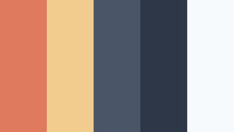
- HEX Codes: #e07a5f, #f2cc8f, #4a5568, #2d3748, #f7fafc
- Mood: Comforting, intelligent, and polished
- Use for: Use this palette for productivity podcasts, educational thumbnails, digital planners, and thoughtful brand storytelling.
Soft harvest colors make slate feel more human and inviting. This palette is useful when a project needs warmth, clarity, and a refined editorial tone.
Use coral-orange for thumbnail headings or podcast artwork, and apply golden cream to graphic accents or quote cards. Graphite backgrounds can give talking-head videos and educational edits a polished appearance.
Soft & Approachable Orange And Slate Color Palettes
Peachy Planner
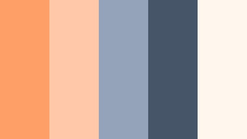
- HEX Codes: #ff9f68, #ffc9a9, #94a3b8, #475569, #fff7ed
- Mood: Friendly, optimistic, and gentle
- Use for: Use this palette for planner templates, lifestyle vlogs, onboarding content, and approachable mobile app interfaces.
Peach orange makes project planning feel lighter and more welcoming. Slate accents preserve structure while cream backgrounds keep the composition soft and comfortable.
This palette works well for lifestyle vlogs, habit-tracking videos, and beginner-friendly app tutorials. Use peach in stickers, labels, and transitions, with slate for navigation and readable captions.
Morning Kanban
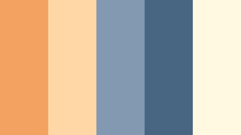
- HEX Codes: #f4a261, #ffd6a5, #829ab1, #486581, #fefae0
- Mood: Fresh, organized, and encouraging
- Use for: Use this palette for morning routine videos, kanban board tutorials, educational graphics, and clean productivity content.
Soft orange and pale cream create a fresh start feeling, while blue slate adds dependable contrast. It is a natural fit for calm, organized visuals and daily planning themes.
Use orange to identify active tasks or new goals, and use blue slate for completed columns, text, and interface frames. Cream backgrounds keep the palette bright without creating harsh contrast.
Apricot Workflow
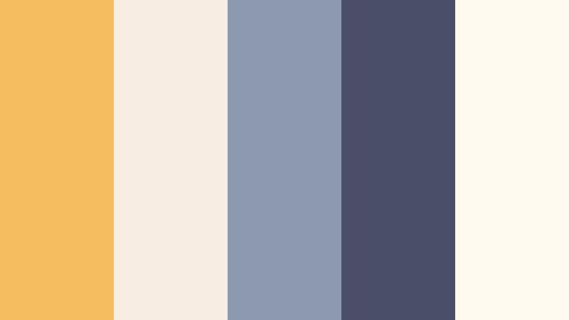
- HEX Codes: #f6bd60, #f7ede2, #8d99ae, #4a4e69, #fffaf0
- Mood: Gentle, creative, and balanced
- Use for: Use this palette for creative workflow videos, design tutorials, personal productivity content, and soft branded social posts.
Apricot and ivory create a relaxed visual foundation for planning concepts. Dusty slate adds enough definition for labels, navigation, and interface details.
Use apricot for handwritten-style annotations, creative prompts, and transition cards. The muted purple-slate shade can add depth to video titles and provide a distinctive accent for personal brands.
Sunlit Backlog

- HEX Codes: #f9a03f, #ffd166, #7b8794, #3d4852, #fff8e7
- Mood: Sunny, clear, and reassuring
- Use for: Use this palette for backlog planning tutorials, team update videos, cheerful thumbnails, and simple task management interfaces.
Sunny orange and yellow make routine planning feel positive and approachable. Neutral slate keeps the palette readable across dashboards and presentation layouts.
Use yellow for completed tasks and orange for priority items in animated boards. The warm cream background is useful for thumbnails, while gray slate supports small labels and subtitles.
Clementine Focus

- HEX Codes: #f28c28, #ffcf99, #9aa5b1, #52606d, #fffaf5
- Mood: Focused, cheerful, and accessible
- Use for: Use this palette for focus timer apps, study videos, productivity reels, and friendly workspace branding.
Clementine orange provides a clear focal point without overwhelming the viewer. Light peach and slate create an accessible system for both video and user interface design.
Use the main orange for timers, progress rings, and attention cues. Peach can soften backgrounds and panels, while slate keeps study notes, captions, and interface text legible.
Tips for Creating Orange And Slate Project Management App Color Color Palettes
Orange and slate can support many visual directions, from energetic productivity content to calm planning videos. Use the tips below to balance contrast, readability, branding, and footage so the palette feels intentional in every format.
- Use bright orange sparingly for buttons, titles, progress indicators, and other focal points instead of covering every surface.
- Pair dark slate with light cream or white text to maintain readable captions, subtitles, and interface labels.
- Choose one primary orange and one supporting orange or yellow so the design does not become visually noisy.
- Match the palette to the footage. Warm desk shots can support terracotta and peach, while screen recordings often suit brighter orange and cooler slate.
- Keep logo colors, intro graphics, lower thirds, thumbnails, and closing screens consistent across a video series.
- Test colors on mobile screens because small thumbnails and vertical videos may reduce subtle differences between slate shades.
- Use color contrast to establish hierarchy. Reserve the strongest orange for the most important message or action.
- Adjust saturation and brightness when combining different clips so the orange accents look consistent from scene to scene.
Orange and slate palettes can shape a brand identity that feels energetic, organized, and modern. Brighter combinations are useful for urgency and productivity, while muted terracotta, peach, and copper variations create a more welcoming or premium mood.
Choose a palette that matches your message, then apply it consistently to titles, overlays, transitions, thumbnails, and interface elements. The HEX codes in this collection make it easier to build a repeatable visual system for video and design projects.
Try these Orange And Slate Project Management App Color combinations in Filmora to refine footage, create branded motion graphics, and maintain a polished look across your next edit.
secure download