

 100% Security Verified | No Subscription Required | No Malware

Pink and brown create a warm, approachable visual language that combines the softness of blush tones with the stability of earthy neutrals. Pink can suggest care, beauty, and comfort, while brown adds trust, natural warmth, and a grounded premium feel. Together, they are especially effective for skincare, wellness, beauty, and lifestyle content.
Creators can use these Pink And Brown Skincare Brand Color color palettes in video intros, product showcases, thumbnails, social media graphics, packaging mockups, and brand systems. Below are curated Pink And Brown Skincare Brand Color color palettes with HEX codes for creators and Filmora users who want to build a consistent visual identity.
In this article
Soft & Romantic Pink And Brown Skincare Brand Color Color Palettes
Rosewood Petal
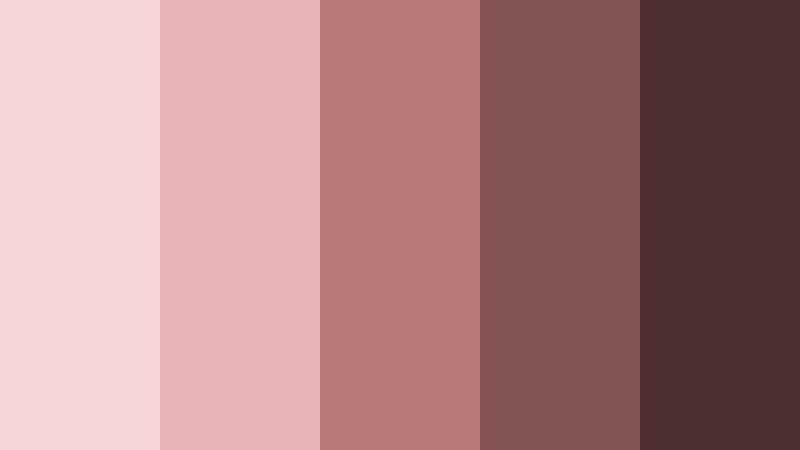
- HEX Codes: #f6d6d9, #e8b4b8, #b87979, #825555, #4b302f
- Mood: Soft, romantic, warm, and reassuring.
- Use for: Use this palette for skincare thumbnails, gentle brand intros, product packaging, and calming social content.
Rosewood Petal blends delicate pinks with grounded brown tones for a polished beauty aesthetic. The lighter shades create a soft, welcoming base, while the deeper rosewood colors add structure and visual depth.
Use the pale pinks for title cards, product close-ups, and background panels, then bring in the darker browns for logo treatments, captions, and transitions. This combination works especially well for feminine skincare campaigns, wellness videos, and reassuring brand intros.
Pro Tip: Enhance Your Pink And Brown Skincare Brand Color Visuals with Filmora
Filmora helps you keep the Rosewood Petal palette consistent across skincare intros, product b-roll, tutorials, and short social edits. Apply similar pink and brown adjustments to different clips so changes in lighting do not weaken the overall brand appearance.
Use coordinated titles, overlays, transitions, and background elements to repeat the same visual language throughout your edit. This makes a short video feel more intentional and helps viewers recognize your skincare brand quickly.
AI Color Palette
Creators can use a reference image, packaging photo, or color card based on Rosewood Petal and apply its visual balance across an entire project. Filmora's AI Color Palette feature can help match the look of multiple clips, even when they were recorded in different locations or under different lighting conditions.
This is useful for skincare campaigns that combine studio product shots, handheld demonstrations, creator footage, and lifestyle b-roll. A consistent palette keeps the final video cohesive from the opening frame to the closing call to action.
 secure download

HSL, Color Wheels & Curves
Fine-tune Rosewood Petal with Filmora's HSL controls by slightly reducing pink saturation for a softer editorial finish or increasing it for a more expressive beauty campaign. Use the color wheels to warm the highlights and keep the shadows rich brown without making skin tones look overly orange.
Curves can add gentle contrast between the pale blush highlights and the deeper rosewood shadows. For a cinematic result, lift the blacks slightly, protect bright product packaging, and keep text overlays in the darkest brown shade for readability.
secure download1000+ Video Filters & 3D LUTs
Filmora's library of filters and LUTs gives you a fast way to stylize Rosewood Petal footage. Start with a soft, warm, or cinematic preset, then lower the intensity so delicate blush colors remain natural on skin and product surfaces.
Filmora's video filters and 3D LUTs make it easy to create a repeatable look for product launches, skincare tutorials, and beauty reels. Save your preferred adjustment style and use it across future videos for stronger brand consistency.
secure downloadBlush Cocoa Embrace
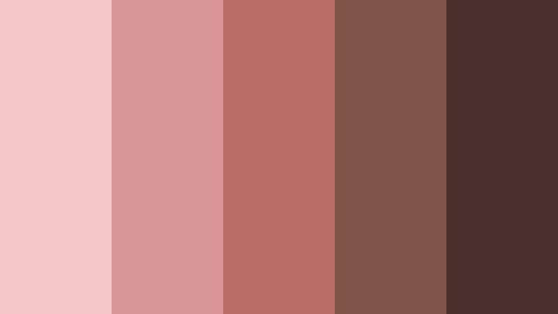
- HEX Codes: #f3c7c8, #d99598, #b96f68, #805348, #4a302d
- Mood: Comforting, intimate, and softly luxurious.
- Use for: Use this palette in vlog covers, skincare tutorials, beauty reels, and warm packaging layouts.
Blush Cocoa Embrace pairs creamy blush with rich cocoa for a welcoming and premium look. The contrast creates clear visual hierarchy without feeling harsh, making it easy to separate titles, backgrounds, and supporting details.
Use the lighter blush tones in vlog covers and skincare tutorial graphics, then reserve cocoa for captions, borders, and logo elements. The palette feels personal and warm while still giving a beauty brand a polished finish.
Petal Latte Mist
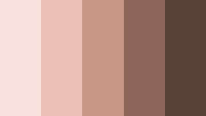
- HEX Codes: #f9e1dd, #edc2b4, #c99784, #8d6657, #574139
- Mood: Airy, natural, and quietly elegant.
- Use for: Use this palette for minimalist UI, lifestyle thumbnails, skincare landing pages, and soft social templates.
Petal Latte Mist combines pale floral tones with creamy latte neutrals for an understated natural feel. Its gentle contrast keeps layouts bright while the mid-tone browns add enough definition for buttons, text, and framing.
It is a strong choice for lifestyle thumbnails, skincare landing page videos, and minimalist social templates. Use the palest shades behind product photography and the darker latte tones for readable labels and subtle motion graphics.
Nude Rose Ritual
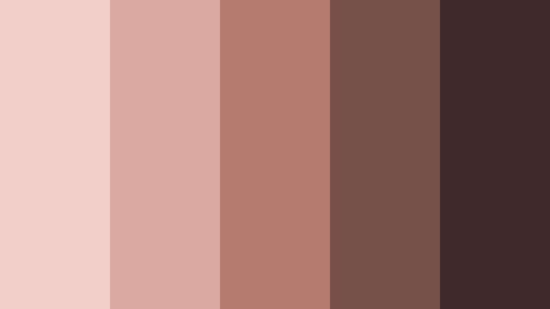
- HEX Codes: #f0d0c8, #d9aaa0, #b77c70, #765047, #3f2c2a
- Mood: Grounded, nurturing, and refined.
- Use for: Use this palette for spa videos, self-care content, editorial graphics, and elegant product labels.
Nude Rose Ritual creates a soothing, ritual-inspired atmosphere through muted rose and earthy brown shades. It feels calm and elevated, with enough tonal range to support both soft backgrounds and strong typography.
Use it for spa videos, self-care explainers, and slow-paced product demonstrations. Gentle fades, close-up footage, and refined product labels will reinforce the palette's nurturing character.
Natural & Earthy Pink And Brown Skincare Brand Color Color Palettes
Terracotta Blush Garden
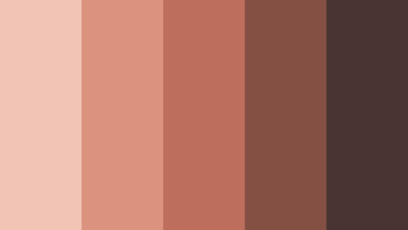
- HEX Codes: #f1c4b6, #dc937d, #bc6f5b, #855044, #493431
- Mood: Earthy, organic, lively, and warm.
- Use for: Use this palette for natural skincare packaging, botanical videos, creator thumbnails, and rustic brand graphics.
Terracotta Blush Garden brings botanical warmth to pink and brown branding. Its terracotta core gives soft pink accents more energy, helping products and titles stand out without losing their natural character.
Use the palette with ingredient footage, botanical b-roll, clay textures, and warm daylight. It is particularly effective for natural skincare packaging, creator thumbnails, and rustic brand graphics.
Clay Blossom Hearth
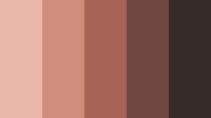
- HEX Codes: #e9b8aa, #cf8d7b, #a96458, #70483f, #362b29
- Mood: Rustic, comforting, and authentic.
- Use for: Use this palette for handmade beauty brands, ingredient explainers, earthy reels, and warm editorial layouts.
Clay Blossom Hearth blends floral pink with fired-clay browns for an artisanal look. The darker shades communicate craftsmanship and authenticity, while the lighter colors keep the overall design approachable.
This palette fits handmade beauty brands, ingredient explainers, and earthy reels. Pair it with natural textures, slow camera movement, and simple typography to create a warm editorial experience.
Mauve Soil Bloom
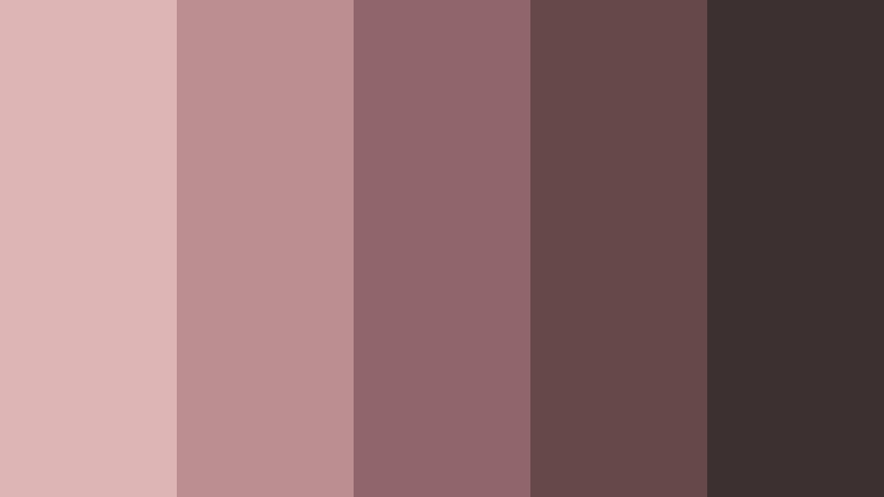
- HEX Codes: #dcb5b4, #bc8d91, #91666b, #67484a, #3d3031
- Mood: Mature, serene, earthy, and contemplative.
- Use for: Use this palette for premium skincare campaigns, thoughtful video essays, wellness apps, and editorial social posts.
Mauve Soil Bloom uses dusty pink and deep brown to create a mature, grounded visual identity. Its muted tones feel restorative and thoughtful rather than overly sweet, which makes them suitable for science-led beauty content.
Use mauve for section titles and soft overlays, then use the deepest brown for data labels, captions, and interface controls. The palette works well in premium campaigns, wellness apps, and reflective video essays.
Apricot Bark Calm
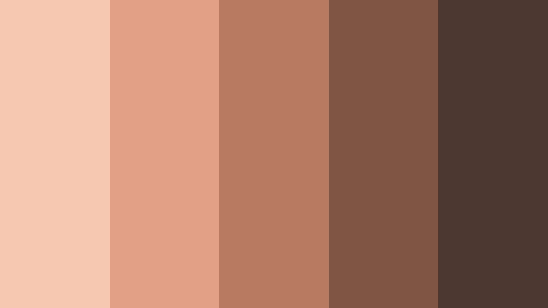
- HEX Codes: #f5c9b1, #e2a186, #b97861, #805546, #4c3731
- Mood: Sunny, approachable, earthy, and optimistic.
- Use for: Use this palette for skincare tutorials, cheerful product launches, mobile UI, and approachable social campaigns.
Apricot Bark Calm adds a light, optimistic note to earthy skincare branding. The warm apricot highlight keeps the brown foundation friendly and inviting, while the deeper tones offer useful contrast.
It suits cheerful product launches, skincare tutorials, and mobile interfaces. Use apricot for animated accents and calls to action, with bark brown supporting text and navigation elements.
Elegant & Modern Pink And Brown Skincare Brand Color Color Palettes
Dusty Blush Atelier
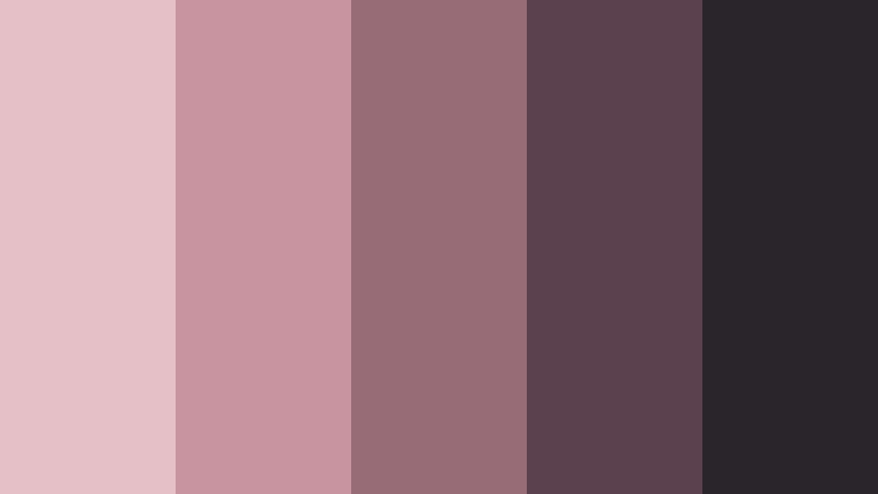
- HEX Codes: #e5c2c5, #c7959b, #966a76, #5b414c, #28252b
- Mood: Editorial, sophisticated, and contemporary.
- Use for: Use this palette for luxury skincare intros, beauty website UI, magazine-style thumbnails, and polished presentations.
Dusty Blush Atelier combines muted pink with plum-leaning brown and charcoal depth. It creates an editorial finish that feels contemporary, controlled, and suitable for modern beauty brands.
Use the pale shades for clean layouts and the charcoal tone for high-impact titles. It is especially effective for luxury skincare intros, magazine-style thumbnails, polished presentations, and beauty website interfaces.
Cocoa Satin Bloom
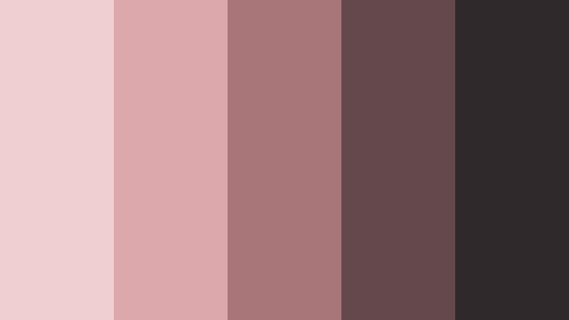
- HEX Codes: #f0cfd0, #dca8ac, #a87578, #65484b, #30292b
- Mood: Luxe, smooth, balanced, and confident.
- Use for: Use this palette for premium packaging, cinematic brand videos, product pages, and refined social graphics.
Cocoa Satin Bloom feels smooth and luxurious, like satin accents against dark cocoa. Its balanced contrast gives designers plenty of flexibility for elegant layouts and readable text.
Try it in cinematic brand videos with soft highlights and controlled shadows. The pale pinks can frame product shots, while the cocoa and near-black tones create premium packaging details and strong closing screens.
Mauve Espresso Frame
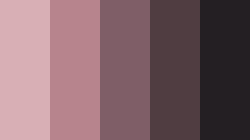
- HEX Codes: #d8afb5, #b7838c, #805e68, #4f3d42, #241f23
- Mood: Dramatic, polished, intimate, and modern.
- Use for: Use this palette for cinematic skincare ads, dark-mode UI, luxury thumbnails, and sophisticated brand intros.
Mauve Espresso Frame delivers a deeper, more dramatic take on pink and brown. Its dark foundation makes pale accents stand out beautifully on screen, especially in controlled studio lighting.
Use it for nighttime skincare ads, dark-mode interfaces, and sophisticated brand intros. Pale mauve text or product highlights can create a strong focal point against espresso backgrounds.
Rosewood Minimalist
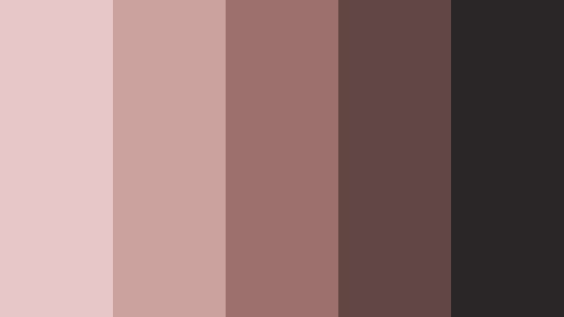
- HEX Codes: #e8c9c7, #cba1a0, #9d706d, #604744, #292627
- Mood: Minimal, composed, timeless, and premium.
- Use for: Use this palette for clean brand systems, skincare app interfaces, packaging mockups, and minimalist video titles.
Rosewood Minimalist balances pale rose with restrained wood tones and near-black contrast. It is a versatile choice for clean, high-end design systems that need both warmth and precision.
Use the pale rose as a spacious background and the near-black shade for logos, captions, and title cards. This palette is ideal for packaging mockups, skincare app interfaces, and minimalist video openers.
Velvet Peony Roast
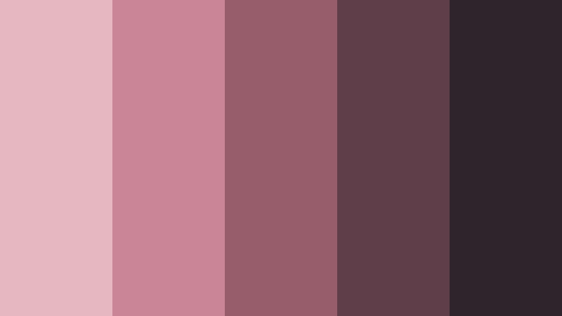
- HEX Codes: #e7b7bf, #c98591, #985d6a, #5f3d49, #2f252c
- Mood: Bold, sensual, luxurious, and expressive.
- Use for: Use this palette for statement thumbnails, campaign openings, beauty launch graphics, and dramatic social content.
Velvet Peony Roast gives pink and brown branding a richer, more expressive personality. The berry-like pinks create energy and emotion, while the dark brown foundation keeps the composition sophisticated.
Use it for statement thumbnails, beauty launches, and dramatic social campaigns. Bold pink can highlight product names or motion graphics, while the deeper shades provide a luxurious base for transitions and title sequences.
Silk Blush Nocturne
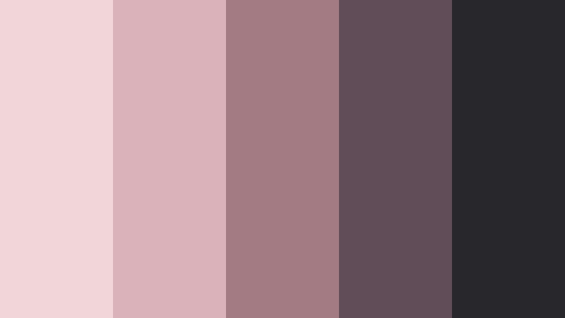
- HEX Codes: #f2d7d8, #d9b3b5, #a47b82, #604d55, #29282d
- Mood: Dreamy, graceful, cinematic, and calm.
- Use for: Use this palette for nighttime skincare content, cinematic reels, elegant presentations, and refined website headers.
Silk Blush Nocturne pairs luminous blush with cool brown depth for a graceful evening mood. It feels calm and cinematic, making it a natural fit for nighttime routines and quiet luxury layouts.
Use the lighter colors for glowing product highlights and the dark shades for headers, captions, and closing frames. Subtle fades, low-key lighting, and slow-motion b-roll can make this palette especially atmospheric.
Tips for Creating Pink And Brown Skincare Brand Color Color Palettes
Successful Pink And Brown Skincare Brand Color combinations depend on balance, contrast, and consistent application. Use lighter pinks to create openness, earthy browns to add trust, and darker tones to anchor text, interfaces, and important visual details.
- Use dark brown or charcoal for text placed over light pink backgrounds to maintain clear readability.
- Limit the brightest pink to accents, calls to action, product highlights, and selected motion graphics.
- Match the palette to your footage by adjusting white balance, exposure, and skin tones before adding stylized effects.
- Repeat the same two or three core colors across intros, lower thirds, thumbnails, captions, and end screens.
- Use warm browns for natural, handmade, and wellness-focused brands, or cooler brown shades for a more modern editorial look.
- Check color contrast on both mobile and desktop screens, especially when designing social thumbnails and subtitles.
- Pair pink and brown with cream, beige, muted gold, or soft white when the design needs more breathing room.
- Save your preferred color adjustments, title styles, and overlays as a reusable template for future Filmora projects.
Pink And Brown Skincare Brand Color palettes can shape a brand's mood before viewers read a single word. Soft pinks create care and comfort, while brown shades add warmth, trust, and an organic premium quality. By changing the saturation, contrast, and depth of these colors, you can create anything from a gentle self-care identity to a dramatic luxury beauty campaign.
Test these palettes across product footage, creator videos, thumbnails, intros, and social graphics to find the combination that best fits your message. Filmora makes it easier to apply a consistent look, refine individual clips, and build polished skincare content with a repeatable visual system.
Start with one palette as your core identity, then use its lighter and darker HEX codes to organize backgrounds, text, accents, and transitions. A focused color system can make even a short beauty video feel more professional and recognizable.
secure downloadNext: Top 15 Cobalt and Mint SaaS Dashboard Color Color Palettes for Creative Projects With HEX Codes
