

 100% Security Verified | No Subscription Required | No Malware

Sage green and clay create a balanced visual language that combines the calming qualities of muted green with the warmth and energy of earthy orange-red tones. Sage suggests nature, stability, and renewal, while clay adds comfort, craft, and a human touch. Together, they can make creative work feel grounded, welcoming, and thoughtfully designed.
These colors work especially well in interior design videos, lifestyle content, brand identities, thumbnails, title cards, intros, and social media graphics. Below are Sage Green And Clay Interior Design Color color palettes with HEX codes for creators and Filmora users who want to build a consistent visual style across video and design projects.
In this article
Earthy And Natural Sage Green And Clay Interior Design Color Color Palettes
Desert Herb Retreat
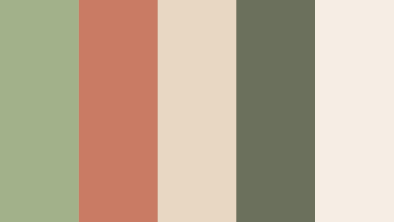
- HEX Codes: #a3b18a, #c97b63, #e8d8c3, #6b705c, #f4eee4
- Mood: Grounded, warm, organic, and quietly inviting.
- Use for: This palette works well for interior design videos, lifestyle thumbnails, home decor branding, and nature-inspired social content.
Desert Herb Retreat blends muted sage with sunbaked clay and soft linen tones. The combination feels relaxed, natural, and handcrafted, making it a strong choice for projects that need warmth without excessive saturation.
Use sage for backgrounds, room details, or lower thirds, then bring in clay for title accents, thumbnail highlights, and intro transitions. The cream shades help keep text readable and give lifestyle footage a soft, welcoming finish.
Pro Tip: Enhance Your Sage Green And Clay Interior Design Color Visuals with Filmora
Filmora can help maintain the Desert Herb Retreat look across an entire edit. Apply consistent color adjustments to interior shots, b-roll, title cards, and social cutdowns so the sage, clay, and linen tones feel connected from the opening frame to the final scene.
Use the palette as a visual reference when choosing text colors, transition styles, overlays, and thumbnail backgrounds. A restrained approach will preserve the calm, organic mood while still giving important moments enough contrast.
AI Color Palette
Creators can use a reference image, mood board, or digital color card based on Desert Herb Retreat and apply its visual character across a video. Filmora's AI Color Palette feature helps match different clips so footage from different locations or cameras feels more consistent.
This is useful for home tours, lifestyle vlogs, and nature content where lighting can change between scenes. A unified palette makes the final video appear more intentional and professionally branded.
 secure download

HSL, Color Wheels & Curves
Fine-tune Desert Herb Retreat by lowering saturation in bright greens and gently warming the clay midtones. HSL controls can separate plant greens from painted walls, while the color wheels can add warm highlights and slightly cooler shadows for a more cinematic balance.
Use curves to protect skin tones and preserve detail in pale fabrics. A small lift in the shadows can create an airy lifestyle look, while deeper contrast can make interior details and textured surfaces feel richer.
secure download1000+ Video Filters & 3D LUTs
Filmora's extensive library of filters and LUTs can quickly give Desert Herb Retreat a softer, earthy finish. Start with a natural or warm cinematic preset, then reduce its intensity so the sage and clay relationship remains visible.
Use the same filter family across your main video, vertical clips, and promotional thumbnails for stronger brand consistency. Filmora's video filters and 3D LUTs make it easy to test different levels of warmth, contrast, and texture.
secure downloadTerracotta Garden
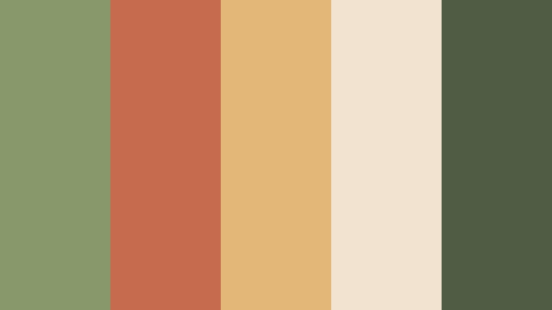
- HEX Codes: #87986a, #c66b4e, #e3b778, #f1e3d0, #4f5d45
- Mood: Fresh, rustic, energetic, and connected to outdoor living.
- Use for: Use it for gardening content, sustainable brands, craft packaging, food videos, and cheerful home improvement graphics.
Terracotta Garden pairs leafy sage with lively clay, golden earth, and creamy neutrals. It feels optimistic and active while staying connected to natural materials and outdoor spaces.
Use the brighter clay and gold tones for calls to action, chapter titles, and thumbnail accents. Sage and forest green can support background areas, product shots, and environmental b-roll without overwhelming the viewer.
Moss And Fired Earth
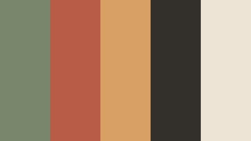
- HEX Codes: #78866b, #b85c48, #d9a066, #332f2a, #ede4d5
- Mood: Rustic, confident, earthy, and visually rich.
- Use for: This palette suits documentary titles, artisan brands, cinematic travel edits, editorial layouts, and premium craft presentations.
Moss And Fired Earth combines deep organic green with red clay and aged amber. Charcoal creates a dramatic foundation, giving the palette a more editorial and cinematic character.
Use the dark tone for title cards and framing elements, then reserve amber for highlights or transition details. This structure works especially well for artisan profiles, travel stories, and videos with tactile close-ups.
Olive Clay Hearth
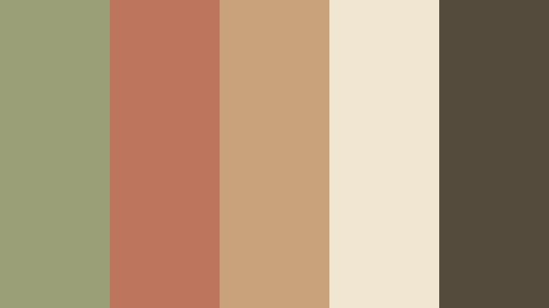
- HEX Codes: #9a9f78, #bd765d, #c8a27a, #f0e6d2, #554b3d
- Mood: Comforting, balanced, timeless, and homey.
- Use for: Use it in cooking videos, cozy room tours, hospitality branding, seasonal campaigns, and warm presentation templates.
Olive Clay Hearth feels like a welcoming room filled with wood, woven textures, and natural surfaces. Its olive, clay, wood, cream, and brown tones create a balanced visual rhythm.
Apply the cream shade to backgrounds and captions, while the darker brown can improve readability over bright footage. The clay accent is useful for recipe labels, chapter markers, and warm intro animations.
Soft And Calm Sage Green And Clay Interior Design Color Color Palettes
Sage Blush Sanctuary
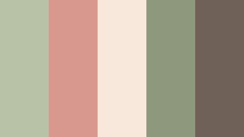
- HEX Codes: #b7c3a3, #d99a8c, #f5e6dc, #8c9a7b, #6f6258
- Mood: Gentle, tender, airy, and restorative.
- Use for: This palette is ideal for wellness videos, beauty thumbnails, self-care brands, wedding content, and calm social media designs.
Sage Blush Sanctuary softens earthy green with delicate clay blush and warm ivory. It feels peaceful, nurturing, and modern, with enough muted contrast to remain sophisticated.
Use the lightest tones for clean backgrounds and overlays, then bring in dusty clay for buttons, captions, and emotional story beats. It is especially effective for wellness intros and beauty content with soft lighting.
Quiet Clay Morning
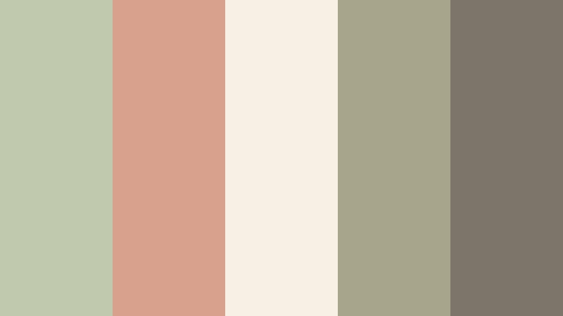
- HEX Codes: #c0c9ad, #d8a18e, #f7f0e5, #a7a58c, #7d746a
- Mood: Light, thoughtful, serene, and softly optimistic.
- Use for: Use it for morning routine videos, minimalist UI, personal blogs, stationery, and slow-living content.
Quiet Clay Morning combines pale sage and dusty clay with soft stone neutrals. The result is clean enough for digital interfaces and warm enough for personal storytelling.
Use the pale sage as a page or video background, while clay can guide the viewer toward headings and key moments. Gray-beige text and accents help maintain a quiet, uncluttered presentation.
Eucalyptus Adobe
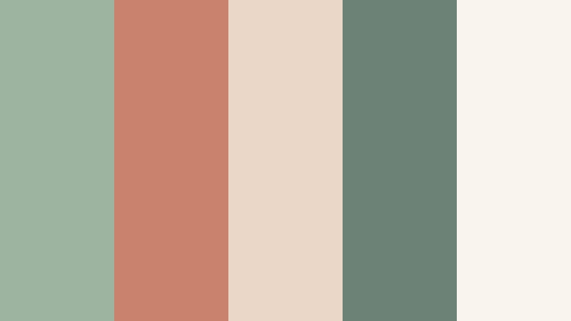
- HEX Codes: #9db5a0, #c9826d, #ead7c7, #6d8276, #faf5ec
- Mood: Fresh, breathable, elegant, and naturally polished.
- Use for: This palette works well for skincare videos, boutique branding, clean thumbnails, wellness apps, and modern packaging.
Eucalyptus Adobe brings a crisp botanical green into conversation with warm adobe and porcelain tones. It feels refined, breathable, and organic without appearing overly rustic.
Use the dark eucalyptus tone for readable text and logo treatments, then balance it with pale cream backgrounds. Clay works well as a subtle product highlight in skincare videos, packaging reveals, and clean brand intros.
Clay Petal Haze
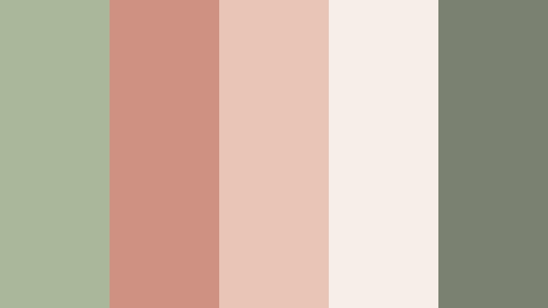
- HEX Codes: #a9b79a, #cf9182, #e8c5b5, #f6eee7, #7b8170
- Mood: Romantic, muted, graceful, and dreamlike.
- Use for: Use it for fashion edits, romantic reels, event invitations, beauty campaigns, and soft-focus title cards.
Clay Petal Haze layers dusty sage with muted rose clay and pale blush. Its low-contrast harmony creates an elegant, intimate mood that suits emotional and romantic visuals.
Keep text in the darker sage-gray shade for clarity, especially over pale blush backgrounds. Gentle fades, soft zooms, and lightly textured overlays can reinforce the dreamy feeling without making the edit feel dated.
Modern And Refined Sage Green And Clay Interior Design Color Color Palettes
Architectural Sage
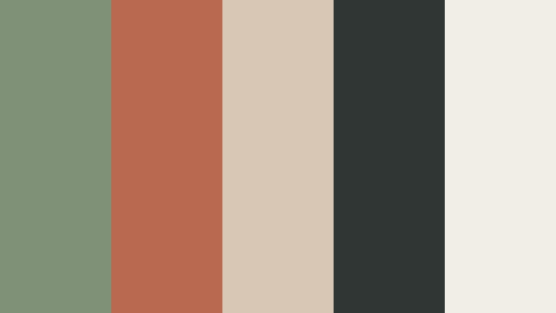
- HEX Codes: #7f9278, #b96950, #d8c7b5, #303633, #f1eee8
- Mood: Structured, sophisticated, contemporary, and composed.
- Use for: This palette is strong for architecture reels, design portfolios, tech presentations, brand systems, and editorial video graphics.
Architectural Sage uses controlled sage and clay accents against charcoal and pale stone. The contrast feels precise and contemporary, making it suitable for projects that need a clear visual hierarchy.
Use charcoal for headers, borders, and title cards, while clay can emphasize key statistics or design details. Pale stone gives layouts breathing room and helps architectural footage retain a polished appearance.
Minimalist Clay Studio
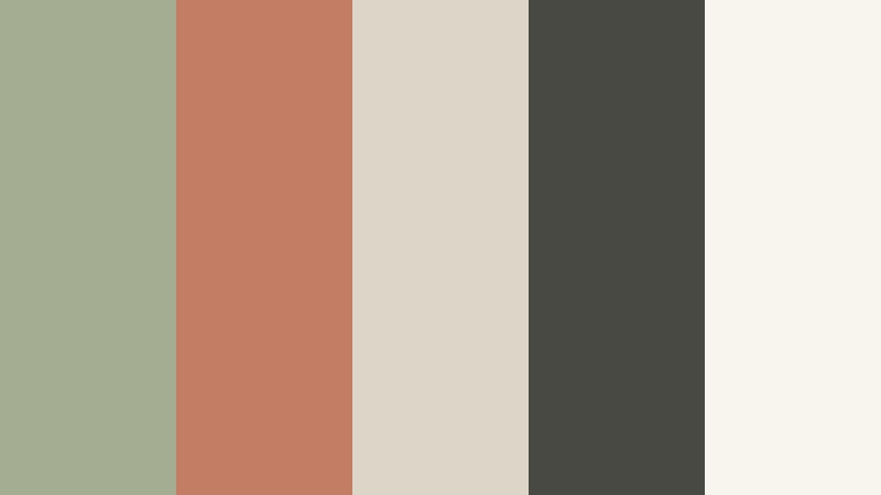
- HEX Codes: #a4ad91, #c47d65, #ded5c9, #494943, #f8f5ef
- Mood: Minimal, creative, balanced, and quietly premium.
- Use for: Use it for portfolio sites, creative agency intros, product showcases, UI dashboards, and clean social templates.
Minimalist Clay Studio balances muted color with strong neutral structure. It feels warm and creative without creating visual clutter, which makes it flexible for both digital design and video branding.
Use the off-white tone as a base, sage for supporting panels, and clay for controlled emphasis. The charcoal shade is useful for captions and interface labels that need to remain readable on pale backgrounds.
Heritage Greenhouse
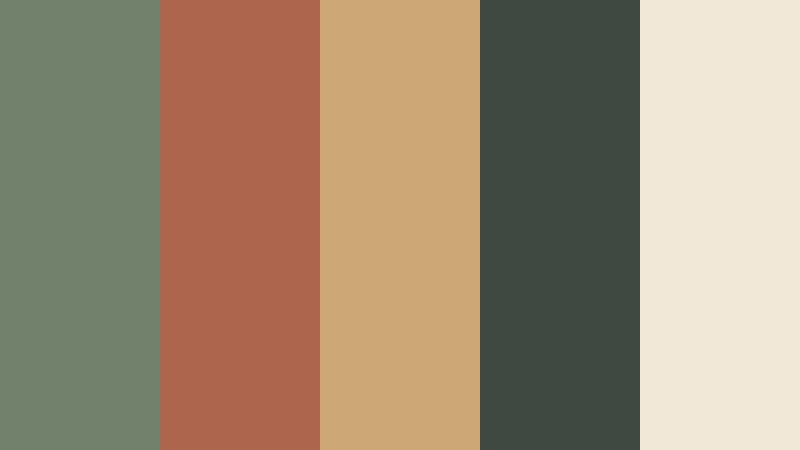
- HEX Codes: #71816b, #ae654e, #cba875, #3e4941, #f2e8d7
- Mood: Classic, cultivated, confident, and richly grounded.
- Use for: This palette fits heritage brands, garden design videos, boutique hotels, educational content, and premium packaging.
Heritage Greenhouse pairs deep sage and clay with antique gold and forest charcoal. The combination feels established and carefully crafted, with a visual character that can suggest tradition and quality.
Use the gold tone sparingly for badges, dividers, and premium details. Deep green and charcoal can anchor a logo or opening title, while cream keeps the overall composition approachable.
Stoneware Balance
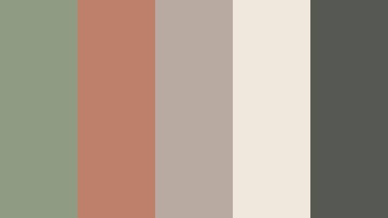
- HEX Codes: #8f9c83, #bd806b, #b8aaa0, #f0e8dc, #565952
- Mood: Measured, tactile, modern, and dependable.
- Use for: Use it for ceramics content, product design, ecommerce graphics, brand presentations, and understated video lower thirds.
Stoneware Balance reflects the quiet beauty of handmade ceramics through sage, clay, stone, and warm white. It offers a calm foundation with enough contrast for readable design.
Apply the stone and warm white tones to product backgrounds, then use clay for labels or price highlights. The dark gray-green shade provides dependable contrast for lower thirds, captions, and logo applications.
Cinematic And Bold Sage Green And Clay Interior Design Color Color Palettes
Copper Moss Cinema
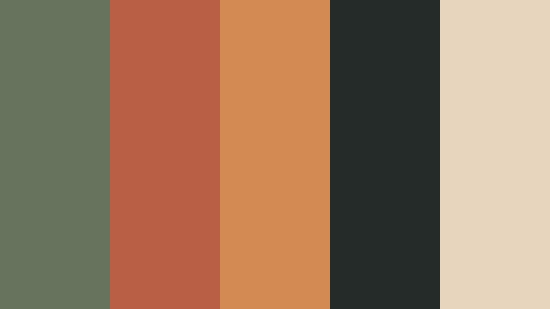
- HEX Codes: #66745d, #b85f45, #d38b52, #252b29, #e7d6bd
- Mood: Cinematic, adventurous, moody, and atmospheric.
- Use for: This palette is ideal for film titles, travel trailers, dramatic thumbnails, music visuals, and storytelling-focused social content.
Copper Moss Cinema adds vibrant copper and deep charcoal to a natural sage base. The strong contrast creates movement and gives cinematic projects a moody, adventurous identity.
Use charcoal for title backgrounds and dramatic transitions, then bring in copper or amber for action points and visual accents. The pale beige tone can keep subtitles and supporting information legible.
Sunset Adobe Trail
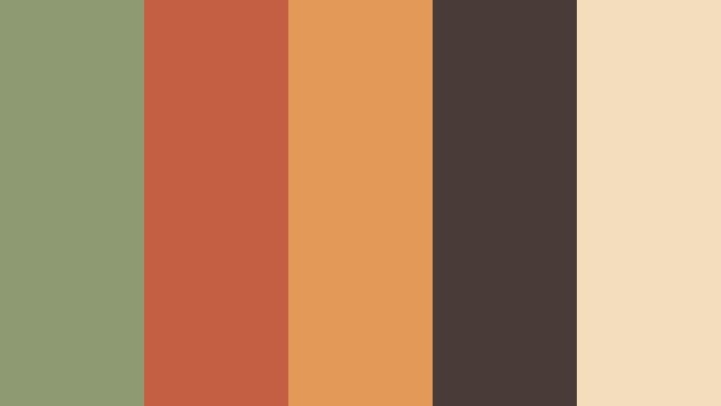
- HEX Codes: #8e9b72, #c45f43, #e39a58, #493b35, #f3ddbd
- Mood: Adventurous, warm, expressive, and sunlit.
- Use for: Use it for travel vlogs, outdoor campaigns, adventure thumbnails, festival promos, and energetic video openers.
Sunset Adobe Trail turns sage and clay into a vivid dusk-inspired combination. Orange highlights and dark brown create warmth, depth, and a memorable finish for high-energy storytelling.
Use sage to connect the design to landscapes and outdoor footage, while clay and orange can energize title reveals and calls to action. Dark brown makes a reliable base for bold text and dramatic thumbnail compositions.
Forest Clay Contrast
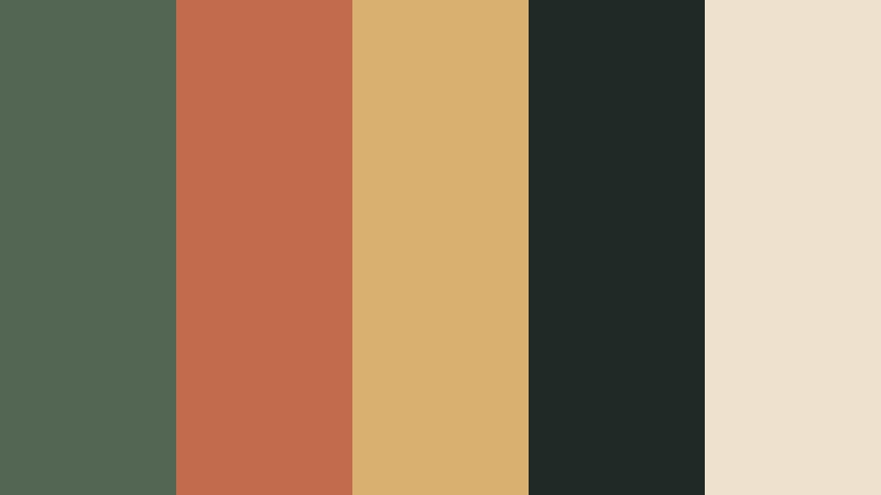
- HEX Codes: #526653, #c26b4d, #d9b06f, #1f2926, #eee2cf
- Mood: Dramatic, adventurous, natural, and high contrast.
- Use for: This palette works for action content, outdoor brands, documentary graphics, bold thumbnails, and attention-grabbing social campaigns.
Forest Clay Contrast sets rich green and warm clay against near-black for immediate visual impact. Muted gold keeps the palette connected to natural landscapes while adding a strong focal accent.
Use the near-black tone for opening cards and cinematic frames, then reserve clay and gold for key words, icons, or action cues. The pale neutral is useful for captions and helps prevent the design from becoming too heavy.
Tips for Creating Sage Green And Clay Interior Design Color Color Palettes
Sage green and clay can be adapted for calm, modern, rustic, or cinematic work depending on saturation, contrast, and supporting neutrals. Use the following practices to build palettes that look attractive while remaining practical for video, branding, thumbnails, and digital design.
- Use sage green as a background, supporting tone, or environmental color when you want a calm and natural foundation.
- Reserve clay for focal points such as titles, buttons, product details, thumbnail accents, and transition graphics.
- Add a light cream, ivory, or stone neutral to create breathing room and improve text readability.
- Use charcoal, dark olive, or deep brown when pale sage and clay do not provide enough contrast for captions or logos.
- Match the palette to the footage by checking how natural greens, skin tones, wood, fabric, and indoor lighting respond to color adjustments.
- Keep saturation consistent across intros, b-roll, thumbnails, lower thirds, and social cutdowns so the brand identity feels unified.
- Test the palette on both bright and dark screens, especially when designing subtitles, mobile thumbnails, or small interface elements.
- Use the most vivid color sparingly. A controlled clay or gold accent often creates more impact than applying every color at full strength.
Sage green and clay palettes can shape the emotional direction of a project before the viewer notices any specific design detail. Softer combinations feel restorative and welcoming, while darker versions can create a more cinematic, editorial, or adventurous identity.
Whether you are editing a home tour, building a lifestyle brand, creating a travel intro, or designing social thumbnails, these HEX combinations provide a reliable starting point. Adjust the saturation and contrast to suit your footage, then repeat the strongest colors across titles, transitions, and supporting graphics.
Filmora makes it easier to test these palettes in real projects, match footage, refine color relationships, and apply a consistent look across multiple formats. Start with one palette, compare several variations, and choose the version that best supports your story and audience.
secure downloadNext: 15 Blue and Silver Financial Advisor Color Palette Ideas
