

 100% Security Verified | No Subscription Required | No Malware

Sky Color is associated with openness, calm, clarity, and possibility. Its lighter shades can make a design feel airy and welcoming, while deeper blue tones add trust, focus, and visual structure. This makes Sky Color a versatile choice for video intros, thumbnails, branding, social media graphics, presentations, and user interfaces.
This collection provides Sky Color color palettes with HEX codes for creators, designers, and Filmora users. Whether you are editing a relaxing vlog, building a recognizable brand identity, or creating an energetic travel thumbnail, these combinations can help you set the right mood and keep your visuals consistent.
In this article
Soft & Serene Sky Color Palettes
Cloud Drift
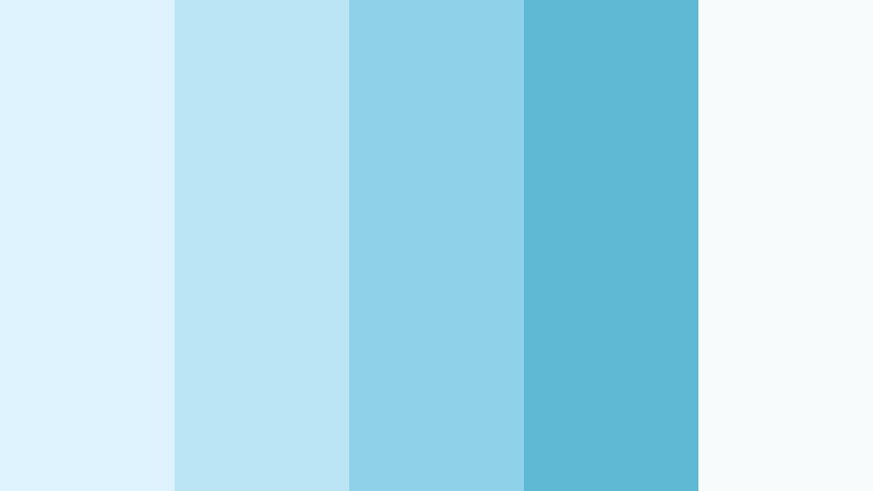
- HEX Codes: #dff3ff, #b9e5f5, #8ed1e8, #5fb8d4, #f7fbfc
- Mood: Light, airy, peaceful, and refreshing.
- Use for: This palette works well for calming video intros, wellness thumbnails, travel content, and soft lifestyle branding.
Cloud Drift creates a gentle open-sky feeling with cool blue tones and a clean white accent. The progression from pale blue to a deeper airy blue gives the palette enough contrast for titles, borders, and graphic overlays while keeping the overall look soft.
Use the lightest shades for backgrounds and intro cards, then bring in #5fb8d4 for buttons, captions, or thumbnail details. The palette is especially effective for serene travel edits, wellness videos, minimalist branding, and visual content that needs to feel spacious and reassuring.
Pro Tip: Enhance Your Sky Color Visuals with Filmora
Filmora can help you carry the Cloud Drift look from the opening title through the final frame. Use the pale shades for clean text panels, blue accents for lower thirds, and matching cool tones across b-roll so your wellness, travel, or lifestyle edit feels connected.
Save your preferred adjustments and reuse them across intros, transitions, thumbnails, and social exports. This creates a recognizable Sky Color visual language without requiring every clip to be edited from scratch.
AI Color Palette
Creators can use a reference image, color card, or favorite frame from the Cloud Drift palette to guide the look of an entire video. Filmora's AI Color Palette feature helps transfer the selected color mood across clips, making mixed footage feel more consistent.
This is useful when your project combines outdoor footage, phone clips, screen recordings, and branded graphics. A unified cool-blue treatment can make the final edit appear calmer and more professionally coordinated.
 secure download

HSL, Color Wheels & Curves
Use HSL controls to refine the balance between cyan and blue in Cloud Drift. You can slightly lower saturation in bright areas for a softer atmosphere, or increase blue luminance when footage looks too gray. Color wheels can add gentle coolness to highlights while keeping skin tones natural in the midtones.
Curves are helpful for adding a small amount of contrast without losing the palette's airy character. Lift the shadows slightly for a clean lifestyle look, or deepen them just enough to make titles and subject details stand out.
secure download1000+ Video Filters & 3D LUTs
Filmora's video filters and 3D LUTs make it easy to stylize Cloud Drift footage with a consistent visual direction. Choose a soft cinematic filter for gentle contrast, or use a cool-toned LUT to bring outdoor clips closer to the palette.
Apply the effect lightly when you want to preserve a natural look. For title sequences, dreamy b-roll, or slow travel montages, a slightly stronger treatment can make the pale blues and white accents feel more intentional.
secure downloadMorning Haze

- HEX Codes: #e8f7ff, #c7e8f4, #a5d4e5, #7db8cf, #f0e9df
- Mood: Quiet, optimistic, and softly nostalgic.
- Use for: This palette works well for morning routine videos, personal vlogs, gentle social posts, and welcoming presentation slides.
Morning Haze pairs pale Sky Color shades with a warm neutral for a tender sunrise atmosphere. The blue range feels fresh and calm, while #f0e9df adds enough warmth to prevent the design from looking cold.
Use the warm neutral for backgrounds, title cards, or subtle borders, and reserve the darker blue for text and navigation elements. This combination works especially well for morning routine videos, personal vlogs, lifestyle branding, and welcoming presentation slides.
Sea Glass Sky
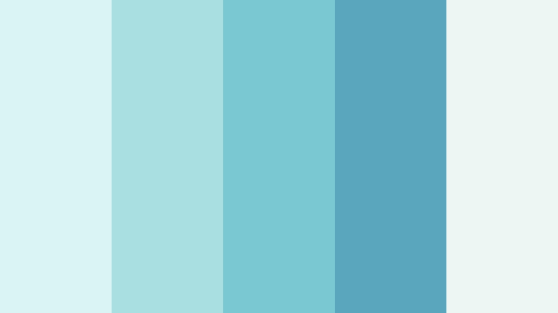
- HEX Codes: #d9f4f2, #a9dfe1, #78c9d2, #5aa7bd, #eef6f4
- Mood: Fresh, tranquil, and naturally restorative.
- Use for: This palette works well for coastal travel content, eco-friendly packaging, skincare branding, and clean app interfaces.
Sea Glass Sky blends blue and aqua tones for a crisp coastal mood. The colors feel polished and refreshing, with a gentle connection to water, glass, and natural light.
Use the palest shades for app backgrounds and packaging space, then add the stronger aqua tones to icons, captions, and thumbnail accents. It is a good fit for skincare videos, coastal travel edits, eco-friendly brands, and clean digital products.
Lullaby Blue
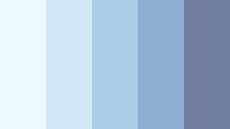
- HEX Codes: #edf8ff, #cfe9f7, #accce7, #8daed2, #707f9d
- Mood: Dreamy, comforting, and introspective.
- Use for: This palette works well for sleep content, reflective storytelling, book covers, journaling videos, and dreamy social media graphics.
Lullaby Blue combines soft blues with a muted slate anchor for a restful, cinematic feel. The pale colors create a quiet surface, while #707f9d supplies depth for readable text and dramatic details.
Try this palette for sleep content, journaling videos, book covers, or reflective storytelling. A slow fade, soft grain, and restrained use of the slate tone can make the edit feel intimate without becoming heavy.
Bright & Energetic Sky Color Palettes
Summer Altitude
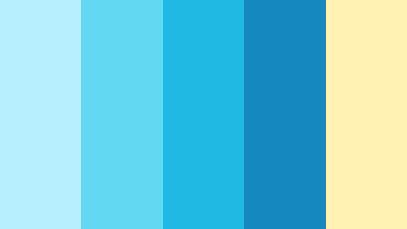
- HEX Codes: #b8efff, #63d8f2, #20b9e3, #1688c0, #fff2b2
- Mood: Energetic, sunny, playful, and adventurous.
- Use for: This palette works well for summer campaign graphics, travel thumbnails, sports content, event promos, and upbeat video openers.
Summer Altitude brings vibrant Sky Color energy together with a sunny yellow highlight. The range moves from bright cyan to a stronger blue, giving energetic compositions a clear sense of movement and optimism.
Use #fff2b2 for calls to action, badges, or key words in thumbnails, while the blue tones support backgrounds and motion graphics. It is made for summer campaigns, travel reels, sports content, and upbeat video intros.
Electric Horizon

- HEX Codes: #b5f3ff, #62dff5, #16b8db, #1378a8, #192c55
- Mood: Bold, futuristic, confident, and dynamic.
- Use for: This palette works well for technology branding, gaming videos, music visuals, digital product launches, and high-impact thumbnails.
Electric Horizon adds a deep navy contrast to vivid blue tones for a powerful modern look. The bright cyan shades feel digital and active, while #192c55 grounds the palette with authority.
Use the navy tone for title backgrounds, menus, or dramatic transitions, and let the vivid blues provide energy in icons, glows, and animated accents. This palette is particularly effective for gaming videos, tech branding, music visuals, and launch content.
Bluebird Spark

- HEX Codes: #e4f8ff, #9be7f5, #35c9e8, #167fb5, #ffcf70
- Mood: Cheerful, friendly, lively, and optimistic.
- Use for: This palette works well for educational videos, creator branding, cheerful social content, app illustrations, and playful packaging.
Bluebird Spark uses bright blue with a warm golden accent to create an inviting visual rhythm. The light background shades keep the look approachable, while the richer blue provides structure and clarity.
Use the golden tone to highlight buttons, key words, stickers, or transitions. Its friendly energy makes it a strong choice for educational videos, creator branding, app illustrations, cheerful social posts, and playful packaging.
Tropical Flight
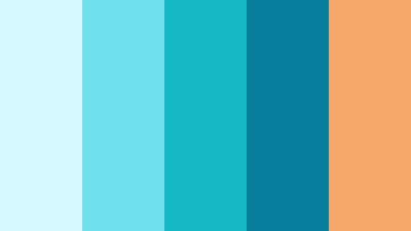
- HEX Codes: #d5f8ff, #71e0ed, #16b9c5, #087f9d, #f6a96b
- Mood: Tropical, spirited, refreshing, and adventurous.
- Use for: This palette works well for vacation reels, food and beverage branding, summer thumbnails, destination guides, and promotional banners.
Tropical Flight combines clear Sky Color shades with coral warmth for an expressive vacation mood. The aqua and teal tones suggest water and open air, while #f6a96b adds a lively sunlit contrast.
Use coral for labels, price points, thumbnail highlights, or animated calls to action. The palette feels fresh and active in vacation reels, destination guides, food and beverage branding, and summer promotional content.
Elegant & Modern Sky Color Palettes
Silver Skyline
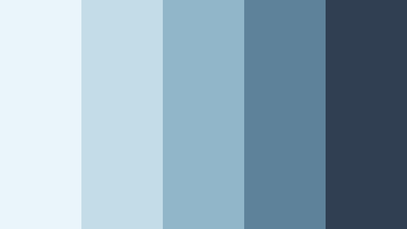
- HEX Codes: #eaf5fa, #c2dce8, #91b5c9, #5e829a, #303f52
- Mood: Refined, intelligent, balanced, and contemporary.
- Use for: This palette works well for corporate presentations, architecture portfolios, professional intros, SaaS branding, and modern website UI.
Silver Skyline gives Sky Color a sophisticated edge through cool gray-blue neutrals. Its measured contrast feels dependable and premium, making it suitable for projects that need clarity without looking plain.
Use the light shades as clean surfaces and the dark blue-gray for headlines, navigation, and professional title cards. The palette works well for corporate videos, architecture portfolios, SaaS branding, and modern website interfaces.
Arctic Glass
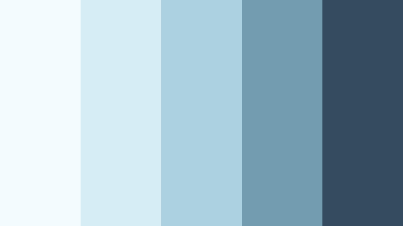
- HEX Codes: #f3fbff, #d7edf5, #acd1df, #729caf, #344d5e
- Mood: Crisp, minimal, cool, and quietly luxurious.
- Use for: This palette works well for luxury product videos, editorial layouts, clean interfaces, tech presentations, and premium packaging.
Arctic Glass layers pale blues with a dark blue-gray foundation for a sleek, polished finish. The high amount of light space creates a refined appearance, while the darker anchor keeps important details readable.
It is especially effective in minimal designs with generous negative space. Try it for luxury product videos, editorial layouts, technology presentations, premium packaging, and clean interface mockups.
Cobalt Air
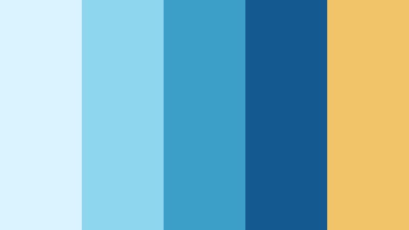
- HEX Codes: #d9f4ff, #8ed5ee, #3c9fc8, #145a91, #f1c46a
- Mood: Confident, elevated, focused, and distinctive.
- Use for: This palette works well for personal brands, business videos, editorial graphics, product launches, and bold web interface accents.
Cobalt Air balances vivid blue with a rich dark anchor and a refined gold detail. The result feels authoritative while retaining the openness and brightness associated with the sky.
Use the gold sparingly for icons, key statistics, buttons, or logo details. The stronger blues can define title sequences and brand graphics, making this palette useful for business videos, personal brands, product launches, and editorial designs.
Twilight Steel

- HEX Codes: #d7ebf5, #9abbd0, #607f9a, #394e6a, #20283d
- Mood: Moody, cinematic, sophisticated, and contemplative.
- Use for: This palette works well for documentary thumbnails, cinematic titles, portfolio sites, atmospheric social content, and dramatic storytelling.
Twilight Steel shifts Sky Color into a deeper, more cinematic direction with layered steel blues. The dark navy foundation adds emotional weight, while the pale blue provides relief and visual balance.
Use the darkest shade behind titles or in letterbox-style graphics, then reserve the lighter tones for highlights and atmospheric overlays. This palette suits documentaries, dramatic storytelling, portfolio sites, cinematic titles, and moody social content.
Pastel & Dreamy Sky Color Palettes
Cotton Candy Air
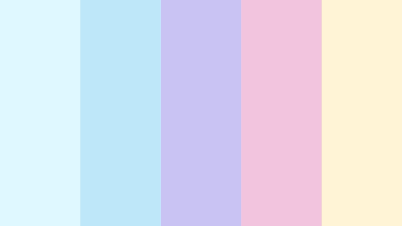
- HEX Codes: #dff7ff, #bce8fa, #c9c3f2, #f3c5dc, #fff4d6
- Mood: Whimsical, sweet, playful, and imaginative.
- Use for: This palette works well for beauty content, animated reels, children's media, creative invitations, and cheerful lifestyle branding.
Cotton Candy Air mixes pale Sky Color with lavender, pink, and cream for a soft fantasy effect. The colors have a playful relationship that feels expressive without becoming too intense.
Use the blue and cream shades as a gentle base, then add pink or lavender to emphasize transitions, stickers, titles, and graphic details. It brings a friendly touch to beauty content, animated reels, children's media, creative invitations, and lifestyle branding.
Bluebell Mist
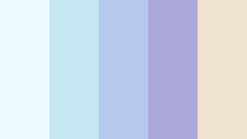
- HEX Codes: #edfaff, #c6e7f2, #b6c9ec, #aaa9d9, #f0e2d0
- Mood: Gentle, artistic, romantic, and reflective.
- Use for: This palette works well for poetry videos, stationery, boutique branding, music covers, and soft-focus social media posts.
Bluebell Mist pairs airy blue with dusty periwinkle and a warm cream note. Its muted contrast creates a delicate, artistic mood that feels calm but still visually distinctive.
Use the cream shade to soften backgrounds and the periwinkle tones for captions, borders, or cover art. The palette is well suited to poetry videos, stationery, boutique branding, music covers, and soft-focus social media posts.
Moonlit Pastel
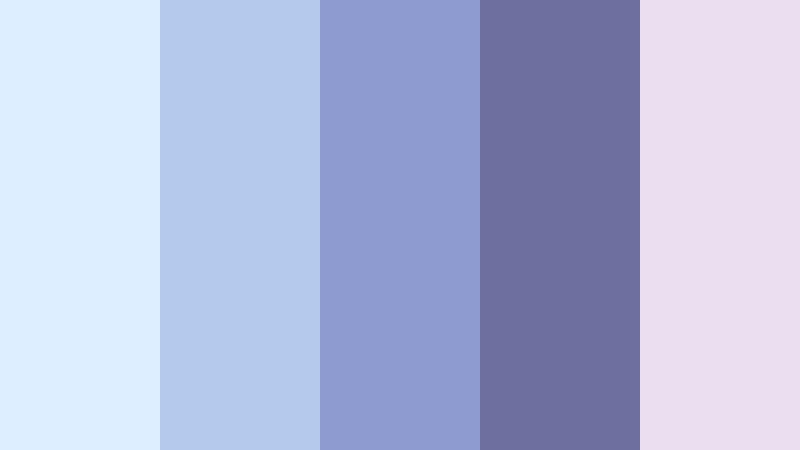
- HEX Codes: #dceeff, #b5c9ed, #8d9bd0, #6d709f, #eadff0
- Mood: Dreamy, mysterious, elegant, and peaceful.
- Use for: This palette works well for nighttime vlog graphics, meditation content, fantasy visuals, app backgrounds, and atmospheric video titles.
Moonlit Pastel combines soft Sky Color shades with dusky violet for a calm evening atmosphere. It gives a project softness with a hint of mystery, while the darker periwinkle creates a useful visual anchor.
Try the pale blues for background gradients and the deeper shades for titles, interface elements, or nighttime transitions. This palette works naturally for meditation content, fantasy visuals, nighttime vlogs, app backgrounds, and atmospheric video openings.
Tips for Creating Sky Color Color Palettes
Sky Color can shift from soft and peaceful to bright, modern, or cinematic depending on the colors placed beside it. Use contrast thoughtfully so your videos and designs remain attractive, readable, and consistent across thumbnails, intros, footage, and social formats.
- Pair pale Sky Color with navy, slate, or charcoal when you need strong text readability and clear visual hierarchy.
- Use warm accents such as yellow, gold, coral, peach, or cream to make blue content feel more energetic and inviting.
- Limit your core brand palette to two or three main Sky Color shades, then choose one accent color for buttons, titles, or calls to action.
- Check text contrast on thumbnails and title cards, especially when using very light blue backgrounds.
- Match the palette to your footage by sampling colors from the sky, water, clothing, interiors, or other recurring visual details.
- Use lighter shades for backgrounds and negative space, medium blues for secondary elements, and the darkest shade for structure and emphasis.
- Keep color grading consistent across b-roll, camera angles, and screen recordings so the final video feels like one complete piece.
- Test the palette on desktop and mobile screens because pale blues and subtle pastel accents may appear less distinct on smaller displays.
Sky Color palettes can shape the emotional direction of a project before viewers hear a single word. Pale blues suggest calm and openness, vivid cyan creates energy, and deeper blue-gray tones introduce trust, sophistication, or cinematic depth.
Use these HEX combinations as starting points, then adapt the saturation, brightness, and contrast to suit your footage and audience. A consistent Sky Color system can make thumbnails easier to recognize, intros more polished, and brand content more memorable.
Try these palettes in Filmora to coordinate your video clips, titles, transitions, filters, and social exports. With the right combination of color matching and creative adjustments, even mixed footage can develop a clear visual identity.
secure download