

 100% Security Verified | No Subscription Required | No Malware

Summer color palettes are associated with sunlight, fresh air, clear skies, tropical fruit, and relaxed outdoor moments. Bright yellows and oranges can create energy and optimism, while aqua, blue, green, and soft pastel shades often make visuals feel refreshing, calm, and approachable.
These color combinations are useful for travel videos, lifestyle branding, social media thumbnails, animated intros, product graphics, and more. Below, you will find Summer Color Palette color palettes with HEX codes for creators and Filmora users who want to build a consistent visual style across video and design projects.
In this article
Bright & Breezy Summer Color Palettes
Sunlit Citrus Pop

- HEX Codes: #ffb703, #fb8500, #8ecae6, #219ebc, #023047
- Mood: Energetic, sunny, and playful with a refreshing coastal spark.
- Use for: This palette works well for travel thumbnails, upbeat brand intros, summer event graphics, and social content.
Sunlit Citrus Pop combines warm citrus tones with breezy ocean blues for an instantly cheerful look. The bright yellow and orange shades bring energy, while the blue tones provide balance and a sense of open space.
Use this palette to make travel vlogs, beach reels, event promos, and social thumbnails feel active and youthful. The deep navy shade can support readable text, logo details, or title cards without reducing the palette's sunny character.
Pro Tip: Enhance Your Summer Color Palette Visuals with Filmora
Use Filmora to carry the Sunlit Citrus Pop mood from your opening title to your final frame. Apply citrus yellow to text or transition accents, then repeat the ocean blues in lower thirds, b-roll overlays, and end screens to create a consistent summer color palette look.
For travel edits, you can also use the palette as a visual guide when choosing stickers, motion graphics, and thumbnail elements. Keeping the warm and cool colors balanced helps energetic footage feel polished rather than overwhelming.
AI Color Palette
Creators can use a reference image, color card, or still frame built around Sunlit Citrus Pop and apply its visual character across an entire project. Filmora's AI Color Palette feature helps match color relationships between clips, making it easier to keep different cameras and lighting conditions visually connected.
This is especially useful when a summer video includes bright outdoor footage, indoor talking-head scenes, and sunset b-roll. A consistent color treatment can help all of these shots feel like part of the same story.
 secure download

HSL, Color Wheels & Curves
Fine-tune Sunlit Citrus Pop with Filmora's HSL controls, color wheels, and curves. Increase yellow and orange saturation for a more vibrant summer commercial, or reduce saturation slightly to create a softer travel-film finish. Lift the highlights toward warm yellow while keeping shadows in the deep blue range for cinematic contrast.
Curves can also help control the brightness relationship between the citrus and coastal tones. A gentle S-curve adds depth, while subtle shadow adjustments can keep dark text and navy elements clear over bright footage.
secure download1000+ Video Filters & 3D LUTs
Filmora's video filters and 3D LUTs make it easy to stylize Sunlit Citrus Pop without adjusting every clip manually. Start with a clean, bright filter, then lower its intensity if skin tones or blue skies begin to look too strong.
Filters can also help unify footage recorded in different locations. Use warm LUTs for golden-hour scenes and cooler adjustments for ocean or pool shots, while repeating the same citrus accents in titles and graphics.
secure downloadTropical Market

- HEX Codes: #ff595e, #ffca3a, #8ac926, #1982c4, #6a4c93
- Mood: Vibrant, adventurous, and full of tropical energy.
- Use for: This palette is ideal for vacation videos, food packaging, festival promotions, animated titles, and colorful social media templates.
Tropical Market layers fruit-inspired colors with a rich violet accent for a lively, expressive style. Red, yellow, and green create a sense of movement, while blue and violet give the combination more structure and visual depth.
Use it for vacation montages, food videos, festival announcements, or animated titles that need immediate personality. For thumbnails, reserve violet or blue for text and outlines so the brighter fruit colors remain the main attraction.
Poolside Sorbet

- HEX Codes: #ffcad4, #f4acb7, #90dbf4, #48cae4, #caf0f8
- Mood: Cool, playful, and refreshing with a soft candy finish.
- Use for: This palette works well for wellness videos, beauty thumbnails, poolside campaigns, mobile UI, and cheerful lifestyle branding.
Poolside Sorbet blends icy aqua with soft pink for a lighthearted summer aesthetic. Its gentle contrast feels polished while remaining fun and approachable, making it a natural fit for beauty and lifestyle content.
Use aqua for backgrounds, borders, or motion accents and reserve pink for buttons, titles, or featured products. The pale tones also work well in clean intros and social templates where you want a bright look without harsh contrast.
Lemonade Garden

- HEX Codes: #f9c74f, #f9844a, #90be6d, #43aa8b, #577590
- Mood: Optimistic, natural, and relaxed with a handcrafted feel.
- Use for: Use this palette for garden content, recipe videos, eco-friendly packaging, vlog graphics, and warm editorial layouts.
Lemonade Garden pairs sunny yellow and soft orange with leafy greens and muted blue. It creates a welcoming look for creative work inspired by outdoor living, home cooking, and relaxed weekend activities.
Try the greens in title cards or branding elements, then use yellow and orange for highlights and calls to action. The muted blue can support captions and keep recipe videos or garden vlogs easy to read.
Soft & Romantic Summer Color Palettes
Peach Blossom Haze
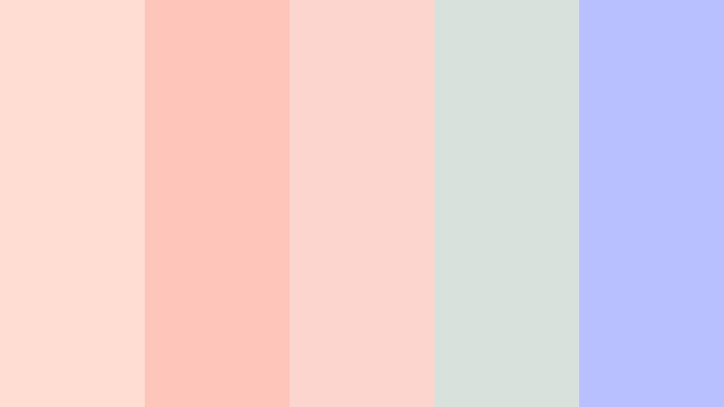
- HEX Codes: #ffddd2, #fec5bb, #fcd5ce, #d8e2dc, #b8c0ff
- Mood: Dreamy, tender, and softly romantic.
- Use for: This palette is a strong choice for wedding videos, beauty branding, romantic reels, invitation designs, and delicate title cards.
Peach Blossom Haze uses blush, peach, and pale lavender tones to create a gentle cinematic atmosphere. The soft gray green adds a quiet neutral balance, keeping the pastel colors from feeling too sweet.
It is especially effective for wedding films, beauty intros, romantic reels, and intimate storytelling. Use the pale shades for backgrounds and overlays, then add lavender to titles or transitions for a subtle creative signature.
Seaside Blush

- HEX Codes: #f7cad0, #f9e2af, #bde0fe, #a2d2ff, #6d6875
- Mood: Calm, affectionate, and airy with a nostalgic seaside tone.
- Use for: This palette works well for couple vlogs, lifestyle thumbnails, coastal branding, journaling content, and soft social templates.
Seaside Blush combines warm blush and cream with misty ocean blues and a muted violet gray. The result feels personal, relaxed, and quietly sophisticated.
Use the cream and blue shades to create open layouts, then bring in blush for emotional moments, captions, or thumbnail accents. The muted gray can improve readability in intros and provide a more mature finish for lifestyle branding.
Mango Cream Dream

- HEX Codes: #ffd6a5, #fdffb6, #caffbf, #9bf6ff, #bdb2ff
- Mood: Whimsical, optimistic, and gently playful.
- Use for: Use this palette for children's content, creative tutorials, pastel packaging, app interfaces, and bright lifestyle graphics.
Mango Cream Dream brings together soft mango, lemon, mint, aqua, and lavender. Its pastel balance makes colorful designs feel friendly rather than overwhelming.
This palette is useful for educational videos, children's content, creative tutorials, and cheerful app graphics. Assign one dominant pastel to the background and use the others as small accents so the design remains organized and readable.
Lavender Sunset
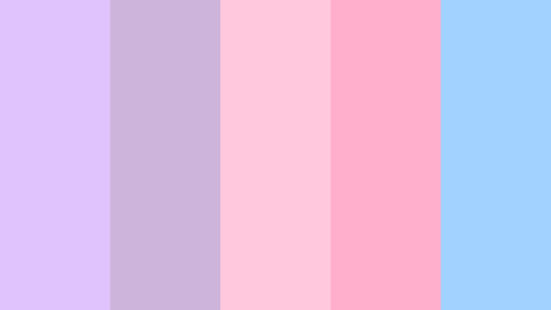
- HEX Codes: #e0c3fc, #cdb4db, #ffc8dd, #ffafcc, #a2d2ff
- Mood: Serene, imaginative, and softly cinematic.
- Use for: This palette is ideal for music videos, dreamy intros, aesthetic vlogs, fashion graphics, and calming digital products.
Lavender Sunset combines cool purple shades with blush pink and airy blue for a graceful twilight effect. It gives creative projects a polished and atmospheric finish without relying on dark, heavy colors.
Use lavender and blue in backgrounds or title cards, then add pink to emphasize key moments in music videos, fashion edits, or aesthetic vlogs. A subtle glow effect can make the palette feel even more cinematic.
Natural & Coastal Summer Color Palettes
Coastal Driftwood

- HEX Codes: #e9d8a6, #94d2bd, #0a9396, #005f73, #bb3e03
- Mood: Grounded, breezy, and adventurous with an earthy coastal character.
- Use for: This palette works well for travel documentaries, outdoor brands, surf content, website headers, and sustainable product design.
Coastal Driftwood mixes sandy beige and seafoam with deep teal and a warm rust accent. It feels natural and dependable while retaining a sense of exploration.
Use the beige and seafoam shades for backgrounds, captions, or packaging, then use deep teal for logos and navigation elements. Rust works best as a controlled accent in travel thumbnails, documentary titles, or calls to action.
Palm Shade
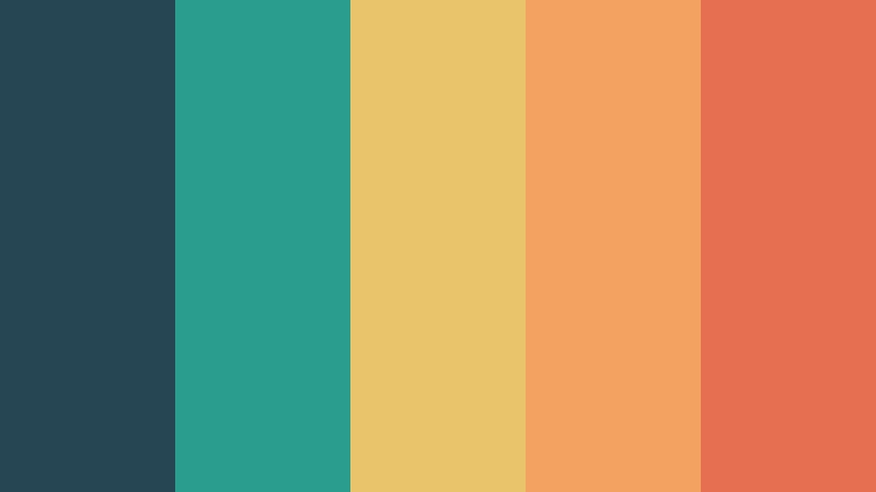
- HEX Codes: #264653, #2a9d8f, #e9c46a, #f4a261, #e76f51
- Mood: Relaxed, confident, and sun-warmed.
- Use for: Use this palette for resort branding, adventure videos, social ads, travel thumbnails, and modern editorial design.
Palm Shade pairs deep green blue with tropical teal, golden sand, and sunset orange. The contrast creates a stylish vacation mood with strong visual clarity.
Deep green blue is useful for text, logos, or opening frames, while the warmer colors can highlight destinations, products, and featured moments. This makes the palette flexible for both relaxed resort branding and energetic travel edits.
Ocean Air

- HEX Codes: #caf0f8, #90e0ef, #00b4d8, #0077b6, #03045e
- Mood: Clear, refreshing, and expansive.
- Use for: This palette is perfect for tech interfaces, ocean education videos, wellness branding, travel content, and clean presentation slides.
Ocean Air moves from pale sky blue to deep navy for a crisp, immersive effect. It gives digital and video designs a sense of openness and calm focus.
Use the lighter blues for backgrounds, charts, and transitions, then reserve the deep navy for headlines and high-contrast text. The palette is particularly effective when you want a clean, trustworthy visual identity for wellness or technology content.
Meadow Picnic
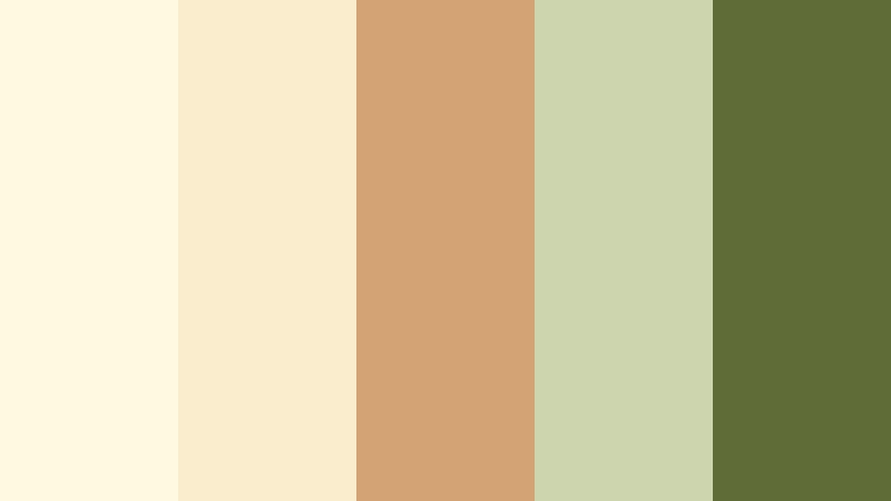
- HEX Codes: #fefae0, #faedcd, #d4a373, #ccd5ae, #606c38
- Mood: Comforting, wholesome, and quietly cheerful.
- Use for: This palette suits food videos, picnic content, handmade packaging, farm-to-table branding, and cozy lifestyle thumbnails.
Meadow Picnic combines creamy neutrals with soft olive and natural brown for an inviting outdoor mood. It feels warm, familiar, and easy to use across print and digital design.
Use the cream shades as a clean foundation for food videos and lifestyle graphics. Olive can support branding or section labels, while natural brown adds a handcrafted quality to thumbnails, menus, and product packaging.
Modern & Energetic Summer Color Palettes
Electric Boardwalk
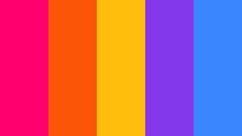
- HEX Codes: #ff006e, #fb5607, #ffbe0b, #8338ec, #3a86ff
- Mood: Bold, kinetic, and unapologetically playful.
- Use for: This palette is made for music videos, gaming graphics, event posters, bold thumbnails, and high-energy social campaigns.
Electric Boardwalk combines neon pink, orange, yellow, purple, and blue for maximum impact. Use it when your visuals need instant attention and a modern digital edge.
Because every color is strong, choose one or two dominant shades for each design rather than using all five equally. Neon accents work well in animated titles, gaming overlays, beat-synced transitions, and attention-grabbing thumbnails.
Modern Melon

- HEX Codes: #ff7f51, #ff9f1c, #2ec4b6, #cbf3f0, #011627
- Mood: Fresh, stylish, and confidently contemporary.
- Use for: This palette works well for startup branding, product launch videos, app UI, editorial graphics, and creative portfolio pages.
Modern Melon balances juicy coral and orange with mint, aqua, and near-black navy. It delivers a clean contemporary look without losing summer warmth.
Use navy as the foundation for professional layouts, then add coral or orange to highlight products, buttons, and key messages. Mint and aqua are useful for secondary panels, charts, motion graphics, and refreshing transitions.
Sunset Vinyl
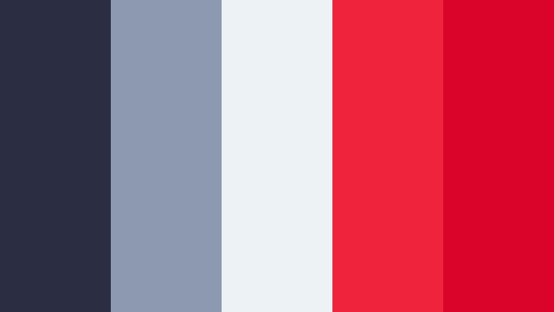
- HEX Codes: #2b2d42, #8d99ae, #edf2f4, #ef233c, #d90429
- Mood: Retro, dramatic, and polished with a bold nightlife feel.
- Use for: Use this palette for music branding, fashion edits, cinematic title sequences, album artwork, and high-contrast social graphics.
Sunset Vinyl pairs cool slate neutrals with vivid red for a striking retro-modern look. It adds drama and structure to designs that need a strong visual signature.
Use the dark slate as a cinematic background and the pale gray as a clean contrast for text. Red works best as a focused accent in music video titles, fashion transitions, album graphics, and thumbnail details that need immediate emphasis.
Tips for Creating Summer Color Palette Color Palettes
Strong summer color palettes balance brightness with structure. Start with the mood you want to create, then choose a dominant color, one or two supporting shades, and an accent that improves focus and readability across video and design.
- Choose one dominant color for the background or main visual area, then use brighter accents for titles, buttons, and key objects.
- Combine warm summer colors such as yellow, orange, coral, and red with cool blue, aqua, or green to create balanced contrast.
- Check text readability against every background, especially when using light pastel shades or bright footage.
- Use a deep navy, charcoal, or muted violet as an anchor color when a palette contains several intense or neon shades.
- Match the palette to the footage. Coastal blues suit beach scenes, while warm peach and orange tones work well with golden-hour clips.
- Repeat the same colors in intros, lower thirds, transitions, thumbnails, and end screens to build stronger brand consistency.
- Reduce saturation when the footage already contains strong colors, so graphics do not compete with the subject.
- Test the palette on both desktop and mobile screens to make sure small text, logos, and thumbnail details remain visible.
Summer color palettes can shape the mood of a project before viewers hear the first word. Bright citrus combinations feel energetic, coastal blues suggest openness and calm, and soft pastels create a more personal or romantic tone.
The right combination can also strengthen brand identity across videos, thumbnails, intros, social posts, and product graphics. Use these HEX codes as starting points, then adjust saturation, brightness, and contrast to match your footage and audience.
Try these Summer Color Palette combinations in Filmora to build a consistent look across your next edit. With color matching, filters, LUTs, and detailed correction tools, you can move from a reference palette to a polished video style more efficiently.
secure download