

 100% Security Verified | No Subscription Required | No Malware

Autumn Color Palette color combinations bring warmth, depth, and a grounded emotional quality to creative work. Rich reds, burnt oranges, golden yellows, earthy greens, and soft neutrals can make viewers feel comfortable, nostalgic, energetic, or quietly reflective. These tones are especially effective when you want a visual style that feels seasonal, human, and inviting.
In video, an Autumn Color Palette can shape the mood of an intro, strengthen a brand identity, improve thumbnail appeal, and create consistency across b-roll, titles, transitions, and social edits. Below, you will find Autumn Color Palette ideas with HEX codes for creators, designers, and Filmora users, along with practical ways to apply each combination.
In this article
Warm & Rustic Autumn Color Palette Color Palettes
Harvest Hearth
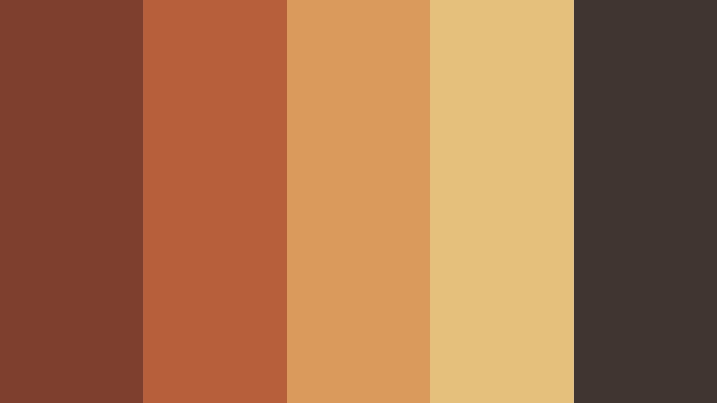
- HEX Codes: #7f3f2f, #b65f3a, #d99a5b, #e5c07b, #40352f
- Mood: Warm, grounded, rustic, and welcoming.
- Use for: This palette works well for cooking videos, lifestyle thumbnails, cozy brand intros, and seasonal packaging.
Harvest Hearth combines roasted reds, amber orange, golden wheat, and deep brown for a comforting fall mood. The darker brown gives the brighter shades structure, while the wheat tone adds a soft highlight that keeps the combination from feeling too heavy.
Use this palette for recipe videos, home and lifestyle content, cozy intros, or seasonal campaigns. Apply the deep brown to backgrounds and text, then use the red, orange, and wheat tones for titles, accents, product details, and thumbnail focal points.
Pro Tip: Build A Cozy Autumn Color Palette Look In Filmora
Filmora can help you carry the Harvest Hearth look from the opening frame through the final scene. Use the dark brown and roasted red tones for title cards, lower thirds, and transitions, then repeat the golden wheat shade in captions or key visual details so the edit feels connected.
For cooking videos and lifestyle edits, use the warmer shades on b-roll while keeping skin tones natural. A consistent visual balance between amber highlights and grounded shadows can make footage feel inviting without making every shot look overly orange.
AI Color Palette
Creators can use a reference image, color card, or still frame that contains the Harvest Hearth combination and apply its visual character across a full project. Filmora's AI Color Palette feature can help match clips so that different cameras and lighting conditions appear more consistent.
This is useful when a video includes indoor scenes, outdoor b-roll, product shots, and social cutdowns. Apply the palette as a starting point, then make small adjustments for accurate skin tones and readable text.
 secure download

HSL, Color Wheels & Curves
Use HSL controls to fine-tune the red, orange, and yellow tones in Harvest Hearth. You can reduce saturation in a distracting background, brighten golden highlights, or shift red shadows slightly toward brown for a more cinematic result. Color wheels can add warmth to highlights while keeping the deepest shadows neutral.
Curves are useful for creating a gentle contrast shape. Raise the midtones for a soft lifestyle look, or deepen the lower curve points for richer cooking videos and dramatic intros. Make changes gradually so faces, food, and product colors remain believable.
secure download1000+ Video Filters & 3D LUTs
Filmora's filter and LUT library can provide a quick starting point for the Harvest Hearth style. Choose a warm cinematic treatment, then lower its intensity if the footage already contains strong orange or red elements. This approach works well for fast social edits, thumbnails, and seasonal video series.
Filmora's video filters and 3D LUTs make it easy to test different levels of contrast, warmth, and texture without rebuilding the look from scratch. Save the result as a repeatable style for future episodes or branded content.
secure downloadCider Mill
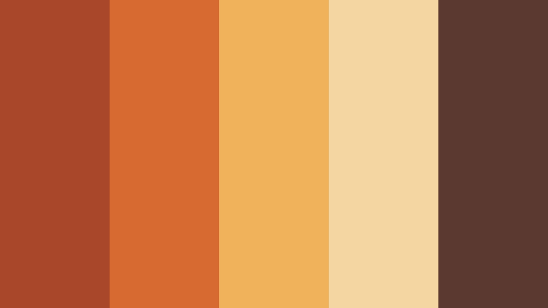
- HEX Codes: #a9472b, #d66b32, #f0b35b, #f3d6a0, #5b3930
- Mood: Cheerful, nostalgic, and warmly energetic.
- Use for: Use this palette for autumn event promos, food content, social media graphics, and playful video title cards.
Cider Mill blends bright apple red, spiced orange, and soft cream with a dark brown anchor. The result feels festive and nostalgic, making it a strong choice when your autumn content needs energy and warmth rather than a quiet or moody atmosphere.
Use the cream shade for backgrounds, the brown for text, and the red and orange tones for buttons, title cards, stickers, and thumbnail accents. It is particularly effective for food content, harvest promotions, and short-form videos with a lively pace.
Maple Cabin
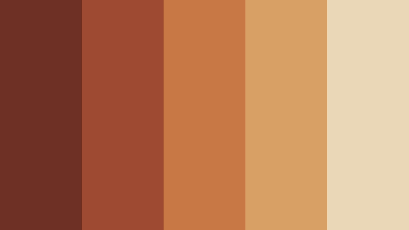
- HEX Codes: #6e2f25, #9e4931, #c87845, #d9a066, #ead7b7
- Mood: Cozy, natural, and quietly nostalgic.
- Use for: This palette is effective for travel vlogs, cabin themes, outdoor campaigns, YouTube thumbnails, and rustic web layouts.
Maple Cabin pairs rich maple shades with muted tan and warm cream. It creates a natural, homespun feeling that suits outdoor stories, cabin tours, travel vlogs, and intimate lifestyle content.
Use the cream tone to create breathing room in a layout, then bring in the maple shades for headings, borders, transition cards, and thumbnail details. The palette also works well with wood textures, foliage footage, and soft natural lighting.
Pumpkin Market
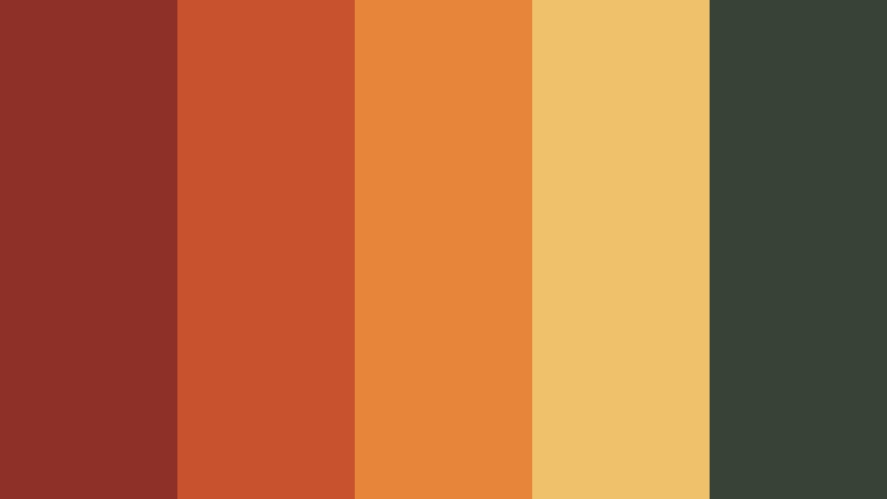
- HEX Codes: #8f3028, #c7522d, #e7863b, #f0c16b, #374337
- Mood: Lively, harvest-inspired, and approachable.
- Use for: Use it for farmers market branding, recipe reels, Halloween content, seasonal promotions, and colorful thumbnail designs.
Pumpkin Market brings together vivid pumpkin orange, tomato red, golden yellow, and leafy green. It feels bright and seasonal while retaining the earthy character associated with an Autumn Color Palette.
Use the green as a grounding color for text or backgrounds and reserve the orange and yellow shades for high-impact details. The combination is useful for recipe reels, Halloween graphics, event announcements, and cheerful video title cards.
Moody & Cinematic Autumn Color Palette Color Palettes
Twilight Forest
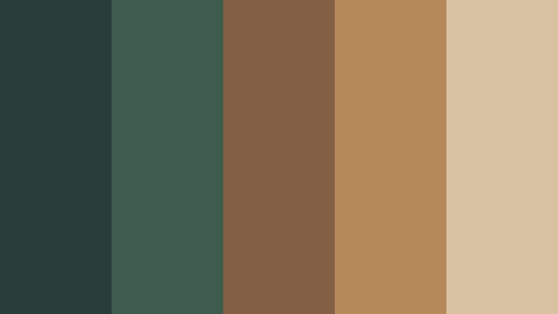
- HEX Codes: #263d3a, #3f5b4e, #836044, #b58a58, #d7c3a2
- Mood: Cinematic, mysterious, and serene.
- Use for: This palette works well for documentary openers, nature videos, cinematic posters, atmospheric websites, and editorial branding.
Twilight Forest uses deep green, weathered brown, muted gold, and pale sand to create a quiet woodland atmosphere. It is suited to refined visuals with a cinematic edge and a natural sense of depth.
Use the darkest green for title backgrounds or shadow areas, then add muted gold to guide attention toward important words and visual details. It works especially well with slow camera movement, ambient sound, documentary footage, and nature-based storytelling.
Ember Night
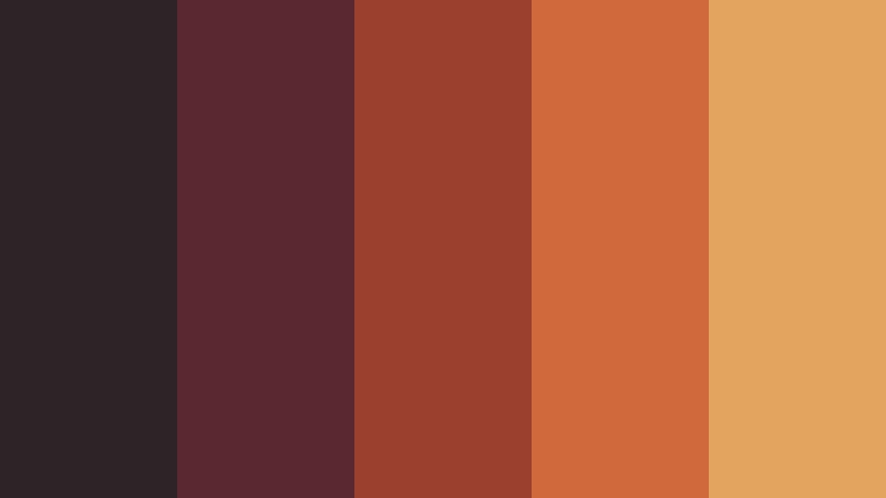
- HEX Codes: #2d2428, #5a2930, #9b3f2f, #d06a3a, #e3a45f
- Mood: Dramatic, passionate, and glowing.
- Use for: Use Ember Night for music videos, fashion edits, dramatic title sequences, gaming graphics, and bold social content.
Ember Night contrasts charcoal plum with glowing red, orange, and amber tones. Its strong contrast adds energy and depth to cinematic and expressive designs, especially when the content needs a powerful visual identity.
Place the charcoal shade behind text or subject cutouts, then use orange and amber as highlights that resemble firelight. This palette can add intensity to music videos, fashion reels, gaming thumbnails, and dramatic introductions.
Mossy Manor
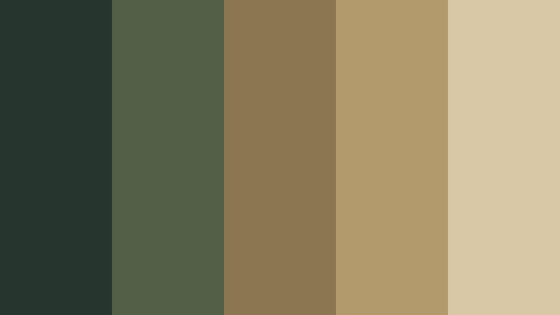
- HEX Codes: #26352e, #526047, #8a7651, #b39a6d, #d9c8a6
- Mood: Elegant, aged, and contemplative.
- Use for: This palette is a strong choice for heritage branding, historical content, editorial layouts, luxury packaging, and slow-living videos.
Mossy Manor combines forest green, olive, antique gold, and parchment cream for a timeless autumn look. It feels sophisticated while retaining a natural, vintage quality that works well with aged textures and carefully paced edits.
Use parchment cream for readable text and page-like backgrounds, while forest green and olive can frame images or create a heritage-inspired title sequence. Antique gold is best used sparingly for logos, borders, and premium details.
Copper Rain
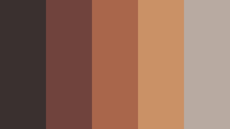
- HEX Codes: #3a3030, #70443c, #a9664b, #c89264, #b8aaa0
- Mood: Reflective, polished, and softly dramatic.
- Use for: Use it for rainy-day vlogs, introspective storytelling, creative portfolios, product films, and modern editorial graphics.
Copper Rain pairs dusky brown and brick with polished copper and cool gray beige. The balance creates a moody but contemporary look for thoughtful visual narratives and polished brand content.
Use the gray beige as a soft counterpoint to the copper accents, especially in title cards and portfolio layouts. In video, the palette suits rainy streets, reflective voiceovers, product closeups, and understated editorial transitions.
Soft & Muted Autumn Color Palette Color Palettes
Dusty Orchard
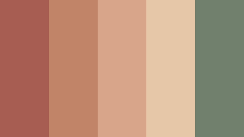
- HEX Codes: #a75d52, #c18469, #d9a58a, #e6c7a8, #71806d
- Mood: Gentle, nostalgic, and organic.
- Use for: This palette works well for wellness reels, personal blogs, soft lifestyle branding, skincare packaging, and friendly social templates.
Dusty Orchard softens autumn reds and peaches with cream and sage green. It offers a calm seasonal feeling that is approachable for personal, wellness-focused, and lifestyle content.
Use the cream and peach shades for open backgrounds and soft overlays, then introduce sage green to balance the warmer tones. This combination works well for gentle transitions, wellness captions, skincare graphics, and personal brand intros.
Rosewood Linen
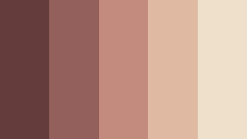
- HEX Codes: #633c3b, #93605b, #c28b7d, #dfb9a1, #efe0c9
- Mood: Romantic, refined, and comforting.
- Use for: Use Rosewood Linen for beauty videos, wedding content, boutique branding, social media covers, and elegant packaging designs.
Rosewood Linen blends muted rose, warm brown, blush, and linen cream for a soft autumn aesthetic. It feels intimate and polished without becoming overly sweet, which makes it flexible for both romantic and modern creative work.
Use the deep rosewood color for headings, logos, and strong text, while blush and linen tones can soften backgrounds and product imagery. The palette is a natural fit for beauty tutorials, wedding films, boutique launches, and elegant social templates.
Sage Pumpkin
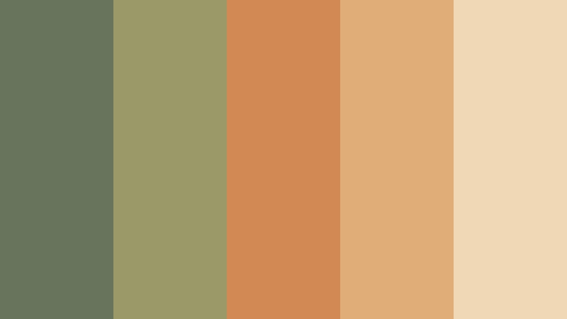
- HEX Codes: #68745b, #9a9a69, #d28a55, #e0ad79, #f0d7b5
- Mood: Fresh, relaxed, and naturally cheerful.
- Use for: This palette is useful for home decor videos, sustainable brands, recipe content, educational graphics, and welcoming website interfaces.
Sage Pumpkin balances gentle green with muted orange, tan, and creamy peach. Its fresh contrast makes autumn content feel bright, modern, and easygoing rather than dark or overly rustic.
Use sage green as the main brand or background color and bring in pumpkin orange for buttons, labels, thumbnails, and motion graphics. The creamy peach tone can keep interfaces, recipe cards, and educational slides easy to read.
Faded Plaid

- HEX Codes: #4d5a4c, #8b5144, #b2765b, #c9a77d, #e1d3b9
- Mood: Nostalgic, relaxed, and handcrafted.
- Use for: Use Faded Plaid in craft videos, autumn fashion content, cozy thumbnails, stationery, and approachable small business branding.
Faded Plaid recreates the softness of worn flannel with forest green, brick, tan, and warm ivory. It is comfortable, familiar, and highly adaptable for seasonal designs that need a handcrafted or nostalgic character.
Use the forest green and brick as alternating accent colors, with warm ivory supporting text and spacious layouts. The palette is effective for craft tutorials, stationery designs, autumn fashion edits, cozy thumbnails, and small business branding.
Modern & Sophisticated Autumn Color Palette Color Palettes
Burnished Gold
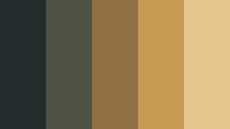
- HEX Codes: #252d2c, #4f5145, #907044, #c69a52, #e4c88f
- Mood: Luxurious, confident, and refined.
- Use for: This palette works well for premium brand intros, finance content, luxury packaging, elegant presentations, and sophisticated UI accents.
Burnished Gold pairs near-black green with slate, bronze, and luminous gold. The high-end combination adds polish and visual authority to modern creative work without feeling too bright or decorative.
Use the darkest tone as a confident background, then reserve gold for logos, key words, borders, and important interface states. It is a strong choice for premium product films, finance content, presentations, and luxury brand systems.
Terracotta Slate
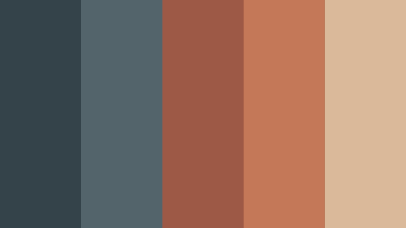
- HEX Codes: #34434a, #53656a, #9d5846, #c47858, #d9b99a
- Mood: Contemporary, balanced, and architectural.
- Use for: Use Terracotta Slate for design portfolios, tech brands with a human touch, modern thumbnails, presentations, and interface themes.
Terracotta Slate creates contrast with cool blue-gray and warm clay tones. It feels current and structured while retaining the approachable warmth of autumn.
Use slate as the dominant interface or background color and apply terracotta to highlight actions, key phrases, or visual markers. The combination is useful for portfolio presentations, technology brands, modern thumbnails, and clean title sequences.
Olive Velvet
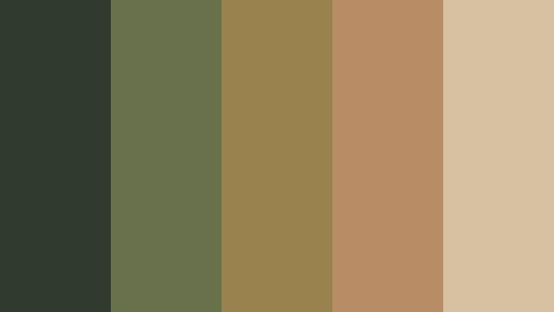
- HEX Codes: #303a2e, #68704a, #9a824e, #b98d63, #d8c1a0
- Mood: Rich, calm, and quietly luxurious.
- Use for: This palette is ideal for fashion reels, boutique branding, editorial covers, premium product videos, and elegant social media graphics.
Olive Velvet combines deep olive with antique gold, camel, and pale taupe. The rich yet restrained colors create a sophisticated seasonal look with plenty of depth and a soft luxury feel.
Use deep olive for a strong visual foundation, then add camel and antique gold to create hierarchy. Pale taupe can soften layouts and maintain readability in fashion reels, boutique campaigns, editorial covers, and premium product videos.
Cranberry Chrome

- HEX Codes: #4a2630, #8d3942, #bd5b4d, #b9a59a, #d9d0c5
- Mood: Bold, polished, and fashion-forward.
- Use for: Use Cranberry Chrome for beauty campaigns, music thumbnails, fashion branding, product launches, and striking video title cards.
Cranberry Chrome updates autumn reds with soft metallic gray and pale neutral tones. It offers a bold editorial feel that stands out in digital and print design while keeping the overall look polished.
Use cranberry shades for strong titles, logos, and focal details, then balance them with gray and pale neutrals. This makes the palette effective for beauty campaigns, music thumbnails, fashion edits, product launches, and high-impact social graphics.
Tips for Creating Autumn Color Palette Color Palettes
A successful Autumn Color Palette should create a clear visual hierarchy rather than use every warm shade at equal strength. Choose one dominant color, one supporting tone, and one or two accents, then adjust saturation and contrast to match the footage, audience, and brand personality.
- Use a dark brown, forest green, charcoal, or slate tone for readable text and strong visual structure.
- Pair warm reds and oranges with cream, pale beige, or muted gray to prevent the design from feeling too intense.
- Keep text contrast high in thumbnails, title cards, and captions so the message remains readable on mobile screens.
- Match the palette to the footage. Warm autumn colors work naturally with wood, foliage, skin tones, food, fabric, and golden-hour light.
- Use saturated colors for focal points such as buttons, logos, product details, and important words instead of applying them everywhere.
- Keep branding consistent by repeating the same accent color across intros, lower thirds, transitions, thumbnails, and social graphics.
- Use color grading carefully when footage comes from different cameras or lighting conditions, and prioritize natural skin tones.
- Test the final design on both large screens and mobile devices because muted colors and fine contrast can change across displays.
An Autumn Color Palette can make creative work feel warm, nostalgic, energetic, refined, or cinematic depending on the balance of hue, saturation, brightness, and contrast. Rustic combinations are useful for cozy storytelling, while muted and sophisticated palettes can support wellness, fashion, technology, and premium branding.
Try these HEX code combinations in your next video intro, thumbnail, brand kit, or seasonal campaign. Filmora can help you apply a consistent look across clips, use AI-assisted color matching, fine-tune tones with professional grading tools, and quickly test filters that fit your creative direction.
Start with one palette and adjust it to suit your footage rather than forcing every shot to look identical. With a focused color system, even simple edits can feel more intentional and recognizable.
secure download