

 100% Security Verified | No Subscription Required | No Malware

Winter Color Palette colors often create a feeling of calm, clarity, elegance, and seasonal atmosphere. Cool blues, icy neutrals, deep evergreen, plum, silver, and crisp white can make a visual project feel peaceful, cinematic, refined, or festive depending on the balance of light and contrast.
These colors work well in video intros, thumbnails, social media content, branding, presentations, and digital design. Below, you will find Winter Color Palette color palettes with HEX codes to help creators and Filmora users build consistent visual styles for videos, campaigns, and creative projects.
In this article
Soft & Icy Winter Color Palette Color Palettes
Frozen Lavender Mist

- HEX Codes: #dcd6f7, #b8c0ff, #8e9aaf, #eef1f6, #5c677d
- Mood: Dreamy, quiet, and airy with a soft frost-inspired elegance.
- Use for: Use this palette for beauty thumbnails, calm vlog intros, wellness branding, and delicate social content.
Frozen Lavender Mist blends cool lavender with pale neutrals for a serene winter mood. The soft violet tones feel imaginative and gentle, while the blue-gray shades add enough structure to keep the composition polished.
Use the lighter colors for backgrounds, title cards, and clean thumbnail space. The deeper gray-blue tones can define text, transitions, lower thirds, or logo details in lifestyle videos, wellness content, and refined digital layouts.
Pro Tip: Enhance Your Frozen Winter Color Palette Visuals with Filmora
Filmora can help keep Frozen Lavender Mist consistent across an entire edit. Apply the pale lavender and icy neutral tones to your intro, b-roll, text overlays, and ending screen so the project feels connected from the first frame to the last.
For calm vlogs and beauty content, use lavender accents on captions and transitions while reserving the darker blue-gray shade for important information. This creates a clear visual hierarchy without taking away from the soft winter atmosphere.
AI Color Palette
Creators can use a reference image, mood board, or color card based on Frozen Lavender Mist and apply its visual direction across a complete video. Filmora's AI Color Palette feature can help match different clips so footage recorded in changing lighting conditions feels more unified.
This is especially useful when combining indoor lifestyle footage with outdoor winter scenes. A consistent color treatment can make the lavender highlights, cool shadows, and pale backgrounds work together naturally.
 secure download

HSL, Color Wheels & Curves
Use Filmora's HSL controls to fine-tune the balance between lavender, blue, and gray. You can reduce saturation for a quiet editorial look or lift the blue and violet channels slightly to make winter footage feel brighter and more atmospheric.
Color wheels and curves are useful for shaping the mood further. Cool shadows can make snowy scenes feel cinematic, while slightly brighter highlights preserve the airy quality of the palette. Filmora's color adjustment tools give you control over skin tones, background detail, and contrast without losing the soft visual identity.
secure download1000+ Video Filters & 3D LUTs
Filmora's video filters and 3D LUTs make it easy to stylize Frozen Lavender Mist without adjusting every clip manually. Choose a cool, faded, or pastel treatment, then reduce the intensity when you want the original footage to remain natural.
Filters can also help unify mixed footage from phones, cameras, and screen recordings. A subtle icy LUT can give your intro, montage, and social cutdowns the same polished winter finish.
secure downloadSnowdrop Serenity
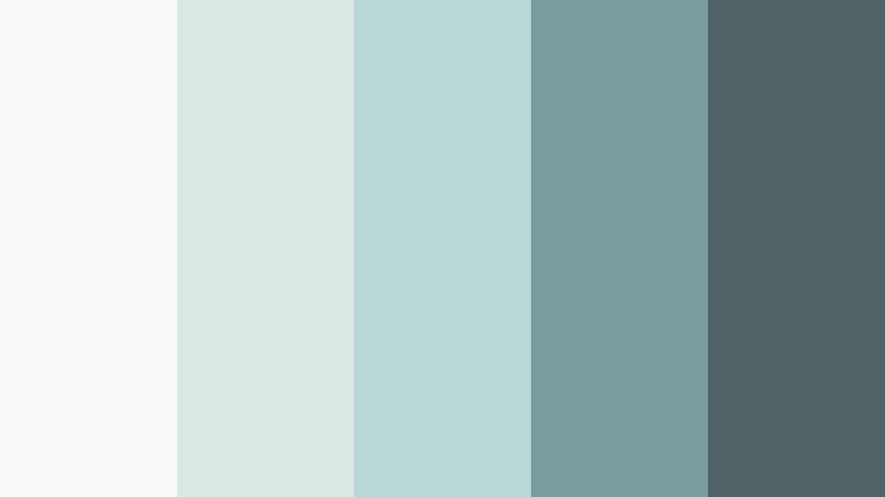
- HEX Codes: #f8f9fa, #dbe7e4, #b8d8d8, #7a9e9f, #4f6367
- Mood: Fresh, peaceful, and clean with a crisp snowy atmosphere.
- Use for: Use this palette for minimalist presentations, skincare videos, wellness websites, and clean product packaging.
Snowdrop Serenity pairs snowy white with muted aqua and slate for a polished winter look. The pale tones create space and freshness, while the darker slate shade gives text and key design elements enough contrast.
Use it for skincare thumbnails, peaceful wellness intros, presentation backgrounds, and clean product demonstrations. Aqua accents can highlight buttons, icons, or subtitles without making the composition feel busy.
Glacier Pearl

- HEX Codes: #e9ecef, #c9d6df, #9fb3c8, #52616b, #1e2022
- Mood: Cool, sophisticated, and restrained with a luxurious icy finish.
- Use for: Use this palette for tech brand intros, editorial graphics, corporate slides, and premium product interfaces.
Glacier Pearl combines pale silver-blue tones with deep charcoal for a sleek winter aesthetic. It feels professional and high-end, making it suitable for brands that want to communicate precision, trust, and modern design.
Use the lighter shades in product shots, title cards, and UI backgrounds. Charcoal works well for headlines, logos, cinematic captions, and thumbnail text that needs to remain readable on bright surfaces.
Arctic Bloom

- HEX Codes: #e0fbfc, #c2dfe3, #9db4c0, #5c6b73, #253237
- Mood: Refreshing, intelligent, and tranquil with a botanical winter feel.
- Use for: Use this palette for educational videos, sustainable brands, app interfaces, and nature-inspired social posts.
Arctic Bloom layers icy cyan, soft blue-gray, and dark charcoal to evoke winter plants beneath snow. It feels fresh and thoughtful, with enough contrast to support informative content and clear visual communication.
Try the pale cyan for backgrounds and motion graphics, then use the charcoal shade for subtitles and key facts. The palette works especially well for sustainability campaigns, educational intros, and nature-focused thumbnails.
Deep & Dramatic Winter Color Palette Color Palettes
Midnight Evergreen

- HEX Codes: #0b132b, #1c2541, #3a506b, #5bc0be, #f0f3bd
- Mood: Mysterious, cinematic, and grounded with a subtle natural glow.
- Use for: Use this palette for cinematic trailers, gaming thumbnails, outdoor branding, and dramatic video title cards.
Midnight Evergreen pairs deep navy and forest tones with bright teal and a soft glow. The dark foundation creates depth, while the teal and pale yellow accents add energy and help important details stand out.
Use navy and evergreen for backgrounds, title sequences, and dramatic transitions. Teal is effective for buttons, highlights, and motion accents in gaming videos, outdoor campaigns, and atmospheric storytelling.
Polar Night Plum
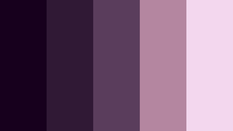
- HEX Codes: #16001e, #301934, #5a3d5c, #b4869f, #f2d7ee
- Mood: Moody, romantic, and artistic with a rich nocturnal character.
- Use for: Use this palette for music videos, fashion campaigns, creative portfolios, and expressive social media graphics.
Polar Night Plum combines dark violet with muted mauve and pale lilac for a dramatic winter mood. It creates a feeling of mystery and intimacy while keeping the color story soft enough for elegant editorial work.
Use the darkest plum as a video background or border color, then add mauve captions and lilac highlights. This combination is effective for fashion reels, music visualizers, portrait edits, and artistic brand identities.
Black Ice Luxe

- HEX Codes: #0a0a0a, #242424, #5a5a5a, #bfc0c0, #f5f5f5
- Mood: Minimal, powerful, and luxurious with a sharp monochrome finish.
- Use for: Use this palette for luxury branding, product launch videos, fashion thumbnails, and sophisticated UI screens.
Black Ice Luxe uses layered black, gray, and white tones to create a confident premium look. Its monochrome structure makes products, silhouettes, and typography feel more prominent.
Use subtle gray changes to separate sections in a video or website without adding unnecessary color. Bright white can emphasize a logo or call to action, while silver-gray details add a polished finish to fashion and product content.
Cranberry Twilight
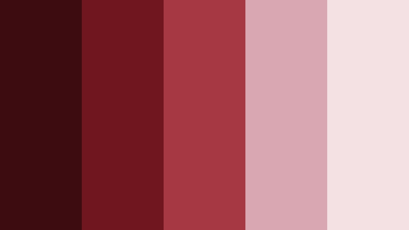
- HEX Codes: #3d0c11, #70161e, #a53840, #d8a7b1, #f4e1e3
- Mood: Warm, dramatic, and festive with a sophisticated berry glow.
- Use for: Use this palette for holiday campaigns, food content, fashion reels, event invitations, and festive packaging.
Cranberry Twilight balances deep berry shades with dusty pink and soft cream. It feels celebratory without becoming overly bright, which makes it suitable for winter campaigns that need warmth and elegance.
Use the dark reds for title cards, borders, or dramatic backgrounds, and reserve the pale pink and cream shades for text and product areas. The palette works well in holiday reels, food videos, event promotions, and seasonal branding.
Modern & Elegant Winter Color Palette Color Palettes
Silver Birch Studio

- HEX Codes: #f1f1f1, #d3d3d3, #a9a9a9, #696969, #2f4f4f
- Mood: Refined, neutral, and contemporary with an understated organic touch.
- Use for: Use this palette for interior design videos, architecture portfolios, presentation decks, and modern brand systems.
Silver Birch Studio blends cool grays with a deep blue-green accent for a polished natural aesthetic. The neutral base keeps the design calm, while the blue-green tone prevents it from feeling flat or overly plain.
Try it in architecture reels, interior design tours, and professional presentations. Gray backgrounds can support large images, while the deep accent shade can organize navigation, headings, and important visual markers.
Frosted Champagne
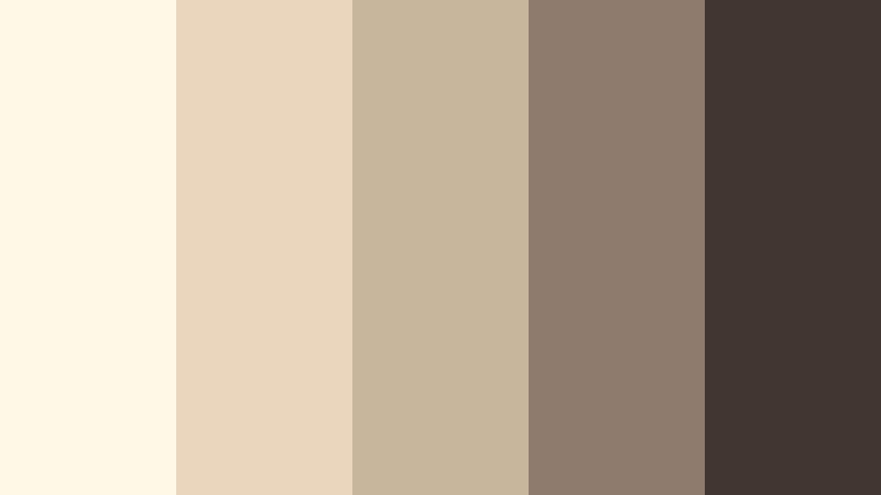
- HEX Codes: #fff8e7, #ead7bb, #c9b79c, #8c7a6b, #40352f
- Mood: Warm, polished, and celebratory with a soft metallic impression.
- Use for: Use this palette for wedding videos, luxury packaging, lifestyle branding, and elegant event graphics.
Frosted Champagne brings creamy ivory and muted gold together with earthy brown accents. It creates a welcoming winter palette that feels premium without becoming distant or overly formal.
Use ivory for backgrounds and title cards, muted gold for decorative lines or transitions, and brown for readable text. This palette can give wedding films, lifestyle intros, and event invitations a warm and graceful finish.
Nordic Stone

- HEX Codes: #f2f2f2, #d8dee9, #a7b0c0, #596275, #303952
- Mood: Calm, structured, and intelligent with a distinctly Nordic character.
- Use for: Use this palette for productivity apps, business videos, design portfolios, and minimalist website interfaces.
Nordic Stone uses cool gray-blue tones to create a focused and dependable visual system. Its quiet contrast supports clear communication and gives professional content a modern, organized appearance.
Use the light gray shades for open space and interface backgrounds, then use slate and navy for headings, charts, and thumbnail text. The palette is a strong choice for tutorials, productivity content, and business presentations.
Icebound Teal

- HEX Codes: #e0f2f1, #b2dfdb, #80cbc4, #39796b, #173f35
- Mood: Crisp, refreshing, and confident with a cool aquatic energy.
- Use for: Use this palette for travel content, health technology branding, app dashboards, and energetic winter thumbnails.
Icebound Teal combines pale mint with richer teal and deep green for a lively winter aesthetic. It feels clean and refreshing, but the darker green gives the palette enough authority for professional branding.
Use mint tones behind text and product images, then add teal to icons, graphics, and transition elements. Deep green is useful for captions, logos, and thumbnail headlines that need strong readability.
Playful & Festive Winter Color Palette Color Palettes
Candy Cane Pop

- HEX Codes: #ffffff, #f7cad0, #e63946, #a8dadc, #1d3557
- Mood: Cheerful, playful, and festive with a bright seasonal energy.
- Use for: Use this palette for holiday reels, children's content, social media posts, stickers, and cheerful promotional graphics.
Candy Cane Pop pairs classic red and white with soft pink, icy blue, and navy. It gives winter content a fun, colorful personality while the navy shade keeps the overall design balanced.
Use red for buttons, titles, and festive accents, while white and pale pink create breathing room. Icy blue can support playful motion graphics, and navy can improve text readability in thumbnails and short-form videos.
Aurora Confetti

- HEX Codes: #10002b, #240046, #5a189a, #00b4d8, #caf0f8
- Mood: Energetic, magical, and imaginative with a colorful northern-light effect.
- Use for: Use this palette for entertainment thumbnails, gaming videos, music graphics, event branding, and animated intros.
Aurora Confetti combines rich violet with electric blue and frosty cyan for a vivid winter spectacle. The dark purple foundation makes the brighter colors glow, creating immediate visual impact.
Use the palette for animated title sequences, gaming overlays, music graphics, and event promotions. Cyan works well for highlights and interface elements, while violet can shape the background and establish a mysterious nighttime atmosphere.
Pinecone Cocoa
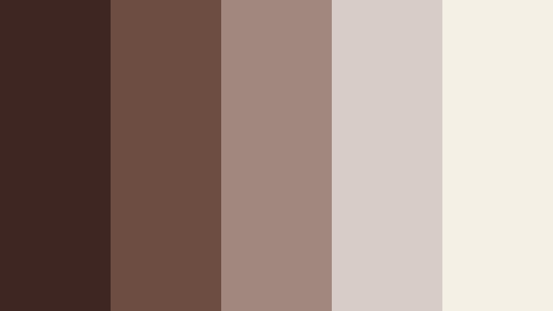
- HEX Codes: #3e2723, #6d4c41, #a1887f, #d7ccc8, #f5f0e6
- Mood: Cozy, familiar, and comforting with a warm cabin-inspired feeling.
- Use for: Use this palette for recipe videos, cozy vlogs, coffee branding, winter merchandise, and inviting social content.
Pinecone Cocoa layers rich brown with taupe, cream, and soft beige to create a comforting winter retreat. It feels warm and tactile, making it a natural fit for content centered on food, home, handmade products, and everyday rituals.
Use the dark browns for titles and borders, then apply cream and beige to keep the composition bright. This palette can make coffee reels, recipe intros, cozy vlogs, and seasonal product videos feel welcoming and personal.
Additional Winter Color Palette Ideas
The palettes above can also be combined to create custom Winter Color Palette color combinations. Pair a soft icy base with one dramatic accent, or balance a festive color with a neutral background to keep the final design clear and versatile.
- Combine icy lavender or pale blue with charcoal when you want a calm but readable visual identity.
- Pair deep evergreen, plum, or cranberry with cream to create a dramatic palette that still feels approachable.
- Use teal or cyan as an accent color instead of applying it across every element of a video or brand system.
- Mix warm winter shades such as cocoa and champagne with cool gray to create contrast between comfort and refinement.
Tips for Creating Winter Color Palette Color Palettes
Effective Winter Color Palette color palettes depend on contrast, consistency, and the relationship between the colors and your footage. Use the following tips to build a winter-inspired visual system that looks attractive in videos, thumbnails, branding, and digital layouts.
- Choose one dominant color, one supporting color, and one accent color so the composition does not feel overcrowded.
- Use dark navy, charcoal, forest green, or deep plum behind light text to maintain readability in thumbnails and title cards.
- Reserve bright colors such as cranberry red, teal, cyan, or lavender for focal points, buttons, logos, and motion accents.
- Match the palette to the lighting in your footage. Cool palettes work naturally with snowy exteriors, blue-hour scenes, and soft indoor light.
- Use warm neutrals such as cocoa, champagne, cream, and beige when a cool winter palette feels too distant or sterile.
- Keep brand colors consistent across intros, lower thirds, captions, thumbnails, transitions, and end screens.
- Check color contrast on mobile devices because subtle gray and pale blue combinations can become difficult to read on small screens.
- Apply filters and color adjustments gradually so the original skin tones and important product details remain natural.
Winter Color Palette color palettes can shape the emotional direction of a project before viewers read a single word. Soft lavender and icy blue suggest calm, deep evergreen and plum create drama, while cranberry, cocoa, and champagne bring warmth to seasonal content.
Choose a palette that supports your message, then repeat its colors across footage, text, transitions, thumbnails, and branding elements. Even a simple three-color system can make a video series or social campaign look more recognizable.
Filmora makes it easy to test these Winter Color Palette ideas with color matching, HSL adjustments, curves, filters, and 3D LUTs. Try different combinations on your footage and refine the balance until the final edit feels consistent and intentional.
secure download