

 100% Security Verified | No Subscription Required | No Malware

Valentine Color Palette choices can instantly shape the emotional direction of a creative project. Soft blush and rose tones suggest tenderness, while vivid red, berry, and magenta create a stronger sense of passion, excitement, and confidence. Dark plum and wine shades add depth for cinematic or luxury visuals.
These romantic colors are useful in vlogs, thumbnails, intros, wedding videos, social media graphics, packaging, and brand identity systems. Below, you will find Valentine Color Palette color palettes with HEX codes to help creators and Filmora users build consistent looks across video edits and design projects.
In this article
Soft & Romantic Valentine Color Palette Color Palettes
Rosewater Kiss
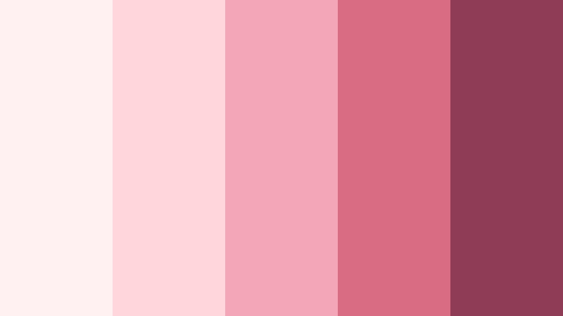
- HEX Codes: #fff1f2, #ffd6dc, #f3a6b5, #d96c82, #8f3d56
- Mood: Tender, warm, and softly romantic.
- Use for: This palette works well for wedding videos, lifestyle thumbnails, romantic social content, and gentle brand intros.
Rosewater Kiss blends an airy near-white with blush, dusty pink, and a muted berry accent. The progression feels tender and polished, making it a natural choice for stories that need emotional warmth without becoming overly dramatic.
In video, use the lightest shades for title cards, backgrounds, and clean transitions, then reserve #d96c82 and #8f3d56 for text, icons, borders, or key moments. This approach works especially well for wedding edits, couple vlogs, lifestyle thumbnails, and romantic brand intros.
Pro Tip: Enhance Your Valentine Color Palette Visuals with Filmora
Use Rosewater Kiss as a visual guide for the entire edit instead of applying pink randomly to individual clips. Keep blush tones in opening titles and b-roll overlays, then bring in the berry shades for chapter cards, lower thirds, and closing frames. Filmora makes it easier to create a unified Valentine Color Palette look across intros, social edits, and longer videos.
For a gentle finish, combine soft transitions with restrained text animation and warm exposure adjustments. Keeping the strongest berry color in a few intentional locations helps viewers follow the story while preserving the palette's delicate character.
AI Color Palette
Creators can use a reference image, mood board, or color card based on Rosewater Kiss to guide the colors in an entire project. Filmora's AI Color Palette feature can help match footage to the selected visual direction, making clips from different cameras feel more consistent.
This is useful when wedding footage, phone videos, and lifestyle b-roll have noticeably different color temperatures. Apply the palette as a starting point, then review skin tones and bright highlights before exporting the final edit.
 secure download

HSL, Color Wheels & Curves
Fine-tune Rosewater Kiss with HSL controls by slightly reducing the saturation of brighter pinks when footage looks too intense. Use the color wheels to add a subtle rose warmth to midtones, keep highlights creamy, and deepen shadows toward the berry end of the palette for a more cinematic result.
Curves can add gentle contrast without making the soft colors harsh. Lift dark areas slightly for an airy lifestyle edit, or create deeper shadows when the same palette is used for an evening wedding sequence.
secure download1000+ Video Filters & 3D LUTs
Filmora's built-in effects can help you move quickly from a basic Valentine Color Palette grade to a more finished visual style. Filmora's video filters and 3D LUTs make it easy to test soft film, warm portrait, and romantic cinematic treatments while keeping the Rosewater Kiss colors recognizable.
Try a subtle filter for wedding b-roll and a slightly stronger treatment for title cards or social teasers. Lower the filter intensity when working with skin tones, flowers, or white clothing so the pale shades remain clean and natural.
secure downloadBlush Garden
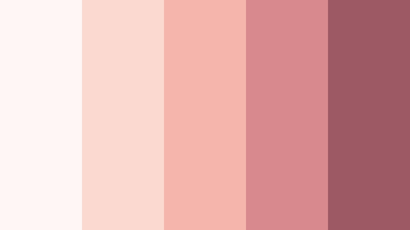
- HEX Codes: #fff7f5, #fbd8d0, #f5b5ad, #d8898d, #9d5964
- Mood: Fresh, graceful, and naturally affectionate.
- Use for: Use this palette for floral reels, beauty content, romantic packaging, Pinterest graphics, and soft video overlays.
Blush Garden pairs delicate peachy pinks with a dusky rose for a floral and inviting mood. The light background shades create a clean canvas, while the deeper rose adds enough contrast for readable captions and branded details.
Use the palette in flower reels, beauty tutorials, romantic packaging mockups, and Pinterest-style graphics. Peach tones can warm up footage, while the muted rose works well for subtitles, logo accents, and elegant transition screens.
Candlelit Romance
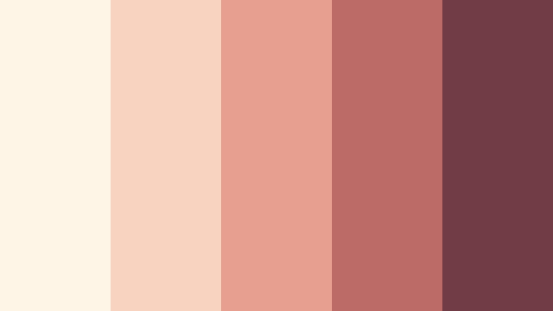
- HEX Codes: #fff5e6, #f8d4c0, #e7a08f, #bd6b67, #713c46
- Mood: Cozy, intimate, and softly luxurious.
- Use for: This palette is suited to date-night videos, cinematic title cards, restaurant branding, invitations, and warm product photography.
Candlelit Romance combines creamy neutrals, terracotta rose, and deep wine for an atmospheric evening glow. It feels intimate and refined, making it a strong option for visuals that need warmth without bright, playful color.
Apply the cream and peach tones to backgrounds and opening frames, then use the wine shade for titles or call-to-action elements. It works beautifully in date-night videos, restaurant promos, invitations, and warm product showcases.
Petal Whisper
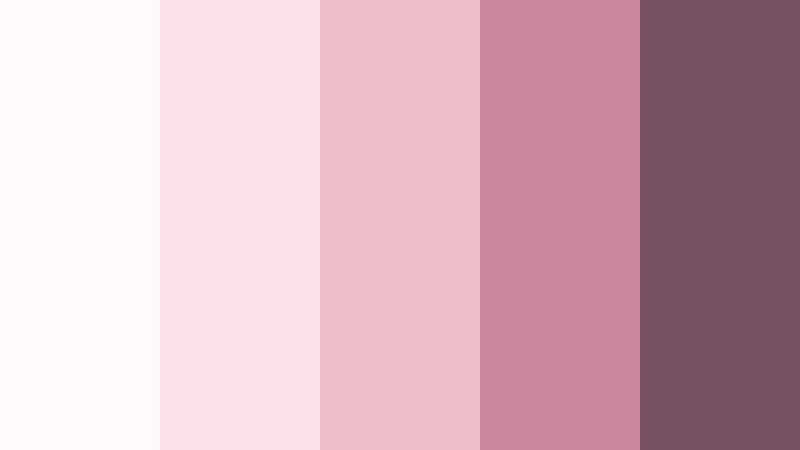
- HEX Codes: #fffafa, #f9e1e7, #efbecb, #c9879b, #775064
- Mood: Delicate, calm, and quietly enchanting.
- Use for: Use it for skincare content, self-care videos, minimalist invitations, editorial layouts, and understated social templates.
Petal Whisper layers pale pinks with a soft mauve shadow for a serene romantic look. Its gentle contrast keeps compositions airy while giving designers a dependable darker tone for type and navigation elements.
Use it in skincare videos, self-care content, clean editorial layouts, and minimalist invitations. The mauve accents can define product names, section headings, and subtle frame lines without overpowering the main visual.
Bold & Passionate Valentine Color Palette Color Palettes
Cherry Heart
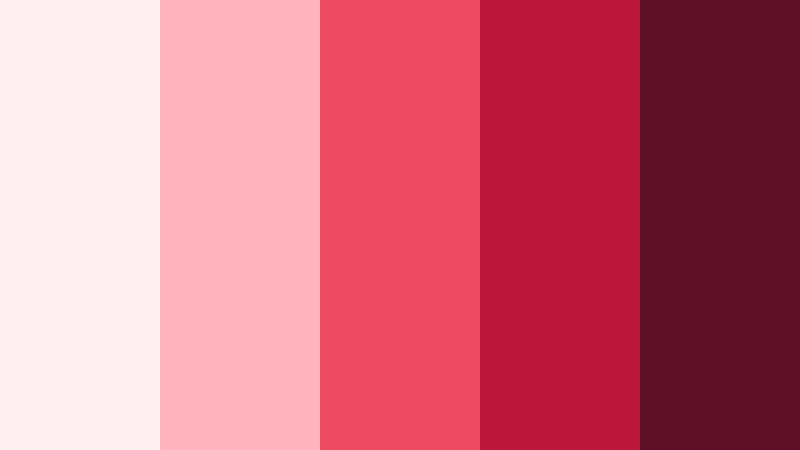
- HEX Codes: #fff0f1, #ffb3bd, #ed4b61, #b9163a, #5e1028
- Mood: Energetic, passionate, and unmistakably romantic.
- Use for: This palette is effective for bold thumbnails, music edits, event promotions, fashion graphics, and attention-grabbing social posts.
Cherry Heart brings bright cherry red together with pink and deep crimson for maximum emotional impact. The combination feels confident and energetic, making it ideal when a design needs to stand out quickly.
Use the vivid red for thumbnail focal points, music video accents, and event graphics, while the darkest shade can anchor text and logos. White and pale pink provide breathing room so the saturated colors remain readable.
Ruby Crush
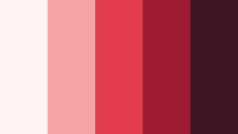
- HEX Codes: #fff4f3, #f7a4a5, #e33d4f, #9e1b32, #3e1724
- Mood: Dramatic, glamorous, and intensely expressive.
- Use for: Use this palette for beauty campaigns, luxury packaging, cinematic intros, fashion reels, and premium promotional graphics.
Ruby Crush balances a vivid ruby center with blackened berry tones for a glamorous finish. It adds drama while preserving a clear Valentine Color Palette identity through its red, pink, and wine progression.
Build cinematic title cards with the deep berry shades, then use ruby red for animated highlights or product details. This palette is especially effective for beauty campaigns, fashion edits, luxury packaging, and premium social promotions.
Neon Sweetheart
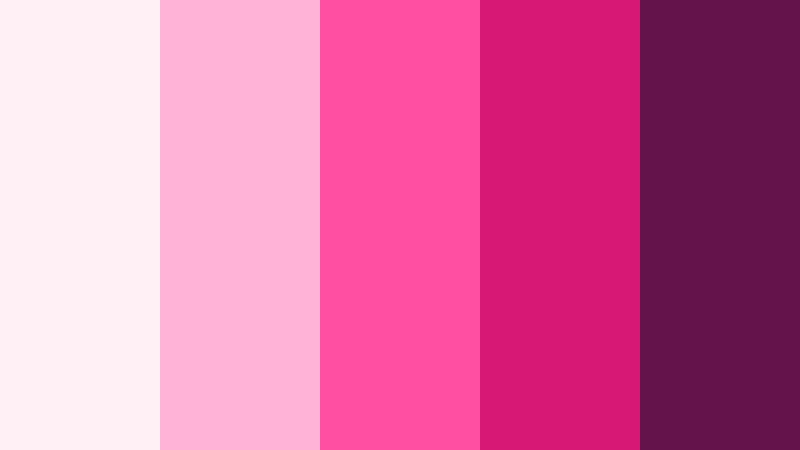
- HEX Codes: #fff0f6, #ffb4d5, #ff4fa3, #d71973, #64134b
- Mood: Playful, electric, and youthful.
- Use for: This palette works well for short-form videos, pop-themed thumbnails, gaming overlays, event flyers, and energetic creator branding.
Neon Sweetheart turns Valentine pink into a vivid digital statement with a saturated magenta core. It feels youthful and expressive, making it a strong choice for creators who want a modern look rather than a traditional romantic style.
Use neon pink for motion graphics, stickers, captions, and thumbnail accents, but pair it with the deep plum shade for contrast. It works well in short-form edits, gaming overlays, pop-inspired branding, and lively event promotions.
Velvet Valentine
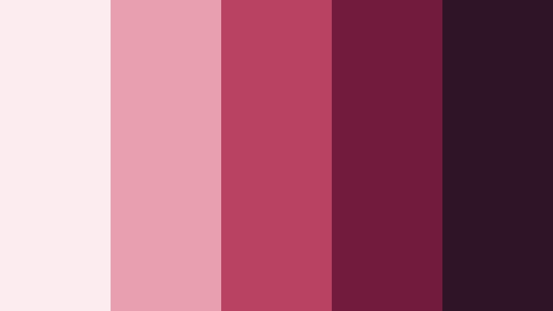
- HEX Codes: #fcecef, #e8a0b1, #b94263, #721c3d, #2f1425
- Mood: Rich, mysterious, and confidently romantic.
- Use for: Use it for cinematic storytelling, album art, luxury logos, dramatic title sequences, and sophisticated Valentine campaigns.
Velvet Valentine layers dusty pink with wine and plum for a deep, tactile mood. The palette feels rich and editorial, giving romantic visuals a sense of mystery and premium quality.
Apply the pale pink as a soft contrast against dark backgrounds, then use wine and plum for titles, logos, and dramatic transitions. It is well suited to album art, cinematic storytelling, luxury campaigns, and sophisticated Valentine branding.
Pastel Valentine Color Palette Color Palettes
Cotton Candy Love
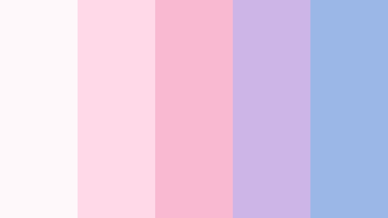
- HEX Codes: #fff8fb, #ffd9e8, #f8b9d1, #cdb5e8, #9bb7e8
- Mood: Cheerful, dreamy, and lighthearted.
- Use for: This palette suits lifestyle vlogs, animated stickers, cheerful social posts, playful packaging, and pastel UI themes.
Cotton Candy Love combines pink, lavender, and powder blue for a sweet and buoyant look. The cool blue and purple notes give the palette a dreamy quality while the pink keeps it connected to Valentine themes.
Use it for lifestyle vlogs, animated stickers, cheerful overlays, and pastel interface designs. The light shades are useful for backgrounds, while lavender and powder blue can separate content sections or support playful motion graphics.
Peachy Promise
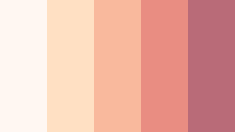
- HEX Codes: #fff8f0, #ffe0c2, #f9b99c, #e98d83, #b96c78
- Mood: Sunny, comforting, and optimistic.
- Use for: Use this palette for couple vlogs, food content, wellness branding, greeting cards, and warm lifestyle thumbnails.
Peachy Promise uses soft peach and coral with a muted rose anchor for an approachable romantic feel. It is warmer and more everyday than a classic pink and red palette, which makes it easy to use across a wide range of content.
Try the peach shades in food videos, wellness graphics, and lifestyle thumbnails, then add muted rose for logos, text, or end screens. The palette gives couple vlogs and greeting cards a welcoming, optimistic finish.
Lavender Love Note
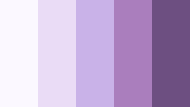
- HEX Codes: #fcf8ff, #eadcf7, #c9b2e6, #aa7dbd, #6d4f82
- Mood: Dreamy, thoughtful, and quietly magical.
- Use for: This palette is ideal for journaling videos, stationery, wellness graphics, feminine UI, and calm social media templates.
Lavender Love Note brings a soft purple perspective to Valentine visuals while keeping the overall mood gentle. Its cool tones feel thoughtful and creative, offering an alternative to designs built entirely around pink and red.
Use pale lavender for journaling video backgrounds, stationery layouts, and wellness content. The darker purple is useful for readable headings, icons, and buttons, especially when a calm but distinctive brand identity is needed.
Strawberry Milk
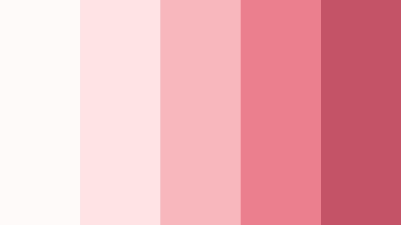
- HEX Codes: #fffafa, #ffe4e5, #f8b7bd, #ec7f8d, #c55368
- Mood: Sweet, nostalgic, and inviting.
- Use for: Use it for dessert videos, cute product packaging, recipe thumbnails, cafe branding, and playful social content.
Strawberry Milk mixes creamy white with soft strawberry shades for a nostalgic and delicious look. It feels friendly and familiar, making it a natural choice for content that should appear warm, cute, and approachable.
Use the creamy tones as a background for recipe videos and cafe graphics, then add coral or strawberry red to highlight ingredients, prices, and calls to action. The palette also suits playful packaging and beauty content with a sweet visual identity.
Elegant & Modern Valentine Color Palette Color Palettes
Plum And Champagne
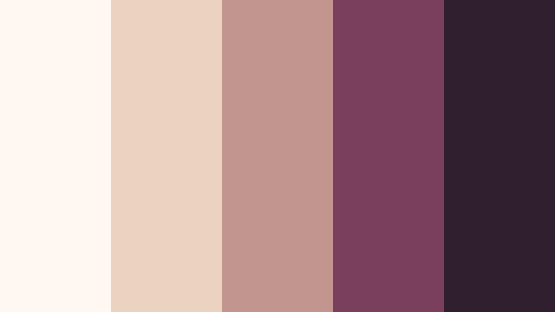
- HEX Codes: #fff8f1, #ead3c1, #c3958f, #7a405b, #30202f
- Mood: Elegant, mature, and softly glamorous.
- Use for: This palette works well for luxury invitations, editorial videos, premium packaging, wedding branding, and refined title cards.
Plum And Champagne pairs a warm champagne neutral with muted rose and dark plum. The contrast feels mature and upscale, offering a romantic look without relying on bright reds or highly saturated pinks.
Use champagne shades for clean backgrounds and product photography, then introduce plum in title cards, logos, and editorial layouts. This combination is especially effective for wedding branding, luxury invitations, and premium promotional videos.
Rose Gold Modern
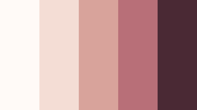
- HEX Codes: #fffaf7, #f3ddd5, #d8a39a, #b86f78, #4a2935
- Mood: Polished, contemporary, and warmly luxurious.
- Use for: Use this palette for beauty branding, modern wedding videos, product showcases, app interfaces, and clean social graphics.
Rose Gold Modern updates classic Valentine colors with blush metallic-inspired tones and deep contrast. The result feels polished and contemporary, making it flexible for both digital content and print design.
Use the pale neutrals to create spacious layouts, then add rose gold-inspired tones to product details, logos, and motion accents. The deep brown-plum shade can support readable text in beauty branding, app interfaces, and modern wedding videos.
Midnight Rose
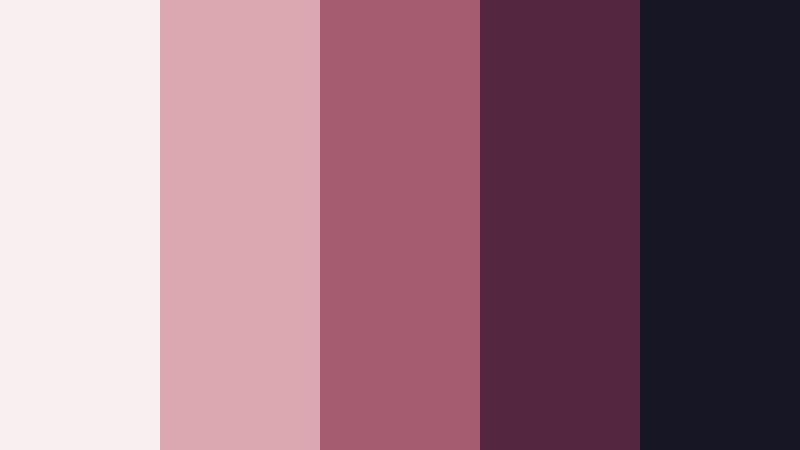
- HEX Codes: #f9eef0, #dba8b2, #a55b70, #54263f, #171625
- Mood: Moody, cinematic, and sophisticated.
- Use for: This palette is suited to film title sequences, dark-mode interfaces, album artwork, luxury campaigns, and dramatic video thumbnails.
Midnight Rose contrasts faded rose with plum and near-black for a cinematic romantic mood. It creates strong visual hierarchy, especially in dark layouts where a small amount of pale pink can immediately draw attention.
Use the near-black shade for backgrounds, the plum tones for framing elements, and faded rose for titles or highlights. This palette is a strong fit for album artwork, dramatic thumbnails, dark-mode interfaces, and luxury campaigns.
Tips for Creating Valentine Color Palette Color Palettes
A successful Valentine Color Palette should support the message, footage, and brand rather than overpower them. Combine light romantic colors with one or two deeper accents, check readability on every screen, and keep the same visual logic across thumbnails, intros, overlays, and end screens.
- Use pale pinks, creams, and soft peach shades as backgrounds, then reserve darker rose, plum, or berry colors for text and important details.
- Check contrast before adding captions to pink or red footage. A dark wine shade or warm near-black often improves readability more than pure black.
- Match the palette to the emotion of the project. Pastels feel playful and gentle, while crimson, ruby, and plum shades feel passionate or luxurious.
- Keep skin tones natural when applying romantic color grades. Reduce saturation or mask faces if pink and red tones begin to look unnatural.
- Choose one primary color, one supporting color, and one accent color to prevent the design from becoming visually crowded.
- Repeat the same colors in the intro, lower thirds, transitions, thumbnail, and final screen to build stronger brand recognition.
- Compare the palette with the original footage before grading. Warm indoor clips may need less peach or red, while cool outdoor footage may need additional warmth.
- Use motion and effects sparingly with bright Valentine colors. A subtle glow, soft blur, or gentle zoom can add energy without reducing clarity.
Valentine Color Palette combinations can make a project feel tender, joyful, dramatic, modern, or luxurious. The right balance of pink, red, berry, lavender, peach, and neutral tones helps define both the mood of the content and the identity of the brand behind it.
Whether you are editing a wedding video, creating a romantic vlog, designing a campaign, or preparing social thumbnails, these HEX-based palettes provide a practical starting point. Test the colors in Filmora, compare them across different clips, and adjust the intensity until the final look feels consistent.
Filmora can help you match footage, refine individual tones, and apply creative filters without rebuilding the color treatment for every clip. Start with one of the palettes above, then adapt the balance for your audience, platform, and visual style.
secure download