

 100% Security Verified | No Subscription Required | No Malware

Analogous Color palettes bring together neighboring hues on the color wheel, creating combinations that feel naturally connected and easy to look at. Because the colors share similar visual qualities, they can communicate calm, warmth, energy, or sophistication without the harsh contrast of complementary schemes.
In video and design, Analogous Color combinations work well for thumbnails, intros, branding, social media graphics, title cards, and complete visual identities. Below, you will find Analogous Color color palettes with HEX codes for creators, designers, and Filmora users who want to build a consistent visual mood across every project.
In this article
Soft & Serene Analogous Color Palettes
Misty Rose Garden
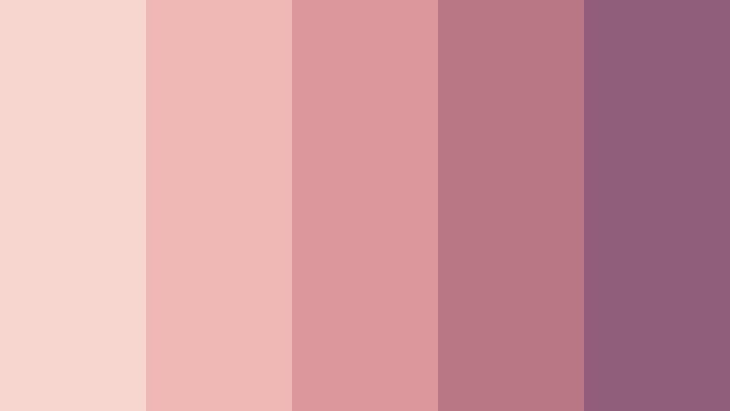
- HEX Codes: #f7d6d0, #efb7b1, #d9979c, #b97888, #8f5f78
- Mood: Gentle, romantic, and quietly elegant.
- Use for: Use this palette for lifestyle thumbnails, wedding videos, beauty branding, and soft social content.
Misty Rose Garden blends dusty pinks and muted berry tones into a graceful, intimate sequence. The lighter shades create a soft background, while the deeper rose and berry colors add structure for text, borders, and focal details.
Use it for romantic storytelling, wedding edits, beauty tutorials, and refined personal brands. In Filmora, these colors can guide your intro cards, lower thirds, b-roll overlays, and thumbnail accents so the entire project feels warm and connected.
Pro Tip: Enhance Your Analogous Rose Visuals with Filmora
Filmora can help you carry the Misty Rose Garden mood from the opening title to the final frame. Use dusty pink overlays for transitions, muted berry accents for captions, and gentle color adjustments on b-roll to create a consistent romantic look.
For lifestyle videos and social edits, keep the palest tones behind important text and reserve the darkest berry shade for logos, calls to action, and visual anchors. This creates hierarchy without losing the palette's soft character.
AI Color Palette
Start with a reference image, mood board, or color card that captures the Misty Rose Garden palette. Filmora's AI Color Palette feature can analyze the reference and apply its color character across clips, helping different shots feel like part of the same story.
This is especially useful when footage comes from different cameras or lighting conditions. Apply the palette first, then make small exposure and skin tone adjustments so the final edit stays cohesive and natural.
 secure download

HSL, Color Wheels & Curves
Use HSL controls to fine-tune the balance between pink, rose, and berry tones. You can lower saturation in bright areas for a delicate finish, deepen shadows with a muted plum adjustment, or warm highlights to make skin tones blend naturally with the palette.
Color wheels and curves provide more control over contrast and mood. Push shadows slightly toward berry, keep midtones neutral, and lift highlights with a soft rose tint for a cinematic result. This Filmora color grading tutorial can help you understand the adjustment process.
secure download1000+ Video Filters & 3D LUTs
Filmora's filters and LUTs can quickly give Misty Rose Garden a polished finish. Choose a soft portrait, film, or pastel treatment, then reduce its intensity so the dusty pink and berry shades remain balanced instead of overpowering the footage.
Filmora's video filters and 3D LUTs make it easy to test several romantic styles before selecting the look that best fits your story. Combine a subtle LUT with rose-colored titles and gentle transitions for a unified edit.
secure downloadLavender Dawn

- HEX Codes: #e6d9f2, #cbb8e3, #aa96d0, #8c76b5, #68558e
- Mood: Dreamy, calming, and imaginative.
- Use for: Use this palette for meditation videos, creative portfolios, podcast covers, and calming app interfaces.
Lavender Dawn creates a peaceful gradient from pale lilac to dusky violet. The soft contrast supports thoughtful, artistic, and wellness-focused designs while giving darker violet tones enough weight for readable titles and graphic accents.
Use the lighter shades for backgrounds and transitions, then add violet to podcast artwork, intro cards, or end screens. The palette is also effective for creative portfolios that need to feel imaginative without becoming overly dramatic.
Peach Blossom Haze
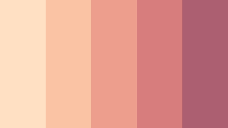
- HEX Codes: #ffe0c2, #fac4a4, #ee9f8c, #d87d7d, #ad5f72
- Mood: Warm, approachable, and optimistic.
- Use for: Use this palette for vlog intros, food content, wellness graphics, and friendly product packaging.
Peach Blossom Haze pairs sunny peach with warm coral and muted rose. It gives creative projects a welcoming glow without feeling overly bright, making it a flexible choice for friendly and approachable communication.
Use peach as a soft canvas for vlog titles or recipe cards, coral for highlights and icons, and muted rose for logos or calls to action. It works well in food videos, wellness content, and personal branding.
Bluebell Cloud

- HEX Codes: #dcebf3, #b9d7e6, #91b9d2, #6d94ba, #526e9e
- Mood: Fresh, airy, and dependable.
- Use for: Use this palette for educational videos, SaaS interfaces, travel thumbnails, and clean presentation templates.
Bluebell Cloud moves through cool blue neighbors for a clear, open atmosphere. It is a strong choice for designs that need calm structure and visual trust, with enough darker blue for contrast and navigation.
Use the pale shades for presentation backgrounds, mid blues for diagrams and captions, and the deepest tone for headlines or branding. Its clean feeling also suits travel thumbnails and educational video intros.
Bold & Energetic Analogous Color Palettes
Citrus Ember
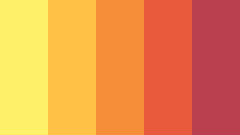
- HEX Codes: #fff06a, #ffc247, #f58d39, #e95a3c, #ba3f4f
- Mood: Energetic, playful, and attention-grabbing.
- Use for: Use this palette for music thumbnails, sports edits, event promos, and bold social media graphics.
Citrus Ember combines electric yellow, orange, and hot coral for instant visual energy. The bright yellow grabs attention, while orange and coral create a warm path toward darker berry details.
Use it for action-focused thumbnails, music edits, event announcements, and sports content. For readable graphics, place dark berry text over the lightest shades and use yellow as a controlled highlight rather than a full-screen color.
Tropical Flame
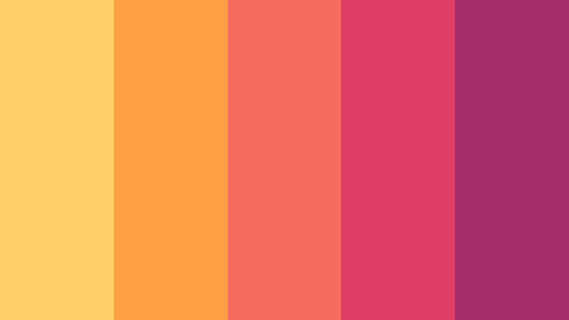
- HEX Codes: #ffd166, #ff9f43, #f76c5e, #dc3f63, #a72d68
- Mood: Vibrant, adventurous, and expressive.
- Use for: Use this palette for travel reels, summer campaigns, fashion edits, and energetic creator branding.
Tropical Flame layers golden yellow, tangerine, coral, and magenta into a lively visual rhythm. The sequence feels sunny and adventurous, while the deeper magenta adds a stylish finish for text and graphic framing.
Use golden yellow in opening frames, coral for motion graphics, and magenta for logos or end cards. This palette is a natural fit for summer campaigns, travel reels, fashion content, and expressive creator brands.
Electric Lagoon

- HEX Codes: #9ff7e5, #51d9d0, #21b7c7, #287fba, #3d4fa1
- Mood: Modern, lively, and refreshing.
- Use for: Use this palette for tech videos, gaming overlays, digital product launches, and futuristic thumbnails.
Electric Lagoon flows from mint to cyan, blue, and indigo for a crisp digital feel. It adds momentum to interfaces and high-energy visual campaigns while keeping the overall color relationship smooth.
Use mint and cyan for glowing interface elements, blue for backgrounds and transitions, and indigo for strong headings or game-related overlays. It can make a product launch or tech intro feel fresh and futuristic.
Neon Berry Rush
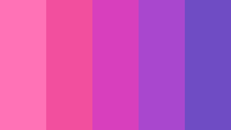
- HEX Codes: #ff72b6, #f34f9f, #d83fbd, #a947ce, #6f4bc4
- Mood: Confident, playful, and unapologetically creative.
- Use for: Use this palette for beauty reels, gaming content, music artwork, and expressive creator portfolios.
Neon Berry Rush uses neighboring pink, magenta, and violet shades to create a punchy glow. It is ideal for designs that need personality and strong visual impact, especially when paired with dark backgrounds.
Use the pink tones for energetic transitions and thumbnail highlights, then rely on violet for text, framing, and depth. The palette works particularly well for beauty reels, gaming edits, music artwork, and bold creator portfolios.
Nature Inspired Analogous Color Palettes
Forest Canopy
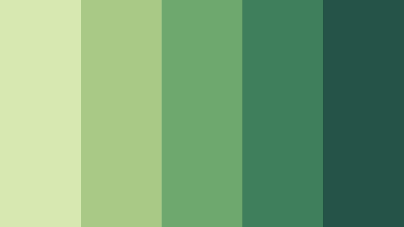
- HEX Codes: #d7e8b0, #a9c987, #6fa86e, #3f7f5b, #245447
- Mood: Grounded, restorative, and organic.
- Use for: Use this palette for eco branding, outdoor documentaries, sustainability content, and natural product packaging.
Forest Canopy combines fresh yellow green, leafy green, and deep woodland tones. It gives visual projects a trustworthy connection to the outdoors and creates a natural sense of progression from light to shadow.
Use the lightest green for maps, labels, or backgrounds, and reserve deep woodland tones for titles and logos. It is effective for outdoor documentaries, environmental campaigns, sustainability videos, and natural product branding.
Mossy Meadow
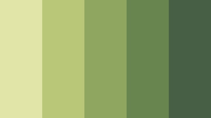
- HEX Codes: #e1e6a8, #b9c779, #8fa65e, #68854e, #465f45
- Mood: Quiet, earthy, and balanced.
- Use for: Use this palette for slow living videos, gardening content, editorial layouts, and sustainable lifestyle brands.
Mossy Meadow softens olive and moss greens with a pale yellow green highlight. It feels natural and understated, making it useful for calm visual storytelling and brands that value simplicity.
Use it in slow living videos, gardening tutorials, editorial layouts, and sustainable lifestyle campaigns. A pale green background with dark moss text can provide a comfortable reading experience while maintaining an earthy identity.
Ocean Herb
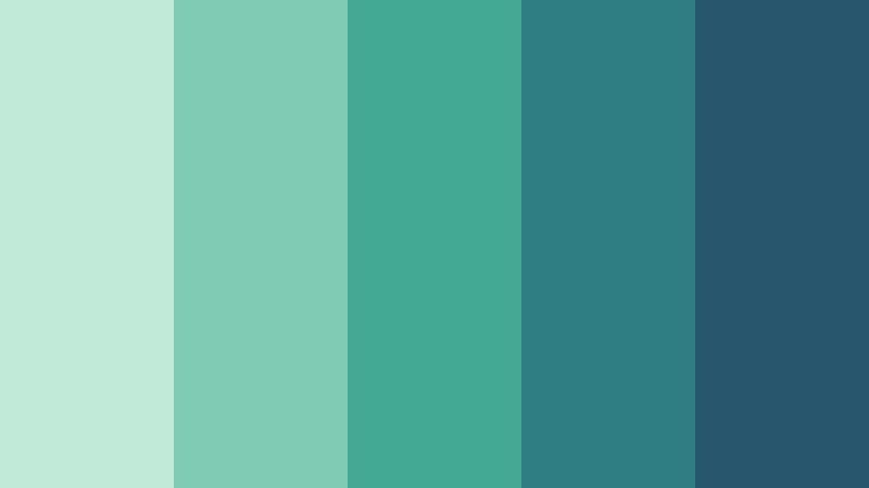
- HEX Codes: #c2ead8, #7fcbb4, #42a995, #2e7e83, #28566d
- Mood: Clean, peaceful, and revitalizing.
- Use for: Use this palette for spa branding, travel content, wellness apps, and ocean conservation campaigns.
Ocean Herb blends seafoam, teal, and blue green into a refreshing natural sequence. It brings clarity and a sense of movement to both digital and print designs without losing its peaceful character.
Use seafoam for open backgrounds, teal for graphic elements, and deep blue green for titles or navigation. The palette suits spa videos, wellness apps, travel content, and ocean conservation campaigns.
Desert Sunset
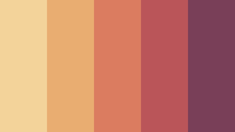
- HEX Codes: #f4d39a, #e9ad72, #d97c5f, #b95659, #793f58
- Mood: Warm, cinematic, and adventurous.
- Use for: Use this palette for travel films, cinematic title cards, landscape photography, and artisan brand stories.
Desert Sunset follows the changing light from sandy gold to terracotta and dusky plum. It creates a rich, cinematic mood with a handcrafted character that feels connected to landscapes and natural textures.
Use sandy gold for opening titles, terracotta for transitions and overlays, and dusky plum for serious text or closing cards. It is a strong choice for travel films, landscape photography, and artisan brand stories.
Elegant & Modern Analogous Color Palettes
Midnight Sapphire

- HEX Codes: #c4d7f2, #7fa5d5, #4f75b8, #364b91, #252f68
- Mood: Polished, focused, and quietly luxurious.
- Use for: Use this palette for corporate intros, finance presentations, premium UI design, and professional video templates.
Midnight Sapphire pairs soft blue highlights with saturated sapphire and deep navy. It offers a sophisticated visual hierarchy for modern, trustworthy projects, with enough contrast for polished layouts and professional communication.
Use soft blue for backgrounds, sapphire for supporting graphics, and navy for logos, headlines, and title cards. The palette fits corporate videos, finance presentations, premium interfaces, and professional templates.
Plum Velvet
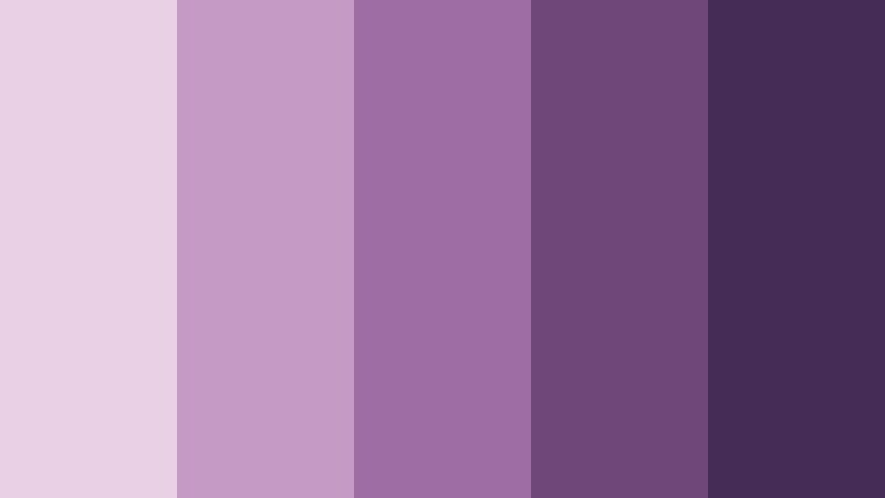
- HEX Codes: #ead0e4, #c59ac4, #9d6da4, #704779, #442c56
- Mood: Rich, artistic, and sophisticated.
- Use for: Use this palette for fashion videos, luxury packaging, album artwork, and editorial social campaigns.
Plum Velvet moves from pale mauve through berry purple to deep plum. Its layered tones create an expressive sense of depth and premium style without relying on sharp color contrast.
Use pale mauve for spacious layouts and product backgrounds, then add deep plum to titles, borders, and branding. It works beautifully for fashion edits, luxury packaging, album artwork, and editorial campaigns.
Sage Stone
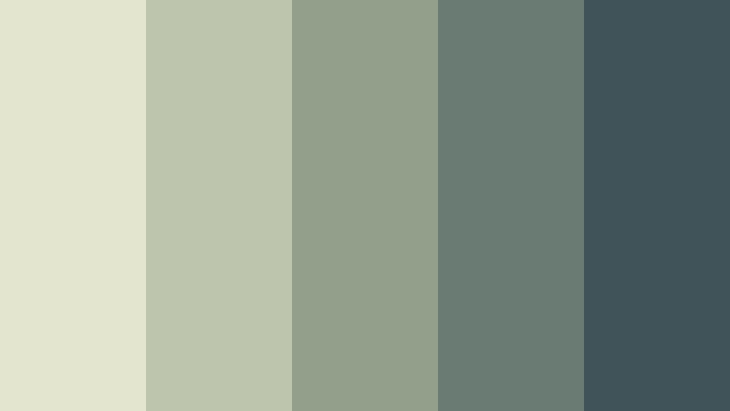
- HEX Codes: #e3e5cf, #bdc6ad, #929f8b, #697b73, #3f5358
- Mood: Minimal, composed, and contemporary.
- Use for: Use this palette for minimalist websites, architecture videos, productivity content, and modern brand systems.
Sage Stone balances muted sage with cool gray green and slate accents. It provides a refined neutral foundation for clean layouts and understated motion graphics.
Use the pale sage tones for backgrounds and the darker slate colors for typography, navigation, and graphic anchors. This palette is well suited to architecture videos, productivity content, minimalist websites, and modern brand systems.
Tips for Creating Analogous Color Color Palettes
Analogous Color palettes are easiest to use when one shade leads, one or two shades support it, and a darker or contrasting accent improves readability. Test each combination against your footage, typography, and brand goals before applying it across a complete video or design system.
- Choose one dominant hue and let neighboring colors support it instead of giving every shade equal visual weight.
- Use a light and dark value range so titles, captions, logos, and calls to action remain easy to read.
- Add a small amount of a triadic accent when an important button, subject, or thumbnail detail needs extra attention.
- Match the palette to the lighting in your footage. Warm palettes suit golden-hour scenes, while cool palettes complement overcast or studio visuals.
- Keep skin tones natural when applying strong Analogous Color grades to lifestyle, beauty, interview, or vlog footage.
- Repeat the same two or three colors across intros, lower thirds, transitions, thumbnails, and end screens to strengthen brand recognition.
- Use saturation carefully. Muted neighboring colors create an elegant look, while brighter shades are better for energetic content and short-form videos.
- Check color contrast on mobile screens, where small text and subtle differences between nearby hues can become difficult to see.
Analogous Color palettes can shape the emotional direction of a project while keeping every visual element connected. Soft pinks and lavenders can make a story feel intimate, bright oranges and corals can create momentum, and greens or blue greens can communicate nature, clarity, and trust.
Choose a palette that supports your footage and audience, then use its HEX codes consistently across thumbnails, titles, overlays, branding, and social graphics. Even a simple three-color combination can give a video series a recognizable identity.
Try these Analogous Color palettes in Filmora to experiment with color matching, grading, filters, LUTs, and branded motion graphics. Small adjustments to saturation, contrast, highlights, and shadows can turn a basic edit into a polished visual experience.
secure download