

 100% Security Verified | No Subscription Required | No Malware

Triadic color palettes use three hues spaced evenly around the color wheel, creating balanced contrast without making a design feel chaotic. This relationship can produce visuals that are lively, memorable, and easy to organize, especially when one color leads and the other two support it through accents, backgrounds, or details.
For video creators, triadic color combinations can shape the mood of thumbnails, intros, transitions, lower thirds, brand graphics, and social edits. This collection provides Triadic Color color palettes with HEX codes for creators, designers, marketers, and Filmora users who want practical color direction for video, branding, and digital design.
In this article
Soft & Balanced Triadic Color Palettes
Peach Garden Harmony
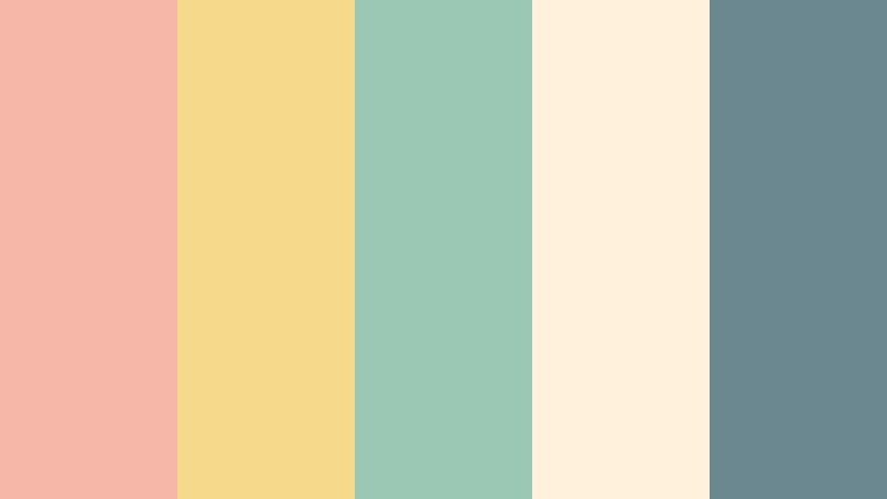
- HEX Codes: #f6b6a8, #f7d98c, #9bc8b5, #fff1dc, #6b8790
- Mood: Warm, gentle, and naturally uplifting.
- Use for: This palette works well for lifestyle thumbnails, wellness videos, soft brand intros, and friendly social content.
Peach Garden Harmony combines mellow peach warmth with refreshing green and blue accents. The creamy neutral softens the composition, while the muted blue-gray adds enough contrast to keep layouts clear and visually balanced.
Use peach for titles, highlights, or transition cards, then bring in green and blue for icons, captions, b-roll frames, or background details. The palette is especially effective for calm storytelling, wellness content, approachable branding, and lifestyle video intros.
Pro Tip: Enhance Your Triadic Color Visuals with Filmora
Filmora can help you carry the Peach Garden Harmony palette across an entire edit instead of limiting it to a single thumbnail or title card. Use peach and soft yellow for opening graphics, mint green for callouts, and blue-gray for captions or framing elements so your intro, b-roll, and social cutdowns feel connected.
Build a simple visual system by assigning one color to key information and using the other two as supporting accents. Filmora's color controls, text styling, overlays, and transitions make it easier to repeat the same warm, gentle look throughout a project.
AI Color Palette
Creators can use a reference image, mood board, or color card based on Peach Garden Harmony and apply its visual character across multiple clips. Filmora's AI Color Palette feature helps match the color style of different shots, making mixed footage feel more consistent.
This is useful when a project includes indoor and outdoor footage with different lighting conditions. Apply the palette to interviews, b-roll, product shots, and social exports, then make small manual adjustments for skin tones and important details.
 secure download

HSL, Color Wheels & Curves
Use HSL controls to fine-tune the peach, yellow, mint, and blue-gray tones in your footage. Slightly lowering saturation can create a softer editorial finish, while warming the highlights and cooling the shadows can make the palette feel more cinematic without losing its friendly character.
Color wheels and curves are useful for balancing shots captured under different lighting conditions. Adjust the highlights toward peach or cream, keep skin tones natural in the midtones, and add a subtle blue-green shift to the shadows for depth. The color grading workflow can help you refine these choices with more control.
secure download1000+ Video Filters & 3D LUTs
Filmora's video filters and 3D LUTs make it easy to stylize Peach Garden Harmony for different types of content. A soft film filter can emphasize the creamy and peach tones, while a lighter cinematic LUT can bring out the muted green and blue accents.
Apply a filter lightly to preserve the palette's natural balance, then adjust intensity for each scene. This approach works well for wellness videos, product reels, and lifestyle edits where the colors should feel polished but not overly processed.
secure downloadLavender Citrus Breeze
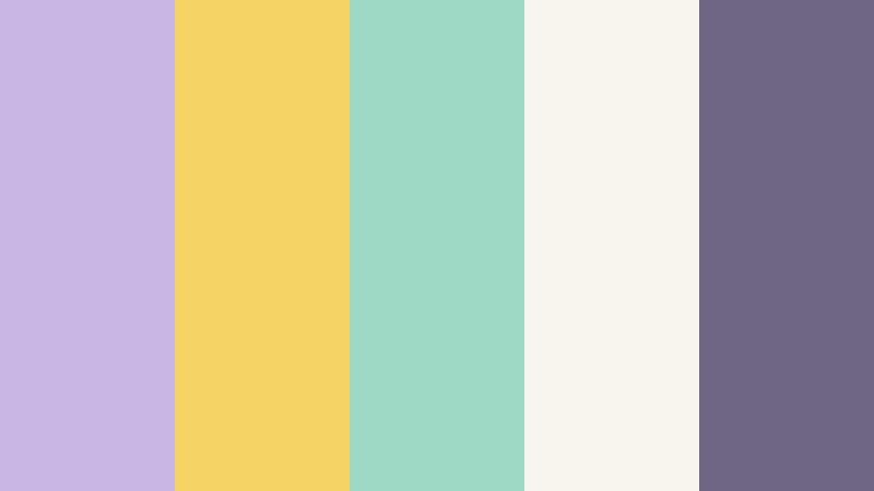
- HEX Codes: #c9b6e4, #f6d365, #9ed9c5, #f8f4ee, #6f6685
- Mood: Lighthearted, fresh, and quietly creative.
- Use for: Use it for beauty reels, creative portfolios, app interfaces, and airy presentation slides.
Lavender Citrus Breeze balances soft purple with sunny yellow and mint green. Its pale background keeps the composition open, while the deeper lavender-gray gives text, icons, and borders enough definition for practical design work.
Use lavender for title screens, yellow for key moments, and mint for supporting graphics or progress indicators. The combination feels playful without becoming overwhelming, making it a strong choice for beauty reels, creative portfolios, app interfaces, and modern lifestyle videos.
Rosewater Meadow
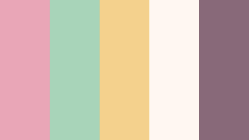
- HEX Codes: #e8a7b7, #a8d5ba, #f3d28b, #fff8f2, #876979
- Mood: Romantic, peaceful, and softly optimistic.
- Use for: This palette is ideal for wedding videos, personal blogs, stationery design, social posts, and gentle product packaging.
Rosewater Meadow pairs dusty rose with meadow green and creamy yellow for a tender, handcrafted feeling. The warm off-white background allows the three main colors to breathe, while the muted mauve shade can anchor typography and small details.
Try rose for emotional title cards or wedding highlights, green for natural footage and decorative elements, and yellow for soft emphasis. This palette works especially well in personal blogs, stationery-inspired graphics, wedding videos, and gentle product introductions.
Misty Berry Coast

- HEX Codes: #b98ac4, #7fc6c2, #f1c27d, #f6f0eb, #584a67
- Mood: Dreamy, coastal, and thoughtfully expressive.
- Use for: Use it in travel vlogs, editorial graphics, boutique branding, music visuals, and atmospheric video overlays.
Misty Berry Coast blends berry purple, seafoam teal, and sandy gold for a relaxed yet distinctive look. The pale neutral keeps the palette calm, while the deep purple adds depth to titles, borders, and cinematic overlays.
Use teal to echo ocean footage, sandy gold for sunlight or travel details, and berry purple for emphasis in thumbnails and music visuals. It is a versatile choice for boutique branding, editorial graphics, travel vlogs, and atmospheric video sequences.
Bold & Vibrant Triadic Color Palettes
Neon Carnival Pulse

- HEX Codes: #ff4f81, #ffd447, #36d1dc, #17152d, #f7f7f2
- Mood: Energetic, playful, and attention-grabbing.
- Use for: This palette is built for event promos, gaming thumbnails, music videos, short-form social content, and energetic brand intros.
Neon Carnival Pulse uses vivid pink, yellow, and cyan against a deep dark base. The strong contrast creates instant visual impact, while the soft white neutral gives the brightest elements room to stand out without making every part of the design compete.
Use the dark navy-purple as the main background, then reserve pink, yellow, and cyan for titles, motion graphics, buttons, and quick transitions. This palette is especially effective for gaming thumbnails, music videos, event promotions, and fast-paced social edits.
Tropical Signal

- HEX Codes: #f05d5e, #f4d35e, #00a8a8, #14213d, #f8f9fa
- Mood: Confident, sunny, and adventurous.
- Use for: Use it for travel thumbnails, outdoor campaigns, sports graphics, tourism branding, and bold social media templates.
Tropical Signal combines coral red, bright yellow, and turquoise with a strong navy anchor. The colors feel active and optimistic, while the navy and pale neutral make it easier to establish structure in busy layouts.
Use coral for primary calls to action, yellow for highlights, and turquoise for supporting information or footage labels. This combination performs well in travel content, outdoor campaigns, sports graphics, tourism branding, and bold social media templates.
Electric Orchard

- HEX Codes: #ff6b35, #8ac926, #1982c4, #202a44, #fff3e0
- Mood: Fresh, energetic, and inventive.
- Use for: This palette suits food content, fitness channels, startup branding, explainer videos, and colorful packaging concepts.
Electric Orchard pairs vivid orange with leaf green and clear blue for a lively, modern look. The deep blue neutral gives the bright colors a polished foundation, while the warm cream adds a friendly finish to backgrounds and content cards.
Use orange to attract attention to important moments, green to suggest freshness or progress, and blue for information panels or brand elements. The palette is a natural fit for food videos, fitness channels, startup explainers, and colorful packaging concepts.
Pop Art Voltage
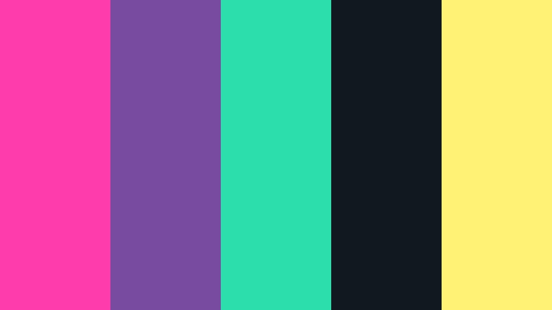
- HEX Codes: #ff3cac, #784ba0, #2bdeac, #101820, #fff275
- Mood: Expressive, youthful, and boldly experimental.
- Use for: Use it in music thumbnails, creator branding, fashion edits, poster art, and high-energy promotional graphics.
Pop Art Voltage layers hot pink, saturated violet, and vivid aqua with a sunny yellow highlight. The near-black base helps the colors feel graphic and contemporary, giving each accent a clear role in the visual hierarchy.
Use pink and violet for expressive title treatments, aqua for motion accents, and yellow for small moments that need immediate attention. It is a strong option for fashion edits, creator branding, music thumbnails, poster art, and high-energy promotional videos.
Earthy & Natural Triadic Color Palettes
Harvest Clay Trio
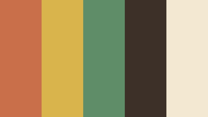
- HEX Codes: #c96f4a, #d9b44a, #5f8d68, #3d3028, #f3e8d0
- Mood: Grounded, rustic, and inviting.
- Use for: This palette works well for cooking videos, handmade product branding, farm-to-table content, and warm editorial layouts.
Harvest Clay Trio combines terracotta, ochre, and muted green with rich brown and cream. The result feels tactile and natural, making it easy to connect visual design with handmade materials, seasonal food, wood, soil, and craft.
Use the dark brown for text or title backgrounds, terracotta for warm visual emphasis, and green for natural details. This palette can give cooking videos, farm-to-table stories, handmade branding, and editorial layouts a dependable and welcoming tone.
Mossy Sunset Trail
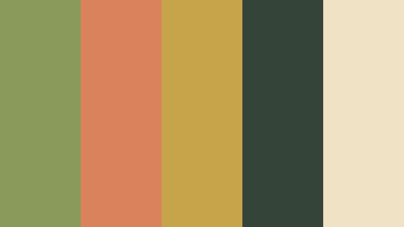
- HEX Codes: #8a9a5b, #d9825b, #c7a44a, #344438, #f0e2c4
- Mood: Adventurous, organic, and reflective.
- Use for: Use it for nature documentaries, hiking vlogs, sustainable brands, travel storytelling, and outdoor campaign graphics.
Mossy Sunset Trail pairs olive green with sunset orange and muted golden yellow. Its deep green anchor adds a quiet sense of stability, while the orange and gold tones suggest evening light, movement, and discovery.
Use olive green for maps, labels, or background blocks, then add orange to highlight action and gold to guide attention toward important details. The palette supports hiking vlogs, nature documentaries, sustainable branding, and reflective travel stories.
Canyon Bloom
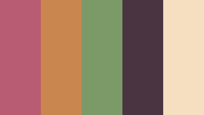
- HEX Codes: #b85c72, #c9874f, #7c9a67, #4a3442, #f4dfc1
- Mood: Artful, warm, and naturally dramatic.
- Use for: This palette is suitable for travel films, artisan packaging, cinematic titles, fashion mood boards, and story-driven social content.
Canyon Bloom blends dusty berry, canyon orange, and sage green for a rich organic composition. The deep plum shade brings cinematic weight, while the warm cream keeps the overall design approachable and easy to read.
Use berry and plum for dramatic title cards, orange for sunlit details, and sage green for natural footage or supporting graphics. This palette can add personality to travel films, artisan packaging, fashion mood boards, and story-driven social content.
Seaside Terracotta
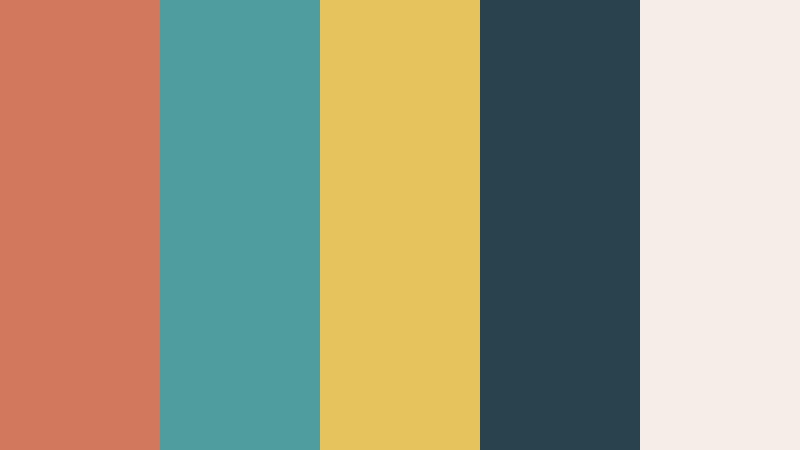
- HEX Codes: #d2785d, #4f9d9d, #e6c35c, #29434e, #f5eee6
- Mood: Relaxed, sunlit, and artisanal.
- Use for: Use it for coastal travel videos, cafe branding, home decor content, packaging, and relaxed lifestyle thumbnails.
Seaside Terracotta brings together sunbaked orange, ocean teal, and soft yellow. A deep blue-green creates a grounded coastal foundation, while the warm cream gives the palette a light and comfortable finish.
Use orange for product details or sunset footage, teal for water and background panels, and yellow for small highlights. The combination works naturally for coastal travel videos, cafe branding, home decor content, packaging, and relaxed lifestyle thumbnails.
Elegant & Modern Triadic Color Palettes
Midnight Gallery

- HEX Codes: #242038, #9067c6, #f2c14e, #4ea699, #f7f4ed
- Mood: Refined, artistic, and quietly luxurious.
- Use for: This palette works for cinematic title cards, premium brand identity, portfolio websites, art presentations, and sophisticated thumbnails.
Midnight Gallery uses deep indigo as a dramatic base for violet, gold, and teal accents. The soft off-white provides breathing room, allowing the saturated colors to feel intentional rather than excessive.
Use indigo for full-screen backgrounds and title cards, violet for artistic emphasis, gold for premium details, and teal for secondary information. It gives portfolio websites, art presentations, premium branding, and cinematic intros a polished gallery-inspired character.
Chrome Blossom
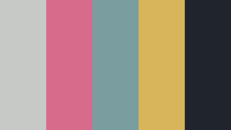
- HEX Codes: #c7c9c7, #d66b8c, #7a9e9f, #d8b45a, #20252b
- Mood: Sleek, contemporary, and unexpectedly warm.
- Use for: Use it for beauty branding, product launches, modern UI design, tech presentations, and polished video openers.
Chrome Blossom combines cool gray with rose, blue-green, and muted gold. The charcoal base adds structure, while the rose and gold accents bring a human warmth that prevents the design from feeling too cold or mechanical.
Use gray and charcoal for interface surfaces or title backgrounds, then reserve rose, teal, and gold for buttons, product details, and motion graphics. This palette is well suited to beauty branding, product launches, tech presentations, and polished video openers.
Urban Prism
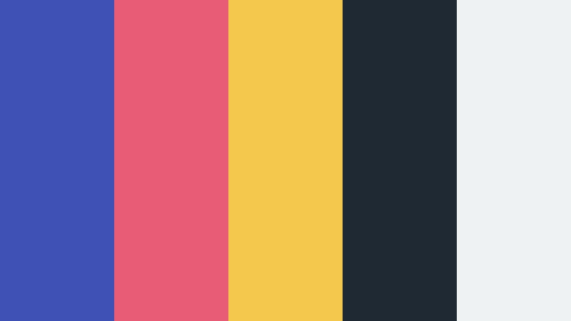
- HEX Codes: #3f51b5, #e85d75, #f2c94c, #1f2933, #eef2f3
- Mood: Structured, confident, and creatively urban.
- Use for: This palette is ideal for tech explainers, business presentations, editorial layouts, app interfaces, and contemporary brand systems.
Urban Prism combines cobalt blue, coral pink, and golden yellow with charcoal and pale gray. The strong primary colors create a clear visual hierarchy, while the neutral shades help organize complex information in digital-first layouts.
Use cobalt for navigation or primary branding, coral for featured moments, and yellow for calls to action or important data. It is especially useful for tech explainers, business presentations, app interfaces, editorial graphics, and contemporary brand systems.
Velvet Circuit

- HEX Codes: #5b2c6f, #00a6a6, #f4a261, #171717, #f1faee
- Mood: Dramatic, intelligent, and digitally sophisticated.
- Use for: Use it in software branding, cinematic trailers, electronic music visuals, dashboard UI, and sleek social campaigns.
Velvet Circuit pairs deep violet with teal and warm orange for a refined digital contrast. Black gives the palette a dramatic base, while soft white keeps text, icons, and interface elements readable.
Use violet for the primary identity, teal for data or motion accents, and orange for moments that need warmth and attention. This combination works well for software branding, cinematic trailers, electronic music visuals, dashboard interfaces, and sleek social campaigns.
Tips for Creating Triadic Color Color Palettes
Triadic color combinations work best when the three main hues have clear roles. Choose a dominant color for the largest areas, a secondary color for supporting elements, and an accent color for details that need attention. Use neutral tones and footage-aware adjustments to keep the final design readable and consistent.
- Choose one dominant color and let the other two support it instead of giving every hue equal visual weight.
- Use dark or light neutral colors for text, backgrounds, and spacing so bright triadic hues do not reduce readability.
- Check contrast on thumbnails and mobile screens before publishing, especially when using yellow, mint, or pale pastel colors.
- Match the palette to the footage. Warm earthy combinations suit outdoor and food content, while neon palettes often work better with controlled lighting and energetic edits.
- Keep brand consistency by assigning recurring roles to colors, such as one hue for titles, one for buttons, and one for highlights.
- Reduce saturation when a palette feels too intense, particularly in longer videos where highly vivid colors can become tiring.
- Use color grading to balance different cameras and lighting conditions before applying the final palette to the whole project.
- Test the palette in several formats, including widescreen video, vertical reels, thumbnails, captions, and presentation graphics.
Triadic color palettes give creators a practical way to balance contrast, emotion, and visual recognition. Soft combinations can make a vlog or personal brand feel welcoming, while bold palettes can add energy to music videos, gaming content, and promotional campaigns. Earthy tones bring warmth and authenticity, and modern combinations can make digital products or premium brands feel more distinctive.
Try one of these palettes as a starting point, then adjust saturation, brightness, and contrast to match your footage and audience. Filmora makes it easier to test color directions across intros, b-roll, titles, filters, and social exports while keeping the overall project visually connected.
Whether you prefer the calm look of Peach Garden Harmony, the energy of Neon Carnival Pulse, or the refined contrast of Midnight Gallery, a consistent palette can make your videos easier to recognize and more memorable.
secure download