

 100% Security Verified | No Subscription Required | No Malware

Earth Tone Color palettes use warm browns, muted greens, terracotta, sand, cream, and other natural shades to create a sense of comfort, balance, and authenticity. These colors often feel grounded and familiar, making them effective for visual stories that need a calm, welcoming, or handcrafted mood.
From video thumbnails and cinematic intros to branding, social content, and product design, the right Earth Tone Color combination can shape how an audience experiences your message. Below, you will find Earth Tone Color color palettes with HEX codes for creators and Filmora users, along with practical ideas for applying each palette to video and design projects.
In this article
Soft And Natural Earth Tone Color Palettes
Sandy Morning

- HEX Codes: #d8c3a5, #b89b72, #8c6f54, #f1e3cf, #6f5846
- Mood: Calm, grounded, and quietly optimistic.
- Use for: Use this palette for lifestyle thumbnails, wellness videos, travel intros, and warm personal branding.
Sandy Morning blends sunlit beige with soft brown for a relaxed natural look. The lighter cream shade keeps the palette open and airy, while the deeper taupe tones add enough structure to prevent the design from feeling flat.
This is a useful Earth Tone Color palette for calm storytelling, lifestyle vlogs, wellness content, and travel videos. Use the pale shades for backgrounds and title cards, then reserve the darker brown for text, borders, subtitles, or logo details. The result feels warm and personal without becoming overly dramatic.
Pro Tip: Build A Cinematic Earth Tone Color Look in Filmora
Filmora can help you carry the Sandy Morning palette across an entire edit. Use beige and cream tones in your opening title, lower thirds, and thumbnail graphics, then use warm brown accents for transitions, captions, and end screens. This creates a consistent visual rhythm from the first frame to the last.
For b-roll, keep skin tones natural and use the darker palette colors sparingly in overlays or graphic elements. A restrained approach helps lifestyle footage feel polished while preserving the soft, grounded character of the palette.
AI Color Palette
Creators can use a reference image, mood board, or color card based on Sandy Morning and apply its visual character to footage throughout a project. Filmora's AI Color Palette feature helps match the color feeling between clips, which is especially useful when footage was recorded in different locations or lighting conditions.
Apply the palette to travel b-roll, talking-head footage, and product shots to create a more unified warm neutral finish. This can reduce the need for repetitive manual adjustments while keeping the edit visually cohesive.
 secure download

HSL, Color Wheels & Curves
Use HSL controls to refine the balance between beige, brown, and cream in your footage. Slightly lower the saturation of distracting colors, warm the highlights for a sunlit finish, and deepen the shadows with a gentle brown or neutral adjustment. Color wheels can add warmth to midtones while keeping skin tones believable.
Curves are helpful when you want more cinematic contrast. Create a subtle S-curve, lift the blacks slightly for a soft editorial finish, or reduce highlight intensity when bright areas compete with your subject. These small adjustments can make Sandy Morning feel more consistent across indoor and outdoor scenes.
secure download1000+ Video Filters & 3D LUTs
Filmora's collection of presets can quickly give Sandy Morning a more finished visual direction. Try a warm film filter for nostalgic vlogs, a soft matte look for wellness videos, or a subtle faded LUT for travel footage. Keep the effect intensity moderate so the cream and beige tones remain clean.
Filmora's video filters and 3D LUTs make it easy to test different versions of the palette before choosing the best match for your story. You can also use the same filter family across clips to create a dependable brand look.
secure downloadClay Garden
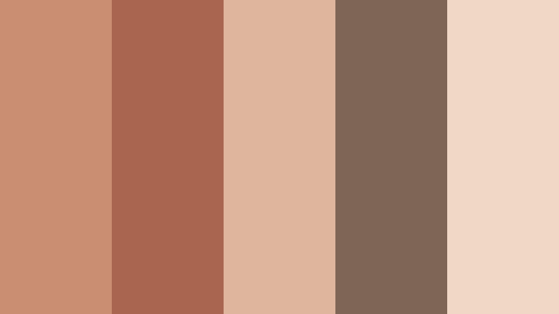
- HEX Codes: #c98f72, #a9654f, #e0b59d, #7d6655, #f0d8c5
- Mood: Organic, welcoming, and softly creative.
- Use for: Use this palette for handmade product videos, garden content, social posts, and artisanal packaging.
Clay Garden pairs terracotta warmth with muted blush and stone brown. The combination feels handcrafted and friendly, with enough variation to create hierarchy in a thumbnail, logo system, or video title sequence.
Use the soft blush tones as a background for product demonstrations, then bring in the deeper clay shades for captions and graphic accents. This palette is especially effective for handmade goods, gardening channels, craft tutorials, and brands that want an approachable visual identity.
Mossy Linen
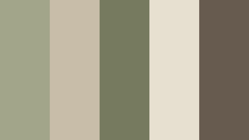
- HEX Codes: #a3a58b, #c8bda8, #777b5d, #e7dfd0, #665b4e
- Mood: Peaceful, earthy, and understated.
- Use for: Use this palette for nature documentaries, sustainable brands, minimalist websites, and relaxing YouTube thumbnails.
Mossy Linen combines soft olive, natural linen, and deep taupe for a balanced organic mood. Its muted colors feel quiet and editorial, making them useful when you want nature-inspired visuals without a highly saturated appearance.
Try the linen shade for title cards and webpage backgrounds, then use olive and taupe for icons, subtitles, and borders. In video, the palette works well with slow camera movement, natural textures, and documentary-style storytelling.
Harvest Cream
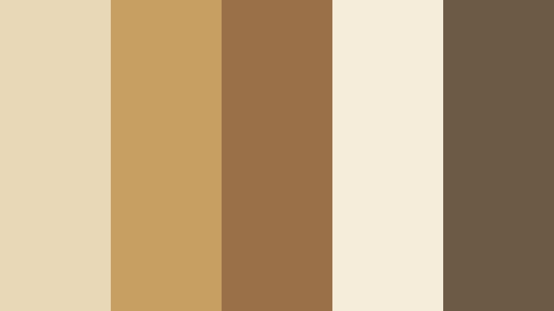
- HEX Codes: #e8d8b8, #c79f62, #9a7048, #f5edda, #6d5a45
- Mood: Comforting, bright, and inviting.
- Use for: Use this palette for food content, autumn campaigns, recipe thumbnails, home decor branding, and seasonal social content.
Harvest Cream adds golden warmth to creamy neutrals and roasted brown. It creates a cozy visual story without feeling overly dark or heavy, making it a natural choice for food, home, and seasonal content.
Use the cream tones to keep recipe cards and thumbnails easy to read, then add gold and brown for emphasis. The palette can also bring warmth to home decor videos, autumn intros, and branded social templates.
Rich And Rustic Earth Tone Color Palettes
Terracotta Dusk
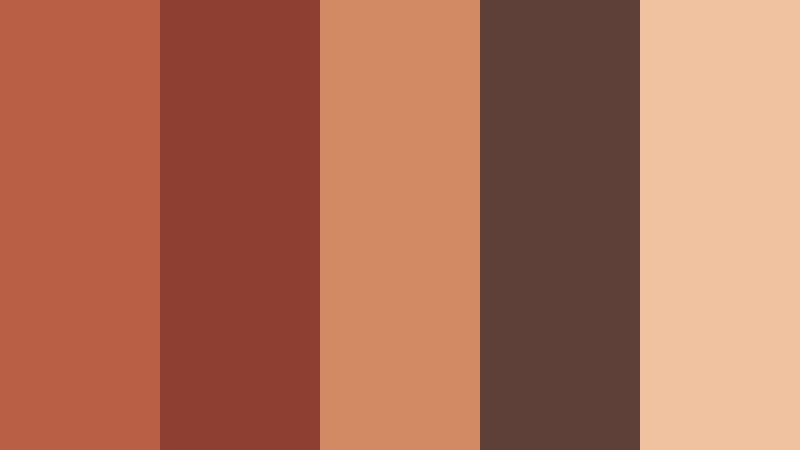
- HEX Codes: #b85f45, #8d3f32, #d18a62, #5e4038, #f0c2a0
- Mood: Passionate, rustic, and cinematic.
- Use for: Use this palette for travel films, bold video titles, restaurant branding, music thumbnails, and dramatic social campaigns.
Terracotta Dusk layers rich red clay with smoky brown and a muted peach highlight. The palette has a strong cinematic presence, with enough contrast to make titles, subjects, and transitions feel expressive.
Use the dark brown and deep red for dramatic title sequences or music content, while the peach shade can soften thumbnails and promotional graphics. Warm lighting and sunset footage will naturally complement this palette.
Canyon Ember

- HEX Codes: #a94f35, #c87545, #6f342b, #d9a06f, #3f3530
- Mood: Adventurous, energetic, and rugged.
- Use for: Use this palette for outdoor videos, adventure branding, sports intros, travel graphics, and attention-grabbing thumbnails.
Canyon Ember brings together burnt orange, canyon red, and charcoal brown for a strong natural contrast. It feels active and rugged, which makes it a good fit for visual stories built around movement, exploration, and challenge.
Use burnt orange for highlights and motion graphics, then balance it with charcoal for readable text. The pale sand color can create breathing room in an otherwise bold thumbnail or sports intro.
Walnut Hearth
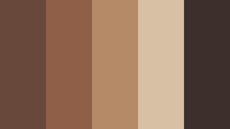
- HEX Codes: #68483b, #8f6047, #b58a67, #d8c0a5, #3d302b
- Mood: Cozy, refined, and intimate.
- Use for: Use this palette for coffee content, cinematic intros, luxury craft brands, podcast covers, and home design videos.
Walnut Hearth uses layered browns and warm wood tones to create a comfortable, premium atmosphere. The deep contrast helps text and subjects stand out while the lighter beige keeps the composition from becoming too dense.
This palette suits coffee reviews, podcast artwork, furniture videos, and quiet cinematic introductions. Pair the darkest shade with cream text for clarity, and use the midtone browns to connect overlays with natural wood, leather, or coffee imagery.
Copper Trail
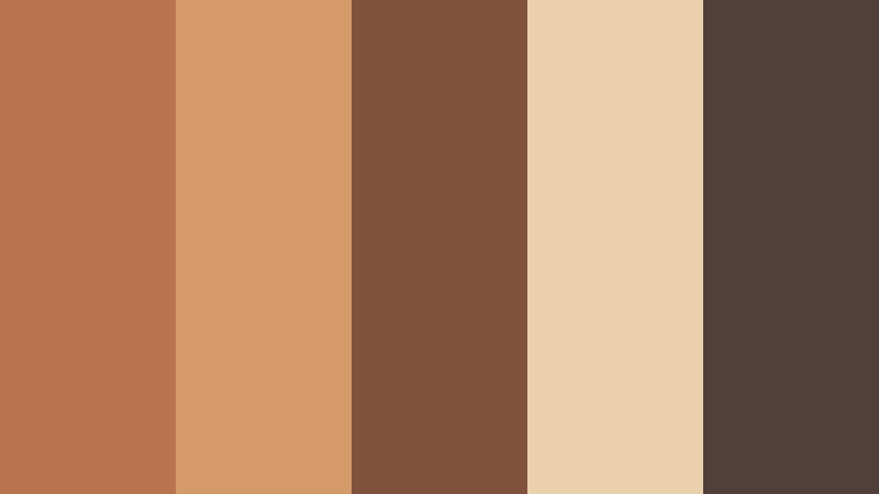
- HEX Codes: #b8734f, #d49a69, #80513d, #ead0ac, #514039
- Mood: Warm, confident, and adventurous.
- Use for: Use this palette for product launches, fashion reels, road trip edits, outdoor campaigns, and modern editorial layouts.
Copper Trail balances metallic warmth with earthy brown and pale sand. It feels energetic enough for motion graphics while staying naturally grounded, which gives it flexibility across both modern and rustic projects.
Use copper as a visual accent for product reveals, logo animation, or kinetic typography. The pale sand shade works well as a clean background, while the deep brown can create contrast in fashion reels, travel edits, and editorial designs.
Forest Cabin
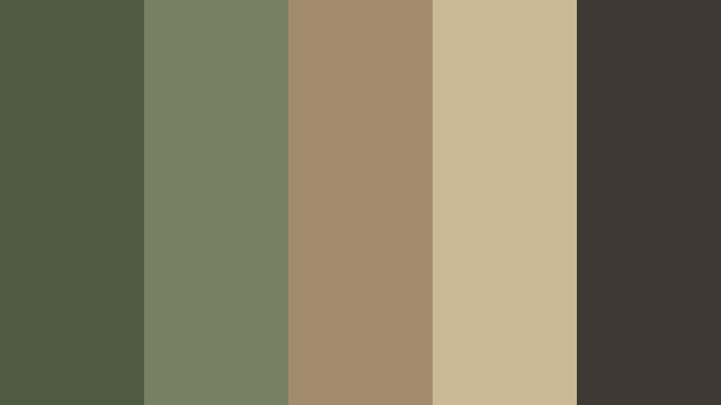
- HEX Codes: #4e5b43, #788064, #a18d6d, #cbb995, #3e3a32
- Mood: Sheltered, natural, and quietly sophisticated.
- Use for: Use this palette for cabin travel videos, outdoor lifestyle content, eco branding, documentary graphics, and cinematic lower thirds.
Forest Cabin pairs muted green with aged wood and a deep charcoal anchor. The result is rustic yet polished, with excellent readability for video design and a strong connection to forests, cabins, and outdoor environments.
Use green for background panels or environmental branding, then use aged wood tones for labels, icons, and transitions. Charcoal provides a dependable color for subtitles and lower thirds, especially when footage contains bright outdoor highlights.
Elegant And Modern Earth Tone Color Palettes
Taupe Minimal
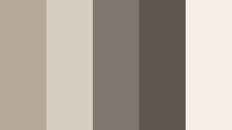
- HEX Codes: #b7a99a, #d7cec2, #81766d, #5d554e, #f2ede6
- Mood: Minimal, polished, and serene.
- Use for: Use this palette for UI design, clean brand intros, portfolio websites, product demos, and modern presentation slides.
Taupe Minimal uses soft gray-brown neutrals to create a sophisticated and uncluttered look. Its subtle contrast makes it easy to build a visual system that feels refined without competing with the main subject.
Use the light cream and taupe shades for interfaces, presentation slides, and clean title cards. The darker gray-browns can define navigation, captions, or product details while maintaining a calm and professional tone.
Olive Stone
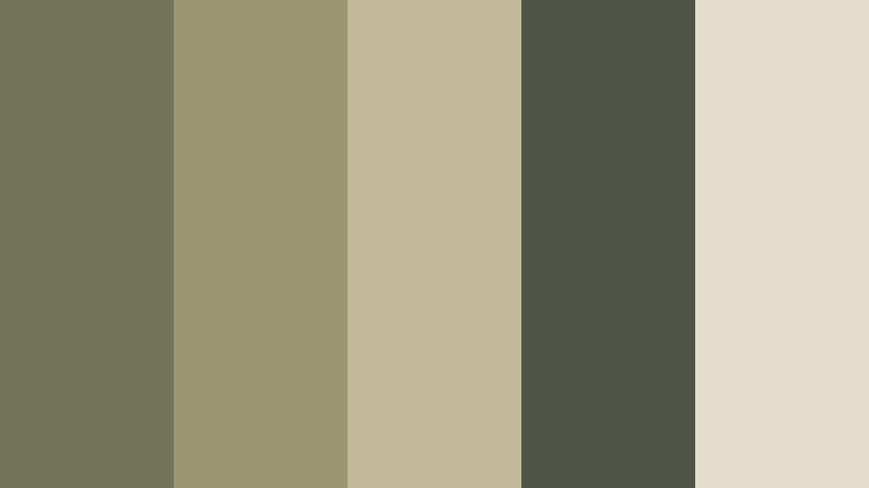
- HEX Codes: #73745a, #9b9671, #c2b89b, #4f5546, #e4ddcc
- Mood: Balanced, thoughtful, and contemporary.
- Use for: Use this palette for sustainable technology brands, editorial videos, app interfaces, wellness content, and educational graphics.
Olive Stone combines muted green with warm mineral neutrals for a modern organic finish. It adds personality to interfaces and graphics without becoming distracting or overly colorful.
This palette is useful for brands that want to suggest sustainability, intelligence, and calm progress. Use olive for buttons, icons, or title accents, and rely on the cream and stone shades for backgrounds and text areas.
Elegant And Modern Earth Tone Palettes
Desert Modern
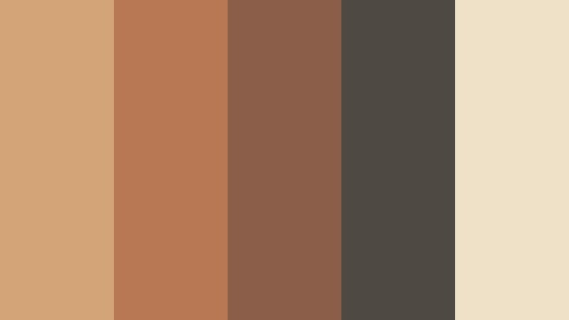
- HEX Codes: #d2a477, #b97854, #8b5e49, #4e4a43, #efe0c8
- Mood: Stylish, open, and sun-warmed.
- Use for: Use this palette for architecture videos, fashion branding, travel reels, modern packaging, and clean social templates.
Desert Modern blends pale sand with terracotta, rose brown, and charcoal. It feels contemporary while preserving the warmth of natural landscapes, giving creative projects an inviting but structured appearance.
Try the light sand shade as a background for architecture and fashion layouts. Terracotta and rose brown can add visual movement to titles and transitions, while charcoal gives enough contrast for captions and brand marks.
Sienna Gallery
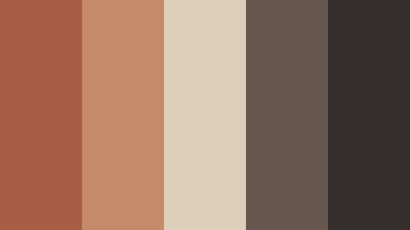
- HEX Codes: #a85d45, #c58a69, #ded0b8, #66564d, #342f2c
- Mood: Artistic, expressive, and gallery-inspired.
- Use for: Use this palette for art channels, creative portfolios, film titles, cultural campaigns, and premium social content.
Sienna Gallery creates a curated look with clay red, pale canvas, and dark umber. It is expressive enough for artistic projects and structured enough for branding, giving layouts a thoughtful gallery-like quality.
Use pale canvas as the foundation for portfolio pages or title cards, then introduce sienna for emphasis. The deep umber shade works well for film titles, captions, and premium packaging that needs a strong but elegant finish.
Coffee Paper
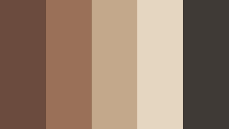
- HEX Codes: #6b4b3e, #987158, #c4a88b, #e5d6c2, #403a36
- Mood: Thoughtful, warm, and dependable.
- Use for: Use this palette for book trailers, podcast branding, cafe content, stationery design, and documentary thumbnails.
Coffee Paper combines roasted brown with creamy paper tones for a familiar editorial mood. Its restrained contrast works well for text-heavy visual storytelling, where clarity and atmosphere need to work together.
Use the cream shade as a paper-inspired background and the roasted brown for headlines or borders. This palette works particularly well for book-related content, cafe videos, podcast covers, and documentary designs with a reflective tone.
Stone And Sage
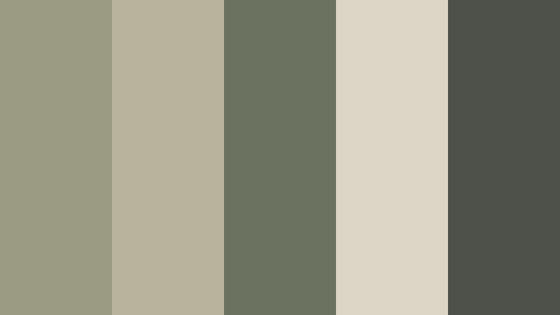
- HEX Codes: #9b9b83, #b9b29d, #6b725f, #dcd5c5, #4c5048
- Mood: Fresh, composed, and restorative.
- Use for: Use this palette for wellness videos, productivity content, eco packaging, calm UI themes, and minimalist brand systems.
Stone And Sage brings together soft mineral gray, sage green, and warm cream. It delivers a clean natural feeling for projects that need calm visual clarity, especially when the design should feel fresh without relying on bright colors.
Use sage for subtle calls to action, section labels, or graphic accents, then use cream and stone as the main surfaces. In video, this palette supports wellness tutorials, productivity edits, and slow-paced content with a restorative mood.
Tips for Creating Earth Tone Color Color Palettes
Earth Tone Color palettes become more effective when each shade has a clear role. Combine warm neutrals with carefully chosen accents, check readability on different screens, and match the palette to the lighting and emotional direction of your footage.
- Choose one dominant Earth Tone Color, one supporting shade, and one darker anchor so the design has a clear visual hierarchy.
- Use dark brown, charcoal, or deep olive for text when a warm neutral background does not provide enough contrast.
- Pair muted earth colors with cream or pale sand to create breathing room in thumbnails, title cards, and social graphics.
- Match the palette to the footage. Warm browns and terracotta work well with sunlight, wood, skin tones, stone, and natural landscapes.
- Use brighter accents sparingly. A small amount of copper, orange, or golden yellow can attract attention without overpowering the earthy base.
- Keep brand colors consistent across intros, lower thirds, thumbnails, end screens, and social templates.
- Test text and logo readability on both light and dark parts of the image before exporting the final video.
- Use color correction and filters consistently across clips so footage from different cameras still feels like part of the same project.
Earth Tone Color palettes can make a creative project feel grounded, welcoming, cinematic, or refined. Soft beige and linen shades are useful for calm lifestyle content, while terracotta, walnut, and forest tones can add depth to travel films, product branding, and dramatic intros.
The best palette depends on your story, audience, and footage. Start with one of the combinations above, test the HEX codes in your thumbnails or graphics, and adjust the brightness and saturation until the colors support your message.
Filmora makes it easier to carry a consistent Earth Tone Color look through titles, b-roll, filters, color adjustments, and social edits. Try several palette styles, compare the results, and save the combination that best represents your visual identity.
secure download