

 100% Security Verified | No Subscription Required | No Malware

Brand color palette choices shape how viewers feel before they process a logo, title, or message. Warm golds can feel friendly and optimistic, deep blues can suggest trust, and vivid pinks or purples can make a visual identity feel energetic and modern. The right combination helps a brand become easier to recognize across videos, thumbnails, intros, social posts, and promotional graphics.
This collection provides Brand Color Palette color palettes with HEX codes for creators, marketers, and Filmora users. Use these brand color palette color combinations as starting points for video editing, thumbnail design, logo concepts, title cards, and social media campaigns.
In this article
Warm & Welcoming Brand Color Palette Color Palettes
Golden Welcome

- HEX Codes: #f4b942, #f28f3b, #d95d39, #f7d488, #fff4d6
- Mood: Friendly, optimistic, and inviting with a lively sense of warmth.
- Use for: Use this palette for brand intros, welcome screens, lifestyle thumbnails, and upbeat social content.
Golden Welcome combines sunny gold with warm orange and coral to create an approachable visual identity. The pale cream tone gives the brighter shades room to breathe, while the coral accent adds enough contrast for titles, buttons, and graphic details.
Use this palette for creator channels, small-business videos, lifestyle branding, and cheerful promotional edits. Gold works well in opening animations, orange can highlight key information, and cream makes a comfortable background for thumbnails or end screens.
Pro Tip: Enhance Your Brand Color Palette Visuals with Filmora
Filmora can help keep the Golden Welcome palette consistent across your entire edit. Use the gold and orange shades in your intro, lower thirds, transitions, and call-to-action screens, then repeat coral accents in b-roll captions or thumbnail text for a unified look.
For lifestyle and welcome content, apply the warm colors selectively so footage still feels natural. A consistent accent color for titles and animated elements can make separate clips feel like part of the same brand system.
AI Color Palette
Creators can use a reference image, mood board, or digital color card based on Golden Welcome and apply its visual character across a complete video. Filmora's AI Color Palette feature helps match clips so different lighting conditions feel more connected.
This is useful when combining indoor footage, outdoor b-roll, and social cutdowns. Start with a clear reference image, then review the result and make small adjustments where skin tones or important product colors need to remain accurate.
 secure download

HSL, Color Wheels & Curves
Fine-tune Golden Welcome with HSL controls by increasing orange saturation for a more energetic look or softening yellow highlights for a gentle lifestyle aesthetic. Color wheels can warm the highlights while keeping shadows slightly neutral, and curves can add contrast without making the cream tones harsh.
Use these controls to balance mixed lighting across interviews, product shots, and b-roll. Small adjustments help preserve natural skin tones while giving titles, backgrounds, and transitions a cohesive warm finish.
secure download1000+ Video Filters & 3D LUTs
Filmora's video filters and 3D LUTs make it easy to stylize Golden Welcome without manually adjusting every clip. Choose a warm cinematic filter, then reduce its intensity so the gold, orange, and coral accents remain clear.
Filters are especially useful for quick social edits and recurring content series. Apply a similar look to intros, talking-head footage, product clips, and outro screens to strengthen visual recognition.
secure downloadSunlit Studio
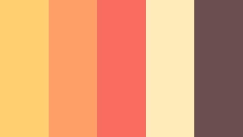
- HEX Codes: #ffcf70, #ff9f68, #f76c5e, #fceabb, #6b4f4f
- Mood: Bright, creative, and energetic with a handcrafted studio feel.
- Use for: Use this palette for creative tutorials, behind-the-scenes videos, product packaging, and maker brand graphics.
Sunlit Studio balances playful citrus tones with a grounding cocoa accent. The combination feels expressive and polished while retaining a personal, handmade character that suits creators and independent brands.
Use the light yellow and orange shades for backgrounds and highlights, then reserve coral for calls to action or thumbnail details. The cocoa tone works well for readable text, logos, and title cards.
Citrus Story

- HEX Codes: #f9c74f, #f9844a, #f94144, #90be6d, #f8f3e7
- Mood: Fresh, spirited, and playful with a natural burst of energy.
- Use for: Use this palette for food content, travel reels, wellness brands, colorful thumbnails, and short-form social videos.
Citrus Story pairs juicy oranges and reds with a crisp green highlight and an airy neutral. It creates an energetic look that catches attention quickly in feeds and video covers.
Use the green as a fresh supporting color rather than a dominant shade. The cream background can improve readability, while orange and red create strong visual anchors in captions, transitions, and product graphics.
Harvest Glow

- HEX Codes: #7f5539, #a68a64, #ddb892, #ede0d4, #b08968
- Mood: Grounded, cozy, and authentic with a refined autumn atmosphere.
- Use for: Use this palette for craft brands, documentary storytelling, seasonal campaigns, cafes, and warm cinematic overlays.
Harvest Glow builds a natural brand presence from earthy browns, sand, and soft cream. It feels dependable and intimate across packaging, title cards, editorial design, and cinematic content.
Use the darker brown for logos and typography, then layer tan and cream into backgrounds or slow transitions. This palette is especially effective for documentary footage, cafe content, handmade products, and autumn campaigns.
Bold & Energetic Brand Color Palette Color Palettes
Electric Launch

- HEX Codes: #5a189a, #9d4edd, #00b4d8, #00f5d4, #f7fff7
- Mood: Confident, futuristic, and high-energy with a strong digital edge.
- Use for: Use this palette for tech launches, gaming content, motion graphics, app interfaces, and bold YouTube thumbnails.
Electric Launch combines vivid violet with cyan and aqua for a modern, screen-ready identity. The pale neutral keeps the brightest colors readable and prevents the design from becoming visually crowded.
Use violet for large areas or title backgrounds, then apply cyan and aqua to buttons, progress bars, animated lines, and interface details. It is a strong choice for technology, gaming, and digital product videos.
Neon Momentum

- HEX Codes: #ff006e, #fb5607, #ffbe0b, #8338ec, #3a86ff
- Mood: Daring, dynamic, and expressive with a festival-like visual pulse.
- Use for: Use this palette for music videos, event promotions, sports edits, creator branding, and high-impact social graphics.
Neon Momentum layers hot pink, orange, yellow, purple, and blue into a maximalist combination. It is designed to stand out in fast-moving content and attention-led campaigns.
Because every color is strong, assign each shade a clear role. Use one dominant background color, one main accent, and smaller neon details for animated captions, stickers, transitions, or thumbnail highlights.
Firefly Signal
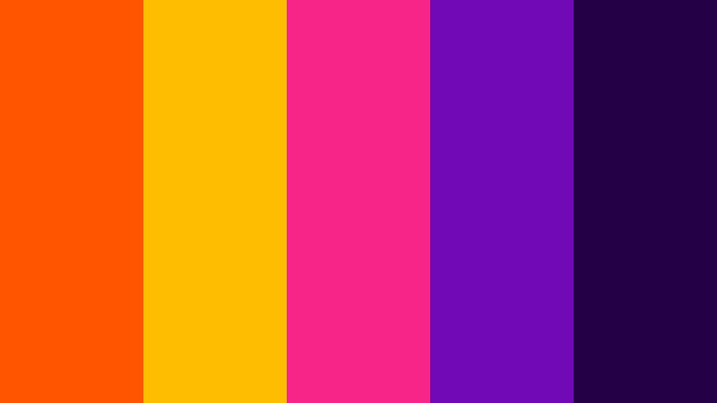
- HEX Codes: #ff5400, #ffbd00, #f72585, #7209b7, #240046
- Mood: Dramatic, magnetic, and adventurous with a glowing night-time feel.
- Use for: Use this palette for cinematic intros, nightlife campaigns, entertainment channels, posters, and dramatic title sequences.
Firefly Signal places fiery orange and gold against deep violet for a luminous contrast. The pink accent adds personality to bold visual storytelling and entertainment design.
Use the deep violet as a cinematic base and bring in orange or gold for light flares, title animation, and focal points. Pink can support music, nightlife, and creator-led content without overwhelming the composition.
Pop Creative

- HEX Codes: #06d6a0, #1b9aaa, #ef476f, #ffd166, #073b4c
- Mood: Playful, smart, and upbeat with a friendly contemporary character.
- Use for: Use this palette for educational content, podcasts, startup branding, explainer videos, and animated social posts.
Pop Creative mixes mint, teal, coral, and yellow with a deep blue anchor. It delivers a cheerful but organized look that supports clear visual communication.
Use deep blue for body text and title backgrounds, then assign mint or teal to supporting graphics. Coral and yellow can highlight key ideas, speaker names, data points, and animated callouts.
Calm & Trustworthy Brand Color Palette Color Palettes
Clear Horizon

- HEX Codes: #0b3954, #087e8b, #bfd7ea, #ff5a5f, #f5f1ed
- Mood: Reliable, open, and refreshing with a sense of forward movement.
- Use for: Use this palette for education platforms, travel videos, service brands, presentations, and clean website interfaces.
Clear Horizon pairs trustworthy blue tones with a coral point of interest and a soft neutral base. It feels professional while remaining warm and accessible.
Use navy and teal for logos, headers, and information panels. Coral is effective for buttons, map markers, important words, and thumbnail accents, while the pale neutral keeps layouts clean.
Quiet Current

- HEX Codes: #264653, #2a9d8f, #8ab17d, #e9c46a, #f4f1de
- Mood: Balanced, natural, and thoughtful with a relaxed editorial tone.
- Use for: Use this palette for wellness videos, sustainability projects, calm vlogs, editorial layouts, and nature-inspired branding.
Quiet Current brings together deep sea blue, teal, sage, and muted gold. Its organic balance supports soothing visuals, mindful storytelling, and long-form content.
Use the ivory shade for spacious backgrounds and the deep blue for readable text. Sage and teal work well in nature footage, while muted gold can add warmth to captions, chapter markers, and subtle transitions.
Oceanic Balance

- HEX Codes: #023047, #219ebc, #8ecae6, #ffb703, #fb8500
- Mood: Clear, confident, and adventurous with a bright coastal spirit.
- Use for: Use this palette for travel channels, outdoor campaigns, environmental brands, dashboards, and informative video graphics.
Oceanic Balance combines layered blues with lively amber and orange accents. The result feels dependable enough for interfaces while still suggesting exploration and movement.
Use the darkest blue for headings and navigation, light blue for open backgrounds, and amber or orange for buttons and visual markers. The palette works well for travel maps, outdoor videos, environmental storytelling, and data-led graphics.
Sage Perspective
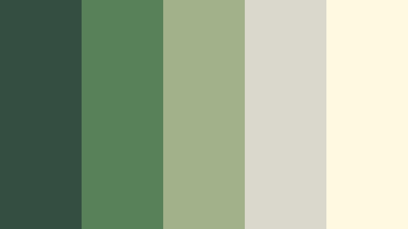
- HEX Codes: #344e41, #588157, #a3b18a, #dad7cd, #fefae0
- Mood: Peaceful, grounded, and intelligent with a quietly premium feel.
- Use for: Use this palette for coaching content, sustainable packaging, minimalist vlogs, wellness interfaces, and brand presentations.
Sage Perspective uses layered greens with stone and ivory for a calm, credible appearance. It is ideal when a brand needs to feel considered, natural, and enduring.
Use dark green for strong typography and logos, sage for secondary panels, and ivory for backgrounds. The palette is especially effective with soft natural light, slow-paced edits, clean presentations, and wellness-focused content.
Modern & Premium Brand Color Palette Color Palettes
Midnight Signature

- HEX Codes: #0b132b, #1c2541, #3a506b, #5bc0be, #f0f3bd
- Mood: Sophisticated, focused, and cinematic with a precise modern edge.
- Use for: Use this palette for luxury brand intros, professional portfolios, SaaS interfaces, title cards, and sleek presentation design.
Midnight Signature layers deep navy and slate with aqua and soft lime highlights. It creates a premium digital identity that feels controlled, memorable, and polished.
Use navy and slate for backgrounds, panels, and title sequences. Aqua can draw attention to interactive details or key words, while the pale lime shade adds a refined highlight to logos and motion graphics.
Monochrome Authority
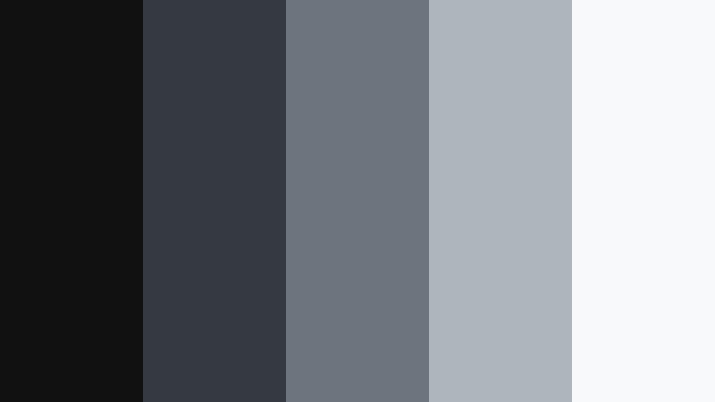
- HEX Codes: #111111, #343a40, #6c757d, #adb5bd, #f8f9fa
- Mood: Minimal, authoritative, and refined with a versatile editorial finish.
- Use for: Use this palette for corporate videos, portfolio websites, fashion campaigns, film titles, and clean user interfaces.
Monochrome Authority builds visual hierarchy through black, charcoal, gray, and white. It is a dependable choice for brands that want clarity, restraint, and timeless appeal.
Use contrast rather than many colors to guide attention. Black and charcoal create strong title cards, mid-gray supports secondary information, and white or light gray keeps thumbnails and interfaces easy to read.
Copper Atelier
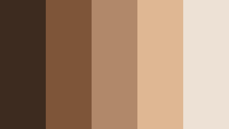
- HEX Codes: #3d2b1f, #7f5539, #b08968, #ddb892, #ede0d4
- Mood: Artisanal, luxurious, and warm with a tactile boutique atmosphere.
- Use for: Use this palette for fashion reels, artisan products, boutique packaging, interior design content, and elegant brand storytelling.
Copper Atelier blends rich espresso with copper, tan, and cream for a crafted premium look. It adds warmth and depth to visual identities that value detail and materiality.
Use espresso for logos, elegant typography, and cinematic backgrounds. Copper and tan can add a metallic or handcrafted impression to product videos, while cream creates a soft foundation for packaging and social layouts.
Tips for Creating Brand Color Palette Color Palettes
A strong Brand Color Palette color palette should be attractive but also practical. Combine dominant, supporting, and accent shades so your videos and designs remain readable, consistent, and appropriate for the audience and message.
- Choose one dominant color for backgrounds, title cards, or large brand areas, then use supporting shades to create hierarchy.
- Check contrast between text and backgrounds so captions, subtitles, logos, and thumbnail headlines remain easy to read.
- Use bright accent colors sparingly for calls to action, important words, buttons, transitions, and visual markers.
- Match your palette to the footage. Warm palettes suit golden-hour scenes and lifestyle content, while cool palettes often support technology, travel, or professional subjects.
- Keep recurring elements consistent across intros, lower thirds, end screens, thumbnails, and social media templates.
- Test colors on both desktop and mobile screens because saturation and contrast can appear different across displays.
- Protect skin tones and important product colors when applying filters, LUTs, or broad color adjustments.
- Save HEX values in a brand reference sheet so collaborators can reproduce the same look in video, design, and marketing materials.
Brand Color Palette choices can define the emotional direction of a project before a viewer hears the first line of dialogue. Warm combinations can make a channel feel welcoming, bold palettes can create instant energy, calm colors can build trust, and premium neutrals can communicate focus and quality.
Use the HEX codes in this guide as practical starting points, then adjust saturation, brightness, and contrast to match your footage. Filmora makes it easier to test these brand color palette ideas across intros, thumbnails, social edits, and complete video projects.
Try several combinations with your own footage and compare how each one changes the mood, readability, and consistency of your content.
secure download