

 100% Security Verified | No Subscription Required | No Malware

Complementary Color creates visual energy by placing contrasting hues side by side. This relationship can make key elements stand out, guide attention, and give a project a clear emotional direction. Depending on the colors you pair, the result can feel romantic, bold, refined, natural, or playful.
These Complementary Color color palettes with HEX codes are designed for creators, video editors, and Filmora users. Use them for video intros, thumbnails, branding, social posts, title cards, lifestyle edits, and other creative projects that need balanced contrast and a memorable visual identity.
In this article
Soft & Romantic Complementary Color Palettes
Blush And Charcoal Luxe
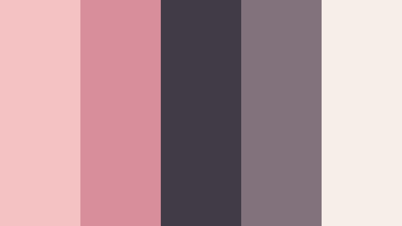
- HEX Codes: #f4c2c2, #d98f9b, #403b45, #81727b, #f7eee8
- Mood: Romantic, refined, and softly dramatic.
- Use for: This palette works well for beauty thumbnails, wedding videos, lifestyle branding, and elegant social content.
Blush tones bring warmth and softness, while charcoal adds sophisticated contrast. The creamy neutral keeps the combination balanced, so the palette feels intimate without losing its premium character.
Use blush for backgrounds, overlays, or gentle title treatments, then introduce charcoal for text, borders, and focal details. This approach works especially well in wedding intros, beauty tutorials, boutique branding, and polished lifestyle thumbnails.
Pro Tip: Enhance Your Complementary Color Visuals with Filmora
Filmora can help you carry the blush and charcoal look through an entire edit instead of limiting it to a single thumbnail or title card. Use blush-inspired overlays for transitions and soft b-roll moments, then repeat charcoal in captions, lower thirds, and end screens to create a consistent visual rhythm.
For a refined result, keep the pale blush and cream tones dominant while using charcoal sparingly for emphasis. This preserves readability and gives your intros, product shots, and social edits a cohesive luxury feel.
AI Color Palette
Filmora's AI Color Palette feature can take the blush, rose, charcoal, and cream tones from a reference image or color card and apply a similar look across your video. It is useful when footage comes from different cameras or locations and needs a unified visual identity.
Apply the palette to wedding footage, beauty b-roll, or lifestyle scenes, then make small manual adjustments if you want warmer skin tones or deeper charcoal shadows. This makes it easier to maintain the same romantic direction from the opening frame to the final card.
 secure download

HSL, Color Wheels & Curves
Use HSL controls to fine-tune the balance between blush, rose, charcoal, and cream. You can lower saturation in the pink tones for a softer editorial finish, deepen the shadows for more drama, or lift the highlights to keep pale backgrounds clean and airy.
Color wheels and curves provide more control over the cinematic quality of the palette. Add subtle warmth to highlights, cool the shadows slightly, and use curves to protect skin tones while giving charcoal details enough definition.
secure download1000+ Video Filters & 3D LUTs
Filmora's filters and LUTs can quickly shift this palette toward a soft romantic grade, a muted fashion look, or a richer cinematic style. Start with a gentle preset, then reduce its intensity so the blush remains natural and charcoal details do not become too heavy.
Filmora's video filters and 3D LUTs make it easy to test several creative directions without rebuilding your color treatment from scratch. Use a consistent preset across b-roll, title sequences, and social exports for a polished final look.
secure downloadLavender Ember Dream
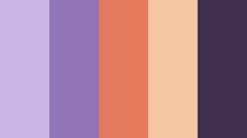
- HEX Codes: #c8b6e2, #9274b8, #e47b5d, #f4c7a1, #3e3150
- Mood: Dreamy, expressive, and gently energetic.
- Use for: This palette is ideal for music edits, creative portfolios, vlog covers, and expressive brand intros.
Lavender and ember orange create a memorable complementary relationship with a creative edge. The pale peach shade adds softness, while deep plum anchors the look and creates a stronger visual hierarchy.
Use lavender for atmospheric backgrounds and motion graphics, then bring in ember orange for calls to action, beat-synced accents, or important thumbnail details. It gives creative portfolios and music edits a distinctive identity.
Peach Teal Serenade
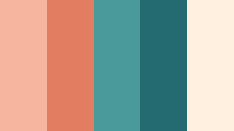
- HEX Codes: #f6b59f, #e27d60, #4b9a9a, #236b70, #fff0df
- Mood: Fresh, welcoming, and cheerful.
- Use for: Use this palette for food videos, travel reels, lifestyle thumbnails, and friendly social media graphics.
Peach creates a sunny foundation while teal provides cooling contrast. The combination feels inviting without becoming overly playful, making it flexible for both casual and polished content.
Use peach in backgrounds, captions, and warm footage, while teal can define titles, icons, transitions, or highlighted objects. The palette is especially effective for travel reels and food content that needs a bright but controlled visual style.
Rosewood Mint Whisper
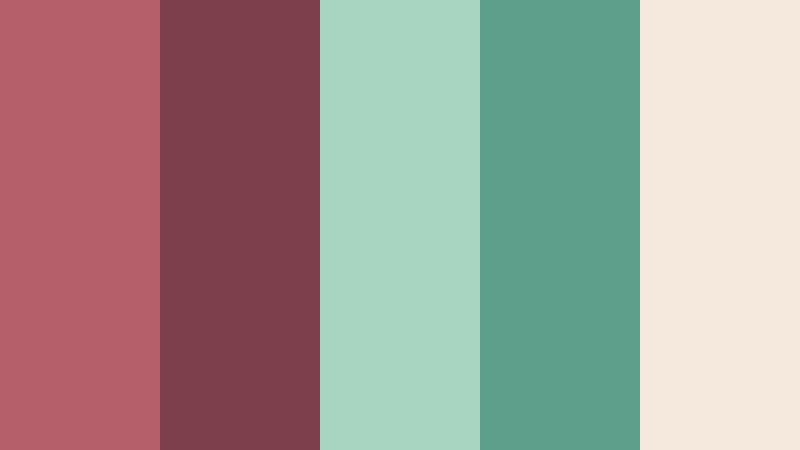
- HEX Codes: #b45f69, #7e3f4d, #a8d5c2, #5c9f8a, #f5e8dc
- Mood: Calm, graceful, and quietly luxurious.
- Use for: This palette suits fashion edits, boutique packaging, wellness content, and sophisticated presentation slides.
Muted rosewood meets refreshing mint for a balanced and upscale mood. Creamy neutrals soften the contrast and give the palette a graceful finish that does not feel too intense.
Rosewood is useful for strong headings, product details, and elegant transitions, while mint works well for backgrounds and subtle graphic accents. Try it in fashion lookbooks, wellness videos, boutique promos, and calm presentation designs.
Bold & Vibrant Complementary Color Palettes
Electric Blue Tangerine

- HEX Codes: #1479d1, #0b3d91, #f28c28, #ffc857, #f7f9fc
- Mood: Energetic, confident, and attention-grabbing.
- Use for: This palette is effective for gaming thumbnails, sports edits, tech launches, and high-impact social content.
Electric blue and tangerine deliver immediate contrast and strong screen presence. The deep blue provides stability, while orange and golden yellow bring movement and urgency to focal areas.
Use blue as the main brand or background color and reserve tangerine for buttons, key words, player highlights, and action moments. White space helps keep the palette clean and readable in fast-moving video content.
Violet Citrus Rush
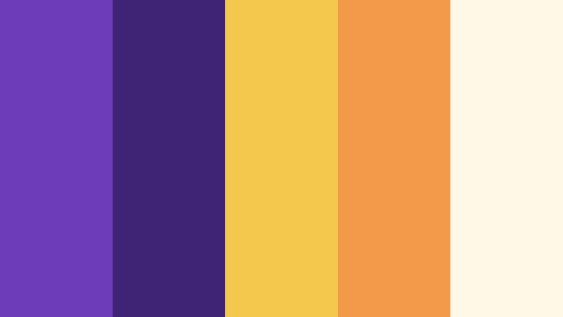
- HEX Codes: #6c3db8, #3f2375, #f2c94c, #f2994a, #fff8e7
- Mood: Playful, inventive, and full of momentum.
- Use for: This palette works well for creator branding, event promos, animated titles, and upbeat video intros.
Rich violet gains brightness from citrus yellow and orange accents. The contrast feels lively and inventive, while the deep plum shade gives the palette enough structure for clear visual hierarchy.
Try violet in title cards, animated backgrounds, and channel graphics, then use citrus tones to draw attention to important words or transitions. It is a strong option for projects that need energy, personality, and a modern creator feel.
Crimson Aqua Impact

- HEX Codes: #c6284f, #801b39, #29c4c7, #117c83, #fff3f0
- Mood: Daring, modern, and highly expressive.
- Use for: Choose this palette for music thumbnails, fashion campaigns, entertainment graphics, and bold channel art.
Crimson adds intensity while aqua introduces a sharp, contemporary counterpoint. The pale background gives these saturated colors room to stand out without making the overall composition feel crowded.
Use crimson for emotional emphasis and aqua for motion, technology, or freshness. The pairing can make music edits, fashion campaigns, and entertainment intros feel confident and visually memorable.
Lime Plum Voltage
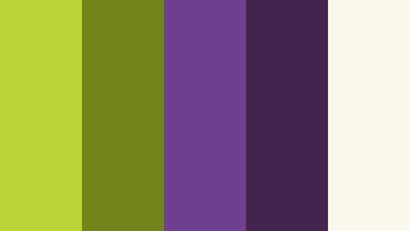
- HEX Codes: #b7d334, #72851b, #713f8f, #432650, #faf7ed
- Mood: Experimental, spirited, and visually electric.
- Use for: This palette is a strong choice for gaming overlays, youth campaigns, creative apps, and edgy motion graphics.
Acidic lime and deep plum create a striking, unconventional contrast. Lime brings immediate energy, while plum adds depth and a slightly mysterious quality.
Use cream as a stabilizing background, plum for large areas or dark interfaces, and lime for badges, icons, and animated accents. This system works well when you want a bold identity that still remains usable across screens.
Elegant & Modern Complementary Color Palettes
Navy Coral Atelier
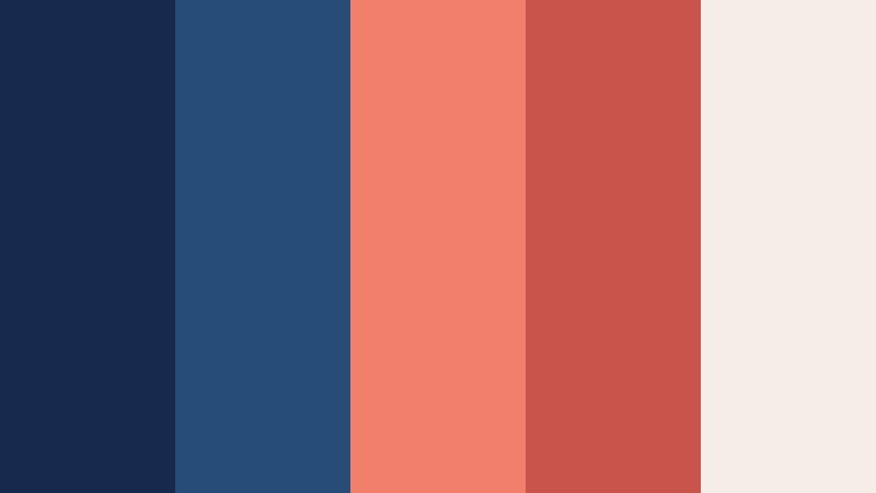
- HEX Codes: #172a4d, #274c77, #f0806b, #c8554c, #f4eee6
- Mood: Sophisticated, composed, and warmly contemporary.
- Use for: Use this palette for corporate videos, portfolio sites, editorial layouts, and premium product presentations.
Navy provides a dependable foundation while coral adds human warmth and focus. The pale neutral makes the combination feel open and modern, allowing the darker tones to appear professional without becoming severe.
Use navy for title cards, navigation elements, and main backgrounds, then introduce coral in highlights, product details, and calls to action. It is a versatile palette for professional videos that still need a welcoming personality.
Forest Rose Minimal
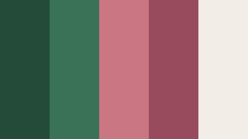
- HEX Codes: #244b3a, #397255, #c97883, #984b5c, #f3eee5
- Mood: Grounded, elegant, and thoughtfully balanced.
- Use for: This palette fits eco-conscious branding, documentary titles, wellness content, and minimalist packaging.
Forest green feels natural and stable beside muted rose accents. Soft ivory creates a calm visual base and prevents the deeper shades from making the composition feel too heavy.
Use forest tones for backgrounds and brand foundations, then apply rose to titles, transitions, or human-centered details. The palette suits documentary openings, wellness campaigns, and sustainable product stories.
Slate Gold Contrast
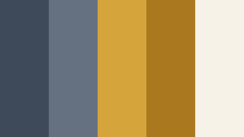
- HEX Codes: #3e4a59, #657180, #d5a53c, #a9781f, #f7f2e8
- Mood: Polished, confident, and quietly luxurious.
- Use for: This palette is well suited to finance videos, luxury branding, title cards, presentation decks, and premium UI design.
Cool slate tones make metallic gold accents feel richer and more intentional. The warm neutral background supports a refined finish while giving the darker colors enough contrast for readable text.
Use slate for large surfaces, charts, and video backgrounds, then reserve gold for statistics, borders, logos, and key transitions. The result feels premium without relying on excessive saturation or decorative effects.
Indigo Marigold Frame

- HEX Codes: #29356f, #4b5db1, #e5a72e, #c47d1b, #fbf5df
- Mood: Intelligent, vibrant, and editorial.
- Use for: Use this palette for educational videos, editorial thumbnails, cultural projects, and polished digital interfaces.
Indigo creates depth while marigold delivers warmth and visual direction. The balance gives the palette authority without making it feel distant or overly formal.
Use indigo for information-heavy layouts and title backgrounds, then apply marigold to highlights, section markers, and animated accents. It works especially well for educational content that needs to feel both trustworthy and creative.
Natural & Earthy Complementary Color Palettes
Terracotta Sage Retreat
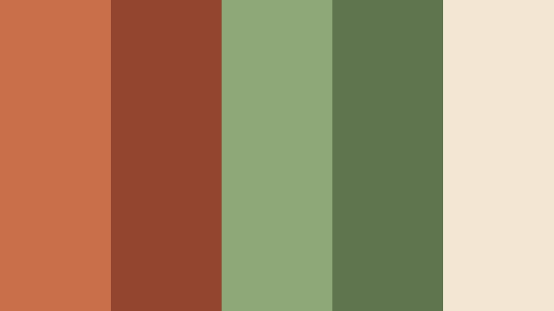
- HEX Codes: #c96f4a, #93462f, #8fa878, #5e754e, #f3e6d2
- Mood: Earthy, restorative, and welcoming.
- Use for: This palette works beautifully for home videos, travel content, sustainable brands, and cozy lifestyle thumbnails.
Terracotta brings sunbaked warmth while sage adds a peaceful natural counterbalance. Beige tones help the palette feel relaxed and approachable, making it suitable for both personal and commercial storytelling.
Use terracotta for warm titles, kitchen details, and sunset footage, while sage can support nature shots, labels, and background elements. The palette is a natural fit for home tours, travel films, and sustainable brand videos.
Ocean Clay Horizon
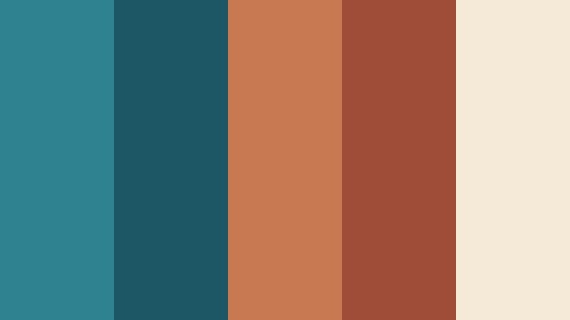
- HEX Codes: #2f8290, #1d5665, #c87952, #9f4d38, #f5e9d8
- Mood: Adventurous, grounded, and serene.
- Use for: Choose this palette for travel films, outdoor campaigns, documentary graphics, and nature-inspired brand identities.
Ocean blue and clay orange echo the contrast between water and earth. The result feels adventurous but stable, with a soft neutral that keeps the deeper colors comfortable in video and print.
Use ocean shades for sky, water, and broad backgrounds, then bring in clay for maps, location markers, captions, or warm landscape details. This palette can connect outdoor footage with a strong, recognizable brand system.
Moss Berry Hearth
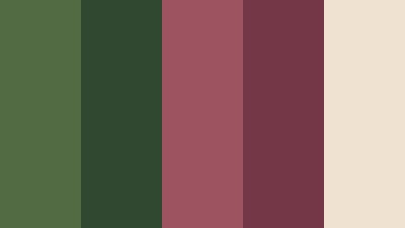
- HEX Codes: #526b43, #30482f, #9e5361, #743747, #f0e2d0
- Mood: Cozy, organic, and richly atmospheric.
- Use for: This palette is ideal for autumn reels, cooking content, artisan products, book covers, and warm seasonal branding.
Moss green and berry red create a natural contrast with a cozy, handcrafted feeling. The soft neutral keeps the deeper shades approachable and gives the palette a comfortable seasonal character.
Use moss for backgrounds, foliage, and grounded brand elements, while berry can highlight recipes, product details, and important words. It is a strong choice for cooking videos, artisan campaigns, autumn reels, and atmospheric book-related content.
Tips for Creating Complementary Color Color Palettes
Successful Complementary Color combinations depend on more than choosing two opposite hues. Consider contrast, proportion, footage, readability, and brand consistency so your colors support the story instead of competing with it.
- Choose one dominant color and use its complementary partner as an accent for better visual balance.
- Adjust saturation when the contrast feels too intense, especially in long-form videos or text-heavy layouts.
- Use light neutrals such as cream, ivory, or soft gray to create breathing room between strong color areas.
- Check text readability against every background and add shadows, outlines, or darker panels when needed.
- Match the palette to the footage. Warm complementary colors often suit sunlight and skin tones, while cooler combinations can support technology or nighttime scenes.
- Repeat the same accent color in intros, lower thirds, thumbnails, transitions, and end screens to build branding consistency.
- Use color temperature to shape emotion. Warm accents can make a video feel friendly and energetic, while cool counterparts can add calm or authority.
- Test the palette on mobile screens and in different export formats to make sure contrast and detail remain clear.
Complementary Color palettes can shape the mood of a project in a matter of seconds. Soft blush and charcoal can suggest elegance, blue and orange can add energy, and earthy green and terracotta can make a brand feel grounded and welcoming.
The best palette is one that supports your subject, audience, and editing style. Use the HEX codes as a starting point, then adapt saturation, brightness, and proportions to match your footage and platform.
Filmora makes it easier to test these combinations across video edits, thumbnails, intros, transitions, and branded graphics. Try an AI-based color match, refine the grade with HSL controls, or explore filters and 3D LUTs until the visual direction feels consistent.
secure download