

 100% Security Verified | No Subscription Required | No Malware

Warm Tone Color palettes are associated with comfort, energy, optimism, and human connection. Shades such as peach, coral, terracotta, amber, and rose can make a visual feel more welcoming, expressive, or cinematic, depending on their brightness and contrast.
These colors work well in video intros, vlogs, thumbnails, branding, social media graphics, product presentations, and lifestyle content. Below, you will find Warm Tone Color color palettes with HEX codes for creators, designers, and Filmora users who want to build a consistent and memorable visual style.
In this article
Soft & Romantic Warm Tone Color Palettes
Peach Petal Glow

- HEX Codes: #fff0dc, #ffd1b8, #f5a98f, #d9786c, #9f4f51
- Mood: Gentle, affectionate, and softly nostalgic.
- Use for: Use it for lifestyle thumbnails, wedding videos, beauty content, and soft social media graphics.
Peach Petal Glow combines airy peach with muted rose for a tender, welcoming look. The lightest shades create a clean and delicate background, while the deeper rose tones add enough contrast for titles, borders, and visual accents.
Use this palette for romantic storytelling, wedding montages, beauty branding, and lifestyle videos. In Filmora, it can help unify soft b-roll, close-up portraits, floral details, and warm social media graphics without making the footage feel overly saturated.
Pro Tip: Enhance Your Warm Tone Color Visuals with Filmora
Peach Petal Glow is especially effective when the same gentle warmth appears across your intro, talking-head footage, b-roll, and end screen. Filmora can help you maintain a consistent visual direction by matching clips, adjusting color temperature, and applying coordinated effects throughout the project.
Keep the pale peach shades for backgrounds and highlights, then reserve muted rose for captions, transitions, and key branding elements. This approach creates a soft hierarchy that feels polished across thumbnails, vertical edits, and longer lifestyle videos.
AI Color Palette
Creators can use a reference image, mood board, or digital color card to capture the creamy peach and rose balance of this palette. Filmora's AI Color Palette feature can apply the selected color character across an entire video, helping different clips feel like part of the same visual story.
This is useful when footage comes from multiple cameras or different lighting conditions. Apply the palette first, then make small adjustments to skin tones and exposure so the result remains natural.
 secure download

HSL, Color Wheels & Curves
Use HSL controls to fine-tune the peach, coral, and rose tones in your footage. You can slightly reduce orange saturation for a more editorial result, lift warm highlights for a soft glow, or deepen the shadows with a restrained red-magenta shift for a more cinematic finish.
Color wheels and curves are useful for balancing skin tones against the background. Keep skin natural while adding peach warmth to highlights and a subtle rose tone to the shadows. The color grading tutorial can help you understand how these controls work together.
secure download1000+ Video Filters & 3D LUTs
Filmora's library of filters and LUTs makes it easy to give Peach Petal Glow a consistent finishing style. Try a soft portrait look for beauty content, a faded film effect for nostalgic vlogs, or a gentle warm filter for wedding and couple videos.
Filmora's video filters and 3D LUTs make it easy to test several variations while keeping the underlying peach and rose palette intact. Lower the intensity when you want the colors to remain subtle and natural.
secure downloadRosewood Blush
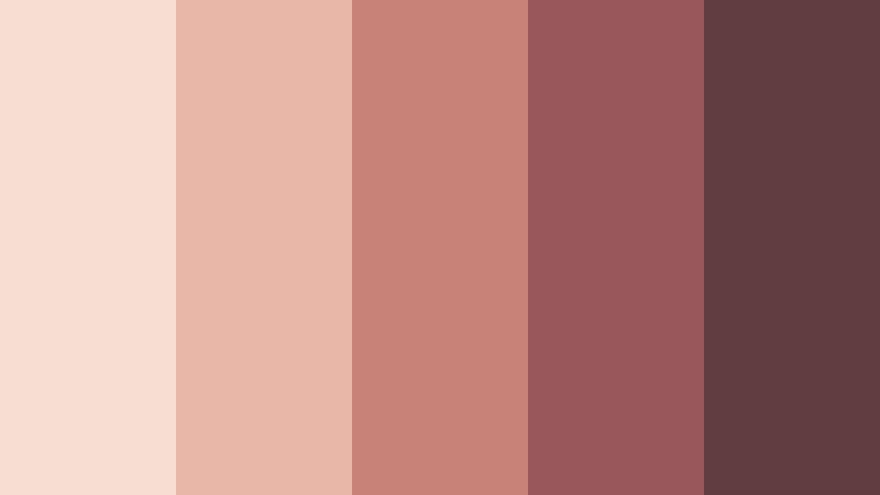
- HEX Codes: #f7ddd2, #e8b7a8, #c98278, #99565b, #613d42
- Mood: Elegant, intimate, and quietly confident.
- Use for: Use it for fashion reels, personal brands, editorial layouts, and cinematic title cards.
Rosewood Blush layers delicate blush shades with deep rosewood accents. The result feels polished enough for editorial design while remaining warm and approachable. Its pale blush tones create breathing room, while the darker shades add sophistication.
Use the lighter colors in fashion reel backgrounds and title cards, then bring in the deep rosewood for logos, subtitles, or dramatic transitions. This palette also suits personal branding where you want a refined look that still feels personal and welcoming.
Honeyed Romance
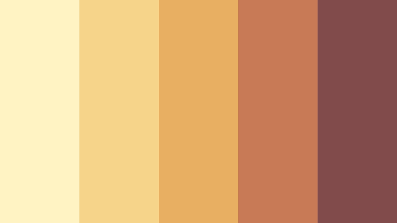
- HEX Codes: #fff3c4, #f5d58a, #e8ae62, #c87955, #814b4b
- Mood: Sunny, affectionate, and inviting.
- Use for: Use it for travel vlogs, couple content, food videos, and cheerful campaign graphics.
Honeyed Romance blends golden light with warm terracotta and berry-brown depth. It creates an optimistic visual story with a soft romantic edge, making ordinary scenes feel sunlit and emotionally engaging.
The palette works well for travel vlogs, couple videos, food content, and cheerful campaign graphics. Use golden yellow for highlights and backgrounds, then add terracotta or berry-brown accents to improve text readability and visual balance.
Candlelit Apricot
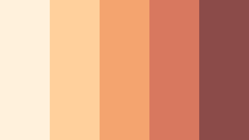
- HEX Codes: #fff1dc, #ffd09b, #f3a56d, #d8785f, #8b4b48
- Mood: Cozy, intimate, and softly radiant.
- Use for: Use it for home decor content, evening vlogs, recipe videos, and cozy product packaging.
Candlelit Apricot captures the glow of a late evening room with creamy highlights and apricot warmth. The darker reddish-brown shade adds depth without taking away from the palette's comforting character.
It is ideal for home decor videos, evening routines, recipe content, and product packaging with a personal feel. Use the creamy tones for clean layouts and the deeper accents for captions, icons, and intro titles.
Bold & Vibrant Warm Tone Color Palettes
Sunset Market

- HEX Codes: #ffd166, #f28f3b, #e85d3f, #b83250, #54213a
- Mood: Energetic, expressive, and adventurous.
- Use for: Use it for travel thumbnails, music promos, event branding, and high-energy social content.
Sunset Market pairs vivid yellow, orange, coral, and berry tones for instant visual impact. Its lively contrast helps important text and imagery stand out, even in fast-moving social feeds.
Use yellow and orange for large graphic areas, coral for calls to action, and berry tones for readable text or framing. The palette is a strong choice for travel videos, event promos, music graphics, and bold thumbnail designs.
Spiced Paprika
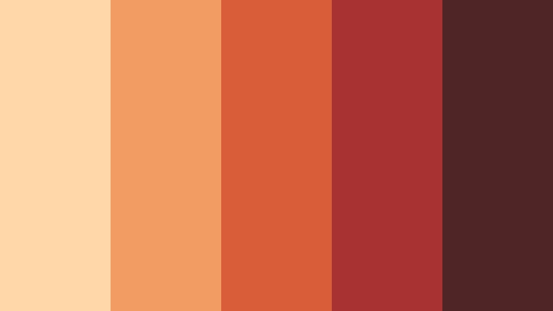
- HEX Codes: #ffd7a8, #f29b62, #d95d39, #a83232, #4f2525
- Mood: Bold, flavorful, and grounded.
- Use for: Use it for cooking channels, restaurant branding, bold thumbnails, and fashion campaign graphics.
Spiced Paprika delivers a rich blend of orange, red, and dark brown inspired by warm spices. It gives creative work a confident and memorable personality while maintaining an earthy foundation.
Use the light apricot tone behind recipe titles, the paprika and red shades for highlights, and the dark brown for strong typography. It can also give fashion campaigns and food brand intros a powerful, editorial feel.
Tangerine Pulse

- HEX Codes: #fff0b3, #ffc857, #f28c28, #e4572e, #8f2d35
- Mood: Playful, optimistic, and dynamic.
- Use for: Use it for fitness videos, youth-focused campaigns, app interfaces, and upbeat social graphics.
Tangerine Pulse uses bright citrus colors with a strong red accent to create movement and excitement. It feels youthful and active, especially when the orange and yellow tones are used in bold blocks or animated shapes.
This palette is a natural fit for fitness edits, youth campaigns, app interfaces, and upbeat social content. Keep the darkest red for small but important areas such as text, badges, buttons, and end-screen branding.
Coral Firelight
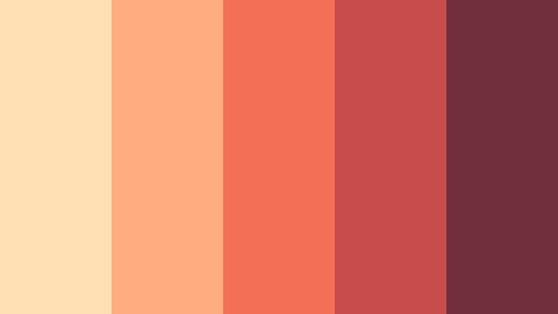
- HEX Codes: #ffe0b5, #ffad80, #f36f56, #c94c4c, #702f3d
- Mood: Passionate, dramatic, and warm.
- Use for: Use it for cinematic trailers, beauty campaigns, concert visuals, and expressive presentation covers.
Coral Firelight balances glowing coral with a smoky wine shade for dramatic contrast. It adds emotional intensity without becoming harsh, making it useful for visuals that need both warmth and atmosphere.
Use the pale peach and coral tones for light flares, backgrounds, or beauty imagery. The wine shade is effective for cinematic title cards, concert graphics, presentation covers, and strong visual accents.
Elegant & Modern Warm Tone Color Palettes
Terracotta Minimal

- HEX Codes: #f2e2d2, #d9b8a5, #b76e59, #7f4f45, #302b2a
- Mood: Refined, earthy, and contemporary.
- Use for: Use it for interior design videos, minimalist websites, portfolio branding, and modern product presentations.
Terracotta Minimal combines neutral cream with restrained clay tones and charcoal depth. Its clean structure makes it effective for sophisticated visual systems that need warmth without excessive decoration.
Use cream and light beige for open layouts, terracotta for section markers or graphic overlays, and charcoal for readable text. It works particularly well in interior design videos, portfolio intros, and modern product presentations.
Copper Noir

- HEX Codes: #f4d4b7, #c9825b, #9b4f3f, #552f32, #201c20
- Mood: Luxurious, mysterious, and cinematic.
- Use for: Use it for premium brand intros, film titles, tech launches, and luxury packaging.
Copper Noir creates a premium atmosphere through glowing copper and nearly black plum-brown tones. The high contrast gives it a mysterious, cinematic quality that is well suited to polished brand experiences.
Use copper as a highlight on dark backgrounds for logos, title animations, and product reveals. The palette can also add depth to film titles, technology launch videos, luxury packaging, and dramatic presentation covers.
Desert Clay

- HEX Codes: #f3dfc1, #d9aa78, #b8754d, #86513f, #3e3030
- Mood: Grounded, natural, and quietly luxurious.
- Use for: Use it for travel films, architecture portfolios, wellness branding, and editorial layouts.
Desert Clay draws from sunlit sand, weathered stone, and baked earth. The palette feels organic and premium across both digital and print applications, with enough contrast to support clear visual hierarchy.
Use the pale sand shades for backgrounds and the clay tones for maps, captions, and graphic overlays. It is a strong choice for travel films, architecture portfolios, wellness brands, and editorial-style video designs.
Amber Studio

- HEX Codes: #fff0c2, #e9c46a, #d08c45, #9c6644, #403333
- Mood: Focused, creative, and warmly sophisticated.
- Use for: Use it for creator portfolios, studio branding, educational videos, and polished presentation templates.
Amber Studio pairs golden amber with muted brown and soft cream for a balanced creative look. It adds warmth while maintaining a clear, professional hierarchy, so it does not overwhelm instructional or business content.
Use amber to highlight key ideas, transitions, or buttons, and keep cream and dark brown as the primary supporting colors. The combination is effective for creator portfolios, studio intros, educational videos, and polished presentation templates.
Pastel & Earthy Warm Tone Color Palettes
Creamy Sunset
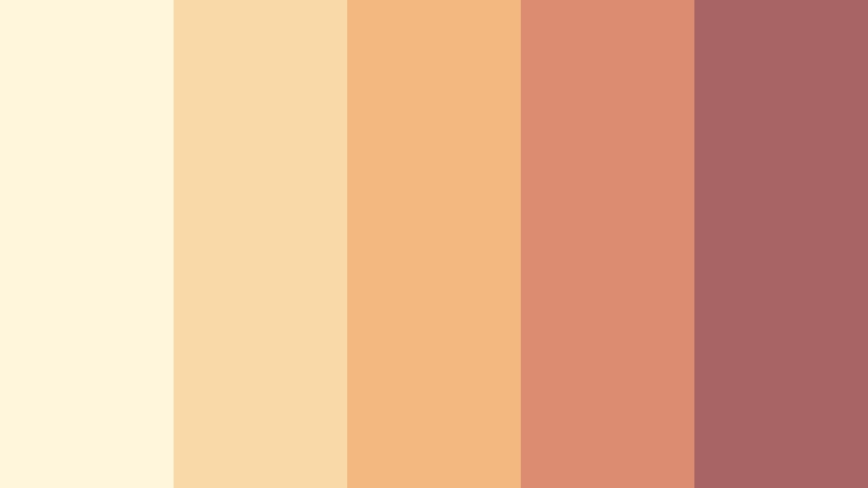
- HEX Codes: #fff6dc, #f9d9a7, #f2b880, #dc8c70, #a86465
- Mood: Peaceful, optimistic, and softly nostalgic.
- Use for: Use it for daily vlogs, journaling content, wellness graphics, and gentle lifestyle branding.
Creamy Sunset softens familiar sunset shades with plenty of light, creating a calm and friendly mood. It works well when warmth is needed without strong contrast or intense saturation.
Use the pale cream and beige tones for vlog backgrounds, journaling layouts, and wellness graphics. The muted coral and rose accents can guide attention toward captions, chapter markers, and lifestyle brand details.
Apricot Meadow
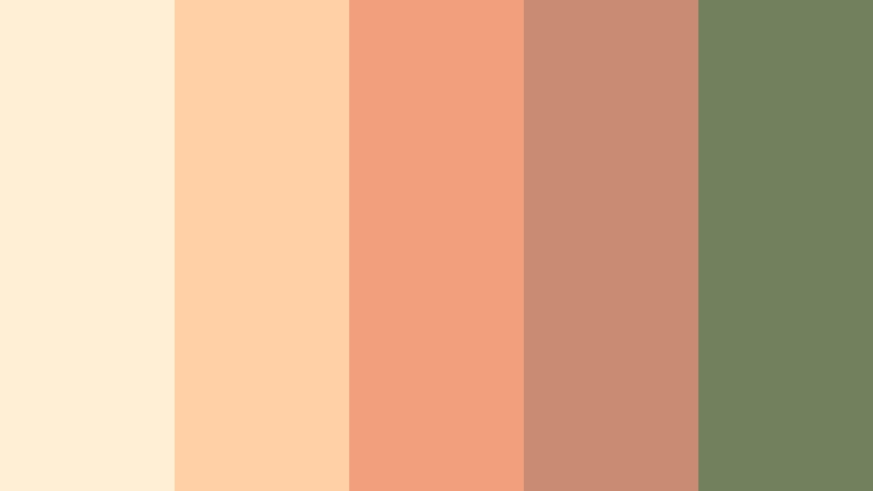
- HEX Codes: #fff0d5, #ffd0a6, #f2a07b, #c98b72, #71805d
- Mood: Fresh, relaxed, and naturally cheerful.
- Use for: Use it for gardening videos, family content, eco-friendly brands, and soft social media templates.
Apricot Meadow introduces a muted green accent to a gentle range of apricot and peach shades. The combination feels fresh, organic, and easy to use because the green balances the warmth of the orange family.
Try it for gardening videos, family content, eco-friendly brands, and relaxed social media templates. Use the green for natural details, labels, or supporting text while keeping apricot as the dominant visual color.
Toasted Vanilla

- HEX Codes: #fff8e7, #f5e0b8, #d8b07a, #b87a5a, #76534a
- Mood: Comforting, tasteful, and understated.
- Use for: Use it for cafe branding, recipe thumbnails, home videos, stationery, and cozy UI designs.
Toasted Vanilla blends creamy neutrals with caramel and toasted brown accents. It offers a subtle warm tone for designs that need comfort and clarity, making it easy to pair with natural textures and soft lighting.
Use the lightest shades for clean backgrounds, caramel for graphic accents, and toasted brown for text or borders. This palette is well suited to cafe branding, recipe thumbnails, home videos, stationery, and cozy interface designs.
Tips for Creating Warm Tone Color Color Palettes
A successful Warm Tone Color palette should support the mood of your footage while keeping text, subjects, and branding easy to recognize. Combine warm shades with enough contrast, repeat the same core colors across your project, and adjust the intensity to match the story.
- Choose one dominant warm color, one supporting shade, and one darker accent instead of using every color at equal strength.
- Use dark brown, charcoal, plum, or muted berry tones when warm backgrounds need readable text.
- Reserve the brightest orange, yellow, or coral shades for calls to action, key objects, logos, and thumbnail focal points.
- Match the palette to the lighting in your footage. Golden palettes suit sunset and indoor light, while muted clay tones work well with natural daylight.
- Protect skin tones when color grading people. Warmth should support natural complexions rather than make them look overly orange or red.
- Keep the same accent color across intros, lower thirds, transitions, thumbnails, and end screens to improve brand consistency.
- Test your palette on mobile screens and small thumbnails to confirm that contrast and text readability remain strong.
- Reduce saturation when a palette feels too intense, or add a neutral cream, beige, or charcoal shade to create visual breathing room.
Warm Tone Color palettes can shape how viewers experience a video before they focus on the message. Soft peach and blush can communicate care and intimacy, while paprika, coral, and tangerine can create energy and urgency. Terracotta, copper, and amber offer a more refined direction for premium or cinematic brands.
The best palette is the one that supports your subject, audience, and platform. Try several of these combinations on thumbnails, title cards, b-roll, and social edits to see which balance of warmth and contrast fits your visual identity.
Filmora makes it easier to test these ideas across a complete project. Use color matching, HSL adjustments, curves, filters, and 3D LUTs to develop a repeatable Warm Tone Color look for your videos and branded content.
secure download