

 100% Security Verified | No Subscription Required | No Malware

Documentary Color palettes tend to feel honest, calm, and grounded. They work because muted neutrals, earthy tones, and cool filmic shades support the story instead of competing with it, which is why they are popular in video edits, branding systems, thumbnails, intros, and lower thirds.
This guide collects Documentary Color color palettes with HEX codes for creators and Filmora users who want a clean cinematic look. Whether you are building a documentary title sequence, a YouTube thumbnail, or a branded intro, these color combinations can help you keep the mood consistent from one scene to the next.
In this article
Soft Neutral Documentary Color Palettes
Linen Light Reel

- HEX Codes: #f4efe6, #d9d3c7, #b7b0a6, #7f7a72
- Mood: calm, grounded, and airy
- Use for: Use this palette for documentary thumbnails, minimalist branding, lower third graphics, and clean UI accents.
Linen Light Reel brings a soft, paper-like warmth that feels natural and restrained. It works well when you want a refined visual tone without pulling focus from the story.
For creators, this palette is a strong base for clean title cards, gentle thumbnail backdrops, and subtle brand kits. It also pairs well with muted footage, making interviews and intro sequences feel polished and easy to watch.
Pro Tip: Build a Soft Documentary Look With Filmora
Filmora makes it easy to keep Linen Light Reel consistent across intro cards, b-roll, subtitles, and social cutdowns. Use the same warm neutrals for text bars, frames, and overlays so the whole edit feels calm and connected.
When your footage shifts between indoor interviews and outdoor scenes, Filmora helps you keep the palette balanced without losing that soft editorial feel.
AI Color Palette
If you have a reference image or a color card for this palette, Filmora's AI Color Palette feature can sample it and apply the look across your edit. That makes it easier to keep documentary intros, talking-head clips, and social highlights visually aligned.
It is especially useful when you want your visuals to stay muted and clean without manually matching every shot.
 secure download

HSL, Color Wheels & Curves
Fine-tuning Linen Light Reel in Filmora starts with keeping the highlights soft and the shadows slightly warm. Use the color wheels and curves to add depth without making the neutrals look harsh, and adjust HSL if any beige or gray tones drift too far from the palette.
For a more cinematic result, reduce overly bright whites and keep midtones smooth. Filmora's color tools let you shape the palette so it stays gentle in interviews, b-roll, and title sequences.
secure download1000+ Video Filters & 3D LUTs
Filmora's video filters and 3D LUTs make it easy to push Linen Light Reel toward a softer film finish. A light vintage filter or a restrained LUT can add texture while still keeping the palette clean and documentary ready.
This is a fast way to unify multiple clips, especially when you are mixing camera sources, stock footage, and screen recordings in one project.
secure downloadAsh Note Frame

- HEX Codes: #f1f1ee, #d0d2cf, #9fa39d, #62665f, #3e423d
- Mood: quiet, balanced, and understated
- Use for: Use this palette for title cards, interview overlays, channel branding, and editorial style social content.
Ash Note Frame leans into cool neutrals that feel composed and professional. It is a strong choice for content that needs a subtle, modern documentary look.
Use it when you want your graphics to feel precise but not sterile. It works especially well for interviews, analysis videos, and minimalist brand systems.
Chalk Room Edit
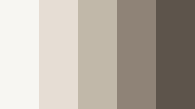
- HEX Codes: #f8f6f2, #e4ded4, #c1b8a9, #8e8376, #5d544b
- Mood: clean, thoughtful, and gentle
- Use for: Use this palette for explainer videos, documentary slides, presentation visuals, and clean packaging concepts.
Chalk Room Edit feels like soft daylight on textured surfaces. Its muted contrast gives layouts a calm and trustworthy presence.
It is a great option for slides, chapter cards, and explanatory content where clarity matters more than bold color. The palette also fits clean packaging mockups and refined social templates.
Studio Dust Horizon

- HEX Codes: #f6f0e8, #d8cbb9, #ada28f, #7a6f5e, #4b4238
- Mood: warm, cinematic, and reflective
- Use for: Use this palette for intro sequences, moody thumbnails, documentary posters, and ambient motion graphics.
Studio Dust Horizon captures the look of aged paper, warm light, and distant scenery. It is ideal for brands and videos that want a human, editorial feel.
Use it to build thumbnails, poster layouts, or opening titles that feel thoughtful and a little nostalgic. The deeper browns help frame the lighter tones without breaking the softness.
Earthy Field Documentary Color Palettes
Clay Road Story

- HEX Codes: #d6b39d, #b97f61, #8f5a43, #5f4035, #2f241f
- Mood: earthy, rustic, and grounded
- Use for: Use this palette for travel documentaries, lifestyle thumbnails, rustic packaging, and warm brand intros.
Clay Road Story blends soft clay tones with deep brown anchors for a natural, handcrafted look. It feels lived in and works well for grounded storytelling.
Use it for travel edits, artisan branding, or title graphics that need warmth and texture. The palette gives your visuals a human quality that feels authentic rather than polished to perfection.
Sienna Tape Field
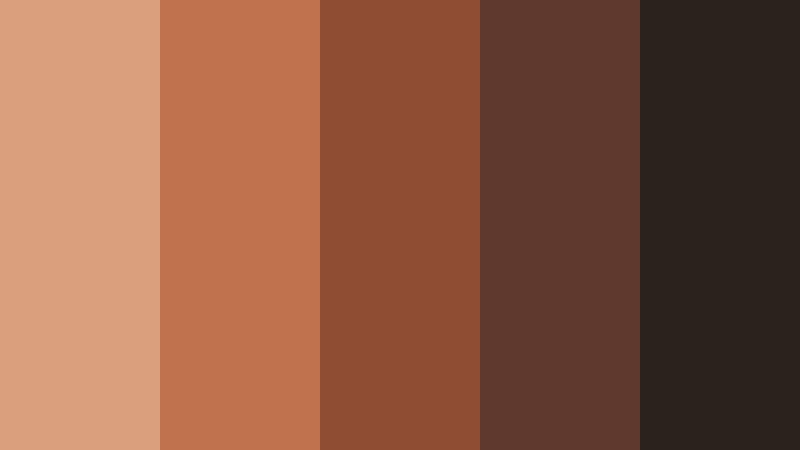
- HEX Codes: #d8a07d, #c0724d, #8f4d34, #5f392d, #2b211d
- Mood: dusty, rich, and organic
- Use for: Use this palette for documentary branding, rustic motion titles, YouTube thumbnails, and earthy product visuals.
Sienna Tape Field mixes sunbaked oranges with dark grounding tones. It adds a warm, tactile quality that feels perfect for outdoor or human centered stories.
This palette can make thumbnails feel inviting while still keeping a serious documentary tone. It also works well for branded openers, especially when paired with natural footage or grainy textures.
Olive Grain Cut

- HEX Codes: #c6c29a, #9aa06a, #6d7346, #494d31, #22261a
- Mood: natural, textured, and calm
- Use for: Use this palette for eco branding, documentary chapter cards, UI accents, and muted social graphics.
Olive Grain Cut uses olive and moss tones to create a grounded, filmic atmosphere. It feels connected to nature and works well in slow paced visual storytelling.
It is a strong fit for environmental content, sustainable brands, and chapter-based documentaries. The darker shades help anchor overlays, while the lighter tones keep layouts easy to read.
Sand Marker Scene
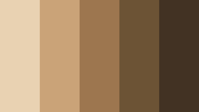
- HEX Codes: #e7d2b2, #c8a478, #9b764f, #6d5335, #423224
- Mood: sunlit, warm, and authentic
- Use for: Use this palette for lifestyle edits, travel reels, thumbnail backgrounds, and vintage inspired branding.
Sand Marker Scene brings a bright desert warmth that still feels restrained and cinematic. It is a flexible option for content that needs friendly color without losing maturity.
Use it for travel reels, lifestyle stories, or thumbnail designs that should feel approachable. The palette also pairs nicely with natural light footage and vintage inspired typography.
Cool Cinematic Documentary Color Palettes
Slate Harbor Roll

- HEX Codes: #d9dfe3, #aab4bb, #73808a, #4d5963, #202833
- Mood: cool, steady, and cinematic
- Use for: Use this palette for investigative documentaries, tech explainers, title sequences, and modern UI systems.
Slate Harbor Roll combines misty gray blues with deep slate contrast. It creates a polished visual rhythm that feels trustworthy and film ready.
This palette works well for investigative storytelling, data driven videos, and tech content. It also gives title sequences and interface graphics a crisp, composed edge.
Deep Ink Chronicle

- HEX Codes: #c7d3df, #7f95aa, #4e657d, #2f4257, #172433
- Mood: serious, immersive, and moody
- Use for: Use this palette for dramatic openers, interview frames, podcast covers, and branded motion graphics.
Deep Ink Chronicle leans into inky blues and layered shadows for a strong editorial mood. It works especially well when you want a documentary look with depth and authority.
Use it for podcast covers, dramatic openers, and branded motion graphics that need a serious tone. It can make lower thirds and frames feel more premium without becoming too flashy.
Steel Focus Still

- HEX Codes: #e1e6ea, #b2bdc6, #7a8b98, #50606d, #27323a
- Mood: clean, precise, and composed
- Use for: Use this palette for tech stories, subtitles, UI overlays, channel art, and modern brand systems.
Steel Focus Still keeps the color story crisp with steel blues and graphite depth. It is a strong fit for structured content that needs clarity and polish.
Use it for tech explainers, subtitles, and interface-heavy edits where readability is essential. The palette also works well in channel art and brand systems that need a modern documentary edge.
Mist Signal Take
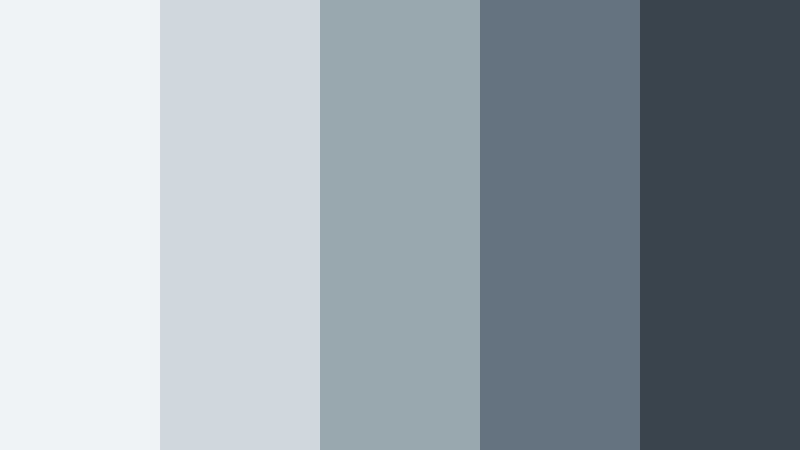
- HEX Codes: #eff3f5, #cfd8de, #98a8b1, #647580, #39454f
- Mood: foggy, subtle, and modern
- Use for: Use this palette for subtle overlays, documentary lower thirds, presentation slides, and clean social templates.
Mist Signal Take feels like cool air and soft camera haze. Its gentle contrast gives designs a quiet, contemporary documentary tone.
It is a good option for presentation slides, lower thirds, and social graphics that should stay polished but low key. The muted blues and grays also blend smoothly with most footage styles.
Warm Archive Documentary Color Palettes
Amber Projection
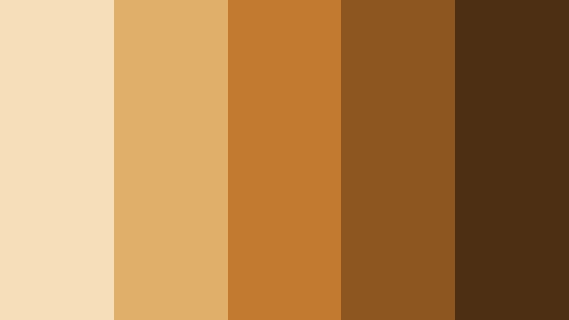
- HEX Codes: #f6dfb8, #e0b06b, #c17a2f, #8c5620, #4d3014
- Mood: nostalgic, glowing, and classic
- Use for: Use this palette for vintage film edits, archive themed graphics, thumbnail highlights, and nostalgic branding.
Amber Projection recalls projector light, film grain, and old theater warmth. It is ideal for stories that need a glowing, memory rich atmosphere.
Use it for archive edits, retro thumbnails, and nostalgic brand graphics. The brighter amber tones draw attention fast, while the deeper browns keep the palette grounded.
Sepia Lantern

- HEX Codes: #f1dfc7, #c9a27b, #956b47, #66462f, #36261b
- Mood: timeless, intimate, and aged
- Use for: Use this palette for historical documentaries, archival slides, book covers, and heritage inspired content.
Sepia Lantern brings a soft sepia glow with rich brown depth. It gives visuals a preserved, vintage quality that feels warm and believable.
It is a natural choice for historical documentaries, heritage branding, or archival slides. Use it when you want the design to feel like it already has a story behind it.
Umber Closing Shot

- HEX Codes: #e0c5a8, #b58a62, #81593c, #563a28, #2d1f16
- Mood: earthy, dramatic, and resolved
- Use for: Use this palette for end cards, cinematic branding, editorial thumbnails, and premium packaging.
Umber Closing Shot pairs mellow tan tones with deep umber shadows for a strong final frame feel. It works well when you want warmth, gravity, and visual closure.
Use it for end cards, premium packaging mockups, and thumbnails that need a grounded finish. The contrast gives your layout a cinematic ending without feeling too dark.
Tips for Creating Documentary Color Color Palettes
Documentary Color palettes work best when they support the footage, not overpower it. Mix muted neutrals with one stronger accent, keep text readable, and match the palette to the tone of the story so your video and design feel intentional.
- Use low saturation for a natural, filmic mood.
- Keep contrast high enough for titles, subtitles, and thumbnails.
- Match warm palettes with daylight or analog style footage.
- Use cool palettes for tech, investigative, or modern documentary content.
- Limit accent colors so the brand stays consistent across edits.
- Test palettes on both dark and light backgrounds before publishing.
- Keep lower thirds and overlays subtle so they do not distract from interviews.
- Reuse the same HEX codes across intros, end cards, and social posts for a unified look.
Documentary Color palettes can shape how people feel about a story before a single word is spoken. Soft neutrals suggest trust, earthy tones add warmth, cool blues bring authority, and archive inspired browns create memory and nostalgia.
That makes these palettes useful far beyond film. You can apply them to thumbnails, branding, social clips, presentation visuals, and intro sequences to build a clear visual identity.
Try these Documentary Color combinations in Filmora and see how small color choices can change the entire mood of a project. A consistent palette can make your edits feel more cinematic, more polished, and easier to recognize.
secure download