

 100% Security Verified | No Subscription Required | No Malware

Holiday Color Palette choices can instantly shape how viewers feel about a video, brand, or social post. Deep cranberry, evergreen, gold, cream, icy blue, and playful candy tones can suggest warmth, celebration, nostalgia, elegance, or winter calm. The right combination also helps viewers recognize seasonal content and connect it with a specific visual identity.
This collection provides 14 Holiday Color Palette color palettes with HEX codes for creators, designers, marketers, and Filmora users. Use these Holiday Color Palette color combinations for video intros, thumbnails, vlogs, product branding, social media graphics, holiday campaigns, and more.
In this article
Warm & Festive Holiday Color Palettes
Candlelit Cranberry

- HEX Codes: #7b1e2b, #c94c4c, #e6b566, #fff1d0, #3d2b2e
- Mood: Warm, celebratory, intimate, and richly nostalgic.
- Use for: This palette works well for holiday thumbnails, cozy vlog intros, gift guides, and festive brand announcements.
Candlelit Cranberry blends deep berry tones with warm gold and cream for a welcoming seasonal look. The dark plum-brown shade adds depth, while cranberry red creates a confident focal point and soft ivory keeps the composition readable.
Use this palette for cozy winter storytelling, holiday gift guides, recipe videos, and festive announcements. In a video intro, gold can highlight titles and transitions, while cream can support subtitles and calls to action without competing with the footage.
Pro Tip: Build A Candlelit Holiday Look In Filmora
Filmora can help you maintain a consistent Candlelit Cranberry look across your entire edit. Use berry reds for title cards and chapter screens, warm gold for animated accents, and cream for text overlays placed on darker footage.
Apply the same visual approach to your intro, b-roll, product shots, and social cutdowns. A consistent warm balance makes separate clips feel like part of one polished holiday campaign.
AI Color Palette
Creators can use a reference image, color card, or still frame that contains the Candlelit Cranberry palette and apply its visual character across a video. Filmora's AI Color Palette feature helps match color relationships between clips, making footage from different cameras or locations feel more unified.
This is useful when a project includes indoor candlelight, outdoor winter scenes, product footage, and social media edits. Matching the clips first gives the whole project a more intentional seasonal identity.
 secure download

HSL, Color Wheels & Curves
Fine-tune the palette with Filmora's HSL controls by slightly adjusting red saturation, reducing unwanted orange casts, or making gold highlights softer. Use the color wheels to warm the highlights and keep the shadows gently neutral so the image feels festive without becoming overly red.
Curves can add contrast between the dark cranberry tones and luminous cream details. For a cinematic finish, lift the shadows slightly for a softer look or deepen them to create a richer evening atmosphere. These adjustments help the same palette work across bright daytime footage and low-light scenes.
secure download1000+ Video Filters & 3D LUTs
Filmora's filters and LUTs provide a fast way to stylize Candlelit Cranberry footage. Filmora's video filters and 3D LUTs make it easy to add warmth, soften highlights, deepen shadows, or create a polished editorial finish.
Choose a subtle filter for talking-head footage and a stronger look for title cards or atmospheric b-roll. Apply the effect consistently, then reduce its intensity when skin tones or product colors need to remain natural.
secure downloadGingerbread Market

- HEX Codes: #8b4a2f, #c98245, #e8c39e, #f7e7ce, #58704b
- Mood: Comforting, handmade, cheerful, and rustic.
- Use for: This palette is ideal for recipe videos, holiday packaging, craft content, seasonal thumbnails, and small business social posts.
Gingerbread Market pairs spiced brown and caramel with soft cream and evergreen accents. The combination feels handcrafted and friendly, making it a natural choice for content built around baking, decorating, gifting, or small business stories.
Use the cream shade as a clean background and reserve caramel or evergreen for buttons, borders, titles, and decorative details. It brings a warm, approachable quality to recipe thumbnails and seasonal product branding.
Evergreen Celebration

- HEX Codes: #164a41, #2f765d, #c23b32, #e8c872, #f4eee0
- Mood: Traditional, grounded, joyful, and timeless.
- Use for: This palette works well for holiday campaigns, seasonal logo animations, event invitations, retail graphics, and festive YouTube thumbnails.
Evergreen Celebration combines classic forest green with red, gold, and warm ivory. It delivers a recognizable holiday feeling while staying balanced enough for both traditional and contemporary designs.
Use green as the dominant brand color, red for important accents, and gold for small highlights or animated details. The palette works especially well for retail promotions, event videos, and family-friendly seasonal content.
Mulled Wine Glow
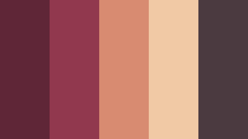
- HEX Codes: #5e2636, #92384d, #d98b72, #f0c9a5, #4b3a3f
- Mood: Romantic, sophisticated, cozy, and softly dramatic.
- Use for: This palette is a strong choice for elegant vlog openers, lifestyle thumbnails, winter fashion content, and premium seasonal packaging.
Mulled Wine Glow uses berry shades and muted peach to create an inviting winter atmosphere. Its refined contrast suits luxurious holiday storytelling, fashion edits, and editorial design.
Use the darkest tone for backgrounds or cinematic frames, then introduce dusty peach and light beige for readable text and soft contrast. The palette can make lifestyle footage feel intimate without looking overly traditional.
Elegant & Sparkling Holiday Color Palettes
Silver Snowfall

- HEX Codes: #d9e1e8, #a9b7c6, #f8fafc, #7d8996, #36454f
- Mood: Crisp, refined, peaceful, and wintry.
- Use for: This palette works well for modern holiday intros, winter travel videos, technology branding, clean UI layouts, and minimalist social graphics.
Silver Snowfall creates a cool, airy look with icy neutrals and slate gray. It is ideal for sleek winter designs that need clarity, spaciousness, and a touch of quiet luxury.
Use the lightest shades for backgrounds and lower-thirds, then rely on slate gray for headlines and navigation elements. A small amount of contrast from the darkest color helps text remain legible over bright snowy footage.
Champagne Ornament
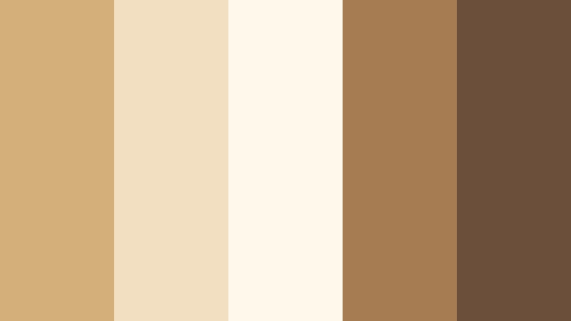
- HEX Codes: #d4af7a, #f2dfc1, #fff8eb, #a67c52, #6b4f3a
- Mood: Luxurious, warm, celebratory, and polished.
- Use for: This palette is suitable for premium product videos, holiday invitations, beauty content, upscale packaging, and elegant brand intros.
Champagne Ornament layers soft gold, ivory, and warm brown for a sophisticated seasonal finish. It adds understated sparkle without overwhelming the main message or product.
Use gold for thin lines, logo details, and motion graphics rather than large blocks of color. Ivory creates a refined canvas, while warm brown gives text and product photography enough visual weight.
Midnight Mistletoe

- HEX Codes: #17243b, #263f5e, #537a72, #d8b36a, #f1ead7
- Mood: Mystical, elegant, calm, and festive.
- Use for: This palette works well for cinematic holiday videos, evening event graphics, luxury social content, and sophisticated website interfaces.
Midnight Mistletoe pairs deep navy with muted teal, antique gold, and cream. It creates a cinematic night-sky mood for memorable seasonal visuals and atmospheric intros.
Use navy as a strong background for gold typography and cream subtitles. Muted teal can connect the palette to evergreen footage, while the warm gold accent keeps the design from feeling too cold.
Rose Gold Winter
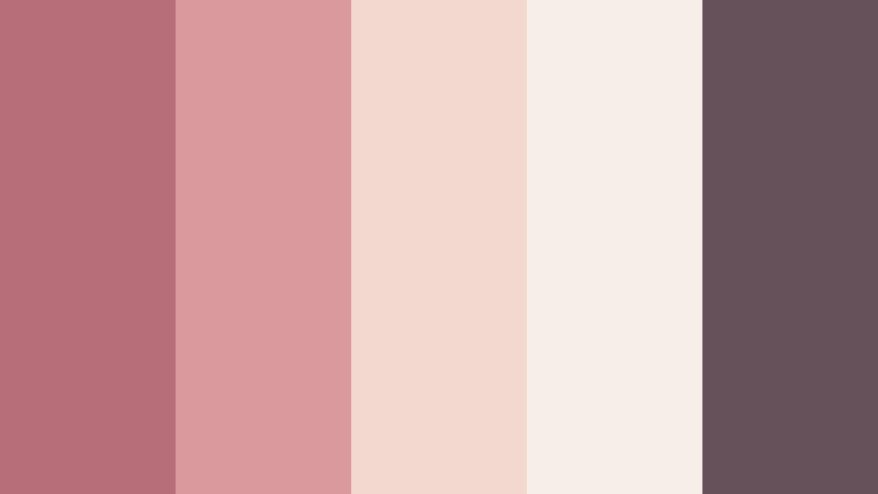
- HEX Codes: #b76e79, #d99a9e, #f2d8cf, #f8eee8, #66515a
- Mood: Soft, glamorous, romantic, and contemporary.
- Use for: This palette is ideal for beauty tutorials, festive lifestyle content, wedding season graphics, social templates, and stylish video covers.
Rose Gold Winter brings a modern glow through dusty pink, blush, and muted mauve. It feels festive while remaining gentle enough for elegant personal brands and beauty-focused content.
Use blush and ivory for backgrounds, rose gold for decorative details, and muted mauve for text or framing. The combination looks polished in vertical videos, beauty thumbnails, and soft lifestyle intros.
Cozy & Nostalgic Holiday Color Palettes
Fireside Flannel
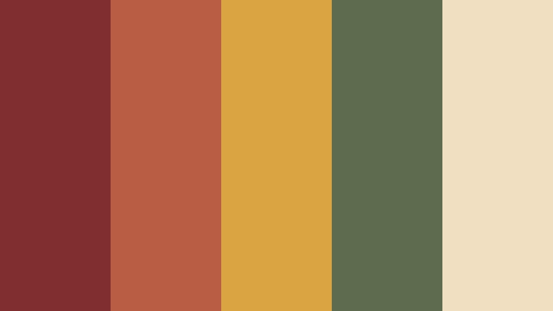
- HEX Codes: #7f2f2f, #b95d45, #d9a441, #5e6b4f, #f0dfc0
- Mood: Rustic, comforting, friendly, and nostalgic.
- Use for: This palette works well for cabin vlogs, family holiday videos, outdoor campaigns, seasonal merchandise, and cozy thumbnail designs.
Fireside Flannel combines warm red, ochre, olive, and cream for a relaxed winter cabin feeling. It adds warmth and familiarity to personal, family, and lifestyle content.
Use olive and cream to balance the stronger red tones, especially when working with busy footage. Ochre is effective for small highlights, timestamps, title accents, and cozy animated transitions.
Vintage Toy Shop

- HEX Codes: #c4473a, #2f5d50, #e0a458, #f5d6a6, #4a3b36
- Mood: Playful, nostalgic, cheerful, and storybook-like.
- Use for: This palette is perfect for family content, holiday gift guides, animated intros, children's projects, and colorful social media posts.
Vintage Toy Shop recalls classic holiday decorations with lively red, green, and golden accents. It gives creative projects a joyful retro character and a welcoming storybook quality.
Use the dark green and brown shades for grounding, then let red and gold draw attention to products, characters, or important text. The palette is especially effective in animated title cards and gift guide thumbnails.
Pinecone Cocoa
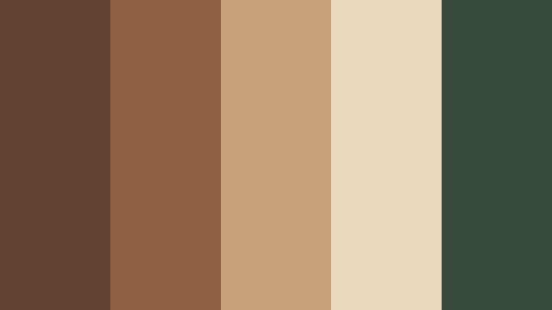
- HEX Codes: #61412f, #906044, #c8a27a, #e9d8bd, #354a3d
- Mood: Earthy, restful, intimate, and natural.
- Use for: This palette works well for slow living videos, handmade product branding, winter recipe content, nature reels, and rustic packaging.
Pinecone Cocoa uses earthy brown, pine green, and creamy beige to create a grounded seasonal look. It feels natural, warm, and easy to use across calm visual stories.
Use beige for clean text areas and green for subtle brand accents. The brown shades can complement wood, coffee, wool, and outdoor footage, making this palette a strong fit for slow living and handmade content.
Playful & Bright Holiday Color Palettes
Candy Cane Pop

- HEX Codes: #e63946, #f7f3e3, #2a9d8f, #f4a261, #264653
- Mood: Energetic, playful, bright, and youthful.
- Use for: This palette is great for short-form social videos, festive promotions, playful thumbnails, youth campaigns, and animated holiday graphics.
Candy Cane Pop refreshes classic holiday colors with teal and orange for a lively modern twist. It helps seasonal content feel bold, upbeat, and highly clickable.
Use red for attention-grabbing headlines and calls to action, while teal can provide a fresh counterpoint. Cream is useful for keeping layouts readable when the brighter colors appear in motion graphics or busy thumbnails.
Jolly Jellybean

- HEX Codes: #d62839, #f77f00, #fcbf49, #3a86ff, #8338ec
- Mood: Vibrant, optimistic, playful, and expressive.
- Use for: This palette works well for party announcements, children's content, gaming videos, energetic reels, and colorful seasonal app interfaces.
Jolly Jellybean uses saturated primary and candy-inspired hues to make holiday visuals instantly energetic. It is built for cheerful projects that need strong color impact and an expressive personality.
Because every shade is highly visible, choose one dominant color and use the others as supporting accents. This approach prevents animated titles, gaming overlays, and party announcements from becoming visually confusing.
Festive Citrus

- HEX Codes: #f94144, #f3722c, #f9c74f, #90be6d, #577590
- Mood: Fresh, spirited, sunny, and modern.
- Use for: This palette is suitable for travel content, holiday sales videos, food branding, upbeat social campaigns, and modern seasonal thumbnails.
Festive Citrus combines warm fruit tones with fresh green and blue for an unexpected holiday direction. It feels bright, contemporary, and full of movement.
Use orange and yellow for energetic accents, then balance them with green and blue in backgrounds, packaging, or lower-thirds. This palette is a strong choice for brands that want seasonal content without relying on traditional red and green.
Tips for Creating Holiday Color Palette Color Palettes
Good Holiday Color Palette color combinations should support the message, footage, and brand rather than compete with them. Start with one dominant color, add one or two supporting shades, and reserve the strongest accent for details that need attention.
- Use strong contrast between text and background so titles, subtitles, and calls to action remain easy to read on mobile screens.
- Choose one dominant Holiday Color Palette shade and limit accent colors to keep thumbnails and video intros visually organized.
- Match the palette to the footage. Warm reds and golds suit candlelight and indoor scenes, while icy blues and silver work well with snow and cool daylight.
- Use cream, ivory, or soft beige to give saturated festive colors breathing room and prevent the design from feeling overwhelming.
- Keep branding consistent by repeating the same HEX codes across thumbnails, title cards, lower-thirds, social templates, and end screens.
- Test color combinations on different screens and export settings because very dark shades may lose detail after compression.
- Use color psychology intentionally. Red can create energy, green can suggest nature and tradition, gold can signal celebration, and blue can create calm.
- Apply color grading consistently across clips so the palette feels intentional even when the footage comes from different cameras or locations.
Holiday Color Palette choices can shape the emotional direction of an entire creative project. Warm berry, cranberry, gold, and cocoa tones create intimacy and nostalgia, while silver, navy, blush, and cream can make a seasonal design feel refined and modern.
The brighter palettes add energy to social campaigns, children's content, and promotional videos, while the earthy combinations work well for slow living, recipes, family stories, and handmade brands. Choosing the right color balance helps your content communicate its mood before viewers read a single word.
Try these Holiday Color Palette ideas in Filmora to test different looks across intros, b-roll, thumbnails, and social edits. With color matching, HSL controls, curves, filters, and LUTs, you can build a consistent seasonal style that supports both your footage and your brand identity.
secure download