

 100% Security Verified | No Subscription Required | No Malware

Minimalist Color palettes use restrained tones, open space, and carefully chosen accents to create a sense of clarity and balance. Soft neutrals can feel calm and approachable, while charcoal, slate, olive, and muted warm shades add depth without overwhelming the viewer. This makes Minimalist Color especially useful when the message, subject, or typography needs to remain the focus.
In video and design, Minimalist Color can shape everything from a thumbnail and intro sequence to a brand identity, social media template, or product presentation. Below, you will find Minimalist Color color palettes with HEX codes for creators and Filmora users, along with practical ideas for applying each combination to videos, branding, and modern design projects.
In this article
Soft & Airy Minimalist Color Palettes
Quiet Linen
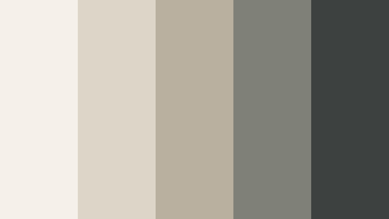
- HEX Codes: #f5f1e8, #ddd6c8, #b9b0a0, #7f8178, #3d4140
- Mood: Calm, grounded, and quietly refined.
- Use for: This palette works well for lifestyle thumbnails, wellness videos, minimalist brand intros, and editorial layouts.
Quiet Linen blends warm ivory with muted stone tones for a relaxed, natural look. The lighter shades create a generous visual base, while the gray-green and charcoal tones provide enough contrast for headings, captions, and key interface elements.
Use the ivory as a background for lifestyle footage or a clean title card, then introduce the darker shades through lower thirds, transitions, or logo animation. It is a reliable choice for serene vlogs, wellness content, and understated visual identities that need to feel warm rather than stark.
Pro Tip: Enhance Your Minimalist Color Visuals with Filmora
Filmora can help you keep the Quiet Linen palette consistent across an entire edit. Use warm ivory and stone tones in title cards, overlays, and intro graphics, then match those elements with the natural colors in your b-roll. This creates a connected look from the opening frame to the final call to action.
For lifestyle edits, apply the same visual direction to thumbnail text, transitions, and end screens. Keeping charcoal for important words and using the lighter colors for space and breathing room helps your content remain readable without losing its calm character.
AI Color Palette
Filmora's AI Color Palette feature can sample the Quiet Linen look from a reference image, mood board, or color card and apply its visual character across your footage. This is useful when clips were recorded under different lighting conditions and need a more unified ivory, beige, and muted charcoal balance.
After applying the palette, review skin tones and bright highlights before making small adjustments. A consistent color direction can make separate clips feel as if they belong to the same minimalist brand system.
 secure download

HSL, Color Wheels & Curves
Use Filmora's HSL controls to reduce overly strong yellows or shift cool gray tones toward a softer stone appearance. The color wheels can warm the highlights while keeping shadows slightly neutral, preserving the natural contrast that makes Quiet Linen feel refined.
Curves are useful for creating a gentle cinematic contrast. Lift the black point slightly for a softer lifestyle look, or deepen the shadows when the palette needs more definition for a title sequence or editorial thumbnail.
secure download1000+ Video Filters & 3D LUTs
Filmora's library can quickly stylize Quiet Linen footage with soft, low-saturation treatments and gentle warm filters. Filmora's video filters and 3D LUTs make it easy to create a consistent starting point before refining individual clips.
Choose a subtle preset for talking-head content, or combine a warm filter with a slight vignette for slow living and home design videos. Keep the effect restrained so the natural ivory and stone balance remains visible.
secure downloadMorning Paper

- HEX Codes: #fffdf7, #f1ede3, #d8d4c9, #a9b0ae, #667174
- Mood: Fresh, clean, and thoughtfully optimistic.
- Use for: Use it for productivity videos, app interfaces, presentation slides, stationery designs, and light social content.
Morning Paper pairs crisp white with cool gray and blue-green accents. The result feels organized, bright, and easy to read, making it a practical modern neutral color palette for content that depends on clarity.
Use the pale tones as a background for tutorial thumbnails, presentation slides, or app demonstrations. The blue-gray shades can define buttons, headings, captions, and motion graphics without making the design feel heavy.
Clouded Sage
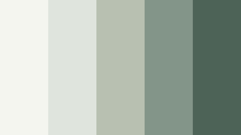
- HEX Codes: #f4f5ef, #dfe5d8, #b5c2b0, #829487, #4e6158
- Mood: Restful, organic, and quietly restorative.
- Use for: This palette suits nature reels, self-care content, sustainable packaging, and calm website or UI designs.
Clouded Sage combines soft neutrals with gentle botanical greens. It creates a peaceful atmosphere without losing visual structure, so it works for both atmospheric footage and clean graphic layouts.
Try the pale green shades in intro backgrounds or section cards, then use the deeper sage tone for captions and icons. The darkest green can anchor a logo reveal, thumbnail headline, or end screen.
Bare Canvas
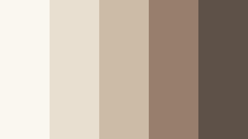
- HEX Codes: #faf7f0, #e9dfd0, #cbbba7, #987f6c, #5d5148
- Mood: Warm, tactile, and naturally elegant.
- Use for: Use it in handmade product videos, fashion mood boards, portfolio pages, packaging, and personal brand visuals.
Bare Canvas layers creamy neutrals with earthy brown for a handcrafted feel. It is a strong choice for warm, premium minimalism because its colors suggest natural materials such as paper, linen, leather, and wood.
Use the brown tones to frame product shots or create strong but gentle typography. In fashion and portfolio videos, this palette can make transitions, title cards, and social graphics feel tactile and carefully made.
Elegant & Modern Minimalist Color Palettes
Graphite Balance
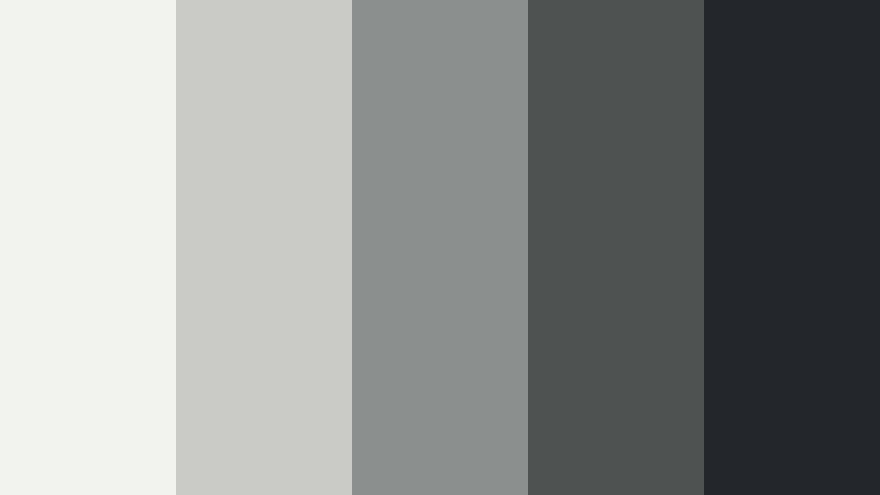
- HEX Codes: #f2f2ee, #c9cbc6, #8b908d, #4d5353, #202629
- Mood: Precise, polished, and confidently modern.
- Use for: This palette works well for tech explainers, cinematic titles, professional portfolios, dashboards, and sleek brand systems.
Graphite Balance uses cool grays and deep charcoal to create a sharp visual hierarchy. It brings a sophisticated, editorial quality to digital projects while keeping the interface or composition easy to navigate.
Use the lightest shade for clean space and the darkest charcoal for key typography, icons, or logo marks. In video, a restrained graphite treatment can make technology demonstrations, title animations, and professional reels feel focused and premium.
Silver Structure
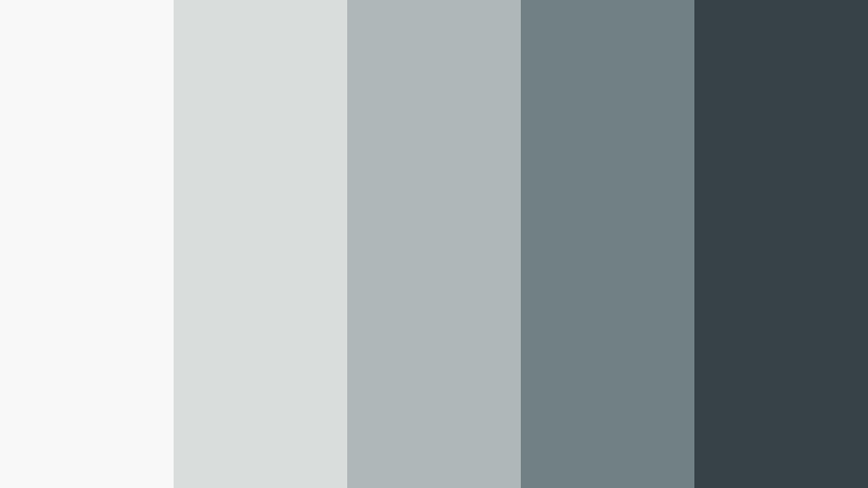
- HEX Codes: #f7f8f7, #d9dddc, #afb8b9, #718083, #374247
- Mood: Crisp, intelligent, and streamlined.
- Use for: Use it for software demos, corporate intros, modern UI screens, infographic videos, and clean presentation templates.
Silver Structure balances pale gray with steel blue and dark slate. It feels efficient and contemporary while remaining approachable, which makes it suitable for business communication and digital products.
Use steel blue as a controlled accent for charts, progress bars, or transition lines. The darker slate shade provides readable contrast for subtitles and callouts without the visual weight of pure black.
Studio Monochrome
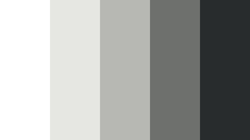
- HEX Codes: #ffffff, #e6e6e3, #b7b8b4, #6e706d, #292c2d
- Mood: Focused, timeless, and visually disciplined.
- Use for: This palette is effective for photography portfolios, fashion edits, logo animations, title cards, and monochrome social graphics.
Studio Monochrome strips color back to essential light and shadow. It helps images, typography, and motion become the main focus, making it a timeless option for visual storytelling.
Apply the pale shades to backgrounds and use dark charcoal for titles or graphic frames. A monochrome grade can also unify footage from different locations, particularly when the subject, composition, or movement matters more than color detail.
Midnight Outline
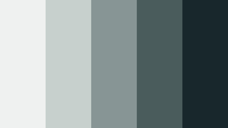
- HEX Codes: #eef1ef, #c8d0ce, #879694, #4b5c5d, #17272b
- Mood: Dramatic, focused, and quietly luxurious.
- Use for: Use it for cinematic YouTube thumbnails, podcast branding, product launches, night-themed UI, and premium packaging.
Midnight Outline contrasts pale gray with deep blue-green charcoal for a refined dark mode aesthetic. It adds depth while preserving minimal clarity, especially when used with strong spacing and simple typography.
Use the darkest shade for backgrounds, frames, and title cards, then reserve the lighter grays for text and product highlights. The subtle blue-green undertone gives night scenes and premium brand videos more atmosphere than a standard black-and-white scheme.
Natural & Grounded Minimalist Color Palettes
Clay And Moss
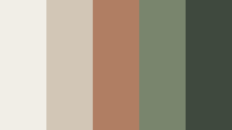
- HEX Codes: #f1eee6, #d2c7b6, #b07f63, #79866d, #3f4a3f
- Mood: Earthy, balanced, and quietly expressive.
- Use for: This palette fits travel stories, outdoor brands, slow living content, product packaging, and textured editorial designs.
Clay And Moss pairs soft clay with muted green for an organic, grounded composition. It feels warm and distinctive without becoming busy, making it useful for brands that want a natural identity with a little personality.
Use clay for selected title elements, product details, or thumbnail accents, while moss can support labels, borders, and environmental footage. The deep green gives the combination enough contrast for readable captions and logo treatments.
Pebble Garden
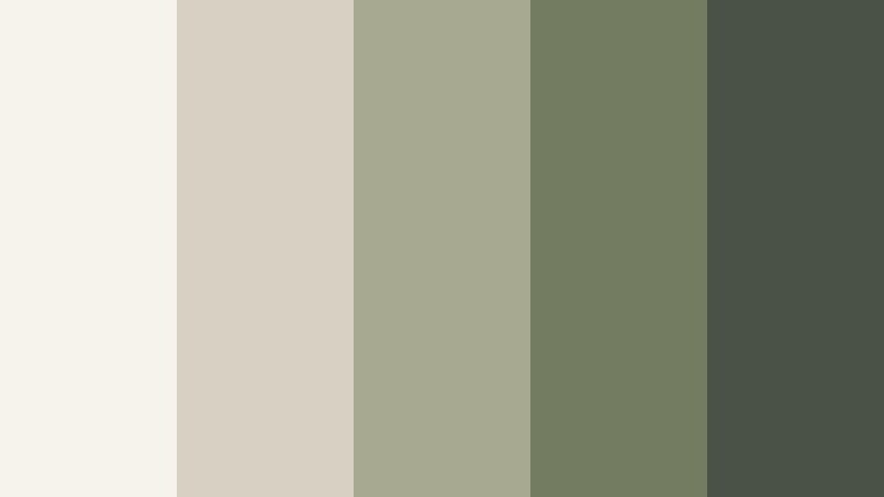
- HEX Codes: #f6f3eb, #d8d1c3, #a7aa91, #737b61, #4a5147
- Mood: Natural, thoughtful, and gently sophisticated.
- Use for: Use it for gardening videos, eco-conscious brands, recipe content, wellness graphics, and earthy social templates.
Pebble Garden combines warm pebble neutrals with desaturated olive green. The palette supports calm storytelling and natural visual textures, from stone and ceramic surfaces to plants, food, and outdoor scenes.
Use the neutral tones as a flexible base and let olive green identify important information. It is effective for recipe cards, sustainability campaigns, tutorial captions, and video overlays that need to feel both responsible and welcoming.
Desert Stillness
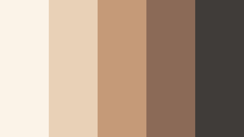
- HEX Codes: #fbf3e7, #e7d2b8, #c49a78, #8b6b57, #403c39
- Mood: Sunlit, peaceful, and warmly introspective.
- Use for: This palette is suited to travel vlogs, architecture reels, home decor content, album artwork, and warm cinematic transitions.
Desert Stillness draws from sunwashed sand, clay, and weathered stone. It brings a soft cinematic warmth to minimalist compositions and works especially well with natural light, textured surfaces, and wide landscape shots.
Use the pale sand colors for title cards and negative space, then bring in terracotta for selective emphasis. Deep brown can frame a thumbnail or support subtitles when a warm video needs clear visual contrast.
Driftwood Calm

- HEX Codes: #f3efe7, #d5c8b8, #aa967d, #766b5e, #3e403d
- Mood: Relaxed, tactile, and reassuring.
- Use for: Use it for coastal content, furniture branding, home tours, craft videos, and calm lifestyle presentations.
Driftwood Calm blends weathered beige with soft brown and charcoal. It creates a dependable, lived-in mood with a polished finish, making it a natural fit for interiors, handmade products, and relaxed lifestyle storytelling.
Use the beige tones to keep layouts open and the charcoal shade for text, navigation, or logo details. In a home tour or craft video, the palette can connect wood, fabric, stone, and natural light into one cohesive visual language.
Subtle Accent Minimalist Color Palettes
Muted Coral Note
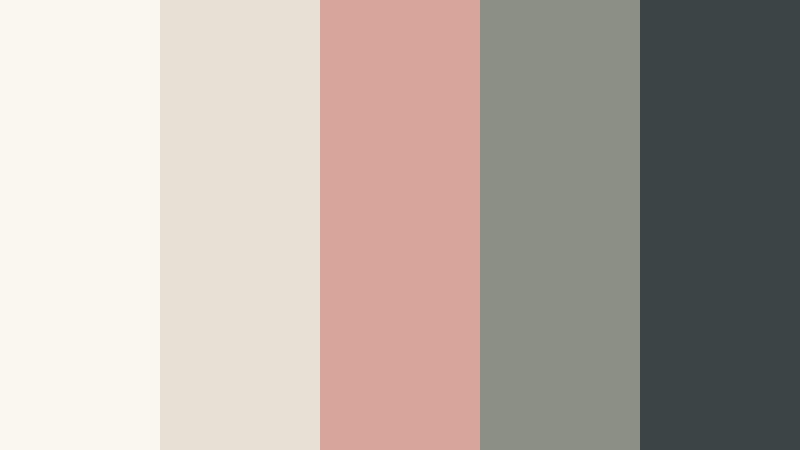
- HEX Codes: #faf7f1, #e8dfd5, #d7a59a, #8c8f86, #3c4545
- Mood: Gentle, personable, and softly playful.
- Use for: This palette works well for beauty videos, personal branding, social content, app onboarding, and friendly campaign graphics.
Muted Coral Note adds a restrained warm accent to an otherwise neutral system. It brings personality while keeping the overall design minimal, approachable, and easy to adapt across different content formats.
Use coral sparingly for buttons, names, key words, or small thumbnail details. Pairing it with pale neutrals and a dark blue-gray creates a polished balance that works for beauty tutorials, creator introductions, and friendly product campaigns.
Dusty Blue Accent

- HEX Codes: #f7f6f1, #dfe2dc, #a7b9bf, #647f89, #303e43
- Mood: Cool, composed, and quietly creative.
- Use for: Use it for educational videos, travel thumbnails, digital products, presentation themes, and modern editorial layouts.
Dusty Blue Accent introduces a muted blue focal point into soft neutral surroundings. It feels clear and contemporary without being overly bold, so it can add interest while preserving a calm visual rhythm.
Try dusty blue in charts, title lines, maps, or thumbnail highlights. The dark blue-gray gives subtitles and headings strong readability, while the pale foundation keeps educational and editorial layouts light.
Olive Signal

- HEX Codes: #f5f3e9, #dedcc8, #abb08a, #6c7650, #353d32
- Mood: Fresh, confident, and naturally distinctive.
- Use for: This palette suits eco campaigns, food content, outdoor thumbnails, wellness branding, and clean dashboard accents.
Olive Signal gives a neutral foundation a focused botanical lift. It is memorable enough for branding while staying calm and functional, which makes it a useful accent system for both video and digital design.
Use the light olive shade for background panels and the stronger green for buttons, labels, or thumbnail framing. Deep green can anchor a logo reveal or closing screen while reinforcing an outdoors, wellness, or sustainability message.
Ink And Ochre
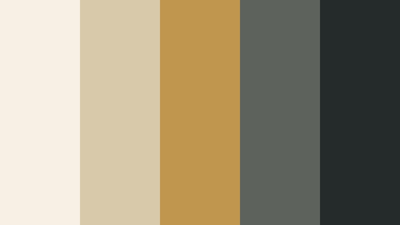
- HEX Codes: #f6f0e5, #d9c9ab, #c0954e, #5d625d, #252b2b
- Mood: Artful, grounded, and quietly dramatic.
- Use for: Use it for cultural videos, editorial thumbnails, logo reveals, poster design, and premium creative campaigns.
Ink And Ochre combines a restrained golden accent with deep ink tones. The contrast adds character and visual rhythm to minimalist layouts without relying on a large number of colors.
Use ochre as a small highlight for titles, timeline markers, or product details, then let ink and warm ivory carry the main structure. This approach works well for documentary intros, cultural storytelling, premium campaigns, and poster-inspired motion graphics.
Tips for Creating Minimalist Color Color Palettes
A successful Minimalist Color palette should feel intentional rather than empty. Start with a flexible neutral foundation, add one or two supporting tones, and reserve the strongest color for moments that need attention. The following tips can help you create consistent palettes for video, thumbnails, branding, and design.
- Choose one dominant background color, one readable text color, and one accent color before adding extra shades.
- Check contrast on thumbnails and video titles at small sizes so captions remain readable on phones and social feeds.
- Use muted accents for emphasis instead of applying the strongest color to every graphic element.
- Match the palette to your footage. Warm neutrals suit natural light and interiors, while cool grays often work better with technology or night scenes.
- Keep brand colors consistent across intros, lower thirds, thumbnails, transitions, end screens, and social templates.
- Use darker shades for important information and lighter tones for spacing, backgrounds, and visual breathing room.
- Test the palette against skin tones, product colors, and white backgrounds before applying it to a complete video.
- Save HEX codes and color presets so future projects can follow the same visual direction with less manual work.
Minimalist Color palettes can make a project feel calm, premium, organized, or quietly expressive depending on the balance between neutrals and accents. Soft ivory and stone tones create an approachable foundation, while charcoal, slate, olive, coral, blue, or ochre can guide attention and strengthen brand identity.
The best palette is the one that supports your content instead of competing with it. Test these combinations in Filmora by applying them to footage, titles, thumbnails, overlays, and transitions. Small adjustments to saturation, contrast, and highlight warmth can turn a simple color set into a complete visual system.
With Filmora's color tools, filters, LUTs, and AI-assisted workflows, you can build a consistent Minimalist Color look across different clips and formats. Start with one palette, compare it against your footage, and refine the tones until the mood feels natural for your audience.
secure download