

 100% Security Verified | No Subscription Required | No Malware

Monochromatic Color palettes use different shades, tints, and tones of one base color to create a unified visual experience. Because the hues share the same color family, these palettes often feel intentional, balanced, and easy to recognize. Lighter shades can create softness and openness, while deeper shades add contrast, drama, and visual weight.
In video, branding, thumbnails, intros, and social content, Monochromatic Color combinations help creators maintain a clear identity without making a design feel chaotic. This collection features Monochromatic Color color palettes with HEX codes for creators and Filmora users, including soft, vibrant, modern, pastel, and cinematic options.
In this article
Soft & Romantic Monochromatic Color Palettes
Rosewater Whisper
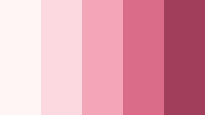
- HEX Codes: #fff5f7, #fbd7df, #f3a6b8, #d96b86, #9f3f5b
- Mood: Tender, intimate, and softly romantic
- Use for: Use this palette for wedding videos, beauty thumbnails, romantic social content, and delicate brand intros.
Rosewater Whisper creates a gentle emotional atmosphere with layered blush shades. The pale pink highlight works well for backgrounds and title cards, while the medium and deep rose tones provide enough contrast for text, transitions, and focal details.
This palette is especially effective for wedding films, beauty content, personal storytelling, and elegant packaging. In a video intro, use the lightest shades for a soft opening and bring in the deeper rose tones for names, captions, or a memorable closing frame.
Pro Tip: Build A Romantic Monochromatic Color Look In Filmora
Filmora can help keep Rosewater Whisper consistent from the first frame to the final call to action. Apply the lighter blush shades to title backgrounds, overlays, and transitions, then use the deeper rose tones for lower thirds, logo treatments, and key words in social edits.
For a cohesive edit, match the color treatment across wedding footage, beauty b-roll, and still images. A consistent pink-based look helps separate the main subject from the background while reinforcing a tender, polished visual identity.
AI Color Palette
Creators can use a reference image, mood board, or color card based on Rosewater Whisper and apply its visual character across an entire project. Filmora's AI Color Palette feature helps transfer a selected color style to clips that were recorded in different lighting conditions.
This is useful when combining indoor portraits, outdoor ceremony footage, and product shots. The AI-assisted workflow can provide a stronger starting point, after which you can make small adjustments to preserve natural skin tones and important details.
 secure download

HSL, Color Wheels & Curves
Use HSL controls to fine-tune the balance between pale blush, warm pink, and deep rose tones. You can slightly reduce saturation in the highlights for a softer finish, or add richness to the shadows when the edit needs more emotional depth. Color wheels can also warm the highlights and gently cool the shadows for a cinematic contrast.
Curves are useful for shaping the brightness range without losing the palette's delicate character. Lift the blacks for an airy fashion look, or create a controlled S-curve for more depth in romantic title sequences and dramatic close-ups.
secure download1000+ Video Filters & 3D LUTs
Filmora's collection of filters and LUTs gives Rosewater Whisper a fast, repeatable style for footage that needs a softer romantic finish. Start with a subtle filter, then adjust its intensity so skin tones remain natural and the pale pink highlights do not become distracting.
Filmora's video filters and 3D LUTs make it easy to test several variations of the same palette. Compare a clean blush treatment with a more cinematic rose look, then save the version that best matches your thumbnail, intro, and overall brand identity.
secure downloadPeach Blossom Haze
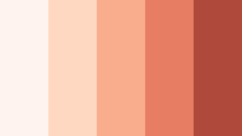
- HEX Codes: #fff4ed, #ffd8c2, #f8ad8d, #e77d62, #ae493b
- Mood: Warm, optimistic, and welcoming
- Use for: Use this palette for food videos, seasonal campaigns, vlog thumbnails, cheerful packaging, and friendly UI accents.
Peach Blossom Haze combines creamy highlights with warm coral depth. The result feels sunny and approachable without becoming overly bright. Its pale tones create generous backgrounds, while the coral and terracotta shades add clear focal points.
Use it for food videos, seasonal campaigns, lifestyle vlogs, and friendly brand content. A peach title card can introduce a video with warmth, while darker coral text and accents help thumbnails remain readable at smaller sizes.
Lavender Daydream

- HEX Codes: #f8f4ff, #e2d5f5, #c2a8e3, #9068bd, #5a397f
- Mood: Dreamy, imaginative, and serene
- Use for: Use this palette for wellness content, music visuals, creative portfolios, dreamy intros, and calming mobile interfaces.
Lavender Daydream brings a peaceful, imaginative quality to visual projects. Its soft-to-deep progression is ideal for content that feels thoughtful and artistic, especially when paired with gentle motion, atmospheric footage, or subtle grain.
Use the pale lavender tones for wellness layouts and intro backgrounds, then reserve the deeper violet shades for headings, logos, and important calls to action. The palette can also give music visuals and creative portfolios a distinctive, reflective identity.
Misty Lilac Bloom
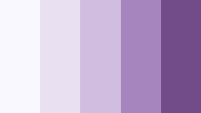
- HEX Codes: #faf8ff, #e9e0f2, #d0bddf, #a684bc, #704d88
- Mood: Quiet, graceful, and reflective
- Use for: Use this palette for editorial layouts, journaling videos, skincare branding, book content, and soft social templates.
Misty Lilac Bloom feels refined and contemplative, with muted violet tones that add softness and depth. It suits understated visuals with a premium finish and can make simple layouts feel more considered.
For video, use the lightest lilac as a clean base for journaling or book content and introduce the darker plum shades through captions, borders, and chapter markers. It also works well for skincare branding that needs to feel calm rather than overly clinical.
Bold & Vibrant Monochromatic Color Palettes
Crimson Spotlight

- HEX Codes: #fff0f0, #ffc1c1, #f35d64, #c82333, #740f22
- Mood: Confident, dramatic, and energetic
- Use for: Use this palette for gaming thumbnails, music videos, sports edits, bold title cards, and high-impact promotional graphics.
Crimson Spotlight uses intense reds to create instant visual focus. It is especially effective when a project needs urgency, passion, or a cinematic edge. The lighter reds prevent the palette from feeling too heavy, while the deep burgundy adds authority.
Use crimson as an accent in sports edits, music videos, and gaming thumbnails, rather than covering every element in saturated red. Pairing pale red backgrounds with a deep red title or logo can create a strong hierarchy that remains easy to scan.
Electric Cobalt Rush

- HEX Codes: #edf5ff, #b9d7ff, #5b9cf6, #2161c9, #102f72
- Mood: Dynamic, focused, and technologically fresh
- Use for: Use this palette for tech explainers, gaming content, app interfaces, sports branding, and energetic YouTube thumbnails.
Electric Cobalt Rush pairs clear blue highlights with authoritative dark tones. The palette feels fast, capable, and highly readable on screen, making it a strong choice for projects that need an organized but energetic visual language.
Use the bright blue shades for interface details, progress bars, and motion graphics, then use navy for text and framing. In tech explainers and gaming content, cobalt can make data points and key actions stand out without relying on multiple unrelated hues.
Emerald Pulse

- HEX Codes: #effff5, #b6f0c8, #4dcc79, #159447, #07572f
- Mood: Fresh, prosperous, and lively
- Use for: Use this palette for sustainability videos, finance branding, wellness content, product launches, and modern dashboards.
Emerald Pulse feels natural yet powerful, balancing bright mint with rich green depth. It helps visuals communicate growth, vitality, and forward motion while giving screens and presentations a clean, contemporary appearance.
Use pale mint for backgrounds and charts, medium green for buttons and transitions, and deep emerald for headlines or brand marks. The palette works well for sustainability campaigns and finance content because it can suggest both environmental awareness and positive progress.
Tangerine Voltage

- HEX Codes: #fff5e8, #ffd19a, #ff9d35, #e76612, #92330d
- Mood: Playful, energetic, and adventurous
- Use for: Use this palette for travel vlogs, food content, event promos, animated titles, and attention-grabbing social graphics.
Tangerine Voltage brings warmth and movement to any composition. Its saturated orange shades are ideal for upbeat projects that need a welcoming spark, while the deep burnt orange creates grounding contrast.
Use the pale cream and peach shades for large areas, then add orange to animated titles, thumbnail shapes, or transition accents. This palette is especially useful for travel and food content, where warmth and energy can make the subject feel more inviting.
Elegant & Modern Monochromatic Color Palettes
Silver Screen Mist

- HEX Codes: #ffffff, #e5e7eb, #b8bec8, #737b87, #353b45
- Mood: Polished, cinematic, and composed
- Use for: Use this palette for film titles, luxury tech branding, minimalist websites, product showcases, and professional presentations.
Silver Screen Mist creates a sleek visual hierarchy through cool neutral shades. It is versatile enough for cinematic storytelling and clean modern design, with enough contrast to support both minimal layouts and detailed product visuals.
Use white and pale gray for open space, medium gray for secondary information, and charcoal for titles or navigation. In film titles and product showcases, this palette can create a premium look without competing with the subject on screen.
Midnight Graphite

- HEX Codes: #f3f4f6, #c9cdd3, #858b95, #4b515b, #171a21
- Mood: Sophisticated, mysterious, and grounded
- Use for: Use this palette for documentary intros, luxury branding, dark mode UI, editorial videos, and dramatic presentation slides.
Midnight Graphite delivers strong contrast with a refined neutral character. It gives digital projects a serious, premium, and slightly mysterious tone without the visual harshness of pure black and white.
Use graphite for backgrounds and deep charcoal for title cards, then bring in lighter gray for captions and interface elements. The palette is a practical choice for documentary work, dark mode designs, and presentations that need a focused, authoritative mood.
Sage Studio Calm
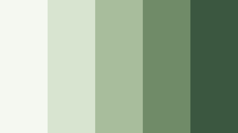
- HEX Codes: #f5f8f1, #d9e4d0, #a8bd9c, #6f8b68, #3c5740
- Mood: Balanced, natural, and quietly modern
- Use for: Use this palette for home design videos, mindful content, eco brands, lifestyle blogs, and calm interface designs.
Sage Studio Calm creates a relaxed and contemporary atmosphere. Its muted green range supports clear layouts and nature-inspired visual storytelling, making it easy to build a brand system that feels grounded and approachable.
Use the pale sage shades for backgrounds and room scenes, then apply darker greens to captions, icons, and logo details. It works particularly well for home design videos, mindful content, and eco-conscious brands that want a modern look with a natural connection.
Pastel & Airy Monochromatic Color Palettes
Skywash Serenity

- HEX Codes: #f3fbff, #cdeefa, #9ad8ef, #5faecb, #32718f
- Mood: Open, peaceful, and refreshing
- Use for: Use this palette for travel vlogs, educational videos, wellness graphics, weather content, and clean website sections.
Skywash Serenity feels light and spacious, making it useful for visuals that should appear calm and optimistic. Its blue shades also support excellent visual clarity, especially when medium and deep tones are reserved for text and graphic details.
Use the pale blue tones for sky footage, title backgrounds, and section dividers. The deeper blue can anchor travel thumbnails, educational diagrams, and wellness graphics while keeping the overall design open and refreshing.
Buttercream Glow

- HEX Codes: #fffdf2, #fff0b8, #f8d96b, #d7a92f, #8b6418
- Mood: Sunny, comforting, and cheerful
- Use for: Use this palette for cooking videos, stationery design, family content, cheerful packaging, and warm social media templates.
Buttercream Glow layers soft yellow tones into a welcoming visual system. It adds brightness and friendliness while retaining enough depth for readable text, borders, and important graphic elements.
Use the creamy shades as a warm canvas for cooking videos and family content, then introduce golden yellow for highlights and ochre for headings. The palette can make social templates feel cheerful without depending on very intense saturation.
Mint Cloud Drift

- HEX Codes: #f3fffb, #c9f1e2, #8bd6bc, #4ba98b, #246354
- Mood: Clean, soothing, and revitalizing
- Use for: Use this palette for health videos, productivity apps, spa branding, sustainability campaigns, and fresh lifestyle content.
Mint Cloud Drift combines airy pale greens with grounded teal accents. The palette feels clean and restorative, making it a natural fit for wellness-focused designs and content that needs a fresh, uncluttered atmosphere.
Use pale mint behind text and footage, medium green for icons or animated highlights, and deep teal for contrast. In health videos and productivity interfaces, this structure can make information feel organized, calm, and easy to follow.
Powder Blue Reverie

- HEX Codes: #f6fbff, #d8eafa, #aecce8, #769fc6, #456d93
- Mood: Thoughtful, airy, and dependable
- Use for: Use this palette for study videos, corporate explainers, personal blogs, presentation templates, and calm digital products.
Powder Blue Reverie offers a softer take on professional blue. Its balanced shades create a dependable look with enough warmth for approachable storytelling, making it suitable for both personal and business-focused projects.
Use the palest shades for clean presentation backgrounds and study video overlays, then rely on medium and deep blue for headings, charts, and navigation. The palette communicates clarity without feeling too formal or distant.
Tips for Creating Monochromatic Color Color Palettes
A successful Monochromatic Color palette depends on more than choosing several shades from the same hue. For video and design, vary lightness and saturation to create hierarchy, test every color against real footage, and consider a restrained complementary accent when the composition needs extra focus.
- Choose one dominant hue first, then create lighter tints, balanced mid-tones, and darker shades around it.
- Use the lightest shade for backgrounds and negative space, and reserve the darkest shade for text, outlines, and high-priority details.
- Check contrast on thumbnails and mobile screens so titles remain readable at small sizes.
- Match the palette to the mood of the footage. Soft pastels suit calm storytelling, while saturated colors work better for energetic edits.
- Keep branding consistent by assigning specific shades to recurring elements such as logos, lower thirds, buttons, and transitions.
- Use HSL adjustments to control saturation and brightness when clips were recorded under different lighting conditions.
- Add a small complementary color accent only when the design needs a clear focal point, warning, button, or call to action.
- Preview the complete edit before exporting to confirm that skin tones, product colors, captions, and background shades remain balanced.
Monochromatic Color palettes can shape the emotional direction of a project while giving every visual element a connected identity. Soft blushes and lavenders can make content feel intimate, while crimson, cobalt, emerald, and orange can create energy and instant recognition.
For a polished result, combine thoughtful color selection with consistent editing. Test these palettes in Filmora across intros, b-roll, thumbnails, captions, and transitions, then adjust the balance until the color system supports both your message and your brand.
Filmora makes it easier to experiment with color matching, HSL controls, filters, and LUTs while keeping the creative process flexible. Start with one palette, compare several treatments, and build a visual style that viewers can recognize from the first frame.
secure download