

 100% Security Verified | No Subscription Required | No Malware

Mysterious Color Palette color choices can make a visual feel cinematic, intimate, and full of hidden meaning. Deep charcoal, midnight blue, muted plum, forest green, and dusky neutrals often suggest suspense, elegance, imagination, or quiet reflection. These tones are especially effective when you want viewers to pause, feel curious, and connect with a story.
This collection provides Mysterious Color Palette color palettes with HEX codes for creators and Filmora users. Use them to shape video intros, thumbnails, branding, social media graphics, title cards, vlogs, and cinematic edits with a consistent visual mood.
In this article
Shadowy & Cinematic Mysterious Color Palettes
Midnight Film Noir
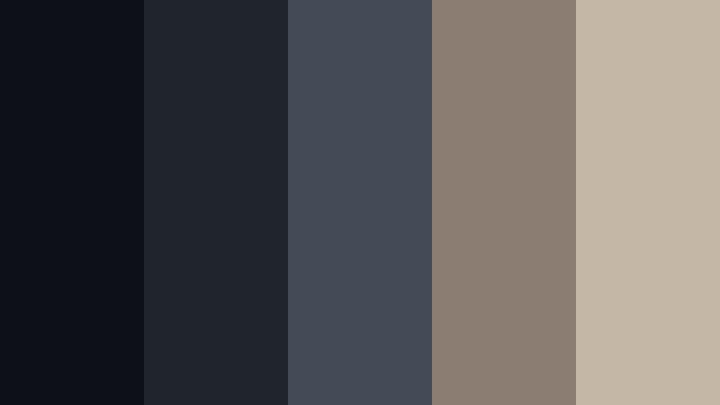
- HEX Codes: #0d1117, #20242b, #454b56, #8b7d72, #c4b7a6
- Mood: Dramatic, mysterious, and cinematic with a refined vintage edge.
- Use for: Use this palette for film trailers, suspense thumbnails, documentary intros, and dark editorial branding.
Midnight Film Noir pairs deep charcoal tones with muted stone neutrals for a classic cinematic mood. The dark foundation creates focus, while the warm gray and beige accents keep the design from feeling flat or severe.
Use the darkest shades for title cards, background panels, and video borders, then reserve the lighter neutrals for subtitles, logos, and key visual details. This combination works especially well for storytelling content, premium visual identities, suspense edits, and documentary sequences.
Pro Tip: Build A Cinematic Mysterious Color Palette Look In Filmora
Use Midnight Film Noir as a visual guide when editing intros, b-roll, interviews, and social clips in Filmora. Apply the deepest charcoal tones to opening titles and transitions, then repeat the muted stone colors in captions, overlays, and end screens to create a unified visual system.
A consistent palette helps separate the important elements from the background without losing the shadowy atmosphere. You can also save your preferred adjustments and reuse them across episodes, thumbnails, and branded video templates.
AI Color Palette
Filmora's AI Color Palette feature can analyze a reference image or color card inspired by Midnight Film Noir and apply its visual balance across an entire video. This is useful when clips were recorded in different lighting conditions or with multiple cameras.
Use a frame with charcoal shadows and warm neutral highlights as your reference, then refine individual shots if needed. The result is a more consistent look across intros, b-roll, talking-head footage, and promotional edits.
 secure download

HSL, Color Wheels & Curves
Fine-tune the Midnight Film Noir look with HSL controls by lowering distracting saturation and slightly cooling blue-gray shadows. Use the color wheels to deepen the shadows, keep the midtones neutral, and add a subtle warm lift to the highlights for a vintage film feeling.
Curves can add contrast without crushing every dark detail. For a softer mystery, raise the lowest point of the curve slightly; for a more dramatic trailer look, create a controlled S-curve that separates the charcoal background from the lighter text and faces.
secure download1000+ Video Filters & 3D LUTs
Filmora's filter library can quickly push Midnight Film Noir toward different cinematic styles. Try a cool, low-saturation filter for suspense footage, or choose a softer vintage LUT when the edit needs a refined documentary or editorial quality.
Filmora's video filters and 3D LUTs make it easy to test several treatments without rebuilding the entire grade. Keep the strongest effect subtle so that faces, captions, and important story details remain clear.
secure downloadVelvet Shadow
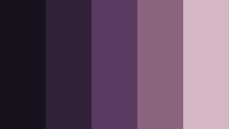
- HEX Codes: #17121d, #33213a, #593b61, #8b647f, #d3b7c5
- Mood: Luxurious, intimate, and softly mysterious.
- Use for: Use this palette for beauty videos, fashion thumbnails, music covers, and elegant social media graphics.
Velvet Shadow blends plum darkness with muted mauve for a rich, tactile feeling. The combination adds drama without becoming harsh or overly bright, making it a natural fit for visuals that need elegance and emotional depth.
Use the deep plum shades behind product shots or title cards, then bring in mauve and pale rose-gray for captions, borders, and highlight details. It can give beauty campaigns, fashion edits, music covers, and lifestyle branding a polished nighttime identity.
Fogbound Harbor
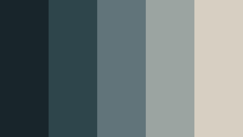
- HEX Codes: #18252b, #2f454c, #60747a, #9aa5a1, #d6d0c3
- Mood: Quiet, atmospheric, and contemplative.
- Use for: Use this palette for travel films, coastal vlogs, reflective storytelling, and calm website interfaces.
Fogbound Harbor captures the stillness of a misty shoreline with blue-gray depths and soft mineral highlights. Its restrained contrast creates a calm mood that feels immersive rather than dramatic.
Use it for coastal footage, slow travel edits, reflective voiceovers, and minimalist interfaces. The pale neutral works well for subtitles and navigation elements, while the darker blue-green shades can frame images without competing with them.
Obsidian Rose
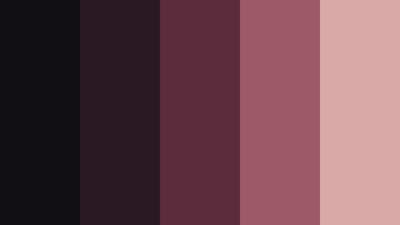
- HEX Codes: #120f14, #2a1823, #5b2c3b, #9d5965, #d8a9a6
- Mood: Romantic, intense, and darkly elegant.
- Use for: Use this palette for wedding films, dramatic title cards, luxury packaging, and romantic lifestyle content.
Obsidian Rose contrasts near-black tones with dusty rose and wine accents. It brings a sophisticated emotional quality to visuals that need both warmth and mystery.
Use the wine shades for transitions, lower thirds, or accent graphics, while the soft rose tone can highlight flowers, skin tones, product details, or romantic typography. This palette is especially effective when a dark design still needs a personal and inviting feeling.
Midnight & Enchanted Mysterious Color Palettes
Lunar Amethyst
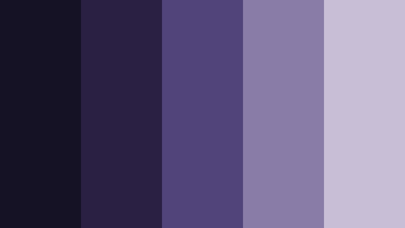
- HEX Codes: #151226, #292044, #51447a, #897da8, #c8bed6
- Mood: Dreamy, mystical, and otherworldly.
- Use for: Use this palette for fantasy videos, astrology content, gaming artwork, and imaginative brand visuals.
Lunar Amethyst layers deep violet with soft lavender for an enchanted nighttime effect. It is ideal for designs that feel creative, spiritual, and slightly surreal without relying on bright neon colors.
Use the darkest purple for backgrounds and cinematic frames, then add lavender to titles, particles, icons, and atmospheric overlays. The palette can make fantasy trailers, astrology videos, game graphics, and imaginative social posts feel more immersive.
Eclipse Blue
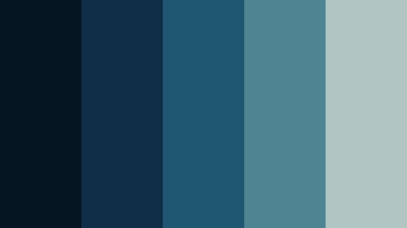
- HEX Codes: #071522, #102f48, #1f5570, #4f8492, #b1c7c3
- Mood: Cool, intelligent, and quietly powerful.
- Use for: Use this palette for technology intros, educational videos, modern dashboards, and science-inspired graphics.
Eclipse Blue combines deep navy with subdued teal for a sleek nocturnal look. The palette feels focused and modern while retaining an air of mystery.
Use navy and blue-teal tones for interface backgrounds, animated charts, and technology title cards. The muted pale highlight can improve readability in captions, diagrams, and logos while maintaining a cool, professional identity.
Enchanted Moss
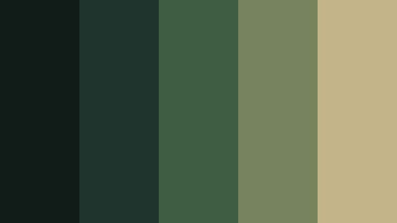
- HEX Codes: #101b18, #20362d, #3f5b43, #78825c, #c3b68b
- Mood: Earthy, secretive, and connected to nature.
- Use for: Use this palette for outdoor vlogs, eco brands, fantasy projects, wellness content, and rustic packaging.
Enchanted Moss pairs forest shadows with olive and muted sage highlights. It gives natural themes a more mysterious and storybook-inspired character.
Use the dark greens for outdoor video overlays, packaging backgrounds, and logo marks, then add sage or muted gold to create separation. This palette works well for hiking content, sustainable brands, herbal products, fantasy scenes, and quiet wellness videos.
Celestial Ink

- HEX Codes: #0b1020, #1d2540, #37466d, #6879a2, #d1c5a8
- Mood: Cosmic, thoughtful, and quietly luxurious.
- Use for: Use this palette for astronomy content, premium presentations, book covers, and cinematic social posts.
Celestial Ink uses inky blues and dusty periwinkle with a warm star-like neutral. The result feels expansive, polished, and perfect for imaginative concepts.
Use the dark blue foundation for space-themed intros, presentation backgrounds, and editorial layouts. The warm neutral can act like a subtle star, spotlight, or premium accent in titles, icons, and visual branding.
Dusky & Atmospheric Mysterious Color Palettes
Twilight Terracotta
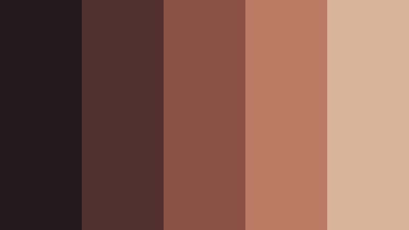
- HEX Codes: #24191c, #51302f, #8b5145, #bb7b63, #d8b49b
- Mood: Warm, nostalgic, and softly dramatic.
- Use for: Use this palette for travel reels, sunset thumbnails, creative portfolios, and artisan product branding.
Twilight Terracotta balances dusky brown with muted clay and peachy highlights. It creates a welcoming mystery that feels handcrafted and cinematic.
Use the darker browns in title backgrounds and video transitions, then bring in terracotta for visual emphasis. The soft peach highlight is useful for captions, product details, sunset imagery, and warm portfolio layouts.
Smoked Lavender

- HEX Codes: #1d1a24, #3a3245, #65566f, #9b879d, #d7c6ca
- Mood: Gentle, introspective, and sophisticated.
- Use for: Use this palette for self-care videos, journal designs, soft fashion content, and modern app interfaces.
Smoked Lavender softens a dark foundation with muted purple and pale rose-gray tones. It feels calm and expressive without losing its enigmatic quality.
Use the darker shades for app navigation, video backgrounds, and understated title cards. The pale tones can support text, product photography, journal pages, and soft fashion graphics while keeping the overall design refined.
Rainy Window
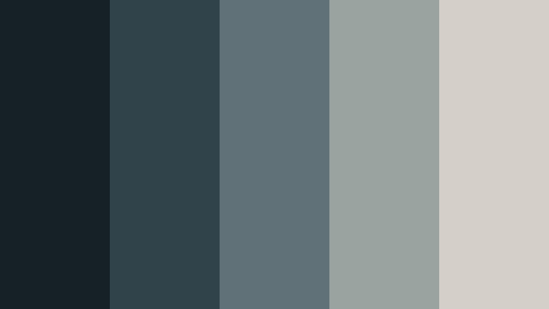
- HEX Codes: #162027, #30434a, #607177, #9aa3a0, #d5d0c7
- Mood: Reflective, peaceful, and atmospheric.
- Use for: Use this palette for study videos, rainy-day vlogs, minimalist websites, and meditative social content.
Rainy Window recreates the cool gray-blue feeling of city light through glass. Its low-contrast tones support quiet visuals and focused storytelling.
Use this palette for ambient edits, study sessions, reflective voiceovers, and minimalist web layouts. The pale gray can keep text readable, while the blue-gray layers create depth around footage of streets, windows, water, and soft indoor light.
Copper Dusk

- HEX Codes: #211719, #4a2925, #7a4030, #ae6a45, #d0a27a
- Mood: Rustic, inviting, and richly atmospheric.
- Use for: Use this palette for food videos, autumn campaigns, craft brands, and warm cinematic title sequences.
Copper Dusk combines deep espresso tones with weathered copper and sandy highlights. It adds warmth and depth to visuals inspired by evening light.
Use the dark brown tones for backgrounds and packaging, then apply copper to headings, transitions, and key product details. It is a strong choice for food photography, handmade goods, autumn campaigns, and cinematic scenes with a tactile, rustic feeling.
Elegant & Modern Mysterious Color Palettes
Charcoal Champagne
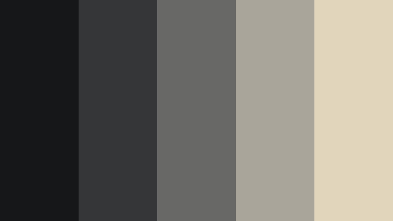
- HEX Codes: #161719, #343638, #686866, #aaa59b, #e1d5bb
- Mood: Polished, restrained, and quietly opulent.
- Use for: Use this palette for luxury branding, corporate presentations, product launches, and premium video graphics.
Charcoal Champagne pairs modern graphite with a soft champagne accent for a clean upscale look. It is a strong choice for minimal designs that still need visual intrigue.
Use charcoal for video frames, presentation backgrounds, and logo areas, then reserve champagne for thin lines, titles, buttons, and product highlights. The palette communicates confidence without relying on excessive contrast or decoration.
Black Pearl Teal
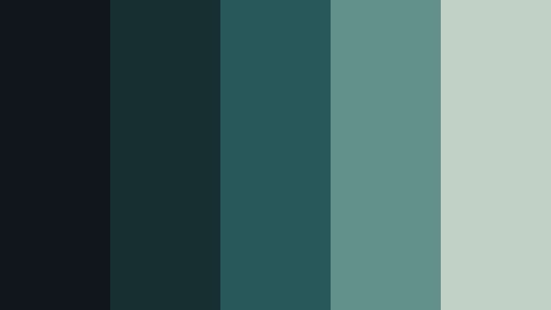
- HEX Codes: #0d1719, #183033, #28585a, #61908a, #c0d0c4
- Mood: Modern, refined, and subtly aquatic.
- Use for: Use this palette for skincare brands, app interfaces, travel content, and sleek product advertisements.
Black Pearl Teal brings together dark green-blue tones and a muted seafoam highlight. The palette feels fresh yet enigmatic, making it versatile for digital design.
Use teal as an accent for buttons, animated elements, product details, and lower thirds. The near-black shades provide a premium foundation for skincare videos, travel edits, technology interfaces, and clean advertising layouts.
Nocturne Gold

- HEX Codes: #111217, #29272b, #514943, #897257, #d4b477
- Mood: Sophisticated, dramatic, and warmly luxurious.
- Use for: Use this palette for awards content, luxury event videos, music branding, and elegant presentation templates.
Nocturne Gold combines near-black neutrals with bronze and antique gold accents. It creates a confident, premium mood for visual stories that need a memorable finish.
Use gold sparingly for logos, awards, title accents, and transition details so it remains special. The dark neutral foundation gives event videos, music branding, presentations, and luxury campaigns a dramatic and cohesive appearance.
Tips for Creating Mysterious Color Palette Color Palettes
A successful Mysterious Color Palette does more than make a design darker. Combine deep shades with carefully chosen midtones and light accents so your video or brand stays readable, balanced, and emotionally clear.
- Use one dominant dark color, one supporting midtone, and one light accent to create a clear visual hierarchy.
- Pair navy, charcoal, plum, or forest green with muted cream, champagne, rose, or sage for readable contrast.
- Keep text and subtitles light enough to remain visible against dark footage, especially on mobile screens.
- Match the palette to the lighting in your footage. Cool palettes suit overcast scenes, while copper and terracotta work well with warm evening light.
- Use accent colors consistently across thumbnails, intros, lower thirds, end screens, logos, and social media templates.
- Avoid using every color at full saturation. Muted tones usually create a more sophisticated and mysterious result.
- Reserve the brightest shade for important actions, keywords, product details, or focal points.
- Test the palette on different screens and export settings to ensure shadows do not become muddy or lose detail.
Mysterious Color Palette color combinations can shape how viewers interpret a story before the first spoken word. Charcoal and navy can suggest suspense, plum can add intimacy, forest green can create a natural secretive mood, and muted gold can make a brand feel premium.
The best palette depends on your footage, audience, and message. Start with one of the HEX code sets above, then adjust saturation, contrast, and highlight intensity until the colors support your content instead of overpowering it.
Filmora makes it easier to test these ideas across complete edits. Apply a reference palette to your footage, fine-tune individual tones, and use filters or LUTs to create a repeatable look for videos, thumbnails, intros, and branded content.
secure download