

 100% Security Verified | No Subscription Required | No Malware

Shorts Color Palette sets a light, playful, and flexible tone that can instantly shape how a video, thumbnail, or brand system feels. In video design, these colors can make content look soft and approachable, while brighter versions can add energy, contrast, and social-first impact.
For creators, Shorts Color Palette color combinations are useful across intros, lower thirds, UI overlays, channel branding, and packaging mockups. This guide shares Shorts Color Palette color palettes with HEX codes for Filmora users, so you can build a look that matches your content style from the first frame to the final cut.
In this article
Soft & Airy Shorts Color Palettes
Cloud Pop Pastels
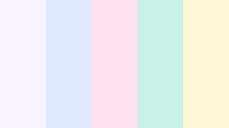
- HEX Codes: #f7f3ff, #dfe9ff, #ffe1ef, #c8f1e7, #fff7d6
- Mood: Light, playful, and breezy.
- Use for: Use it for vlog thumbnails, channel intros, and soft social graphics.
Cloud Pop Pastels feels airy and approachable with a gentle pastel mix. The palette keeps visuals soft without feeling flat, which makes it a good fit for lifestyle edits, beauty content, and friendly creator branding.
Use these tones when you want thumbnails, intro cards, or story overlays to feel calm and inviting. The mix also works well for social posts that need a polished but relaxed look.
Pro Tip: Enhance Your Shorts Color Palette Visuals with Filmora
Cloud Pop Pastels works best when the same pastel balance appears across your whole edit. In Filmora, you can keep your intro cards, captions, b-roll, and end screens visually connected by matching the same soft tones throughout the project.
This helps your content feel like one complete brand system instead of separate clips. It is especially useful for vlog creators, beauty channels, and soft product promos that rely on a consistent mood.
AI Color Palette
If you have a still frame, color card, or mood board built from Cloud Pop Pastels, Filmora's AI Color Palette feature can help apply that look across the rest of your timeline. It is a fast way to keep pastel balance consistent in intros, cutaways, and social edits.
You can use one reference image to guide the color style of multiple clips, which saves time when you want a clean and unified finish.
 secure download

HSL, Color Wheels & Curves
Use HSL to soften the most saturated tones in Cloud Pop Pastels if you want a more muted, editorial finish. Color wheels can help you push highlights a little cooler or warmer depending on the footage, while curves give you fine control over contrast without losing the pastel feel.
For a deeper breakdown of tonal control, Filmora's color grading controls can help you shape pastel edits with more precision. This is useful when you want thumbnails, b-roll, and intro graphics to keep the same light visual language.
secure download1000+ Video Filters & 3D LUTs
Filmora's video filters and 3D LUTs make it easy to turn Cloud Pop Pastels into a more polished or dreamy finish. A soft filter can add warmth to beauty clips, while a clean LUT can keep the palette looking modern and fresh.
This is a quick way to style reels, shorts, and intro sequences without rebuilding the color mood from scratch.
secure downloadPeach Drift Glow
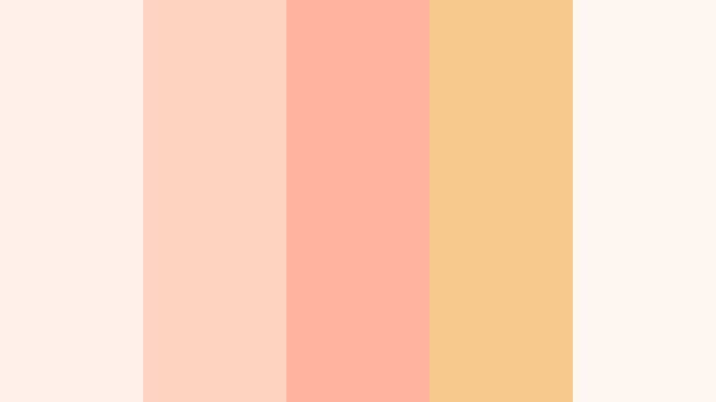
- HEX Codes: #fff1ea, #ffd2c2, #ffb39d, #f7c98b, #fef7ef
- Mood: Warm, soft, and optimistic.
- Use for: Use it for storytelling overlays, seasonal promos, and thumbnail accents.
Peach Drift Glow brings a warm glow that feels inviting and modern. It suits soft product shots, beauty reels, and cozy brand visuals where you want warmth without heavy contrast.
Use it for covers, lower thirds, and overlay shapes that need to feel friendly and easy to watch. The palette also works well for seasonal campaigns and lifestyle content.
Lilac Screen Bloom
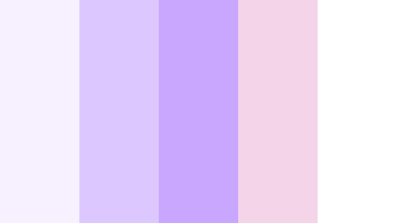
- HEX Codes: #f6f0ff, #dcc8ff, #caa7ff, #f2d6e7, #ffffff
- Mood: Dreamy, fresh, and creative.
- Use for: Use it for aesthetic edits, creator branding, and polished UI highlights.
Lilac Screen Bloom blends soft purple tones with a clean finish. It creates a dreamy visual mood that works nicely for music content, feminine branding, and curated social edits.
It is especially effective in title cards, creator logos, and app-style UI graphics where you want a modern but gentle look.
Mint Whisper Fade
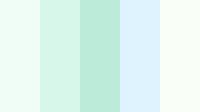
- HEX Codes: #effdf6, #d6f7ea, #bcecd9, #dff3ff, #f9fff7
- Mood: Calm, clean, and refreshing.
- Use for: Use it for wellness content, tutorial covers, and minimal motion graphics.
Mint Whisper Fade feels crisp and soothing with a clean pastel balance. It works well for health, productivity, and minimalist video design where clarity matters as much as style.
Use it in tutorial thumbnails, wellness reels, and calm brand systems that need a fresh and easygoing tone.
Bright & Energetic Shorts Color Palettes
Neon Swipe Rush
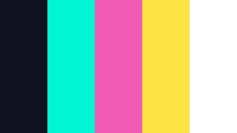
- HEX Codes: #0f1020, #00f5d4, #f15bb5, #fee440, #ffffff
- Mood: Bold, fast, and high-energy.
- Use for: Use it for punchy titles, motion-heavy edits, and scroll-stopping thumbnails.
Neon Swipe Rush is vivid and electric with a strong digital edge. It is a strong match for gaming clips, challenge videos, and hype-driven promos that need instant attention.
The dark base helps the neon accents pop, making it ideal for title animations, reaction graphics, and fast-paced social edits.
Electric Coral Burst
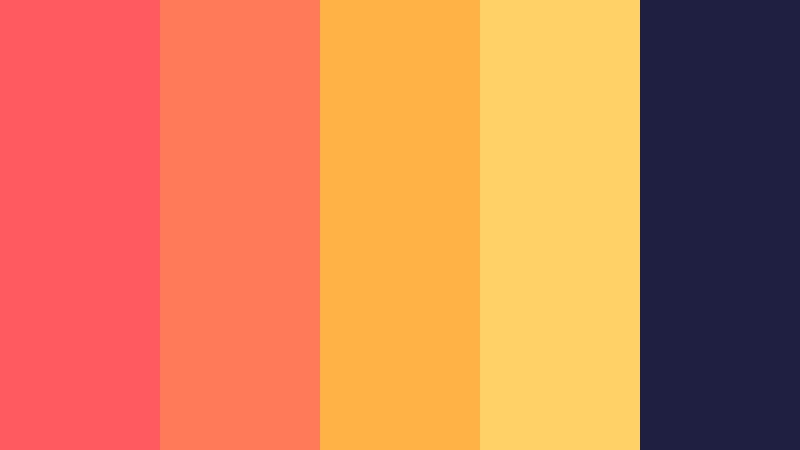
- HEX Codes: #ff5a5f, #ff7a59, #ffb347, #ffd166, #1f2041
- Mood: Fiery, lively, and upbeat.
- Use for: Use it for energetic thumbnails, social ads, and bold opening cards.
Electric Coral Burst pairs coral heat with bright gold for instant impact. It feels active and persuasive, which makes it useful for travel reels, launch promos, and fast cuts.
The palette can also work well for bold branding that needs warmth, motion, and a strong call to action.
Sunset Feed Flash
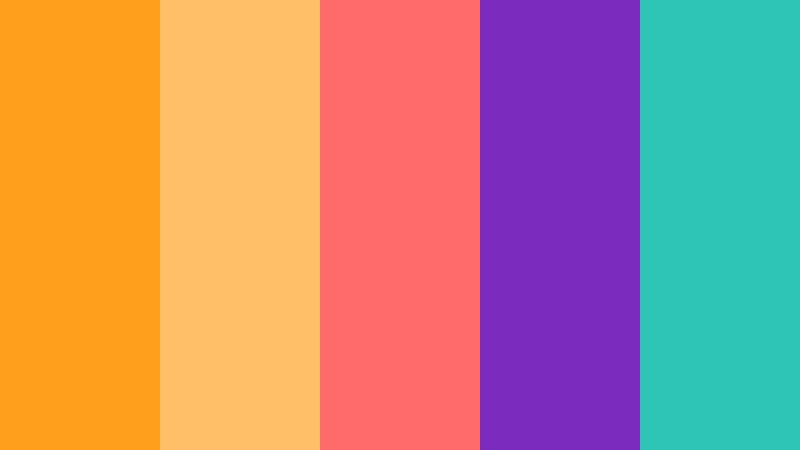
- HEX Codes: #ff9f1c, #ffbf69, #ff6b6b, #7b2cbf, #2ec4b6
- Mood: Vibrant, cinematic, and social.
- Use for: Use it for reel covers, event promos, and creator intro graphics.
Sunset Feed Flash mixes warm sunset tones with a bright social-ready twist. It creates a lively feel that is easy to use across event promos, reels, and creator branding.
It also gives you enough color variety to build thumbnails, captions, and transitions that feel connected but never dull.
High Key Berry
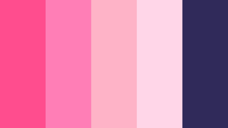
- HEX Codes: #ff4d8d, #ff7eb6, #ffb3c6, #ffd6e7, #2f2a5a
- Mood: Flirty, bright, and modern.
- Use for: Use it for beauty content, fashion edits, and bold cover art.
High Key Berry delivers a sweet berry punch with clean contrast. It feels playful and polished at the same time, which makes it a strong choice for beauty videos and fashion content.
Use it for social covers, promo cards, or brand graphics that need to look fresh, energetic, and visually rich.
Earthy & Cinematic Shorts Color Palettes
Amber Grain Reel
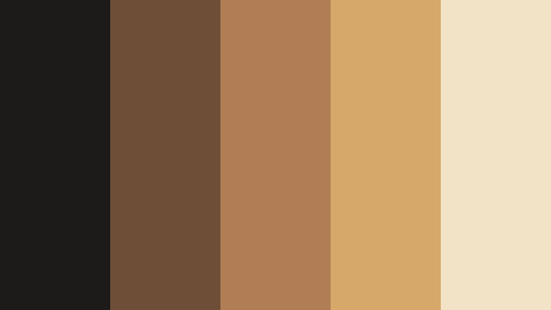
- HEX Codes: #1c1b1a, #6f4e37, #b07d54, #d6a86a, #f2e3c6
- Mood: Rich, warm, and film-like.
- Use for: Use it for documentary titles, cinematic b-roll, and rustic product design.
Amber Grain Reel feels textured and grounded with a warm film aesthetic. It suits travel edits, artisanal branding, and moody storytelling where a natural finish matters.
The palette is a good choice for title sequences, lower thirds, and rustic product visuals that need depth and warmth.
Olive Night Cut
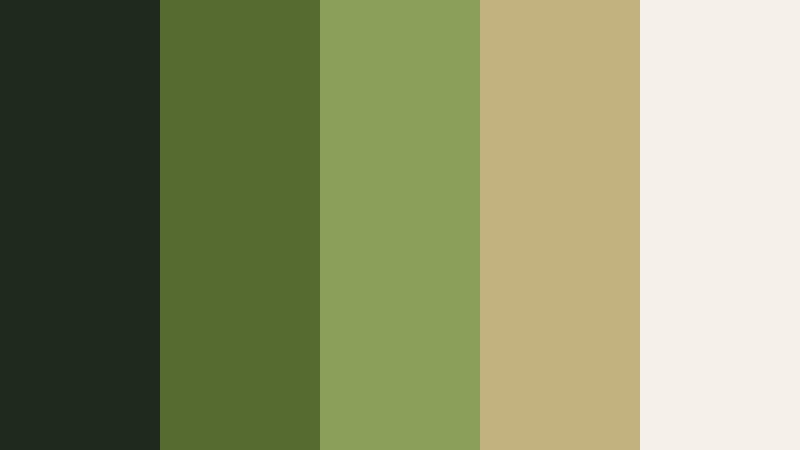
- HEX Codes: #1f2a1f, #556b2f, #8aa05a, #c2b280, #f5f1e8
- Mood: Moody, organic, and refined.
- Use for: Use it for nature content, editorial layouts, and understated brand motion.
Olive Night Cut combines deep green shadows with muted earth tones. It creates a calm, organic feel that works well for outdoor content and quiet cinematic visuals.
This palette can support editorial layouts, subtle motion graphics, and lifestyle branding that aims for a natural premium look.
Terracotta Frame
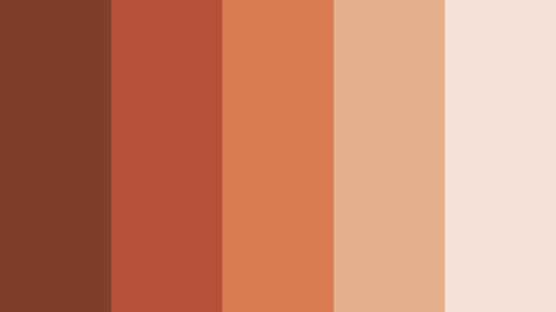
- HEX Codes: #7b3f2a, #b55239, #d97d54, #e7b08c, #f3e2d5
- Mood: Grounded, warm, and handcrafted.
- Use for: Use it for packaging mockups, travel titles, and cozy brand systems.
Terracotta Frame brings clay warmth and a handcrafted feel. It works well for handmade products, interiors, and earthy creator branding that needs a human touch.
Use it in packaging visuals, travel titles, or social posts that should feel welcoming and tactile.
Sapphire Dusk Clip

- HEX Codes: #0f172a, #1d4ed8, #4f83ff, #93c5fd, #e5eefc
- Mood: Moody, polished, and cinematic.
- Use for: Use it for tech explainers, night scenes, and premium motion design.
Sapphire Dusk Clip balances deep navy with luminous blue highlights. It feels sleek and dramatic, which makes it a strong choice for tech, travel, and story-led edits.
The palette works well for premium title cards, app promos, and cinematic overlays that need a cooler and more refined tone.
Clean & Modern Shorts Color Palettes
Monochrome Motion
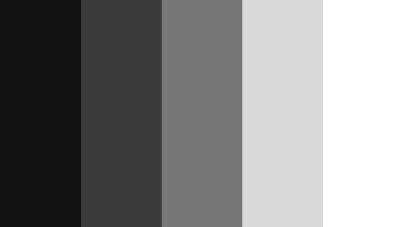
- HEX Codes: #111111, #3a3a3a, #777777, #d9d9d9, #ffffff
- Mood: Minimal, crisp, and timeless.
- Use for: Use it for UI layouts, typography-led thumbnails, and sleek branding.
Monochrome Motion keeps things sharp with classic black, gray, and white balance. It is ideal for clean interfaces, modern channels, and refined visual systems.
Use it when your footage or typography needs a clear, high-contrast backdrop that feels professional and easy to read.
Slate Chrome Loop

- HEX Codes: #2b2d42, #4f5d75, #8d99ae, #cbd5e1, #f8fafc
- Mood: Cool, structured, and professional.
- Use for: Use it for app promos, corporate shorts, and polished lower thirds.
Slate Chrome Loop has a cool tech-forward feel with smooth contrast. It works well for startups, software content, and modern motion graphics that need structure.
This palette is a smart choice for app demos, explainer videos, and business branding where clarity matters.
Digital Sand Minimal
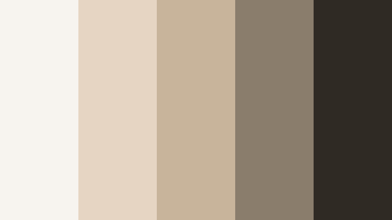
- HEX Codes: #f7f3ee, #e6d5c3, #c8b39b, #8b7d6b, #2f2a24
- Mood: Soft, balanced, and understated.
- Use for: Use it for premium lifestyle branding, product pages, and calm video titles.
Digital Sand Minimal feels warm and contemporary without losing clarity. It is a great fit for neutral branding, architecture content, and elegant UI design.
Use it when you want a minimal look that still feels rich, textured, and premium across video and design assets.
Tips for Creating Shorts Color Palette Color Palettes
To get the best results from a Shorts Color Palette, start with one dominant tone and support it with one or two accent colors. In video and design, balance matters just as much as style, so keep contrast, readability, and brand consistency in mind.
- Use strong contrast for text overlays so thumbnails stay readable on mobile.
- Keep brand colors consistent across intros, lower thirds, and end screens.
- Match palette mood to footage, such as soft pastels for lifestyle clips or deep blues for tech videos.
- Avoid using too many saturated colors in one frame unless the design is meant to feel loud and energetic.
- Test your palette on dark and light backgrounds to make sure key details still stand out.
- Use neutrals to give bright accent colors room to breathe.
- For social videos, make sure your title cards and captions stay clear on small screens.
- In packaging or UI design, repeat one accent color to create a stronger visual system.
Shorts Color Palette color combinations can shape mood just as much as footage, typography, or motion. A soft palette can feel calm and friendly, while a bright or cinematic set can make content feel energetic, premium, or dramatic.
Try these palettes in Filmora to keep your thumbnails, intros, and edits visually aligned from start to finish. With the right color system, even simple projects can feel polished and memorable.
Testing different Shorts Color Palette ideas in Filmora is an easy way to find the right visual voice for your content. Whether you want a pastel brand look, a neon social style, or a clean modern layout, these HEX codes give you a strong place to start.
secure download