

 100% Security Verified | No Subscription Required | No Malware

Spring color palettes are associated with renewal, optimism, softness, and natural growth. Gentle pinks, fresh greens, airy blues, warm yellows, and floral purples can make visual content feel welcoming and energetic without becoming overwhelming. These colors often create an emotional connection that works especially well for lifestyle, beauty, wellness, travel, and seasonal storytelling.
In video and design, Spring Color Palette combinations can shape thumbnails, intros, title cards, social posts, product packaging, and brand identities. This guide provides Spring Color Palette color palettes with HEX codes for creators and Filmora users, along with practical ideas for applying each combination to videos, branding, and creative projects.
In this article
Soft And Romantic Spring Color Palettes
Blossom Mist
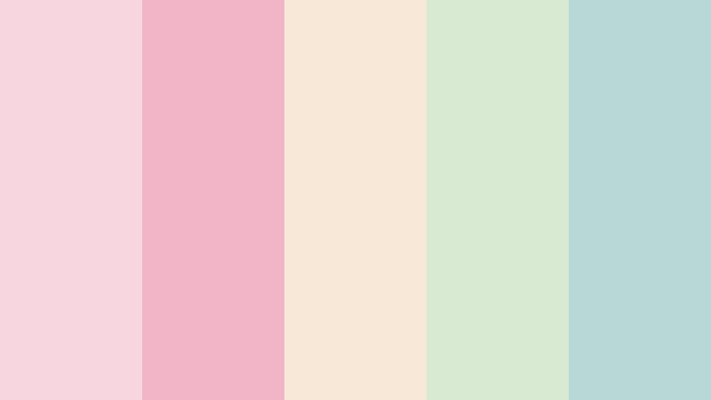
- HEX Codes: #f7d6e0, #f2b5c8, #f8e8d8, #d9ead3, #b8d8d8
- Mood: Tender, airy, and quietly romantic.
- Use for: This palette works well for wedding videos, lifestyle thumbnails, beauty branding, and gentle social content.
Blossom Mist combines blush pink, cream, and soft botanical tones for a delicate spring feeling. The gentle contrast gives footage a polished yet intimate appearance, making it useful for romantic edits, elegant invitations, and calming visual identities.
Use the blush shades for title cards, lower thirds, or thumbnail accents, then reserve the pale green and blue-green tones for backgrounds and supporting details. In a video intro, this balance can create a soft visual signature that feels consistent from the opening frame to the final scene.
Pro Tip: Enhance Your Spring Color Palette Visuals with Filmora
Use Filmora to build a consistent Blossom Mist look across wedding highlights, lifestyle b-roll, and social edits. Apply similar adjustments to your opening titles, transitions, overlays, and end screens so the blush, cream, and botanical colors feel connected throughout the project.
For a more refined result, use the softer shades as background colors and keep the pink tones for important visual cues. This helps your spring visuals remain romantic while preserving clear text and strong subject focus.
AI Color Palette
Creators can use a reference image, color card, or favorite Blossom Mist frame to guide the look of an entire video. Filmora's AI Color Palette feature helps transfer the main color character of a reference to other clips, making it easier to unify footage recorded in different locations or lighting conditions.
Use a floral image, wedding detail, or pastel mood board as your reference, then apply the result to b-roll, portraits, intros, and social cutdowns. This creates a more cohesive Spring Color Palette style without adjusting every clip from scratch.
 secure download

HSL, Color Wheels & Curves
Fine-tune Blossom Mist with HSL controls by slightly reducing saturation in the pinks for a more cinematic wedding look or increasing the greens when you want the botanical tones to feel brighter. Color wheels can warm the highlights with cream and peach while keeping shadows gently blue-green.
Curves are useful for adding soft contrast without losing the airy quality of the palette. A subtle lift in the blacks can create a light editorial finish, while controlled highlight adjustments help preserve detail in white dresses, pastel props, and bright outdoor scenes.
secure download1000+ Video Filters & 3D LUTs
Filmora's library can quickly stylize Blossom Mist with soft, pastel, romantic, or film-inspired treatments. Filmora's video filters and 3D LUTs make it easy to test different moods while keeping your blush, cream, and botanical accents visually harmonious.
Try a gentle filter for beauty content or a subtle cinematic LUT for wedding footage. Keep the intensity moderate so the pale tones remain clean and skin tones do not become overly pink.
secure downloadPeach Petal Glow
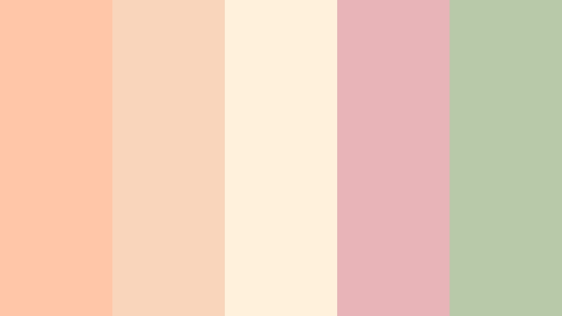
- HEX Codes: #ffc6a8, #f9d5bb, #fff1dc, #e8b4b8, #b7c9a8
- Mood: Warm, cheerful, and softly nostalgic.
- Use for: This palette is ideal for food content, fashion reels, skincare packaging, and warm lifestyle thumbnails.
Peach Petal Glow pairs sunny peach with creamy neutrals and muted green. It feels welcoming and youthful, with enough warmth to make everyday footage appear more inviting.
Use peach for thumbnail highlights, product labels, and intro graphics, while cream provides breathing room for text. The muted green adds a natural counterpoint that works well in skincare, food, and lifestyle branding.
Lavender Garden
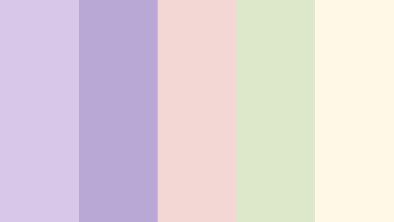
- HEX Codes: #d8c7e8, #b9a7d6, #f2d7d5, #dce8c9, #fff8e7
- Mood: Dreamy, graceful, and imaginative.
- Use for: This palette works well for wellness videos, creative portfolios, journaling content, and soft editorial layouts.
Lavender Garden blends lilac, pale rose, leafy green, and ivory for a peaceful floral mood. Its low-pressure contrast supports mindful design and gentle storytelling.
Try lavender for title cards and section dividers, then use ivory behind body text or captions. This combination can give wellness videos, journaling reels, and creative portfolios a calm yet distinctive visual identity.
Rosewater Picnic

- HEX Codes: #f4c2c2, #f7d9c4, #c9d8b6, #f5efdc, #c2d4e8
- Mood: Playful, fresh, and softly nostalgic.
- Use for: This palette suits picnic vlogs, family content, seasonal announcements, and friendly social media graphics.
Rosewater Picnic combines gentle pinks with sage, cream, and powder blue. The result feels lighthearted and approachable, with a nostalgic quality that suits outdoor and family-focused content.
Use the blue and sage tones in backgrounds or footage overlays, while the pink and peach shades can draw attention to titles and calls to action. The palette is cheerful without looking too loud.
Fresh And Botanical Spring Color Palettes
Dewy Meadow

- HEX Codes: #b7d7a8, #d9ead3, #a8d5ba, #f3f0d7, #8fc1a9
- Mood: Natural, refreshing, and restorative.
- Use for: This palette is a great fit for nature videos, eco brands, gardening content, and sustainable product design.
Dewy Meadow layers fresh greens with a soft cream highlight for an organic spring atmosphere. It communicates growth, balance, and clean living without relying on highly saturated color.
Use the darker green for logos, headings, and navigation elements, then let the lighter greens support backgrounds and video overlays. It is especially effective for environmental campaigns and gardening tutorials.
Citrus Garden

- HEX Codes: #f9d976, #f4a261, #b7d7a8, #70a288, #fff3bf
- Mood: Energetic, sunny, and optimistic.
- Use for: This palette works especially well for recipe videos, fitness content, travel thumbnails, and upbeat promotional graphics.
Citrus Garden brings lemon yellow and orange into balance with leafy greens. It creates a lively look that grabs attention while remaining connected to natural spring imagery.
Use yellow for highlights and calls to action, orange for energetic accents, and green for structure. In a recipe or travel intro, these colors can make the first few seconds feel bright, active, and inviting.
Minted Morning

- HEX Codes: #c7f0db, #98d8c8, #f1f7d4, #f7d6a3, #b6c9d9
- Mood: Clean, bright, and uplifting.
- Use for: This palette is useful for productivity videos, app interfaces, wellness branding, and minimalist presentation slides.
Minted Morning pairs cool mint with pale yellow, peach, and blue-gray accents. The result feels fresh and organized, making it a strong choice for projects that need clarity and a modern spring mood.
Use mint as the dominant background color and reserve peach or pale yellow for important buttons, headings, or visual markers. The blue-gray shade can provide structure in charts, captions, and interface elements.
Bluebell Breeze

- HEX Codes: #a8c7e8, #c7d9f0, #d9ead3, #f6e8c8, #8db6a7
- Mood: Calm, open, and quietly refreshing.
- Use for: This palette fits travel films, outdoor event branding, educational content, and clean website interfaces.
Bluebell Breeze combines sky blue with soft green and warm ivory for an open-air feeling. It provides calm energy and plenty of visual space, which is useful for content with narration or detailed captions.
Use the blue shades for spacious backgrounds and the green tones for natural accents. Warm ivory can soften the overall look and stop the design from feeling too cool or distant.
Bold And Playful Spring Color Palettes
Tulip Pop

- HEX Codes: #f05d7b, #f7b267, #f9d976, #70c1b3, #ffffff
- Mood: Vibrant, playful, and confident.
- Use for: This palette is made for social thumbnails, music edits, youth campaigns, event posters, and eye-catching title cards.
Tulip Pop uses energetic pink, orange, yellow, and teal to create instant visual excitement. White acts as a balancing color, helping the brighter shades feel crisp instead of chaotic.
Use one or two vivid colors at a time in thumbnails and intros. For music edits and youth campaigns, animated text in pink or yellow can provide energy while teal adds contrast and helps key elements stand out.
Coral Carnival

- HEX Codes: #ff7f6a, #f4a261, #e9c46a, #2a9d8f, #264653
- Mood: Lively, adventurous, and expressive.
- Use for: This palette works well for travel content, festival promotions, bold intros, merchandise, and energetic creator branding.
Coral Carnival balances warm coral and gold with teal and deep blue. It gives spring visuals a bold, worldly character that can make a brand or video feel adventurous.
Use deep blue for readable text and structural backgrounds, then bring in coral and gold for movement and emphasis. Teal can connect the warm colors to ocean, travel, or outdoor footage.
Electric Garden

- HEX Codes: #d8f3dc, #95d5b2, #52b788, #f72585, #4361ee
- Mood: Creative, modern, and high energy.
- Use for: This palette is suited to gaming videos, music graphics, digital campaigns, creator logos, and contemporary web design.
Electric Garden contrasts vivid pink and blue with layered greens for a memorable digital look. The green foundation keeps the palette connected to nature, while the bright accents add a distinctly modern edge.
Use neon pink and blue selectively for buttons, transitions, icons, or kinetic typography. A pale green background can give the design enough breathing room for the strongest colors to remain readable.
Apricot Parade

- HEX Codes: #ffb07c, #ffcc80, #f67280, #6ec6ca, #355c7d
- Mood: Friendly, festive, and dynamic.
- Use for: This palette works well for food branding, celebration videos, podcast covers, and colorful promotional content.
Apricot Parade mixes sunny orange with coral, turquoise, and a grounding blue. It creates a welcoming spring identity with plenty of personality and a clear sense of celebration.
Use the deep blue for readable captions and logos, while orange and coral can highlight products, faces, and key moments. Turquoise adds freshness to festive edits and promotional graphics.
Elegant And Modern Spring Color Palettes
Sage And Linen
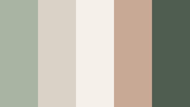
- HEX Codes: #a8b5a2, #d8d2c4, #f5f1e8, #c8a995, #4f5d50
- Mood: Refined, grounded, and understated.
- Use for: This palette is ideal for interior design videos, premium packaging, editorial branding, and sophisticated website layouts.
Sage And Linen combines muted botanical green with warm neutrals and charcoal. It creates a quiet luxury look that feels natural, mature, and highly adaptable.
Use linen and warm beige as the main background colors, then add sage for visual identity and charcoal for strong typography. This combination works particularly well in premium product videos and editorial-style intros.
Pearl Blossom

- HEX Codes: #f7f1e3, #e8c7c8, #c9b6e4, #a8c7c7, #6b6870
- Mood: Elegant, gentle, and polished.
- Use for: This palette works well for beauty campaigns, boutique branding, cinematic title sequences, and refined social templates.
Pearl Blossom pairs soft ivory with rose, lavender, and muted blue-green. Its subtle contrast creates a graceful look for premium spring storytelling and polished visual campaigns.
Use ivory as the dominant canvas, then layer rose and lavender into titles, borders, or product details. The muted blue-green and gray shade can anchor text and give the design enough contrast for practical use.
Modern Wisteria

- HEX Codes: #b8a9c9, #e4c1f9, #cdeac0, #f6e7cb, #3d405b
- Mood: Contemporary, creative, and balanced.
- Use for: This palette is a strong choice for portfolio sites, app interfaces, tech branding, creative presentations, and modern video graphics.
Modern Wisteria blends soft purple and green with cream and deep slate for a sophisticated contrast. It feels fresh while maintaining a confident professional tone.
Use the purple tones for creative accents and the pale green for supporting panels or backgrounds. Deep slate creates strong readability in presentations, portfolio sites, title cards, and technology-focused brand graphics.
Tips for Creating Spring Color Palette Color Palettes
Spring Color Palette combinations work best when they balance freshness with readability. Start with one dominant color, add one or two supporting shades, and use a deeper neutral or contrasting accent to organize the design. This approach helps your video, thumbnail, or brand identity feel colorful without becoming visually crowded.
- Choose one dominant spring shade for backgrounds, large areas, or the overall color grade.
- Use darker green, blue, plum, or charcoal accents when text needs stronger contrast.
- Reserve bright yellow, coral, pink, and orange for calls to action, titles, transitions, and thumbnail focal points.
- Check text readability on both light and colorful backgrounds before exporting your design or video.
- Match the palette to your footage, since outdoor daylight, indoor lighting, and skin tones can change how colors appear.
- Keep branding consistent by repeating the same accent colors in intros, lower thirds, thumbnails, end screens, and social templates.
- Use color temperature intentionally: warm peach and coral can feel friendly, while blue and green can create calm or natural energy.
- Test the palette on mobile screens, where overly pale colors and low-contrast captions may be difficult to see.
Spring Color Palette combinations can shape the emotional direction of a project, from soft and romantic to energetic and modern. Pastel shades can make a brand feel approachable, while stronger coral, teal, yellow, and pink accents can help content stand out in busy feeds.
Whether you are editing a wedding film, building a lifestyle channel, creating a product campaign, or designing a seasonal thumbnail, the right color balance can make your work more memorable. Use HEX codes as a starting point, then adjust saturation, contrast, and brightness to match your footage.
Try these Spring Color Palette ideas in Filmora to create consistent intros, b-roll treatments, social edits, and branded video graphics. With color matching, adjustment tools, filters, and LUTs, you can move from a reference palette to a finished visual style more efficiently.
secure download