

 100% Security Verified | No Subscription Required | No Malware

Sunrise Color is associated with optimism, warmth, energy, and fresh beginnings. Its blend of golden yellow, soft peach, coral, orange, and pink can make visual content feel welcoming and emotionally bright, while deeper accents add contrast and confidence.
These Sunrise Color color palettes are useful for videos, thumbnails, branding, intros, social posts, presentations, and other creative projects. Each idea includes HEX codes so creators and Filmora users can build a consistent look across footage, graphics, titles, and promotional content.
In this article
Warm & Radiant Sunrise Color Palettes
Golden Horizon Glow
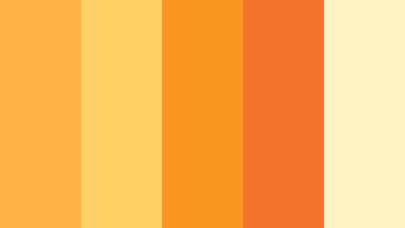
- HEX Codes: #ffb347, #ffd166, #f8961e, #f3722c, #fff1c1
- Mood: Optimistic, radiant, energetic, and welcoming.
- Use for: Use this palette for travel thumbnails, uplifting brand intros, lifestyle videos, and cheerful social content.
Golden Horizon Glow captures the first bright light of morning with warm orange and sunny yellow tones. The creamy pale yellow keeps the combination open and friendly, while the orange shades give it enough depth to stand out.
Use the brighter colors for titles, thumbnail accents, transitions, and animated logo reveals. The softer cream tone works well as a background, helping travel videos, lifestyle edits, and welcoming brand content feel positive without becoming visually overwhelming.
Pro Tip: Enhance Your Sunrise Color Visuals with Filmora
Use Golden Horizon Glow as a visual guide for your entire edit in Filmora. Apply the golden yellow and orange tones to opening titles, lower thirds, b-roll overlays, and end screens so every part of a travel or lifestyle video feels connected.
For a more polished result, reserve the strongest orange for important moments and use the pale cream shade behind text. This creates a clear hierarchy while preserving the optimistic Sunrise Color mood across widescreen videos, vertical reels, and thumbnail designs.
AI Color Palette
Creators can use a sunrise photograph, a color card, or a Golden Horizon Glow reference image to establish a unified visual direction. Filmora's AI Color Palette feature can analyze the reference and help apply its warmth across clips, making mismatched footage feel more consistent.
This is especially helpful when a project combines indoor scenes, outdoor b-roll, and phone footage with different lighting conditions. The result is a more cohesive edit with warm highlights and a welcoming overall tone.
 secure download

HSL, Color Wheels & Curves
Fine-tune Golden Horizon Glow in Filmora by increasing the saturation of orange and yellow highlights while keeping skin tones natural. HSL controls can help separate golden details from red elements, and the color wheels can add warmth to highlights while preserving cooler, balanced shadows.
Use curves to create gentle contrast and make bright areas feel more luminous. For a cinematic sunrise look, slightly deepen the shadows and protect the pale cream areas from becoming too bright. The Filmora color correction tutorial can help guide these adjustments.
secure download1000+ Video Filters & 3D LUTs
Filmora's video filters and 3D LUTs make it easy to stylize Golden Horizon Glow without adjusting every clip manually. Start with a warm cinematic preset, then reduce its intensity if the oranges become too strong.
Filters can also help create variations for different platforms. Use a brighter treatment for social thumbnails and short-form videos, then choose a softer, lower-contrast version for longer travel stories and branded intros.
secure downloadPeach Dawn Radiance
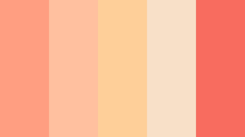
- HEX Codes: #ff9f80, #ffc09f, #ffcf99, #f8e0c8, #f76c5e
- Mood: Soft, friendly, fresh, and gently optimistic.
- Use for: Use this palette for beauty content, cozy vlogs, wellness graphics, invitation designs, and approachable product branding.
Peach Dawn Radiance blends delicate peach tones with a lively coral accent. The result feels warm and personable without becoming overly bright, making it a natural choice for visuals that should feel inviting and easy to trust.
Use the lightest colors for backgrounds, cards, and title areas, then add coral to buttons, captions, logos, or thumbnail highlights. This palette works especially well for beauty videos, wellness intros, cozy vlogs, and approachable product branding.
Amber Morning Light
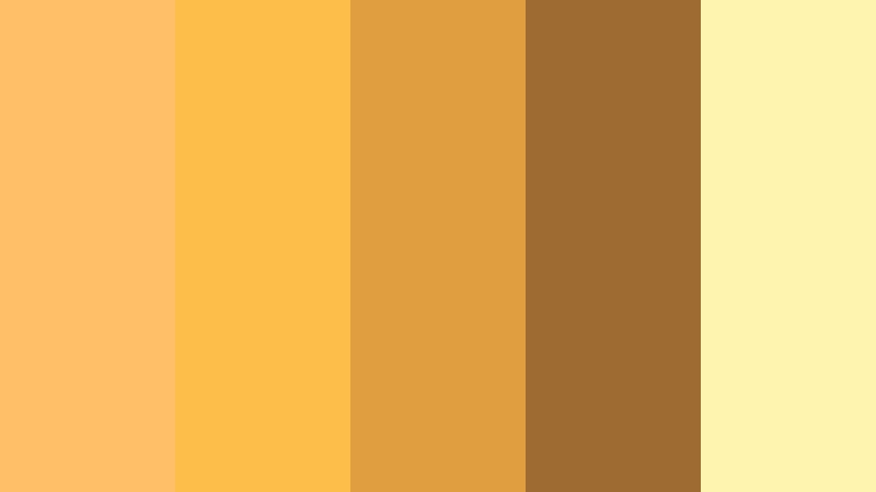
- HEX Codes: #ffbf69, #fcbf49, #e09f3e, #9e6b32, #fff3b0
- Mood: Nostalgic, glowing, earthy, and comforting.
- Use for: Use this palette for cinematic openings, food videos, handmade packaging, editorial layouts, and autumn-inspired campaigns.
Amber Morning Light evokes sunlight passing through a quiet morning window. Its golden shades bring depth and warmth to both digital and print designs, while the brown accent gives the palette a grounded, tactile quality.
Try it for cinematic openings, food content, recipe thumbnails, handmade product packaging, and editorial titles. The pale yellow can lift dark footage, while amber and brown tones add a nostalgic finish to transitions and brand graphics.
Coral Sunburst
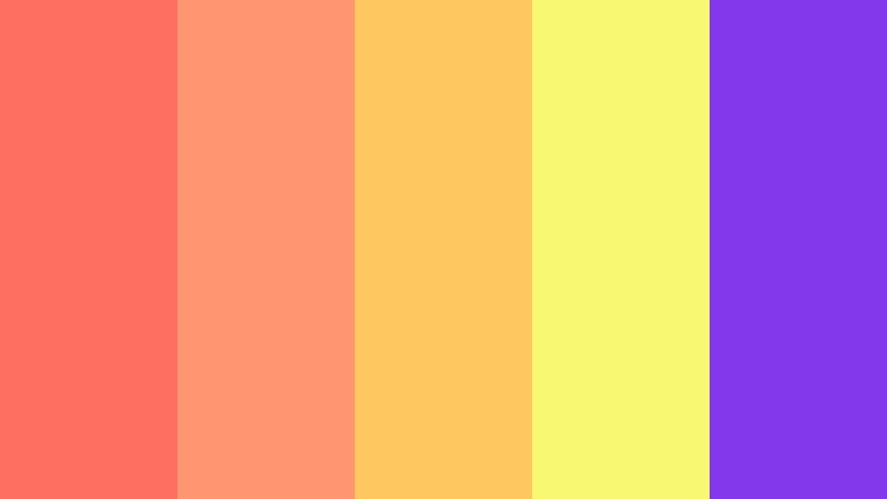
- HEX Codes: #ff6f61, #ff9671, #ffc75f, #f9f871, #8338ec
- Mood: Bold, playful, expressive, and high-energy.
- Use for: Use this palette for creator thumbnails, music promos, event posters, social campaigns, and energetic app graphics.
Coral Sunburst pairs vibrant Sunrise Color warmth with a surprising violet contrast. It is designed for projects that need motion, personality, and strong visual impact.
Use coral and orange for main titles or background shapes, then apply violet to icons, outlines, or selected words. The yellow shades can draw attention to calls to action in music promos, event posters, creator thumbnails, and energetic social edits.
Soft & Dreamy Sunrise Color Palettes
Misty Blush Sunrise
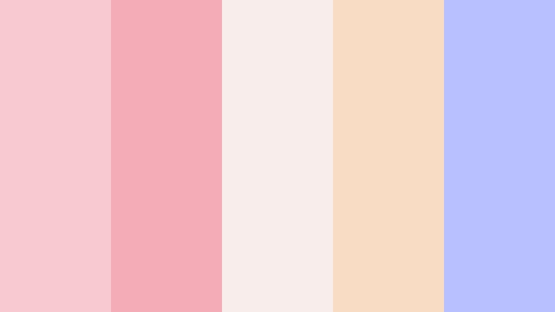
- HEX Codes: #f7cad0, #f4acb7, #f8edeb, #f9dcc4, #b8c0ff
- Mood: Dreamy, tender, calm, and romantic.
- Use for: Use this palette for romantic reels, wedding visuals, self-care content, lifestyle blogs, and soft personal branding.
Misty Blush Sunrise combines airy pinks with a muted lavender-blue accent. It creates a gentle atmosphere suited to emotional storytelling and elegant layouts.
Use the blush colors for title cards, overlays, and soft backgrounds, then introduce lavender-blue in small details for balance. The palette is a strong fit for wedding videos, self-care content, romantic reels, and calm personal branding.
Lavender Dawn Haze
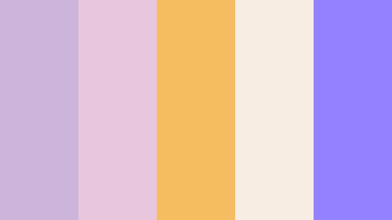
- HEX Codes: #cdb4db, #e8c7de, #f6bd60, #f7ede2, #9381ff
- Mood: Peaceful, imaginative, graceful, and softly modern.
- Use for: Use this palette for meditation videos, creative portfolios, beauty packaging, dreamy thumbnails, and refined social templates.
Lavender Dawn Haze balances cool lavender with a warm golden Sunrise Color accent. The combination feels imaginative while remaining polished and easy to use.
Lavender works well for large backgrounds and atmospheric video graphics, while gold can emphasize headings, logo details, and key transitions. Use the deeper violet sparingly in meditation videos, creative portfolios, beauty packaging, and refined social templates.
Rosewater Morning
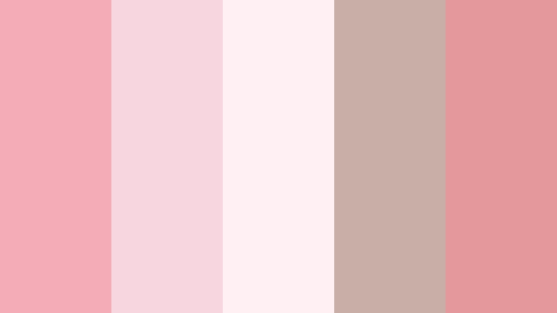
- HEX Codes: #f4acb7, #f7d6e0, #fff0f3, #c9ada7, #e5989b
- Mood: Gentle, intimate, elegant, and comforting.
- Use for: Use this palette for skincare videos, romantic announcements, boutique branding, editorial graphics, and cozy social posts.
Rosewater Morning uses soft rose and cream shades to create a graceful, welcoming look. A muted taupe adds balance and keeps the palette sophisticated rather than overly sweet.
Use cream as a clean canvas for product shots and rose tones for captions, borders, and intro animations. It can give skincare videos, romantic announcements, boutique branding, and cozy social posts a calm and carefully considered identity.
Apricot Cloudscape
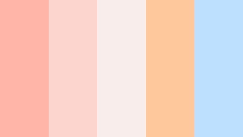
- HEX Codes: #ffb5a7, #fcd5ce, #f8edeb, #fec89a, #bde0fe
- Mood: Lighthearted, airy, cheerful, and serene.
- Use for: Use this palette for family content, cheerful presentations, educational videos, app interfaces, and friendly community branding.
Apricot Cloudscape combines soft orange-pink shades with a peaceful blue accent. It feels bright and optimistic while retaining a calm visual rhythm.
The apricot and cream tones are useful for friendly backgrounds and illustrations, while blue can separate information or create a clear interface accent. Try this palette for family content, educational videos, presentations, and welcoming community branding.
Bold & Vibrant Sunrise Color Palettes
Electric Sunrise Beat

- HEX Codes: #ff595e, #ffca3a, #8ac926, #1982c4, #6a4c93
- Mood: Dynamic, youthful, playful, and adventurous.
- Use for: Use this palette for gaming videos, energetic intros, youth campaigns, sports content, and vibrant social media graphics.
Electric Sunrise Beat turns sunrise warmth into a lively spectrum of red, yellow, green, blue, and purple. It is ideal for bold designs that need immediate energy.
Because every shade is strong, choose one dominant color and use the others as controlled accents. This approach works well for gaming videos, sports intros, youth campaigns, animated thumbnails, and fast-paced social graphics.
Tangerine Festival

- HEX Codes: #f3722c, #f8961e, #f9c74f, #90be6d, #577590
- Mood: Festive, confident, warm, and social.
- Use for: Use this palette for event promotions, food channels, festival branding, creator campaigns, and colorful packaging.
Tangerine Festival brings vivid orange and yellow together with grounded green and blue accents. It gives creative work a celebratory but balanced personality.
Use tangerine for energetic titles and food imagery, then rely on blue-gray for readable text or structured layouts. The green accent adds a natural touch that suits event promotions, food channels, festival branding, and colorful packaging.
Flame And Citrus

- HEX Codes: #ff5400, #ff7b00, #ffba08, #d00000, #370617
- Mood: Powerful, dramatic, passionate, and intense.
- Use for: Use this palette for action trailers, restaurant branding, bold thumbnails, promotional graphics, and high-impact video titles.
Flame And Citrus creates a dramatic sunrise effect with intense reds, oranges, and yellows. A deep burgundy tone adds contrast and cinematic weight.
Use the bright orange and yellow shades for movement, sparks, and attention-grabbing text, while burgundy can frame the composition or support dramatic shadows. This palette is effective for action trailers, restaurant branding, promotional graphics, and high-impact thumbnails.
Sunlit Pop Art

- HEX Codes: #ffbe0b, #fb5607, #ff006e, #8338ec, #3a86ff
- Mood: Creative, expressive, modern, and irreverent.
- Use for: Use this palette for pop culture content, music videos, poster designs, merchandise, and scroll-stopping social graphics.
Sunlit Pop Art mixes golden yellow with hot pink, orange, purple, and blue. The high-contrast combination feels contemporary and instantly recognizable.
Use it to create layered title treatments, bold thumbnail backgrounds, graphic transitions, and colorful music video effects. Keep text readable by placing light lettering over darker purple or blue areas and using yellow for small highlights.
Elegant & Modern Sunrise Color Palettes
Modern Solar Minimalism
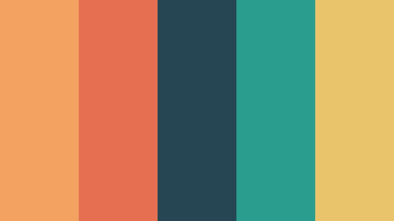
- HEX Codes: #f4a261, #e76f51, #264653, #2a9d8f, #e9c46a
- Mood: Refined, grounded, confident, and contemporary.
- Use for: Use this palette for brand systems, presentation decks, modern websites, documentary titles, and professional video templates.
Modern Solar Minimalism pairs warm sunrise tones with deep teal and blue-green structure. It feels polished enough for corporate design while retaining natural warmth.
Use teal and deep blue-green for backgrounds, navigation, or text, then add coral, orange, and muted gold as selective accents. This balance is useful for professional video templates, documentary titles, presentation decks, and modern websites.
Desert Sunrise Luxe
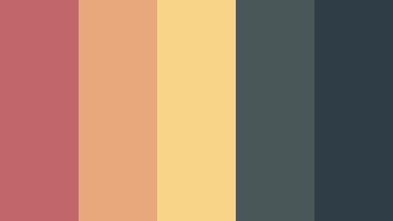
- HEX Codes: #c1666b, #e8a87c, #f7d488, #4a5759, #2f3e46
- Mood: Sophisticated, earthy, warm, and quietly luxurious.
- Use for: Use this palette for premium packaging, travel films, interior design content, luxury thumbnails, and editorial brand identities.
Desert Sunrise Luxe combines dusty coral and sand with charcoal blue-gray tones. It creates a rich, elevated look inspired by open landscapes and early light.
Use the warm shades for product details, landscape footage, and refined title accents. The charcoal tones provide a strong foundation for readable text and cinematic framing in travel films, interior design content, premium packaging, and luxury brand visuals.
Copper Sky Editorial
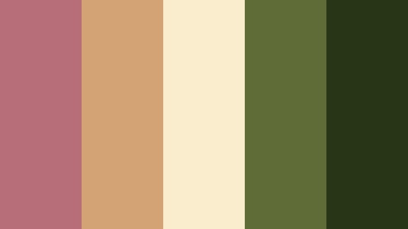
- HEX Codes: #b76e79, #d4a373, #faedcd, #606c38, #283618
- Mood: Editorial, artistic, natural, and composed.
- Use for: Use this palette for magazine-style layouts, creative agency reels, documentary branding, sustainable products, and thoughtful social campaigns.
Copper Sky Editorial blends warm copper and cream with muted botanical greens. The palette feels artful and grounded, making it effective for premium storytelling.
Apply cream to spacious layouts and use copper for headings, frames, and image overlays. The green shades work well for sustainable brands, documentary content, creative agency reels, magazine-style videos, and thoughtful social campaigns.
Tips for Creating Sunrise Color Color Palettes
Combining Sunrise Color with the right supporting shades can make a video or design feel warm without losing clarity. Start with one dominant color, add a supporting tone, and reserve the strongest accent for details that need attention.
- Use dark blue, charcoal, burgundy, or deep green to create contrast against bright orange, yellow, peach, and pink tones.
- Check text readability on every thumbnail, title card, and video overlay, especially when using pale yellow or cream backgrounds.
- Choose one main Sunrise Color shade for branding consistency and use the other palette colors as secondary accents.
- Match the palette to the lighting in your footage. Warm colors suit golden-hour clips, while cooler accents can balance indoor or overexposed scenes.
- Use saturation carefully. Strong orange and coral tones can attract attention, but reducing saturation may create a more premium or cinematic finish.
- Repeat palette colors across intros, lower thirds, transitions, captions, end screens, and thumbnails to create a recognizable visual system.
- Test color combinations on mobile screens because small displays can reduce contrast between similar peach, pink, yellow, and cream tones.
- Save your final color values as reusable brand references so future videos and social designs maintain the same visual identity.
Sunrise Color palettes can shape the emotional direction of a project, from cheerful and energetic to calm, romantic, earthy, or luxurious. Warm shades create a sense of optimism and connection, while blue, green, purple, and charcoal accents provide structure and visual balance.
Choose a palette based on your audience, footage, and message, then adjust the intensity for each platform. A bright combination may work well for a creator thumbnail, while a softer version may be better for a documentary intro or professional brand video.
Filmora makes it easier to test these Sunrise Color color combinations across complete edits. Use AI Color Palette for consistent matching, HSL and color tools for precise adjustments, and filters or 3D LUTs to develop a finished visual style.
secure downloadNext: Sky Color Color Palette
