

 100% Security Verified | No Subscription Required | No Malware

Sunset Color palettes combine warm amber, coral, rose, berry, and twilight tones to create feelings of comfort, optimism, romance, and cinematic depth. These colors can make visual content feel more personal and memorable while giving viewers a sense of warmth and movement.
Creators use Sunset Color in video intros, travel edits, thumbnails, branding, social media graphics, and title cards. This collection provides Sunset Color color palettes with HEX codes for creators and Filmora users, along with practical ideas for applying each combination to video and design projects.
In this article
Warm & Dreamy Sunset Color Palettes
Golden Horizon
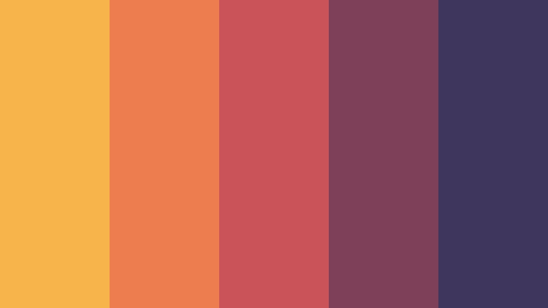
- HEX Codes: #f6b44b, #ed7d4f, #c95358, #7d4058, #3e365c
- Mood: Warm, optimistic, and cinematic with the glow of a late summer evening.
- Use for: Use this palette for travel thumbnails, inspirational brand intros, lifestyle reels, and cinematic title cards.
Golden Horizon blends glowing amber with coral, berry, and dusky violet for a rich sunset effect. The bright first color brings energy, while the darker shades add depth and a polished cinematic finish.
Use the lighter tones for backgrounds, highlights, and animated titles, then reserve the berry and violet shades for text, overlays, or shadow areas. This combination works especially well for travel stories, uplifting campaigns, lifestyle videos, and warm personal branding.
Pro Tip: Build a Cinematic Sunset Color Look in Filmora
Use Golden Horizon as a visual guide for the entire edit instead of applying it only to the opening title. Keep amber and coral tones visible in the intro, b-roll, transitions, and end screen so the project feels unified from beginning to end.
Filmora makes it easy to balance warm highlights with dusky shadows. You can use the palette for title cards, lower thirds, overlays, and thumbnail graphics while keeping skin tones and important subjects natural.
AI Color Palette
Creators can capture the colors from a reference image, sunset photograph, or custom color card and apply the look across an entire video. Filmora's AI Color Palette feature helps match clips so different scenes share the same Golden Horizon warmth.
This is useful when footage was recorded in different locations or under changing light. Apply the palette to travel b-roll, talking-head clips, and social edits, then make small manual adjustments where needed for a consistent result.
 secure download

HSL, Color Wheels & Curves
Fine-tune Golden Horizon by increasing orange and yellow saturation in the highlights while keeping berry and violet tones controlled in the shadows. HSL adjustments can make the sunset feel brighter, softer, or more dramatic without changing every color in the frame.
Use the color wheels to warm the highlights and gently cool the shadows. Curves can add contrast around the subject while preserving the soft glow that makes this palette effective for cinematic intros and travel footage.
secure download1000+ Video Filters & 3D LUTs
Filmora's presets can quickly push Golden Horizon toward a nostalgic film look, a clean travel style, or a richer evening mood. Start with a warm filter, then reduce its intensity so the amber and coral shades remain balanced.
Filmora's video filters and 3D LUTs make it easy to stylize sunset footage without grading every clip from scratch. Use one look for the main sequence and a slightly darker variation for titles or night scenes.
secure downloadDesert Afterglow
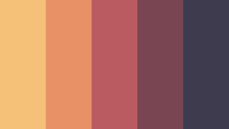
- HEX Codes: #f4c27a, #e89068, #ba5b61, #784653, #3f3c4f
- Mood: Earthy, nostalgic, and quietly dramatic.
- Use for: Use this palette for documentary visuals, desert travel content, editorial layouts, and atmospheric social posts.
Desert Afterglow pairs sandy gold with muted terracotta and plum shadows. Its restrained saturation gives the palette a grounded, handcrafted character that feels connected to natural landscapes.
Use sandy tones for backgrounds and warm light, then add plum for text, borders, or cinematic shadows. It is a strong choice for documentary visuals, desert travel edits, editorial layouts, and atmospheric social posts.
Peach Ember
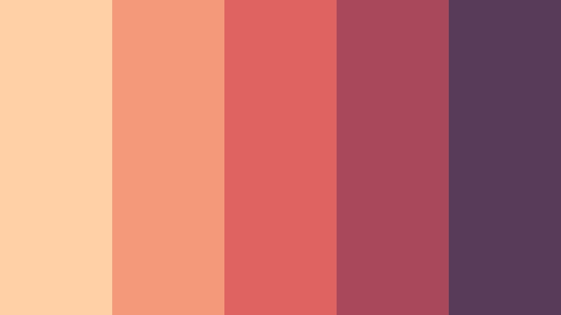
- HEX Codes: #ffd0a6, #f49a78, #df645f, #a9475b, #573b59
- Mood: Playful, romantic, and softly energetic.
- Use for: Use this palette for beauty thumbnails, personal vlogs, wedding content, social templates, and cheerful packaging.
Peach Ember combines light peach and coral with a berry base for a friendly, romantic look. The pale shades create an open feeling, while the darker tones prevent the design from becoming too delicate.
Use it for beauty tutorials, wedding videos, personal vlogs, and social templates. Peach works well as a background, while coral and berry can highlight calls to action, titles, and key visual details.
Canyon Rose
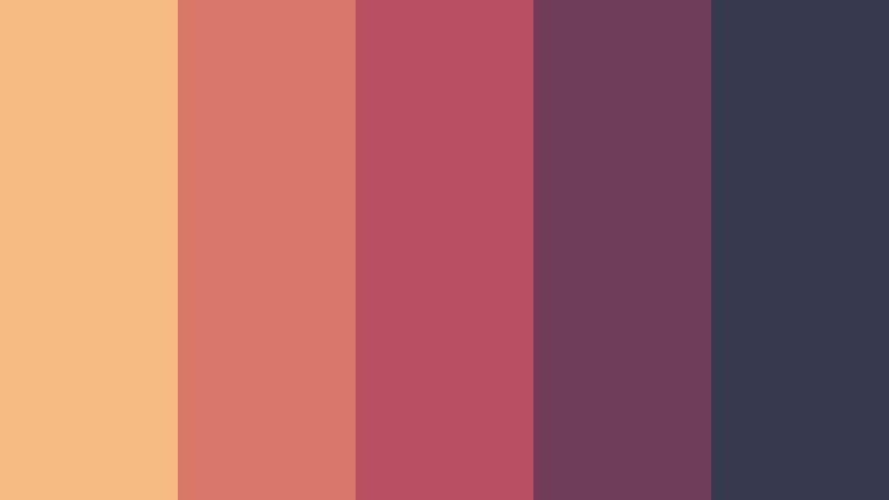
- HEX Codes: #f5bb82, #d97868, #b84f63, #713c57, #37394f
- Mood: Romantic, adventurous, and richly expressive.
- Use for: Use this palette for fashion edits, travel campaigns, music visuals, personal branding, and dramatic video covers.
Canyon Rose brings together sunlit sand, dusty rose, and deep twilight tones. It feels adventurous and expressive while maintaining an elegant editorial finish.
Use the lighter shades for scenic footage and backgrounds, then apply rose and twilight colors to fashion graphics, music visuals, and dramatic video covers. The combination also works well for personal brands that want warmth with a confident edge.
Coastal Sunset Color Palettes
Ocean Meets Flame
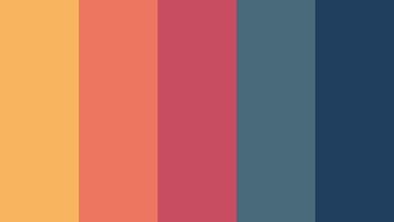
- HEX Codes: #f9b45f, #ec765e, #c84d61, #496a78, #203e5d
- Mood: Vibrant, refreshing, and visually balanced.
- Use for: Use this palette for coastal travel videos, adventure thumbnails, outdoor brands, and energetic social content.
Ocean Meets Flame contrasts fiery sunset hues with cool ocean blue. The opposing temperature creates clear visual hierarchy and helps important elements stand out.
Use orange and coral for subjects, titles, and calls to action, then use blue for backgrounds, water scenes, and supporting text. This palette is especially effective for coastal travel videos, outdoor brands, and energetic thumbnails.
Coral Tide
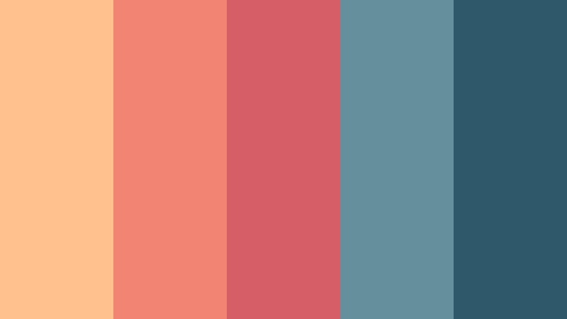
- HEX Codes: #ffc18d, #f18472, #d65f67, #63909a, #2f596b
- Mood: Fresh, relaxed, and inviting.
- Use for: Use this palette for beach vlogs, wellness content, hospitality branding, mobile interfaces, and summer campaigns.
Coral Tide softens sunset warmth with seafoam blue and deep teal. It feels approachable and polished, making it suitable for content that needs both energy and calm.
Use coral for friendly accents and teal for navigation, text, or background areas. The palette works across beach vlogs, wellness content, hospitality branding, mobile interfaces, and summer promotions.
Twilight Lagoon
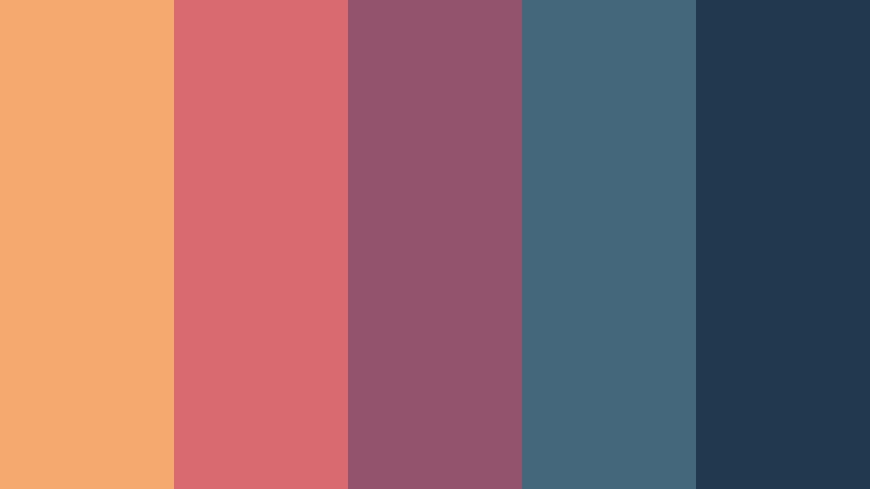
- HEX Codes: #f6a96e, #d96a70, #94536d, #45677c, #21384f
- Mood: Mysterious, calm, and cinematic.
- Use for: Use this palette for evening travel edits, film posters, ambient music content, gaming visuals, and dark UI accents.
Twilight Lagoon moves from orange glow into berry, slate blue, and midnight navy. This progression creates depth and an elegant after-dark atmosphere.
Use the orange and rose shades to guide attention toward faces, titles, or illuminated scenery. The navy and slate colors are useful for dark interfaces, film posters, ambient music videos, and evening travel edits.
Tangerine Shore

- HEX Codes: #ffc36b, #f58b58, #df5a55, #8eb0aa, #35616b
- Mood: Sunny, lively, and optimistic.
- Use for: Use this palette for food content, summer promotions, creator intros, travel thumbnails, and cheerful product packaging.
Tangerine Shore combines bright citrus tones with muted aqua and coastal teal. It delivers a playful summer mood while keeping layouts balanced and readable.
Use tangerine and orange for energetic titles, food imagery, and creator intros. Aqua and teal can support text, borders, and backgrounds in travel thumbnails, summer campaigns, and product packaging.
Bold & Cinematic Sunset Color Palettes
Neon Dusk

- HEX Codes: #ffb34f, #f05a55, #c52f68, #673d83, #20284f
- Mood: Electric, confident, and nocturnal.
- Use for: Use this palette for music videos, gaming thumbnails, event promotions, motion graphics, and bold social campaigns.
Neon Dusk intensifies sunset orange with hot pink, violet, and deep blue. It is designed for high-impact visuals that need a modern nightlife edge.
Use the brightest colors for animated titles, glow effects, and focal points, while deep blue anchors the composition. This palette is a natural fit for music videos, gaming graphics, event promotions, and bold social campaigns.
Crimson Eclipse
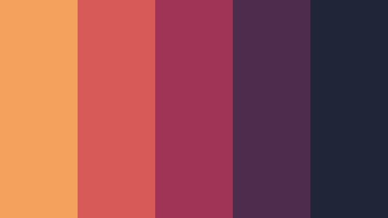
- HEX Codes: #f3a15d, #d85a56, #9f3456, #4d2d4e, #1f2638
- Mood: Powerful, moody, and dramatic.
- Use for: Use this palette for film titles, luxury campaigns, thriller thumbnails, album art, and cinematic presentation slides.
Crimson Eclipse layers copper light over deep crimson and near-black violet. The dark foundation gives the palette a commanding quality suited to suspenseful and premium storytelling.
Use copper for highlights and metallic details, then reserve crimson and violet for titles, shadows, and dramatic transitions. It works well for thriller thumbnails, luxury campaigns, album art, and cinematic presentations.
Firelight Noir
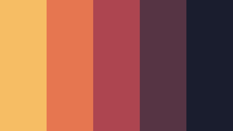
- HEX Codes: #f7bd65, #e4774f, #ad4550, #563443, #191d2d
- Mood: Intimate, mysterious, and filmic.
- Use for: Use this palette for documentary openers, restaurant branding, fashion reels, podcast covers, and moody editorial design.
Firelight Noir balances a warm firelit center with smoky burgundy and charcoal navy. The contrast creates intimacy and atmosphere without losing visual clarity.
Use warm tones on faces, food, or key products, and use charcoal navy for backgrounds and framing. The palette brings a refined filmic quality to restaurant branding, fashion reels, podcast covers, and documentary openers.
Solar Drama
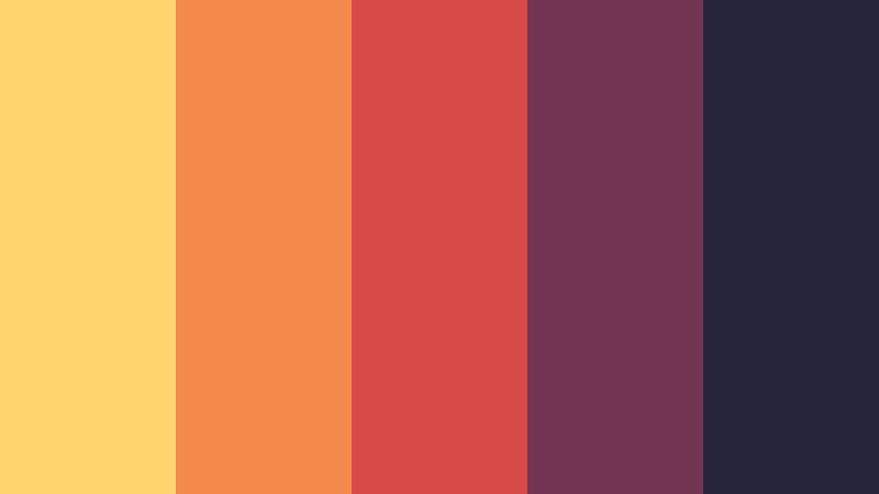
- HEX Codes: #ffd36e, #f58b4b, #d84a48, #713451, #27253c
- Mood: Bold, radiant, and emotionally charged.
- Use for: Use this palette for motivational videos, sports edits, campaign graphics, bold thumbnails, and expressive brand identities.
Solar Drama makes bright yellow and orange feel more sophisticated with red wine and dark plum. The bright center creates a strong focal point, while the darker colors add authority and contrast.
Use yellow for energetic highlights and orange for movement or calls to action. Wine and plum are useful for logos, text, and background panels in sports edits, motivational videos, and expressive brand identities.
Soft & Modern Sunset Color Palettes
Blush Horizon
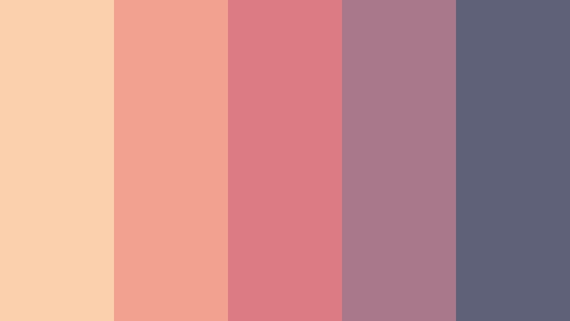
- HEX Codes: #fbd0ad, #f2a18e, #dc7b83, #a9788a, #5f6178
- Mood: Gentle, elegant, and contemporary.
- Use for: Use this palette for wellness brands, beauty tutorials, soft social templates, personal websites, and calm video intros.
Blush Horizon turns sunset colors into a refined mix of peach, rose, mauve, and muted slate. It feels polished in minimal layouts and soothing in calm content.
Use peach for open backgrounds, rose for visual accents, and slate for readable text. The palette suits wellness brands, beauty tutorials, personal websites, social templates, and gentle video intros.
Mauve Sundown

- HEX Codes: #f5c09e, #dda08f, #b98291, #826d86, #4a526b
- Mood: Calm, sophisticated, and introspective.
- Use for: Use this palette for editorial graphics, journaling videos, lifestyle branding, app interfaces, and modern packaging.
Mauve Sundown blends muted sunset pinks with cool lavender and blue-gray. Its understated contrast supports thoughtful storytelling and premium design systems.
Use the warm shades to soften photography and the cool shades to organize layouts or frame text. This palette works especially well for journaling videos, lifestyle branding, editorial graphics, app interfaces, and modern packaging.
Lavender Horizon
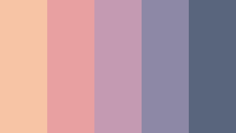
- HEX Codes: #f7c4a5, #e8a0a0, #c49ab0, #8d88a3, #59647d
- Mood: Dreamy, airy, and quietly creative.
- Use for: Use this palette for creative portfolios, music playlists, soft-focus reels, digital stationery, and gentle UI themes.
Lavender Horizon adds a cool lavender finish to peach and rose sunset tones. The palette feels imaginative, light, and easy to adapt for modern digital content.
Use the peach and rose colors for gentle motion graphics, thumbnails, and image overlays, then use lavender and blue-gray for text and interface elements. It is a natural choice for creative portfolios, playlists, soft-focus reels, and digital stationery.
Tips for Creating Sunset Color Color Palettes
A successful Sunset Color palette should balance warmth with enough contrast for clear communication. Choose colors based on the mood of your footage, the personality of your brand, and the way viewers will see the final design on screens of different sizes.
- Pair bright sunset colors with deep navy, plum, or charcoal when you need strong text contrast.
- Use one dominant warm color, one supporting color, and one darker anchor shade to keep the composition organized.
- Check text readability on thumbnails, title cards, and mobile screens before publishing.
- Match the palette to the lighting in your footage so the color treatment feels intentional rather than artificial.
- Use coral, orange, and yellow for focal points, buttons, transitions, and important visual details.
- Keep darker berry, violet, and blue tones for backgrounds, shadows, outlines, and secondary information.
- Repeat the same accent colors in intros, lower thirds, captions, thumbnails, and end screens to strengthen brand consistency.
- Test the palette in both bright and dark scenes, then reduce saturation if skin tones or important product colors look unnatural.
Sunset Color palettes can shape the emotional direction of a project before viewers hear the first line of dialogue. Warm amber and coral can suggest optimism and connection, while berry, violet, and navy can add sophistication, mystery, or cinematic depth.
Whether you are creating a travel vlog, a branded intro, a social campaign, or a cinematic short, the right combination can make your visuals easier to recognize. Choose a palette that supports your message, then repeat its key colors across footage, graphics, and promotional assets.
Try these Sunset Color palette ideas in Filmora to compare different moods, match footage, and build a consistent look from the first frame to the final call to action.
secure download