

 100% Security Verified | No Subscription Required | No Malware

Travel Video Color often feels fresh, cinematic, and easy to connect with because it blends adventure, warmth, and movement. In video, it can make a thumbnail pop, give a vlog intro more energy, and create a clear visual identity across titles, lower thirds, and social clips.
This guide shares Travel Video Color color palettes with HEX codes for creators and Filmora users who want ready-to-use combinations for edits, branding, thumbnails, and motion graphics. Each palette is built to help you match mood with footage while keeping your visuals consistent.
In this article
Bright Coastal Travel Video Color Palettes
Coastal Dawn Glow

- HEX Codes: #f6e7d7, #f7b36a, #ff7f50, #4fb3bf, #1f4e79
- Mood: Fresh, uplifting, and sun-washed.
- Use for: Use this palette for travel vlog thumbnails, beach intro screens, and cheerful social graphics.
A glowing mix of seaside warmth and sky blue energy makes this palette feel open and inviting. It works especially well for content that needs a friendly, adventurous mood without losing polish.
Use it for thumbnails, intro cards, and channel branding when you want viewers to feel like the journey is already starting. The warm coral and blue balance also helps create a clean look for overlays and title sequences.
Pro Tip: Enhance Your Coastal Travel Video Look In Filmora
Filmora makes it easy to keep this palette consistent across your edit, from opening titles to b-roll transitions. Use the same warm sand, coral, and ocean blue accents in text, stickers, and lower thirds so the whole video feels connected.
If your travel footage includes bright skies or beach highlights, Filmora can help you keep the colors vibrant without making them look overdone. That balance is useful for creator intros, recap edits, and short-form clips that need a polished but natural finish.
AI Color Palette
Take this palette from a reference image or color card and apply it across your project with Filmora's AI Color Palette feature. It is a fast way to match a thumbnail design, intro frame, or mood board to the rest of your travel video.
Creators can use the same look for title screens, social teasers, and branded content without manually rebuilding every color choice. That saves time and keeps the visual style steady across multiple scenes.
 secure download

HSL, Color Wheels & Curves
Use HSL to gently boost the coral and aqua tones while keeping skin tones natural. Filmora's color correction tools can help you tune highlights and shadows so the footage keeps a sunny, cinematic feel.
Color wheels and curves are useful when you want the ocean blues to feel deeper or the highlights to glow a little more. A soft S-curve can add contrast without making the scene look harsh.
secure download1000+ Video Filters & 3D LUTs
Filmora's video filters and 3D LUTs make it easy to push this coastal palette toward a brighter vacation style or a softer cinematic tone. A light filter can help the sky blues and warm oranges feel more unified across different clips.
This is a fast way to give your travel montage or vlog opener a consistent color identity. You can test a few looks, then keep the one that fits your beach footage, thumbnail design, and social exports.
secure downloadLagoon Snap

- HEX Codes: #d7fff6, #73e2d1, #1ebfa6, #0f766e, #083344
- Mood: Cool, crisp, and refreshing.
- Use for: Use this palette for ocean reels, clean UI overlays, and polished brand intros.
Soft aqua tones meet deep lagoon contrast for a modern coastal look. The result feels calm, clean, and ideal for travel footage with water, glass, or bright natural light.
It works well for serene reels, minimalist thumbnails, and branding elements that need a fresh, organized appearance. The darker anchor shade adds enough depth to keep the palette from feeling too light.
Sunlit Harbor Blues

- HEX Codes: #eaf6ff, #9fd3ff, #4ea3ff, #1d4ed8, #0f172a
- Mood: Bright, open, and cinematic.
- Use for: Use this palette for destination highlights, title cards, and clean travel channel branding.
Layered blues create a polished harbor mood with strong visual clarity. It feels breezy and cinematic, which makes it a strong fit for destination storytelling and wide scenic shots.
Use the lighter blues for backgrounds and the deep navy for text or borders to keep designs readable. This palette can also make channel banners and title cards look more professional.
Coral Passport Pop
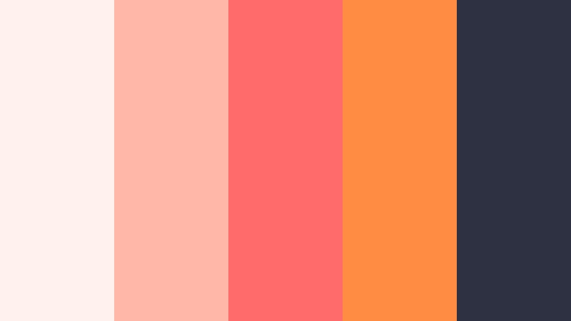
- HEX Codes: #fff1ee, #ffb7a8, #ff6b6b, #ff8c42, #2d3142
- Mood: Playful, vibrant, and energetic.
- Use for: Use this palette for catchy thumbnails, social promos, and lively travel recap graphics.
Coral and tangerine accents make this palette feel upbeat and eye catching. It is a strong choice for fast paced edits, bold text treatments, and creator content that needs instant personality.
The dark base shade adds structure, so bright colors can stay lively without overwhelming the frame. Use it for recap titles, callouts, and thumbnail text that needs to stand out in a crowded feed.
Warm Desert Road Travel Video Color Palettes
Desert Mile Gold
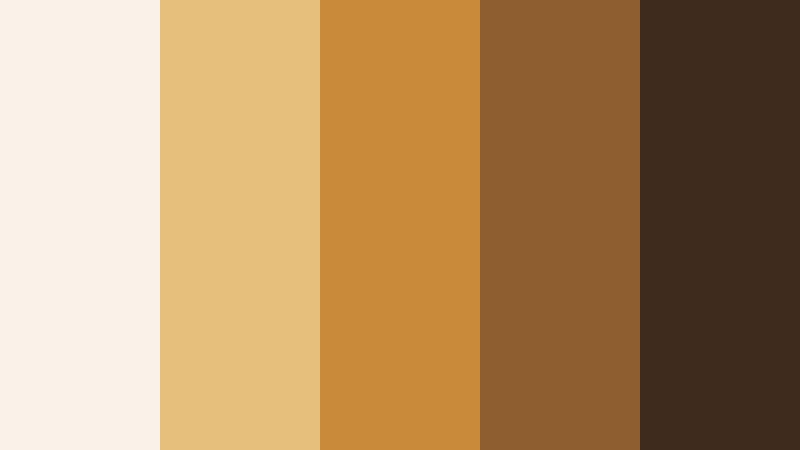
- HEX Codes: #f9f2e8, #e6c07b, #c98b3a, #8f5e2e, #3f2b1d
- Mood: Golden, earthy, and expansive.
- Use for: Use this palette for road trip edits, outdoor branding, and warm documentary titles.
Dusty golds and deep browns bring out the feeling of open roads and long horizons. The palette feels grounded and cinematic, which makes it easy to pair with landscape footage and travel narration.
It is a natural fit for rustic titles, documentary overlays, and brand graphics that need warmth without looking too bright. The darker brown adds a strong base for text and logo marks.
Canyon Sunset Route
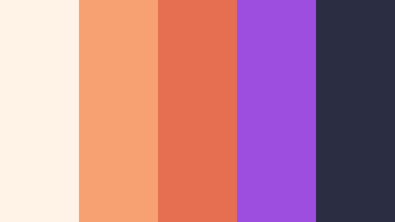
- HEX Codes: #fff2e6, #f7a072, #e76f51, #9d4edd, #2b2d42
- Mood: Dramatic, warm, and memorable.
- Use for: Use this palette for travel bumpers, music video overlays, and bold thumbnail compositions.
Sunset oranges blend with a violet accent for a striking canyon inspired mood. It feels dramatic and stylish, especially when your footage has a lot of motion or strong horizon lines.
This palette works well for bold thumbnails, animated bumpers, and editorial style travel graphics. The violet detail adds a creative twist that helps the design feel less predictable.
Safari Dust Drift
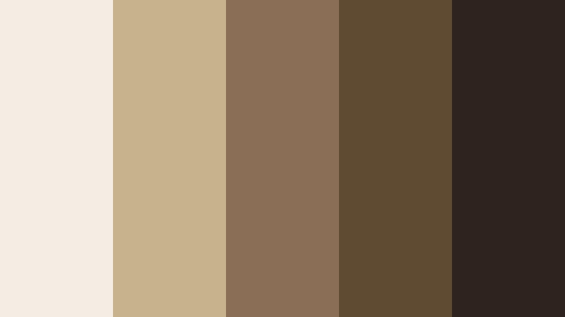
- HEX Codes: #f4ede4, #c8b28b, #8a6f56, #5f4b32, #2f241d
- Mood: Dusty, grounded, and calm.
- Use for: Use this palette for adventure documentaries, editorial thumbnails, and earthy UI themes.
Muted sand and mocha tones create a steady, natural feel. The palette is subtle, but that is what makes it useful for storytelling that focuses on landscape, texture, and movement.
Use it for documentary covers, calm travel explainers, or brand systems that want a softer, more editorial look. It also pairs nicely with handwritten fonts and minimal layouts.
Nomad Ember Trail
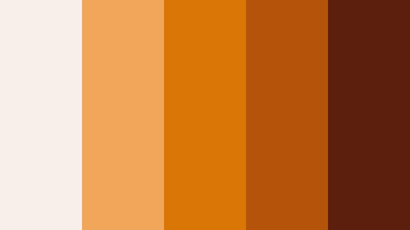
- HEX Codes: #f8efe9, #f2a65a, #d97706, #b45309, #5b1f0e
- Mood: Bold, rustic, and adventurous.
- Use for: Use this palette for trip recap titles, bold lower thirds, and branded travel graphics.
Amber and ember tones give this palette a rugged campfire warmth. It feels active and adventurous, which makes it a strong match for travel edits with hiking, road stops, or outdoor camp scenes.
Use the richer oranges and browns for branded graphics, title cards, or social post covers. The palette helps your content feel energetic while still staying earthy and approachable.
Urban Night Transit Travel Video Color Palettes
Neon Terminal

- HEX Codes: #f5f7fa, #7dd3fc, #38bdf8, #8b5cf6, #111827
- Mood: Modern, electric, and fast paced.
- Use for: Use this palette for city travel intros, neon thumbnail text, and nightlife content branding.
Bright cyan and violet accents cut through a dark base for a sleek urban look. It suits energetic edits, metro transitions, and motion graphics with a bold nightlife feel.
Use it when you want titles and overlays to feel sharp and contemporary. The contrast also makes it easy to design thumbnails that stand out on busy home feeds.
Midnight Streetlight
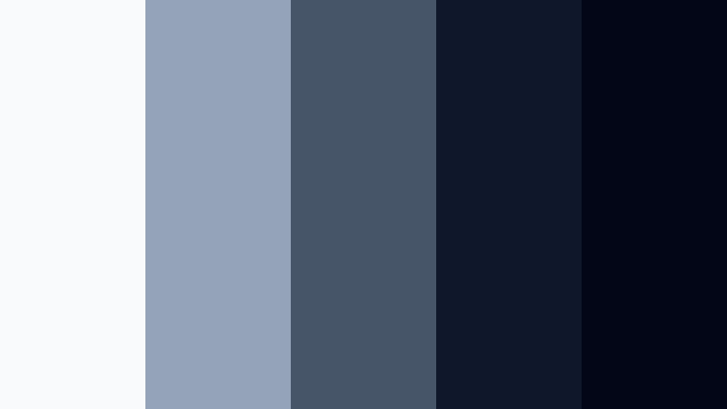
- HEX Codes: #f8fafc, #94a3b8, #475569, #0f172a, #020617
- Mood: Moody, refined, and cinematic.
- Use for: Use this palette for late night city reels, minimalist covers, and sleek channel branding.
Cool grays and deep navy tones create a quiet streetlight atmosphere. The palette feels restrained and elegant, which works well for urban stories with a reflective or cinematic tone.
It is a strong choice for minimalist covers, dark title cards, and branded visuals that need a polished look. Use the lighter grays for labels and the deeper shades for backgrounds or frame accents.
Rooftop City Pulse

- HEX Codes: #fce7f3, #fb7185, #f97316, #22d3ee, #1e293b
- Mood: Energetic, bold, and nightlife ready.
- Use for: Use this palette for nightlife recaps, event promos, and punchy social media templates.
Pink, orange, and electric blue create a vibrant skyline rhythm. It feels festive and fast moving, so it works well when the footage is full of lights, crowds, and evening energy.
Use this palette for event promos, creator stories, or social templates that need bold contrast. The dark anchor color keeps the bright accents readable and balanced.
Metro Chrome

- HEX Codes: #f8fafc, #cbd5e1, #94a3b8, #334155, #0f172a
- Mood: Clean, sleek, and contemporary.
- Use for: Use this palette for transit maps, techy overlays, and elegant travel channel graphics.
Metallic grays and deep blue shadows give this palette a modern metro feel. It looks clean and professional, which makes it a great fit for transit edits and structured information design.
Use it for map graphics, schedule overlays, and polished channel branding. The restrained tones also help make route details and captions easier to read.
Soft Adventure Travel Video Color Palettes
Mountain Mist Story

- HEX Codes: #f7fafc, #dbeafe, #93c5fd, #64748b, #334155
- Mood: Airy, calm, and reflective.
- Use for: Use this palette for hiking videos, documentary openers, and clean informational layouts.
Light sky blues and misty neutrals create a peaceful mountain atmosphere. The palette feels quiet and spacious, which is ideal for slow paced travel stories and scenic intros.
It works well for documentary openers, route summaries, and educational overlays where clarity matters. The deeper blue-gray tones add enough contrast to keep text legible.
Forest Campfire Calm

- HEX Codes: #f0fdf4, #bbf7d0, #86efac, #4ade80, #14532d
- Mood: Fresh, natural, and restful.
- Use for: Use this palette for camping edits, eco travel branding, and relaxed outdoor content.
Gentle greens and a deep forest anchor make this palette feel restorative. It has a clean outdoor look that fits nature focused videos and calm lifestyle visuals.
Use it for eco branding, camping recaps, and wholesome thumbnails that need a fresh organic mood. The darker green gives your text and icons a natural but strong base.
Sunrise Trail Journal
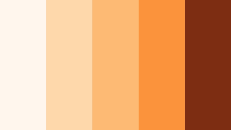
- HEX Codes: #fff7ed, #fed7aa, #fdba74, #fb923c, #7c2d12
- Mood: Warm, hopeful, and personal.
- Use for: Use this palette for morning travel vlogs, journal style titles, and cozy social content.
Peach and apricot hues create the feeling of a sunrise hike or early departure. The palette feels personal and warm, which makes it a great fit for vlog storytelling and diary style edits.
Use it for cozy title cards, intro pages, or social graphics that need a soft emotional touch. It can make morning scenes feel brighter and more inviting without overpowering the footage.
Tips for Creating Travel Video Color Color Palettes
The best Travel Video Color palettes balance mood, readability, and consistency. Start with a main shade that matches your footage, then add supporting colors that work across thumbnails, titles, and motion graphics.
- Choose one dominant color and use it across intros, titles, and thumbnail accents.
- Keep text high contrast so titles stay readable on bright skies or dark city scenes.
- Match the palette to the location, such as coastal blues, desert golds, or urban neon.
- Use one dark anchor color to stabilize bright combinations.
- Limit your design to 3 to 5 colors so the brand looks clean and focused.
- Check skin tones after color grading so people look natural in every scene.
- Reuse the same palette in banners, lower thirds, and end screens for brand consistency.
- Test the palette on both video frames and static designs before publishing.
Travel Video Color palettes can shape the mood of a story before the first scene even plays. Whether you want coastal freshness, desert warmth, city neon, or a softer adventure look, the right colors can make your content feel more memorable and more branded.
Try a few of these combinations in Filmora and adjust them to fit your footage, title cards, and social exports. Small color changes can make a big difference in how polished and recognizable your travel videos feel.
secure download