

 100% Security Verified | No Subscription Required | No Malware

Vlog Color palettes are popular because they feel approachable, polished, and easy to recognize on screen. Soft pastels can make content feel friendly and airy, while brighter combinations help thumbnails, titles, and intros stand out fast. Warm cinematic tones add depth and emotion, and minimal neutrals keep branding clean and readable.
This article brings together 15 Vlog Color color palettes with HEX codes for creators, editors, and Filmora users. Use them for video branding, vlog thumbnails, intro cards, social posts, UI accents, and style guides that stay consistent across every platform.
In this article
Soft Pastel Vlog Color Palettes
Soft Focus Sunrise
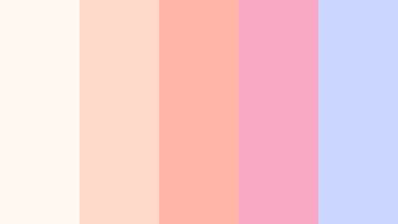
- HEX Codes: #fff7f2, #ffd9c7, #ffb8a7, #f7a8c4, #c9d7ff
- Mood: gentle, bright, and welcoming
- Use for: Use for beauty thumbnails, intro cards, and soft social branding.
A light pastel mix that feels airy and approachable. The balance of peach, blush, and soft blue creates a calm first impression that works well in friendly creator branding and lifestyle edits.
This palette fits vlog covers, channel banners, and quiet UI accents where you want a warm but polished look. It also pairs nicely with clean typography in intros and short-form social content.
Pro Tip: Keep Soft Pastel Vlog Color Visuals Consistent In Filmora
Filmora makes it easy to carry this soft palette across an entire edit, from opening titles to b-roll transitions. If your vlog uses pastel clothing, bright daylight, or beauty props, matching the on-screen graphics to those tones can make every scene feel intentional.
Try using the same peach and blush accents for lower thirds, subscribe buttons, and story frames so the whole video feels unified. That kind of visual consistency is especially useful for creator branding and recurring intro sequences.
AI Color Palette
If you have a reference image or a simple color card for this palette, Filmora's AI Color Palette feature can help you apply those tones across the full timeline. It is a fast way to keep thumbnails, intros, and social cutdowns aligned with one clear look.
Use it when you want a pastel vlog style that stays balanced from the first frame to the final outro. A single reference can guide the overall grade so your edit feels consistent without manual color matching on every clip.
 secure download

HSL, Color Wheels & Curves
To make this Vlog Color palette feel more cinematic, gently lower saturation in the shadows and keep the highlights soft. Filmora's color wheel and curve controls can help you preserve the creamy pastel look while avoiding colors that feel washed out.
If you want a cleaner creator aesthetic, lift the midtones slightly and use HSL adjustments to keep pinks, peaches, and blues separated. For a deeper breakdown of tone control, Filmora's color matching tools can help you keep the palette controlled from clip to clip.
secure download1000+ Video Filters & 3D LUTs
When you want a faster style shift, Filmora's video filters and 3D LUTs can turn this pastel palette into a dreamy vlog look in just a few clicks. Use soft filters to keep the image bright and gentle while making thumbnails and intro frames feel more cohesive.
This is useful for beauty edits, lifestyle montages, and social cutdowns where you want the same soft tone across multiple shots. Filters and LUTs can help keep the palette consistent without overcomplicating the workflow.
secure downloadPeach Milk Notes
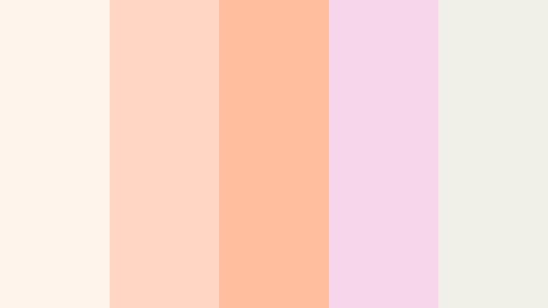
- HEX Codes: #fff4eb, #ffd7c2, #ffbf9f, #f6d6e8, #f0efe8
- Mood: sweet, creamy, and relaxed
- Use for: Use for product shots, lifestyle reels, and soft packaging mockups.
Creamy peach and blush tones give this palette a cozy, clean feel. It is gentle enough for lifestyle branding, yet colorful enough to keep a frame feeling fresh.
Use it in overlays, packaging mockups, and friendly channel graphics when you want your visuals to feel calm and approachable. It is also a strong fit for soft product edits and aesthetic social posts.
Lavender Edit Glow
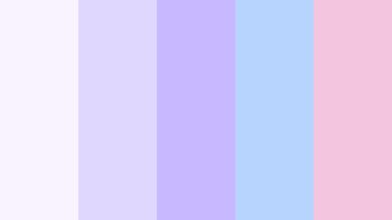
- HEX Codes: #f8f3ff, #e0d7ff, #c7b8ff, #b7d4ff, #f3c6de
- Mood: dreamy, modern, and playful
- Use for: Use for study vlogs, aesthetic intros, and channel art.
Lavender and powder blue create a light dreamy look without losing clarity. The palette feels playful but still polished, which makes it a good match for creator branding.
Use it in pastel thumbnails, title cards, and channel art when you want your design to feel soft, modern, and visually calm. It also works well for study content and minimal intro screens.
Cloudy Blush Story
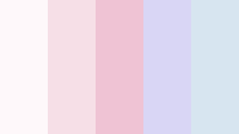
- HEX Codes: #fff8fb, #f6dfe7, #efc3d4, #d9d5f5, #d6e5ef
- Mood: soft, romantic, and polished
- Use for: Use for wedding edits, storytelling thumbnails, and delicate social posts.
This mix of blush, lilac, and misty blue feels gentle and editorial. It gives your content a polished storybook quality that suits romantic or sentimental edits.
It is a strong option for wedding videos, storytelling thumbnails, and delicate social graphics where you want the visuals to feel calm, refined, and emotionally warm.
Bright Studio Vlog Color Palettes
Neon Subtitle Pop

- HEX Codes: #0f1020, #ff3d81, #ffb703, #00d1b2, #7c4dff
- Mood: bold, punchy, and energetic
- Use for: Use for gaming vlogs, high contrast thumbnails, and animated lower thirds.
Bright neon accents against a dark base create instant impact. The palette feels fast, loud, and made for attention grabbing visuals.
It works especially well for gaming thumbnails, motion graphics, and bold lower thirds where you want text and accents to stand out immediately.
Electric Room Tour

- HEX Codes: #111827, #22c55e, #38bdf8, #f97316, #facc15
- Mood: vivid, confident, and upbeat
- Use for: Use for room tour graphics, YouTube covers, and bold subscribe screens.
This palette mixes vivid green, sky blue, and warm orange for a lively modern feel. It creates an upbeat energy that suits energetic creator content.
Use it for room tours, cover art, and subscribe screens when you want a vibrant look that keeps viewers engaged. It also works well for bright call to action elements.
Glossy Thumb Stopper

- HEX Codes: #1f2937, #ff5f6d, #ffc93c, #00c2ff, #f4f4f5
- Mood: fresh, glossy, and eye catching
- Use for: Use for thumbnail text blocks, promo banners, and short form campaign art.
High contrast pairings make this palette feel glossy and easy to notice on screen. The colors are bright enough for fast scrolling audiences but still controlled by the dark foundation.
It is a smart choice for thumbnail text blocks, promo banners, and short form campaigns where you need a clean but bold visual punch.
High Energy Cut

- HEX Codes: #0b132b, #6fffe9, #5bc0eb, #fde74c, #ff5964
- Mood: sporty, dynamic, and modern
- Use for: Use for action vlogs, workout edits, and bold social templates.
Cyan, yellow, and coral bring motion into the palette right away. The result feels sporty, sharp, and ready for quick transitions.
Use it for workout edits, action content, and event promos where the design should feel energetic and modern. It also works well in motion titles and social templates.
Warm Cinematic Vlog Color Palettes
Golden Hour Journal
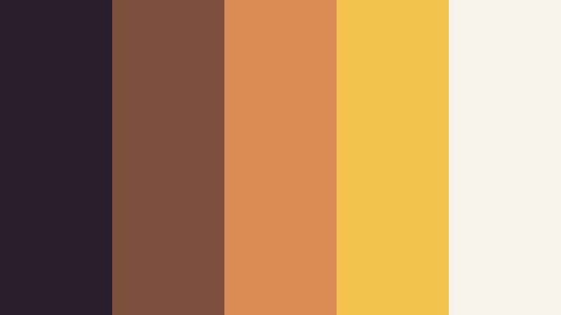
- HEX Codes: #2d1e2f, #7b4f3a, #d98c55, #f2c14e, #f7f3e9
- Mood: warm, nostalgic, and intimate
- Use for: Use for travel vlogs, storytelling intros, and golden hour thumbnails.
Amber light and earthy browns create a filmic, lived in feeling. This palette has a nostalgic mood that works beautifully with travel shots and personal storytelling.
Use it for journaling visuals, warm overlays, and thumbnails that should feel intimate and reflective. It is especially effective in edits built around sunset footage and memory driven content.
Cozy Streetlight

- HEX Codes: #1b1b2f, #3d405b, #81b29a, #f2cc8f, #e07a5f
- Mood: moody, cozy, and reflective
- Use for: Use for evening vlogs, reflective edits, and cinematic title screens.
Muted teal and sunset amber create a quiet, cinematic mood that feels grounded and thoughtful. The palette is balanced enough for slower edits while still giving the frame personality.
It works well for evening vlogs, coffee shop scenes, and title screens that need a warm but reflective atmosphere. Use it when you want a cozy night look without losing clarity.
Amber Rewind
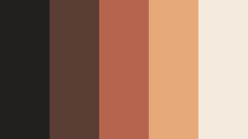
- HEX Codes: #221f1f, #5a3e36, #b5654d, #e7a977, #f3e9dc
- Mood: rich, warm, and vintage
- Use for: Use for retro edits, memory montages, and warm social graphics.
Deep browns and amber highlights give this palette an analog, nostalgic feeling. It feels rich and slightly vintage, like a memory with texture.
That makes it a good fit for archive clips, film style intros, and branded story posts. It can also add warmth to retro edits and sentimental montages.
Velvet Night Clip

- HEX Codes: #0f172a, #243b55, #3b82f6, #a78bfa, #f8fafc
- Mood: cool, cinematic, and sleek
- Use for: Use for late night vlogs, music overlays, and elegant lower thirds.
Midnight navy with blue and violet highlights creates a sleek late night look. The palette feels polished, smooth, and strongly cinematic.
Use it for music overlays, elegant lower thirds, and night content where you want a cool, modern mood. It is also a strong base for polished creator branding.
Clean Minimal Vlog Color Palettes
Mono Frame White

- HEX Codes: #ffffff, #f4f4f5, #d4d4d8, #71717a, #18181b
- Mood: clean, crisp, and timeless
- Use for: Use for minimalist thumbnails, UI mockups, and brand intro layouts.
A monochrome palette like this feels clear, timeless, and professional. It keeps the focus on typography, spacing, and structure.
Use it for minimalist thumbnails, UI mockups, and brand intro layouts when you want a clean design system that never distracts from the message.
Slate Interface Calm

- HEX Codes: #f8fafc, #e2e8f0, #94a3b8, #475569, #0f172a
- Mood: calm, structured, and modern
- Use for: Use for dashboard UI, creator decks, and clean video overlays.
Soft slate tones make this palette feel organized and easy to read. It has a modern structure that works well in design systems and tutorial content.
Use it for dashboards, creator decks, and overlays that need a calm, structured look. It is especially useful for tech content and interface-heavy visuals.
Studio Grid Neutral

- HEX Codes: #faf7f2, #e7e1d8, #c9c1b5, #8b8277, #34302d
- Mood: balanced, refined, and versatile
- Use for: Use for brand kits, title cards, and neutral packaging concepts.
Warm neutrals keep this palette flexible while still feeling premium. It is understated, which makes it useful for brands that need a reliable visual base.
Use it for title cards, brand kits, and packaging concepts when you want the design to feel clean, balanced, and adaptable across different formats.
Tips for Creating Vlog Color Color Palettes
Vlog Color palettes work best when they support the mood of your footage and keep text easy to read. Whether you are building a thumbnail, intro, or social post, use contrast and repetition to make the palette feel intentional.
- Keep text high contrast against backgrounds so thumbnails stay readable on mobile.
- Use one main color, one support color, and one accent color to avoid visual noise.
- Match warm palettes with sunset, indoor, or travel footage for a natural result.
- Use cool palettes for night scenes, tech content, and polished creator branding.
- Repeat the same colors in lower thirds, subscribe buttons, and end cards for consistency.
- Test pastel palettes on both light and dark footage to make sure they do not disappear.
- Use saturated accents sparingly so the frame stays balanced and not too busy.
- Build a simple style guide with HEX codes for thumbnails, intros, and social templates.
Vlog Color palettes can shape how your channel feels at a glance, from soft and welcoming to bold and high energy. The right combination can make your content look more polished, recognizable, and aligned with your brand identity.
Use these palettes as a starting point, then refine them inside Filmora to fit your footage, titles, and social cuts. A few small color choices can make your edits feel much more consistent and memorable.
secure download